Putting the Bran in Brand
Kellogg’s
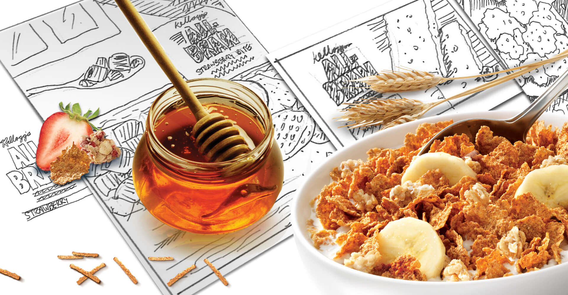
Kellogg’s was looking to solve a problem with one of their iconic brands – All-Bran – which has been found in cupboards and on breakfast tables since 1916. Perhaps in part due to the age of the brand, Kellogg’s was looking to widen the appeal of All-Bran to include a more youthful market, and to dispel the stigma that digestive health products lack flavour. Its existing packaging was clinical and cold and only served to support the idea that All-Bran was a function-first cereal. They had recently introduced new inspired flavour extensions such as Strawberry Medley and new product formats such as All-Bran bars, but the brand still needed the impact of new packaging to sway consumer perceptions.
The All-Bran design exercise would involve finding a solution that would create impact without losing the equity of this internationally renowned brand.
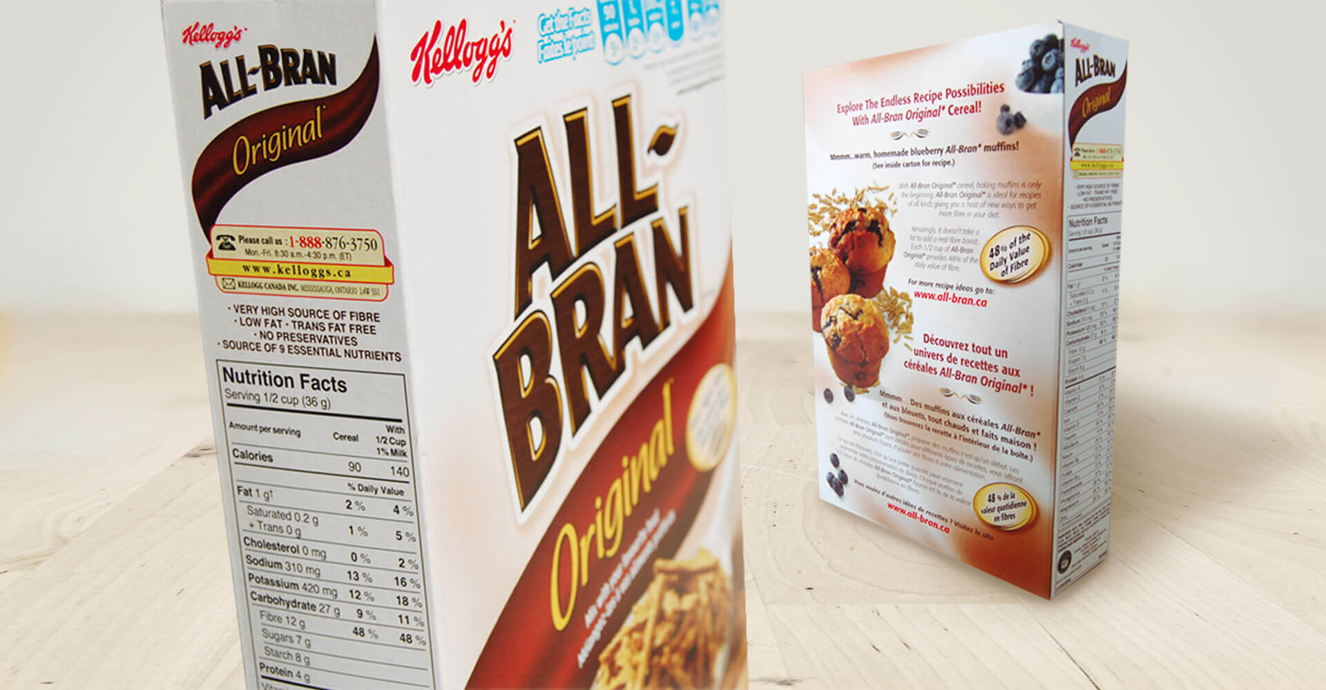
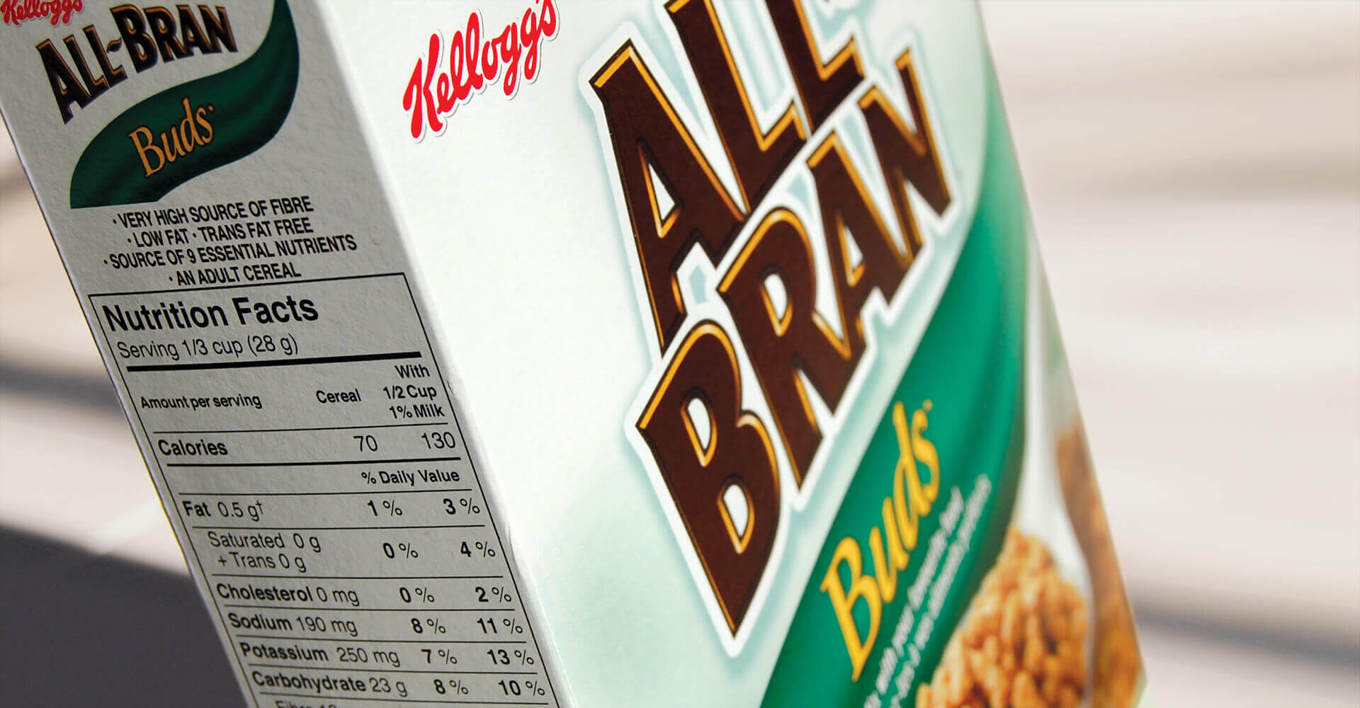
We started by introducing waves of colour into the packaging to distinguish the flavour varieties and create more appetite appeal on shelf. The distinctive shape of the colour bands also gave the new packaging great shelf blocking capability, the key to success in an over-crowded cereal aisle. We retained the soft white background as a brand signifier but introduced a more dynamic wordmark and new fruit-laden product photography to amplify taste appeal and bring the brand to life.
In addition to creating a fresher, more contemporary look for the packaging, we designed the new packaging to communicate the health benefits of fibre and to promote the use of some of the cereals as an additive to other foods such as yogurt.
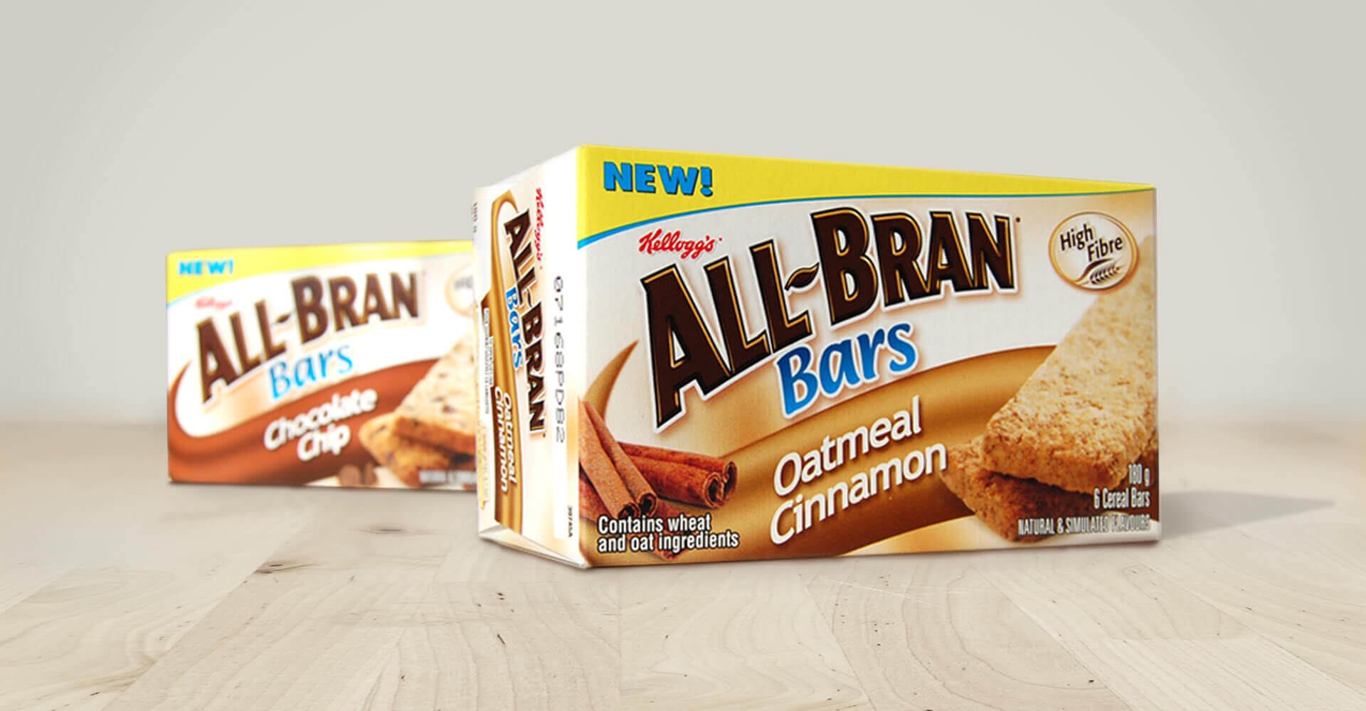
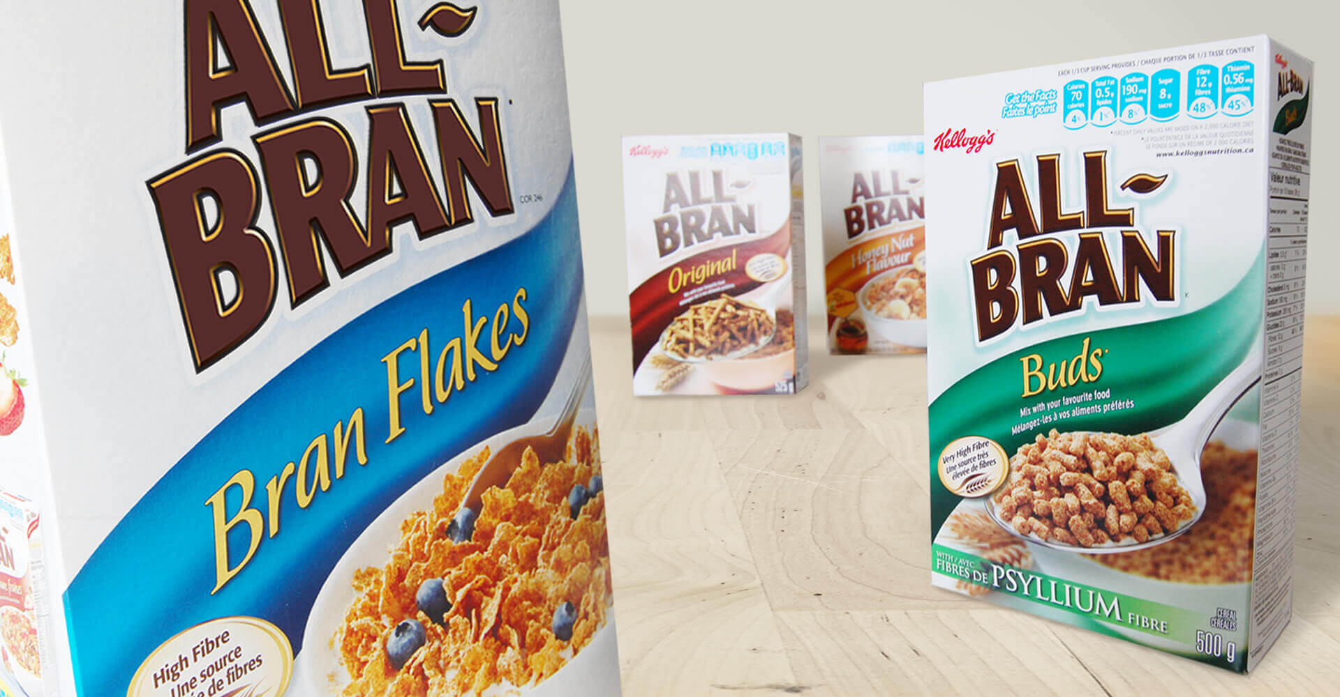
We also worked with Kellogg’s to apply the new style to other products in the All-Bran family, to create consistency and encourage trial outside their core buyer demographic.
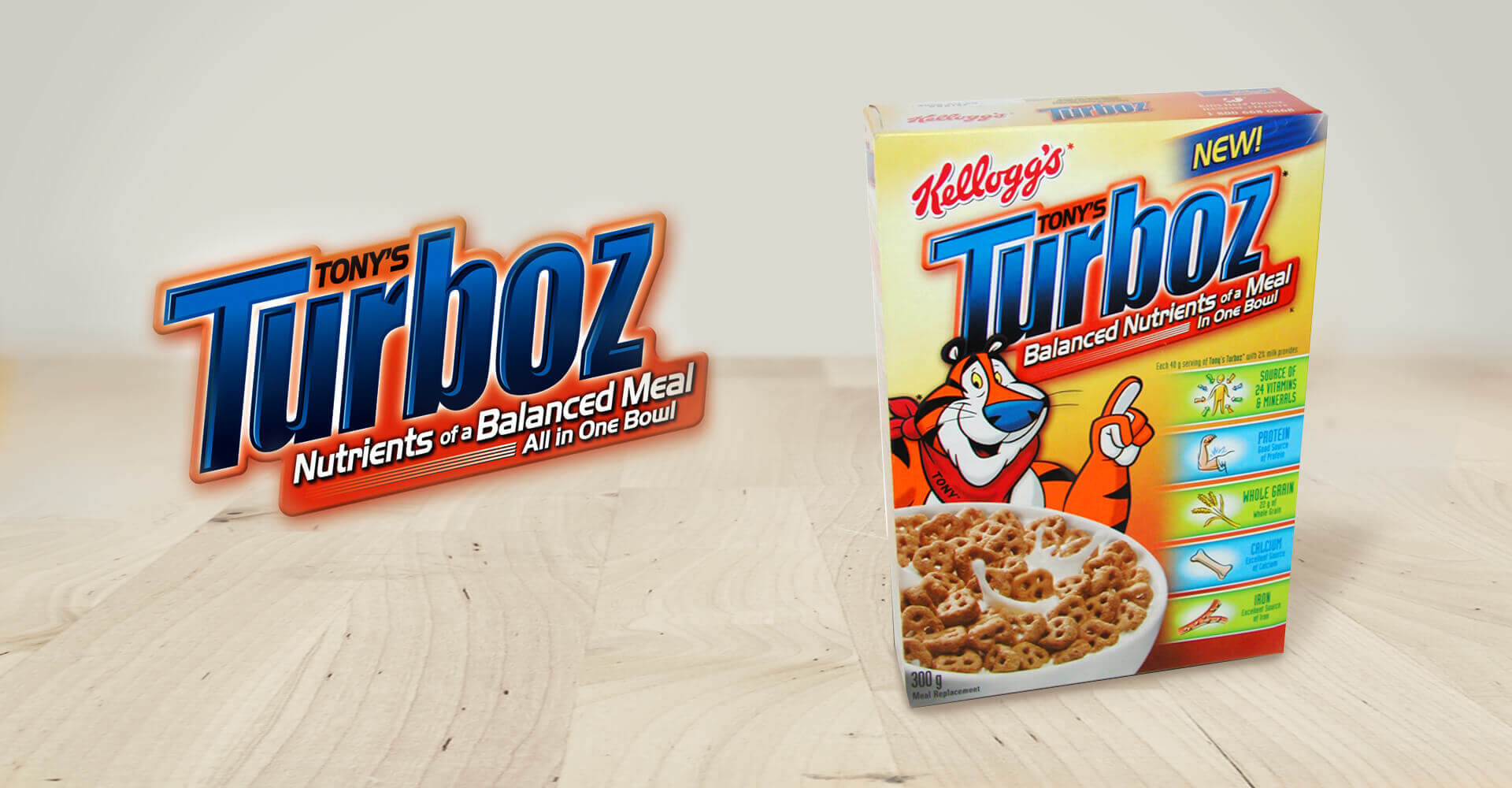
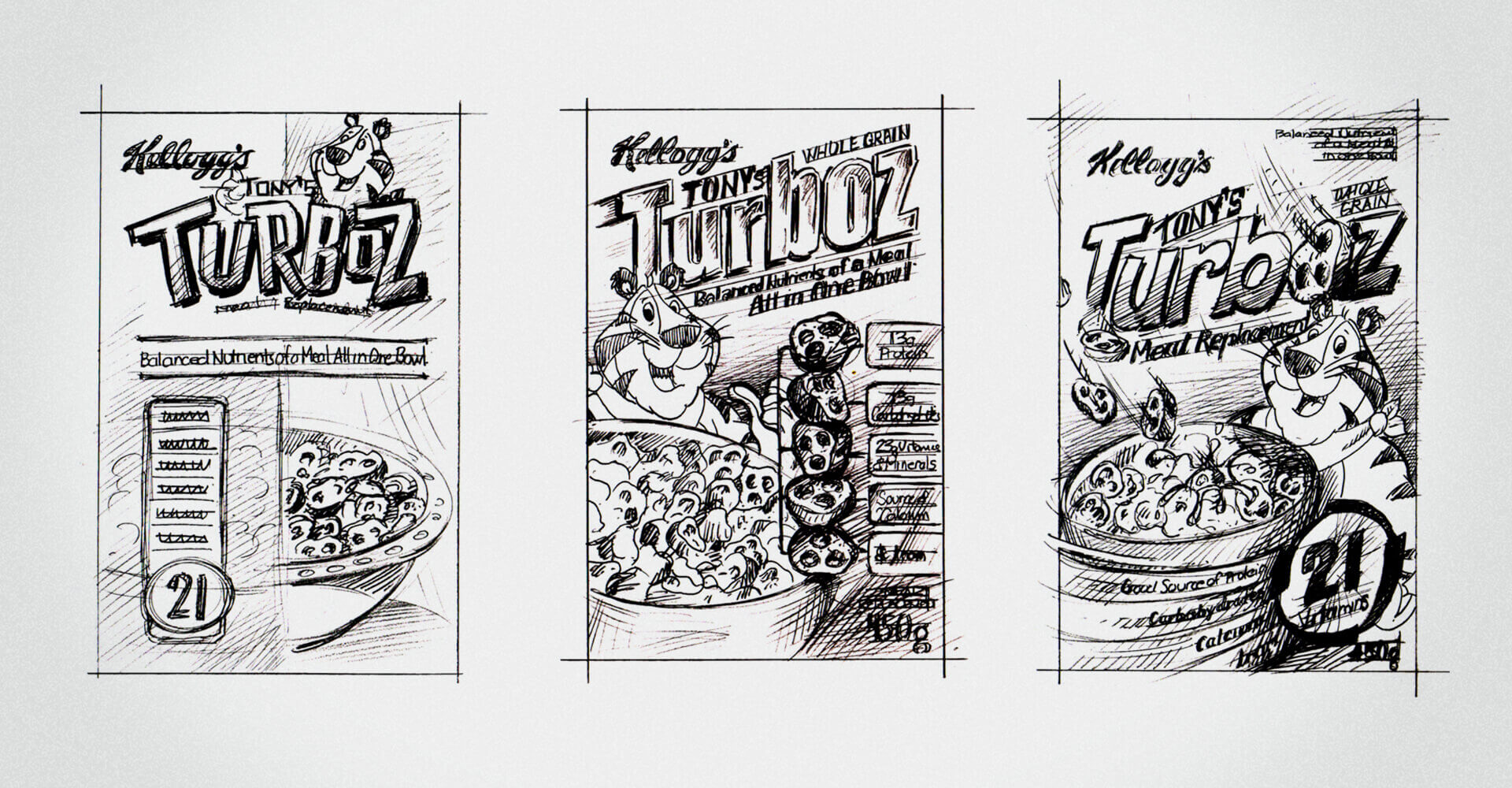
We actually began working with Kellogg’s in 2005, when Kellogg’s asked us to assist with the development of a brand new product extension. The product was Tony’s Turboz, a new meal replacement cereal for kids. Being first to market in the children’s meal replacement category led to several challenges for Turboz, the most critical being how to effectively communicate that the product provides all the nutrients of a meal in one bowl while still appealing to kids. To overcome this challenge, we developed a package that features colourful nutritional flashes on the face panel and a dynamic Turboz brand identity…with a little help from Tony the Tiger, of course.
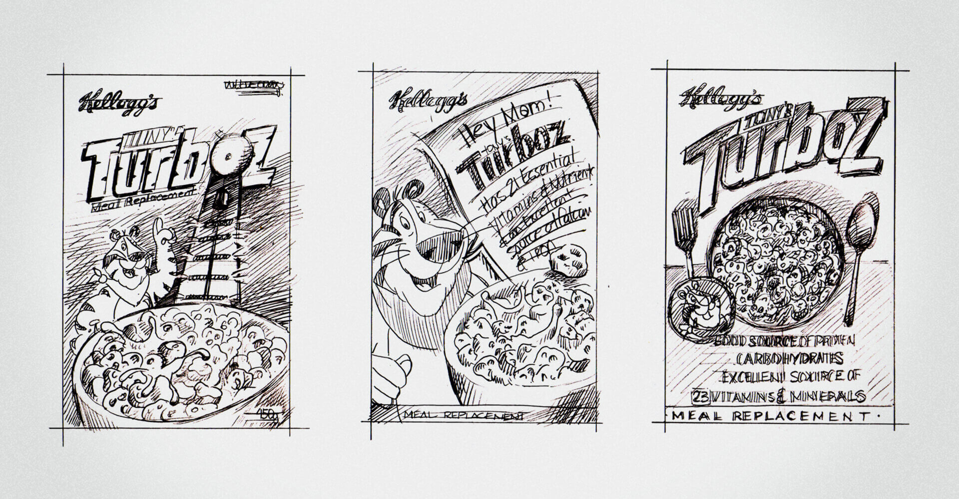
The package design concepts explored a range of roles for Tony the Tiger. In the selected direction he is prominently featured as the children’s ambassador representing fun, taste, and excitement to kids.
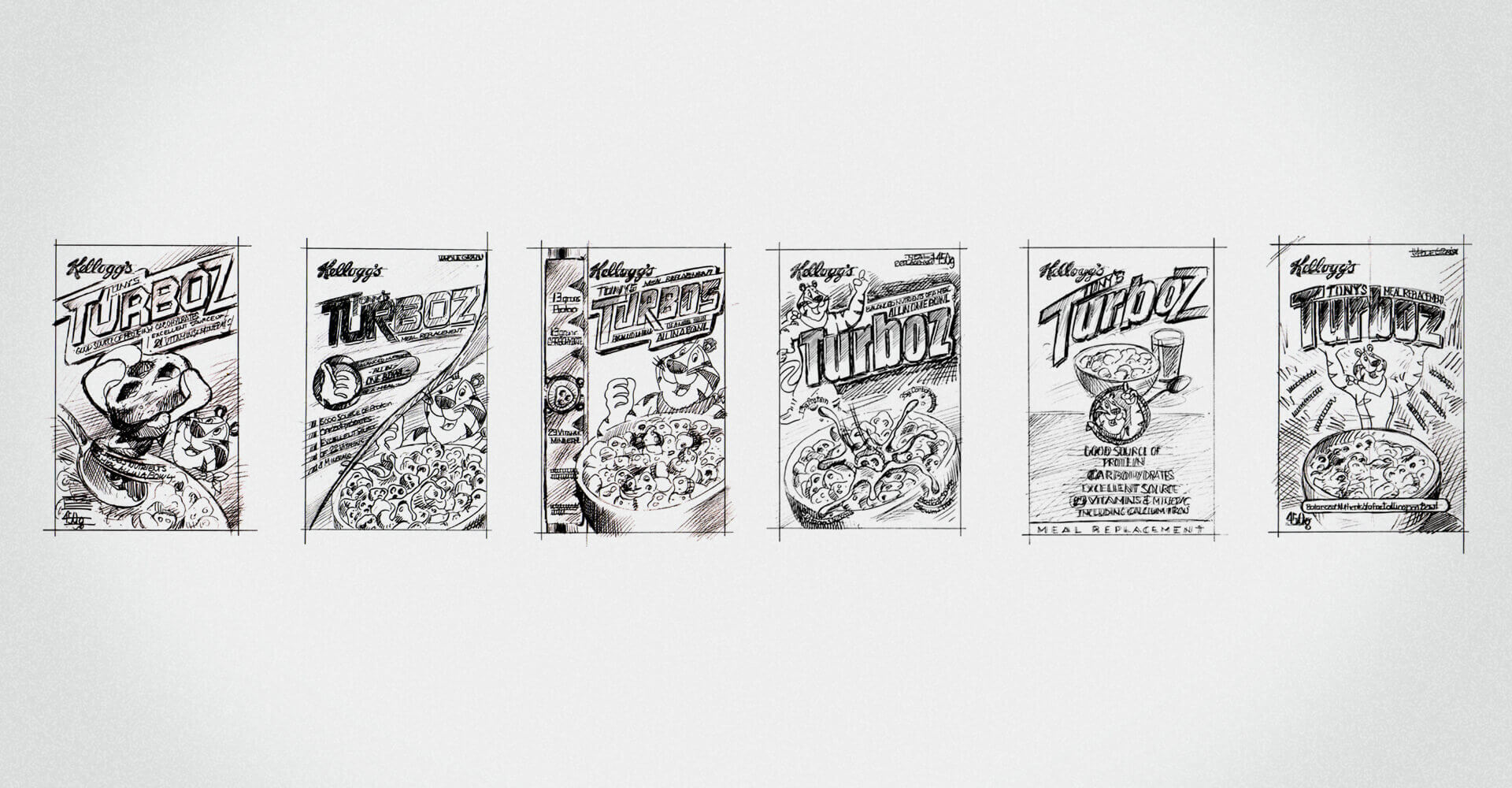
The design is intended to capture the attention of Mom in the grocery aisle, who is looking to provide guilt-free meal options her kids will enjoy, while maintaining a playful design that appeals to the children.
As parents’ aversion to serving their children sugar-based cereal grows, Kellogg’s looked to capitalize on an alternative solution that appealed to the whole family. Tony’s Turboz launched in Canada in 2005.