Sleek and Sporty

Canadian Tire

Canadian Tire engaged Jump to redesign their private label brand of automotive accessories called Autotrends. The previous brand and packaging was dated and lacked the consistency of execution that would make it stand out on shelf. After going through our strategic discovery phase where we determine the target consumer and define the strengths and weaknesses of the competitive set, we went about re-inventing the brand.

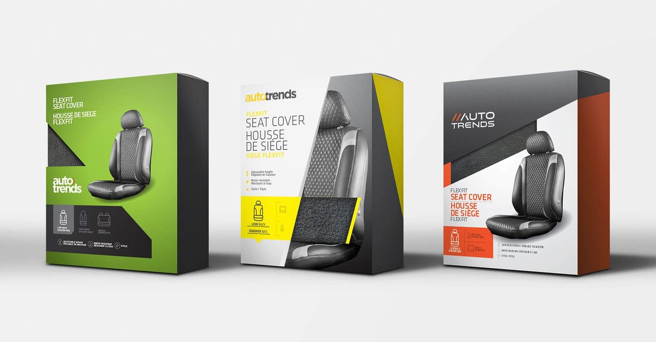
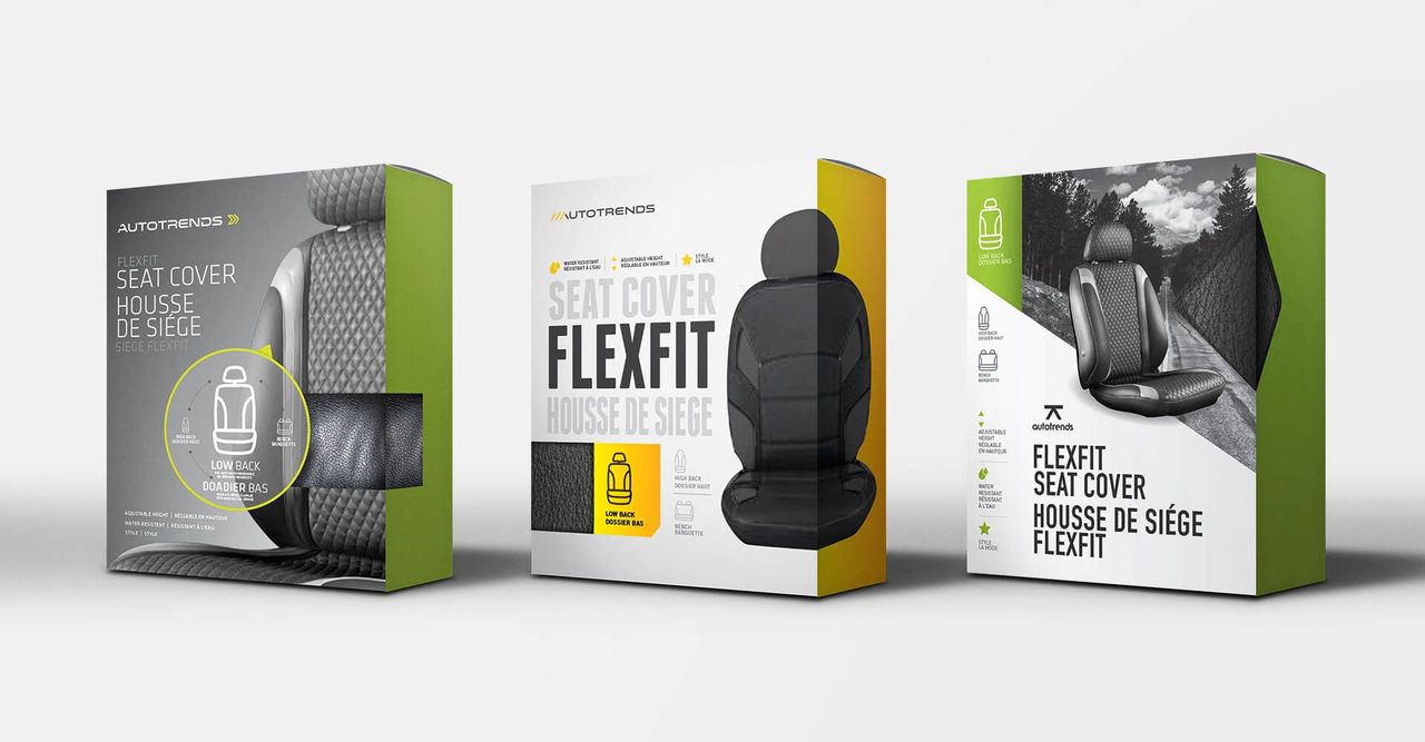
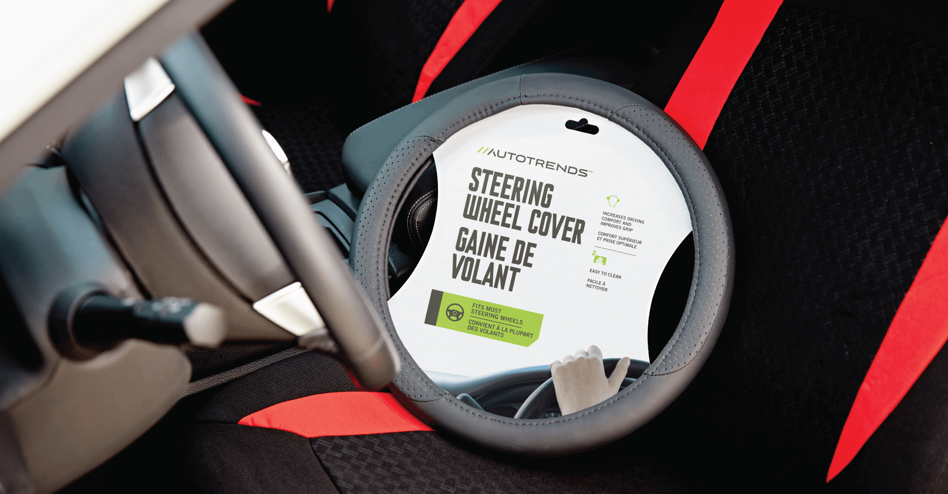
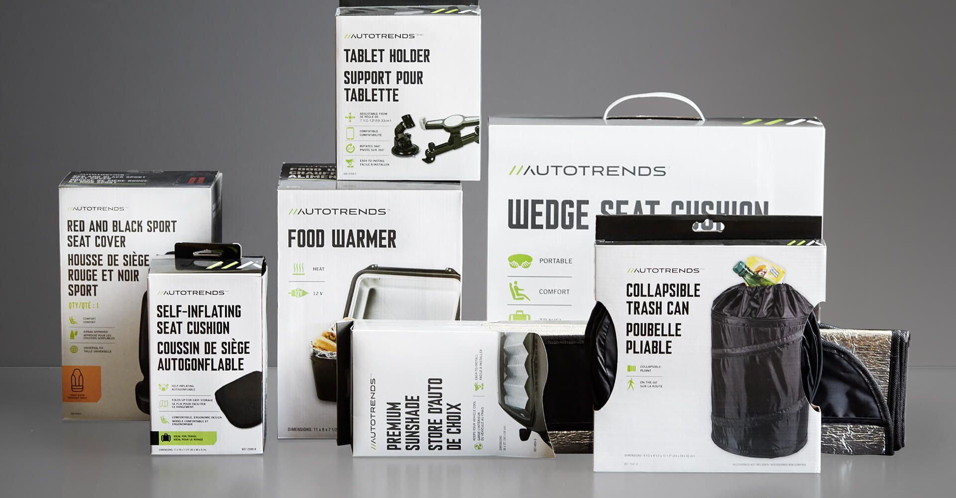
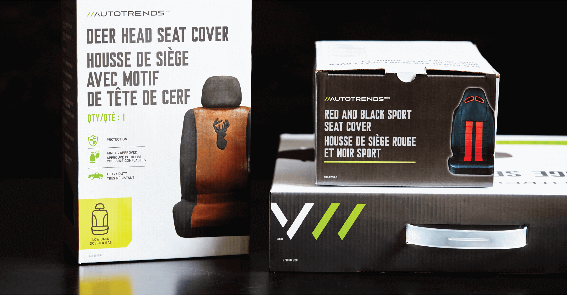
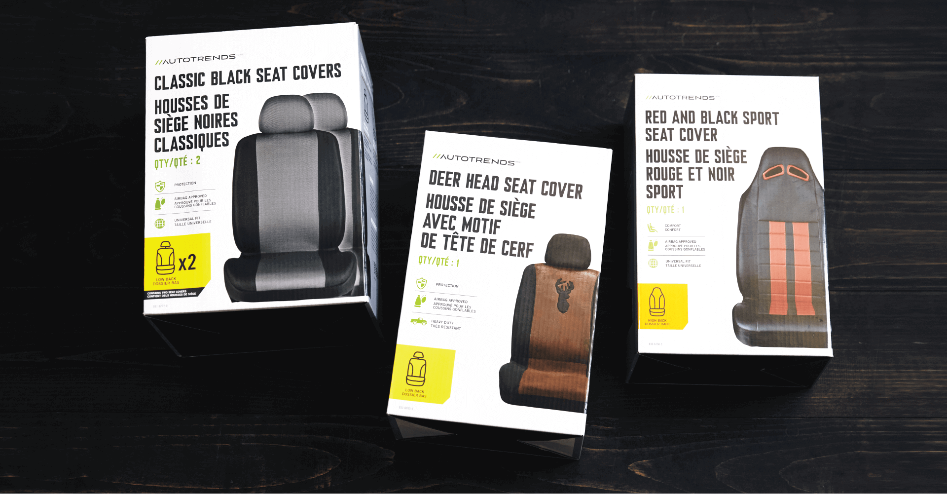
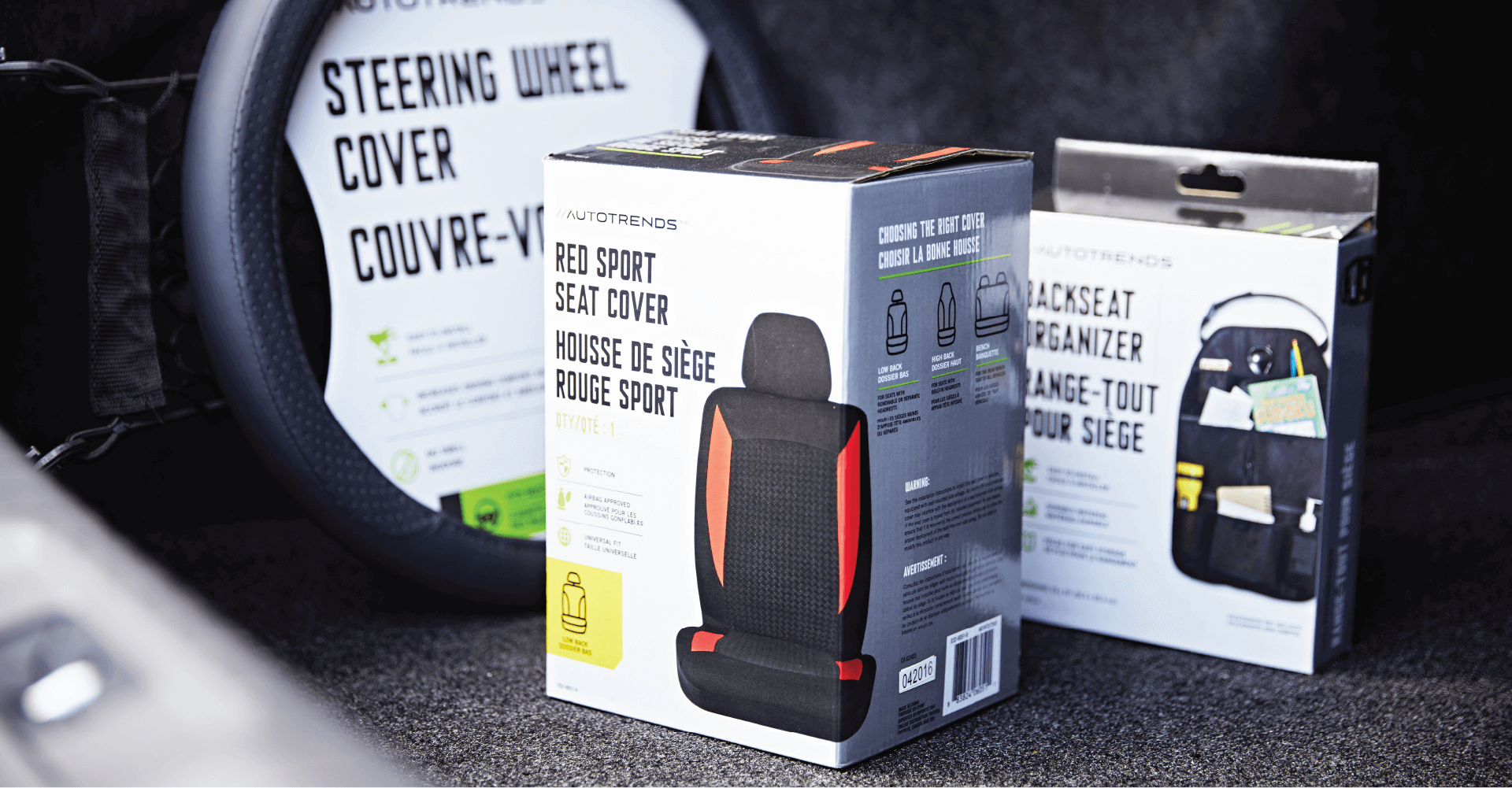
The primary target consumer is a younger male, aged 20-35 who is looking to customize and improve the appearance of their entry level vehicle. We designed the Autotrends brand identity to have a sleek, sporty appearance that is evocative of a car logo. Knowing that this line of products is not purchased for the prestige of the name, the logo was given an understated presence on the package design.

Canadian Tire

For the packaging, the design needed to work for a wide variety of formats and configurations. Jump developed a tri-tone system that uses white, black and grey for the three dimensions of the packaging, along with lime green accents for distinction. The product imagery was designed to wrap around the corner of the boxes to the side panel and an icon system was developed to effectively communicate the product features to make it easy for consumers to shop the category.

Canadian Tire

The bold new look for Autotrends is now prominently featured in Canadian Tire stores across the country.

Canadian TireCanadian TireCanadian TireCanadian TireCanadian TireCanadian TireCanadian TireCanadian Tire