into the wild blue yonder
Canadian Tire recognized the emergence of the mobile electronic accessories as a growing business but they did not have a brand in their portfolio to suit the category. This included products such as USB cables, power banks and charging stations. They turned to Jump to develop the brand and packaging that would fulfill this need.
Packaging
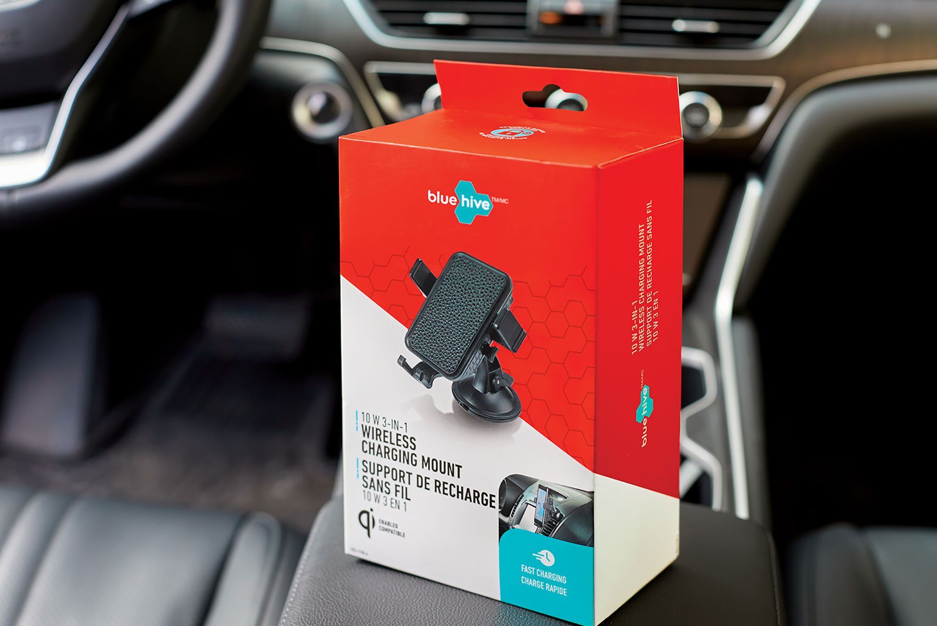
We began with an extensive brand name generation exercise that started with establishing the naming ‘buckets’ for the different potential brand positions. The name Bluehive was eventually selected for its technical feel and correlation to the concept of connectivity.
The logo incorporates a honeycomb pattern with a lowercase font that is friendly and approachable. The style of the package design is bold but simple. It features an angled split on the face panel between the bright red and white halves of the package. The product imagery floats over top of this split at an opposing angle, featuring unique configurations of the chords where possible. Turquoise is used in the logo and to highlight product features, adding to the striking effect on shelf. The matte finish on all the packaging also helps to elevate the appearance.
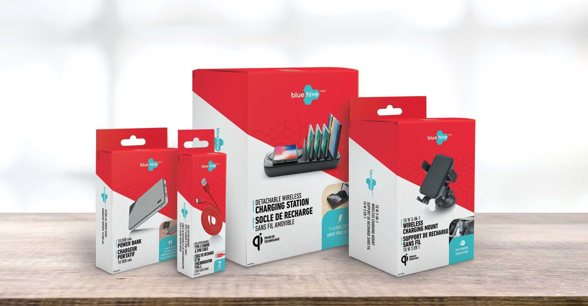
The Bluehive brand was launched in 2019 and the early results have been outstanding.
Canadian Tire has reported that “Bluehive’s performance out of the gates has been incredibly strong – thanks in large part to the packaging. We’ve outpaced weekly planned sales every week so far, now pacing ahead +30% against our plan.” This is a testament to the effect great package design can have in the market.