refreshing an outdated brand
Cliplight Manufacturing has led the industry for more than 35 years with their line of internationally respected automotive, HVAC and OEM Battery Charger products. The Company’s storied reputation has been built on providing innovation, service excellence and user-friendly, cost-effective solutions.
Unfortunately, Cliplight’s logo and product packaging was stuck in the 1970s. Conceived at the company’s establishment, the logo emulates the bulb-and-cage design of the original patented ‘clip light’. With the clip icon dominating the wordmark, the Cliplight name was illegible on packaging. As products were developed over time, Cliplight failed to create consistency in their packaging design, with varying graphics, complex product features and an absent hierarchy template.
Digital, Identity, Packaging
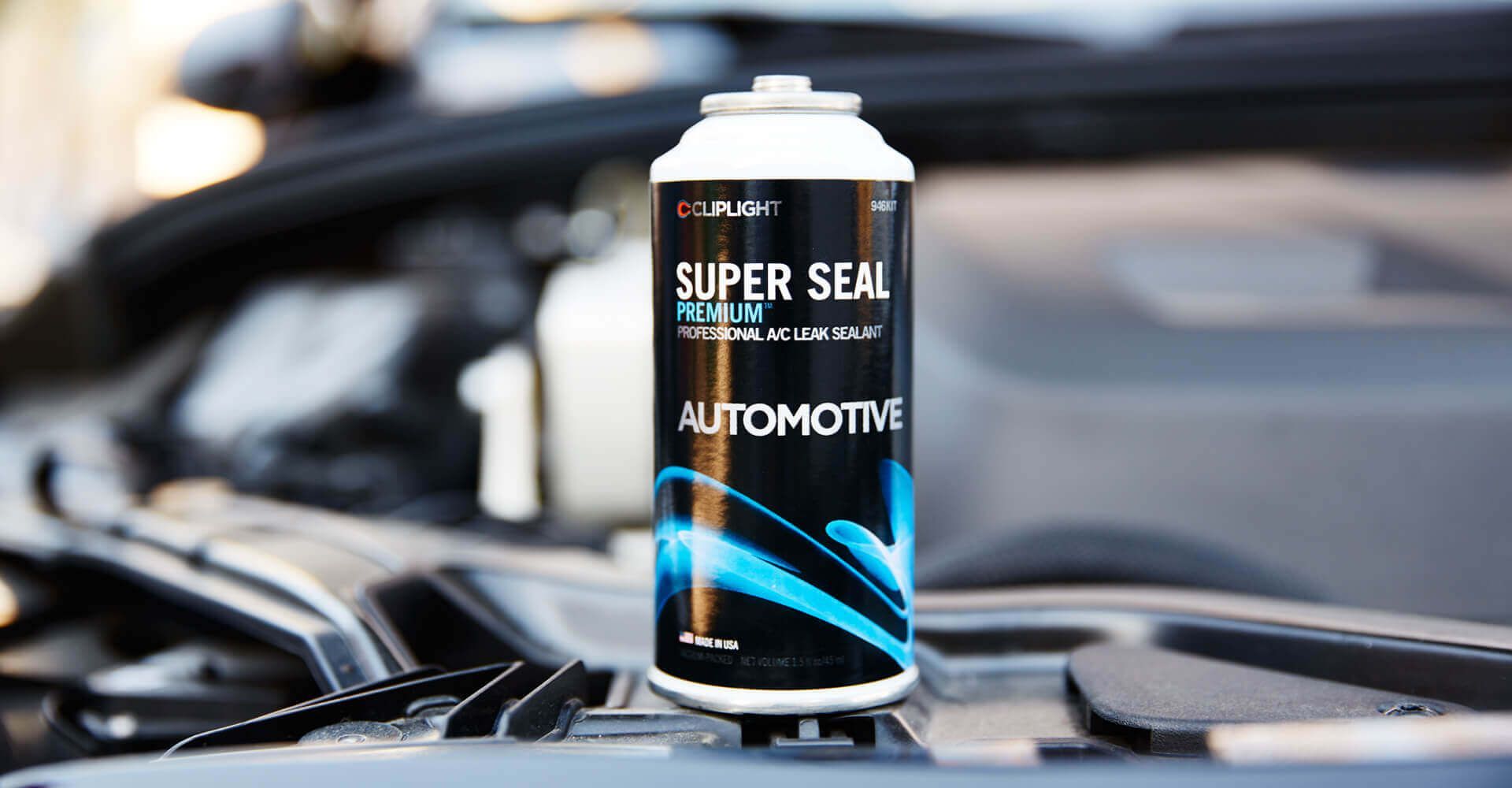
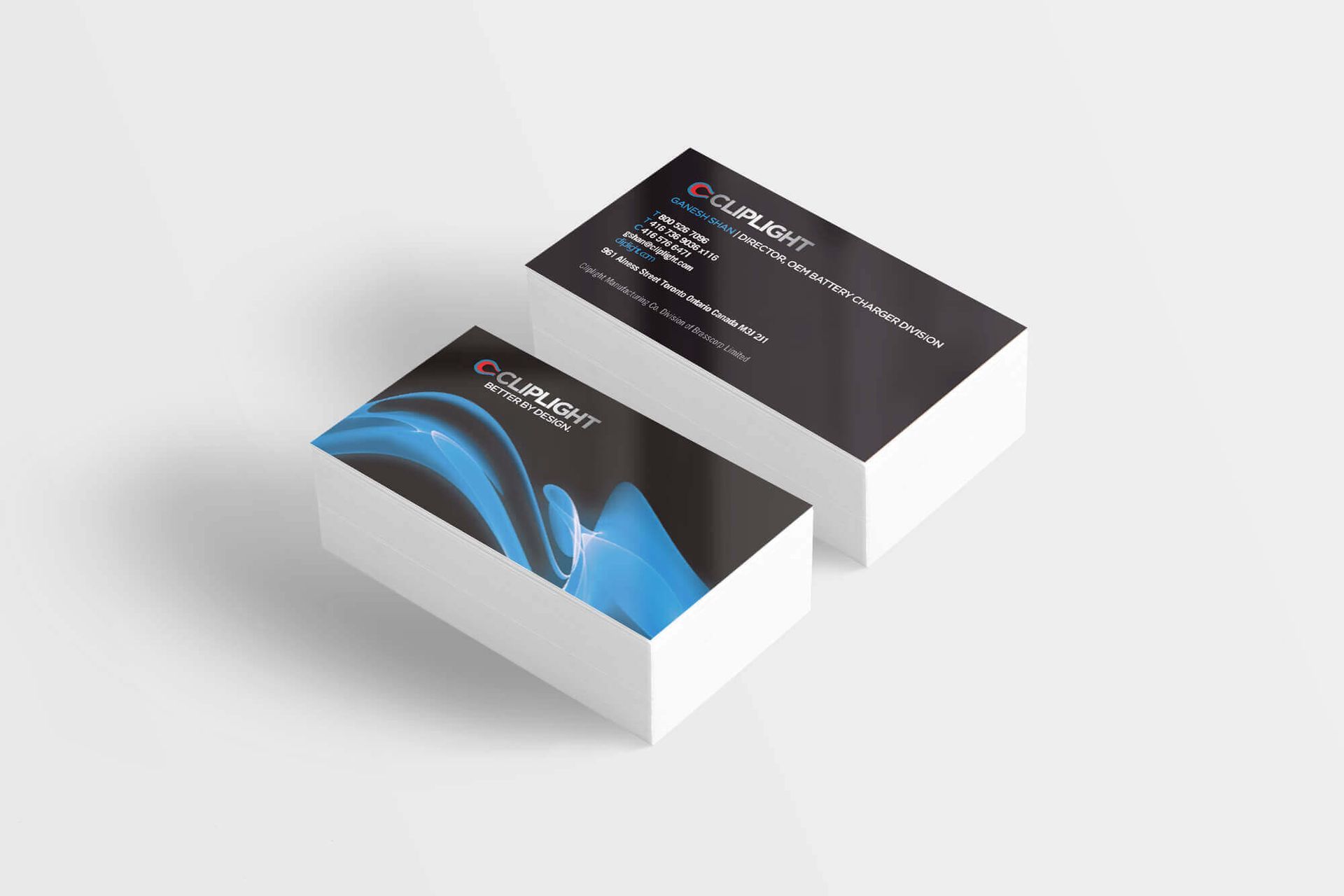
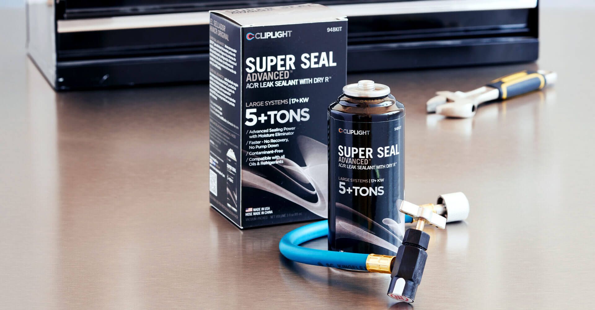
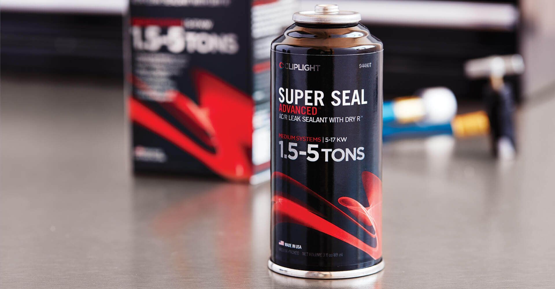
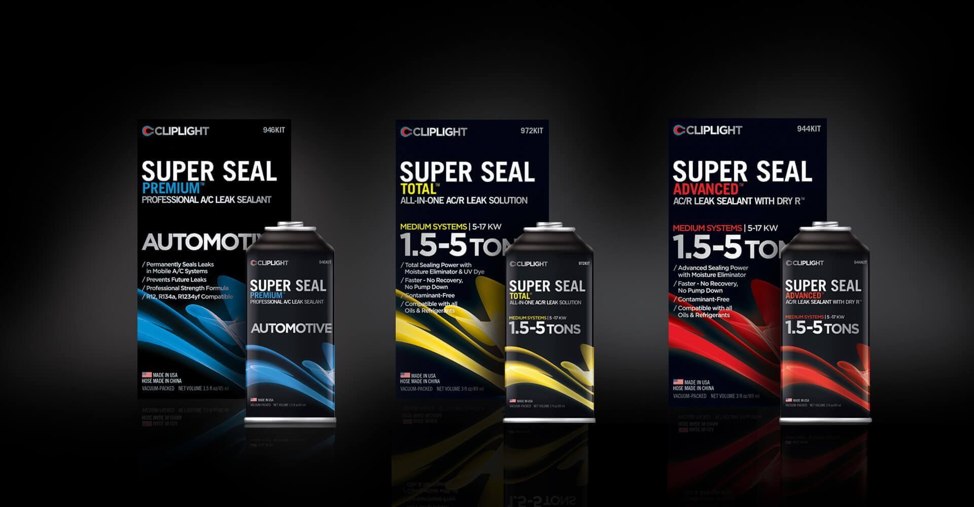
We were retained to refresh and bring consistency to the communication hierarchy and convey commitment to innovation. Starting with the logo, we rebalanced the existing ‘clip’ icon and wordmark, selecting a new, modern, industrial font and utilizing subtle gradations to bring the logo to life. Our new packaging design refreshed the outdated look of the brand’s line of HVAC Chemical Sealants. Better reflecting Cliplight’s commitment to delivering innovation, the redesign achieves a level of sophistication indicative of their product excellence. The new packaging follows a bold, masculine, industrial aesthetic, with a clean, stylized logo that is consistently positioned throughout the product line.
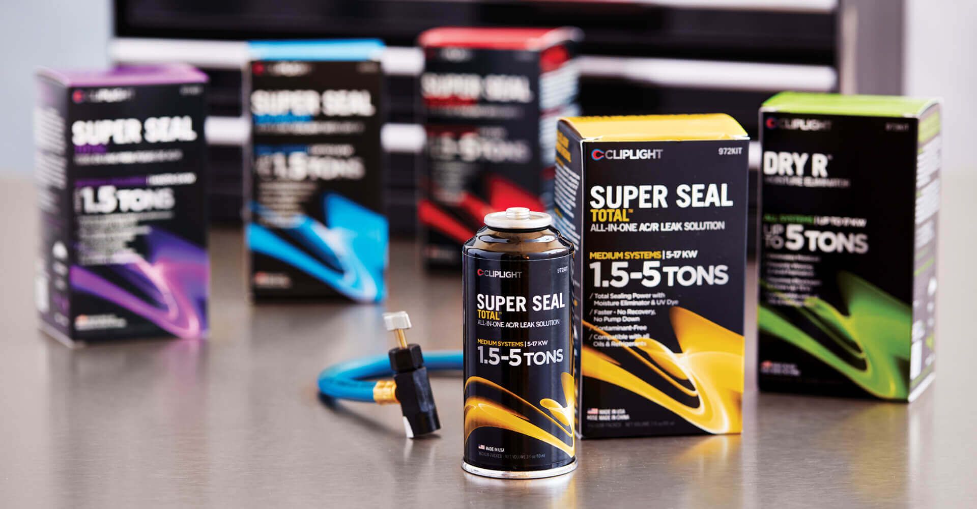
With a focus on appealing to the adult male demographic, the formerly white packaging has been overhauled with a matte black background to emit a hard, stylish edge. Vibrant colour swooshes, and clearly identifying system size for technicians both with the use of a large scale communication and with corresponding colour accent on top of the packaging achieve the visual clarity lacking in the previous format. A spot gloss varnish highlights the coloured swoosh. Emulating Cliplight’s advanced scientific and chemical processes, the packaging infuses performance-based messaging with suggestive, subtle iconography. The refreshed design delivers a strong family approach and achieves successful on-shelf brand blocking.
With the redesign, we successfully brought relevance back to the Cliplight brand by crafting an eye-catching extension of their superior products. Instilling design standards and bringing together their diverse portfolio. Our design has improved both the packaging’s function and style, finally bringing a premium presentation to a premium brand.


.cliplight.com
explore the website