Fresh Thinking
Freshwest Grill
A lot of restaurants are focussed on fresh these days, but Freshwest Grill? They put it right in their name.
Freshwest Grill wants to “bring the Southwest’s unique fusion of spices and flavours to Canada with an attention to quality and freshness that is unrivaled.” Their food is sourced locally where possible, and they are committed to being a leader in sustainable foodservice practices.
Freshwest has 6 locations in Toronto’s Financial District, appealing to office workers looking for something lighter and healthier than traditional food court fare. Freshwest specializes in burritos and salads, all prepared to order at their locations.
Project Type:
Related Projects:
A FRESH IDENTITY
We began working on the Freshwest logo. Their existing logo looked dated, and the oval carrier around it closed it in. The logo contained a lime icon that failed to add real value to the mark, and the words seemed to compete with each other for prominence. We replaced the mustard-coloured oval shape with a simple underline in the same colour, allowing the wordmark to reach higher and give the letterforms a leaner, taller look. We eliminated the lime altogether, and we re-introduced the word grill as a punctuation, thereby giving the word Freshwest top billing in the mark.
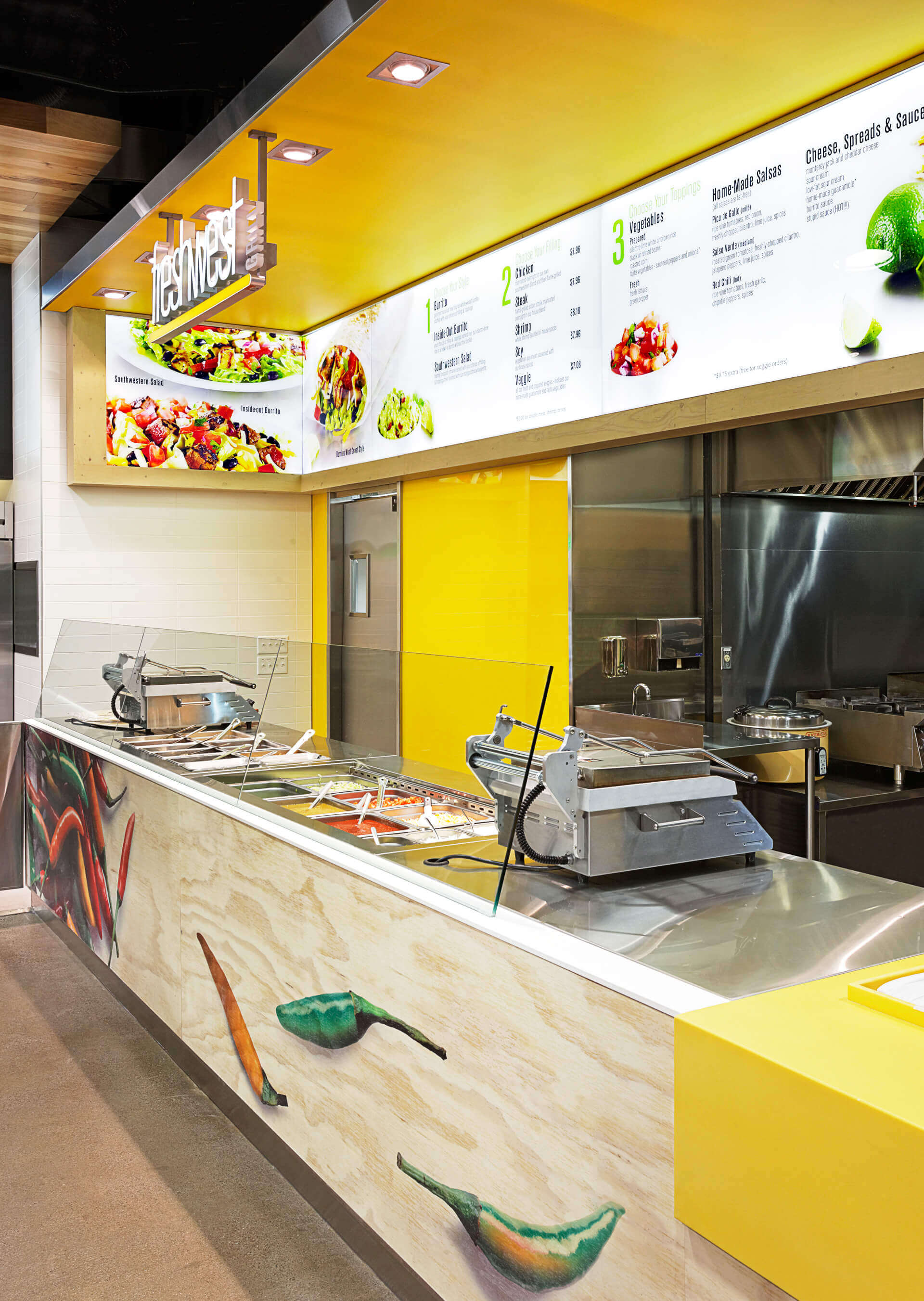
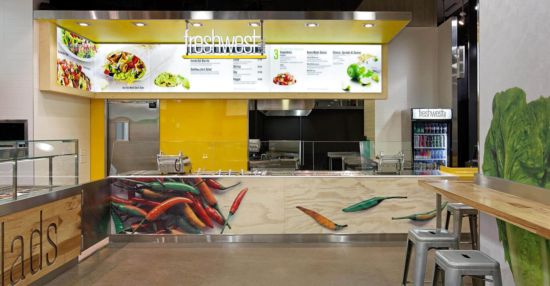
AMPED UP APPETITE APPEAL
We also reimagined the menu system, putting the food first and allowing for white space to help communicate the freshness of the food. Large format food photography creates appetite appeal while the numbering simplifies the order process.
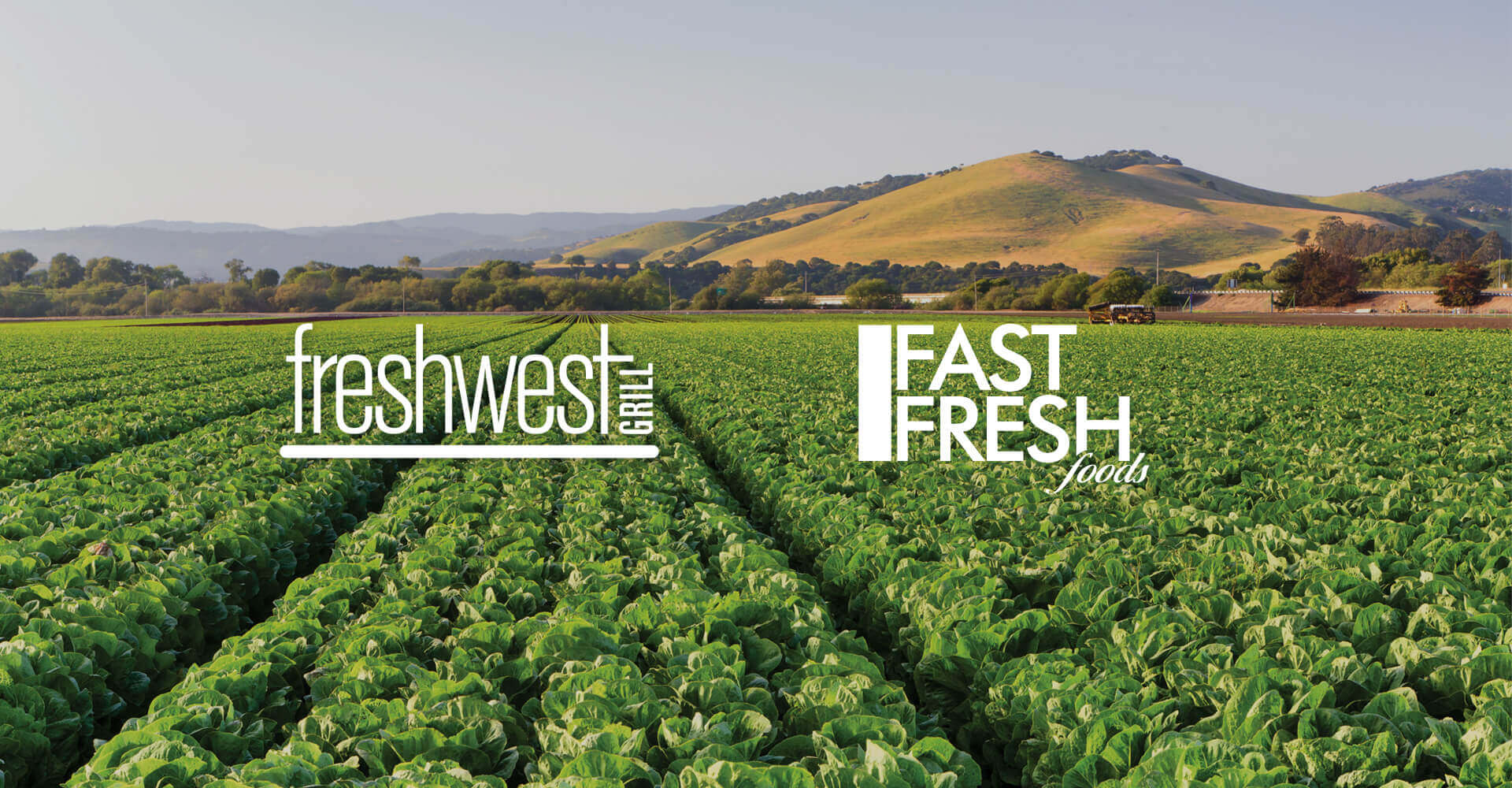
CO-BRANDING FRESHNESS
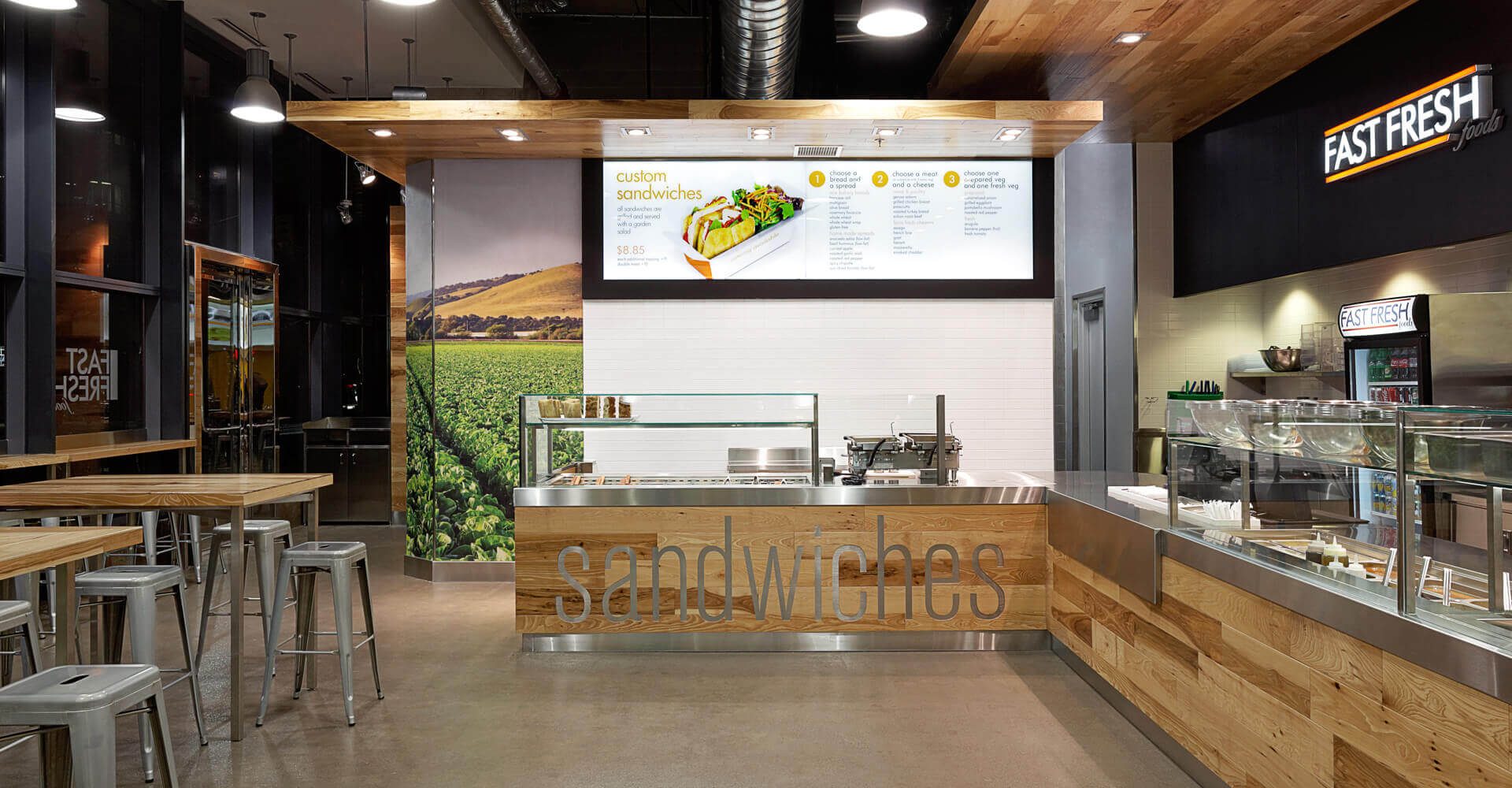
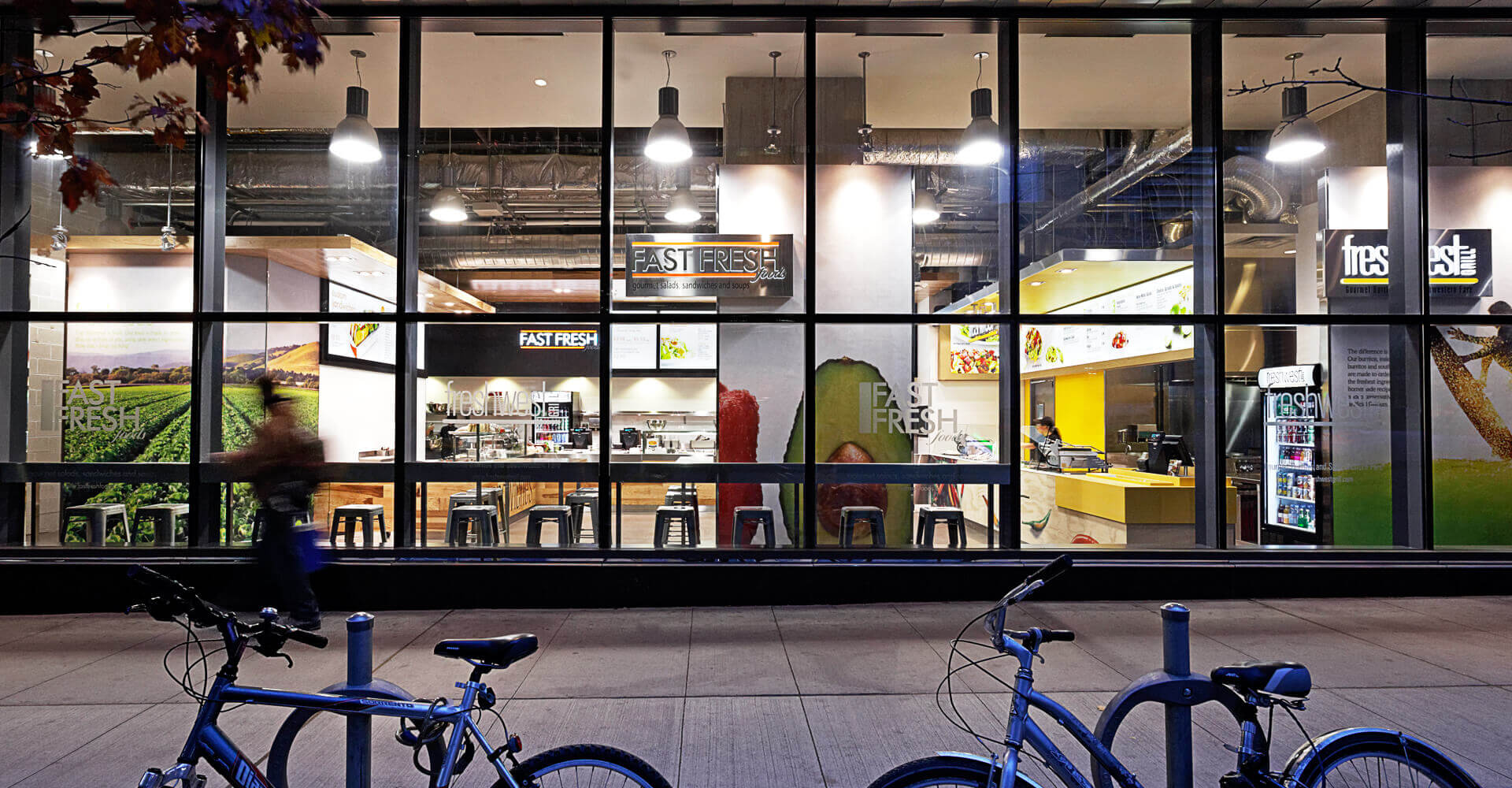
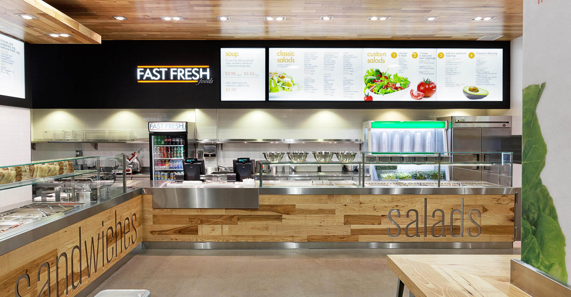
Finally, we were asked to redesign the restaurant interior of their new food counter concept. The space was a cobranded unit in the new Sick Kids Hospital building, which included both Freshwest Grill and Fast Fresh Foods – the two brands had to coexist and work together in the space, but it was important to communicate their distinctly different food offerings. It would be the first time these two brands would occupy the same space. Where Freshwest sells burritos and salads, Fast Fresh Foods sells soups, sandwiches, and salads. Out front, the brands are distinctly different, but in the back of house they would be sharing one space.
The retail location itself has a unique frontage, as it is at grade level at one corner, but below grade at the other. The large glass window frontage covers two sides, and gives passersby a clear look into the concept, and affords opportunities to communicate the brand position from both inside and out.
The two brands successfully coexist in the space, and give customers a wider range of menu choices than a standalone store could, and articulating the differences visually between the brands allowed them to retain their independence in an otherwise harmonious space.
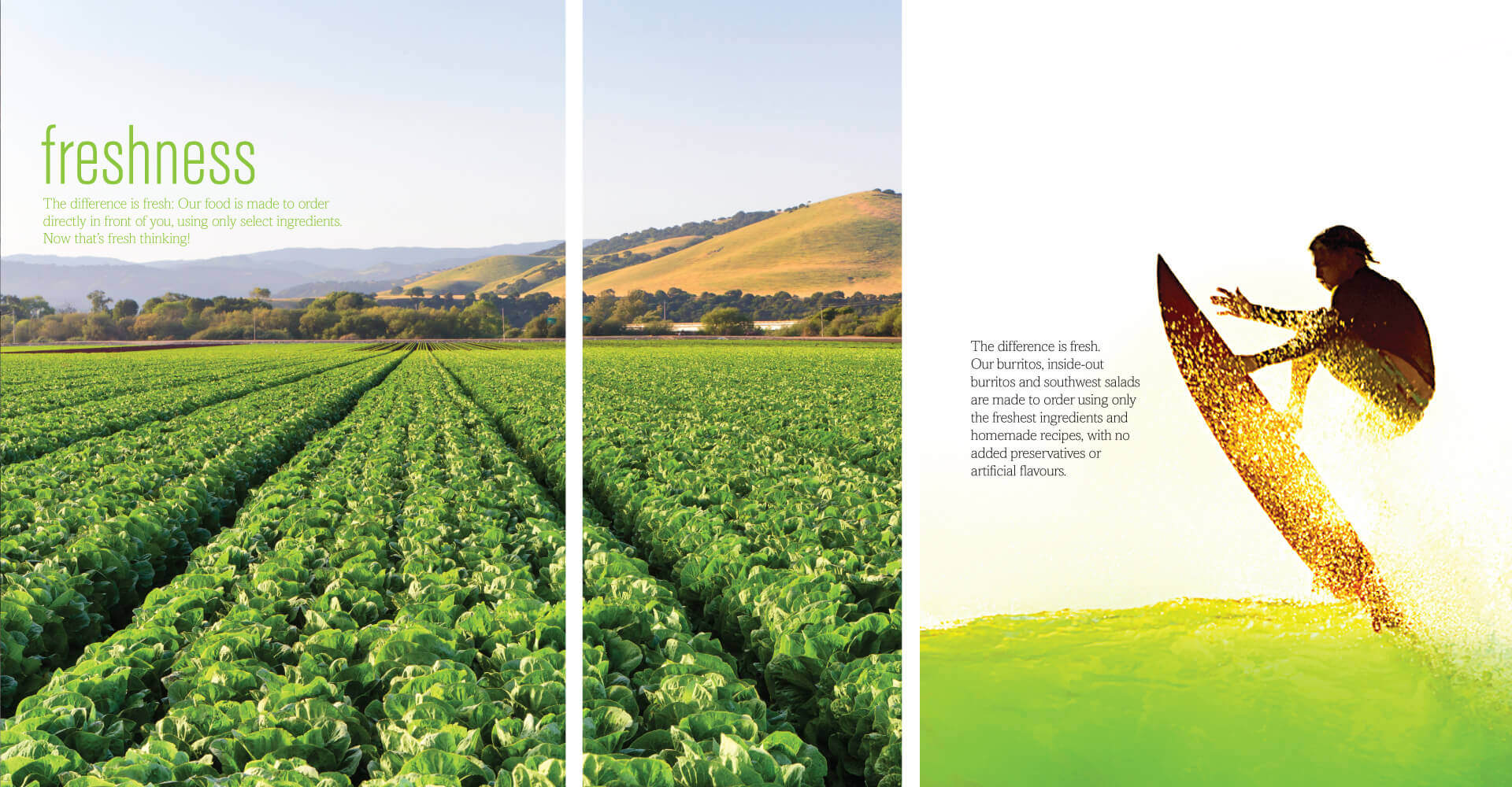
FEELING FIELD FRESH
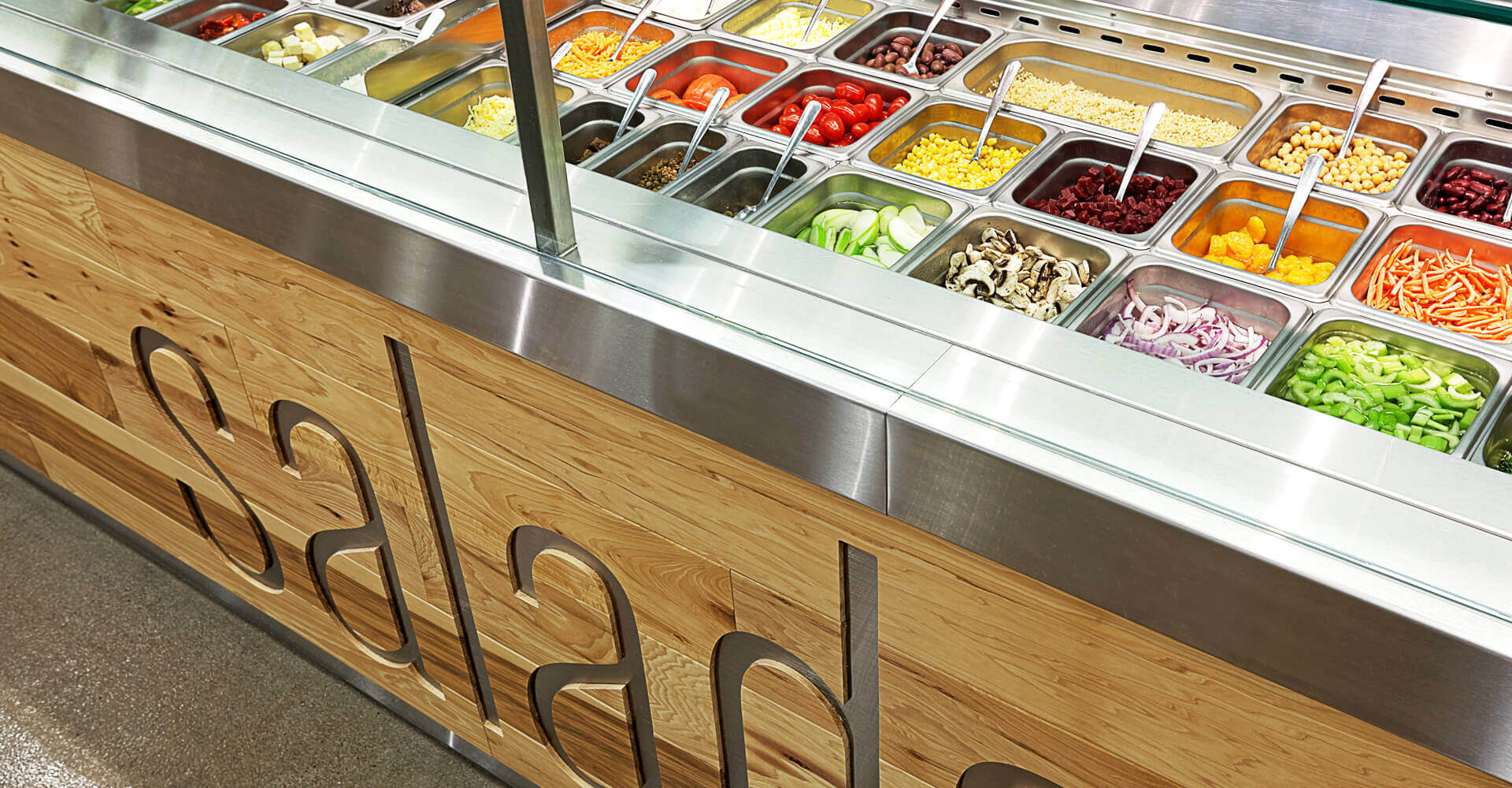
Oversized shots of farmers fields and vegetables communicate the fresh positioning, while lifestyle graphics of surfers lend Southwestern authenticity, edge, and health cues. Stainless steel is the material of choice in both brands, but they are differentiated by varying wood finishes (flooring planks vs. plywood on the counter facings), and opposing black and yellow colours.
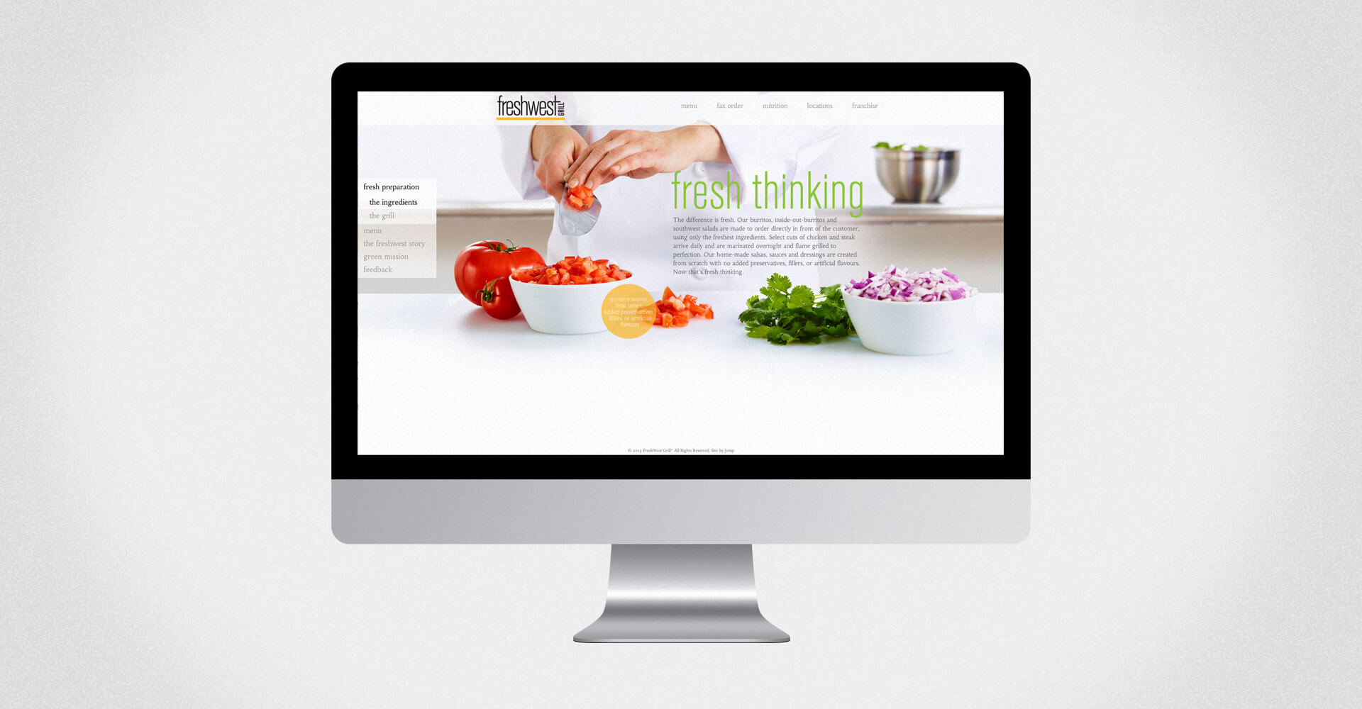
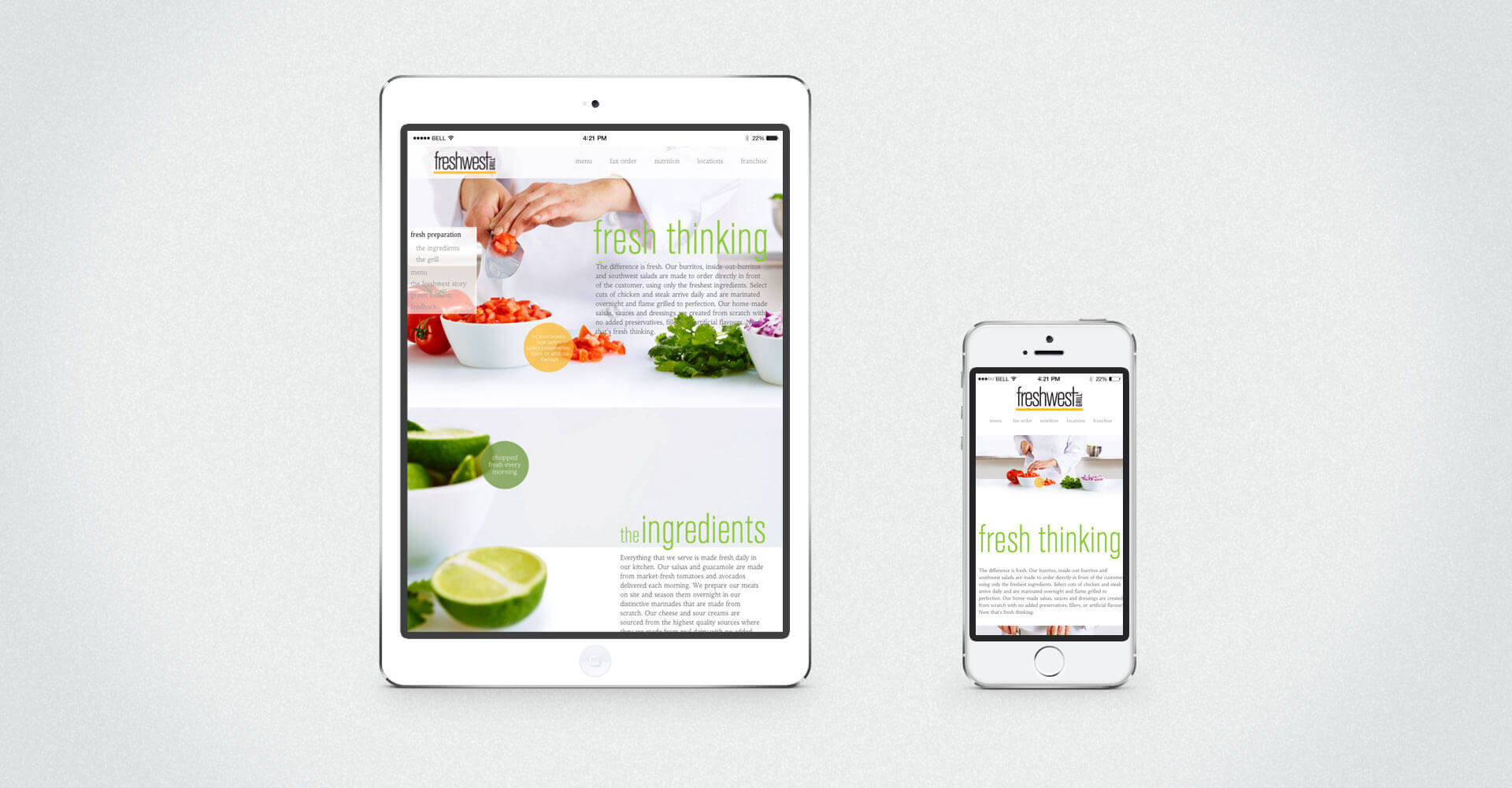
FRESH ONLINE
On the Freshwest website, food photography once again dominates the landscape where the bright colours of the ingredients contrast with the stark whites to bring the freshness to the fore. Sophisticated and subtle animations add character, and the content reinforces the brand position. The nutrition calculator allows guests to customize their meal to give them specific information on their order, helping them to manage everything from vitamin intake to calorie counts. The site was designed an developed to be responsive for mobile devices and tablets.