An aerial view of a large wave in the ocean.

Slide Title

Slide description
Button

Slide Title

Slide description
Button

Slide Title

Slide description
Button

urban street style

Canadian Tire engaged Jump to rebrand a line of clothing that they were introducing into Sportchek, one of their retail subsidiaries. The brand is geared towards boys and girls between the ages of 8-14 and is intended to have a stylish edge that reflects onto the clothing. After analyzing the competitive set for this age category, it was clear that the brands that projected a ‘urban street’ style to them really resonated with the target audience and were more popular. We knew that kids of this demographic never want to associate themselves with brands that are too young or juvenile and so we aimed to design the brand with slightly older appeal.

Identity, Packaging

A black and white logo for gravity on a white background
An aerial view of a large wave in the ocean.

Slide Title

Slide description
Button

Slide Title

Slide description
Button

Slide Title

Slide description
Button

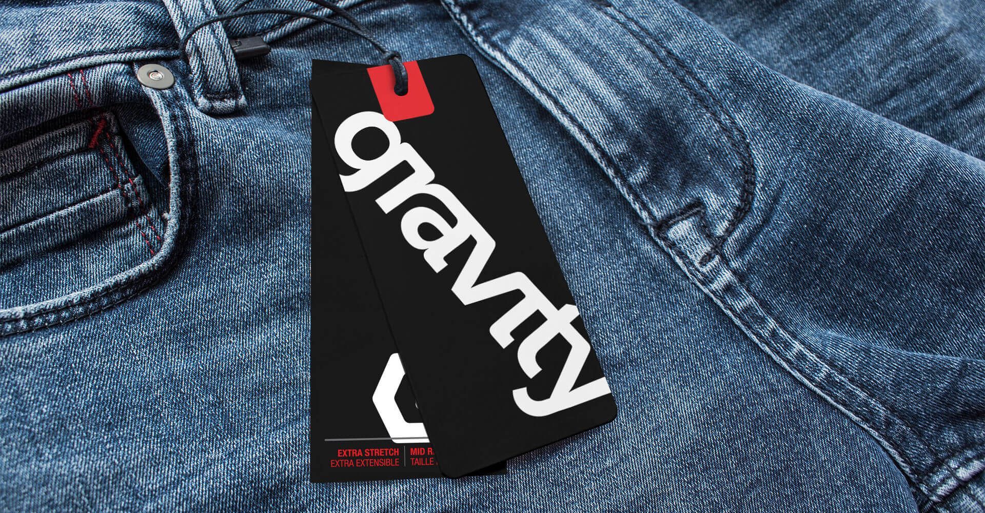
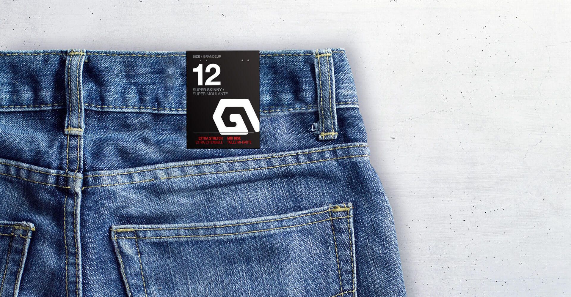
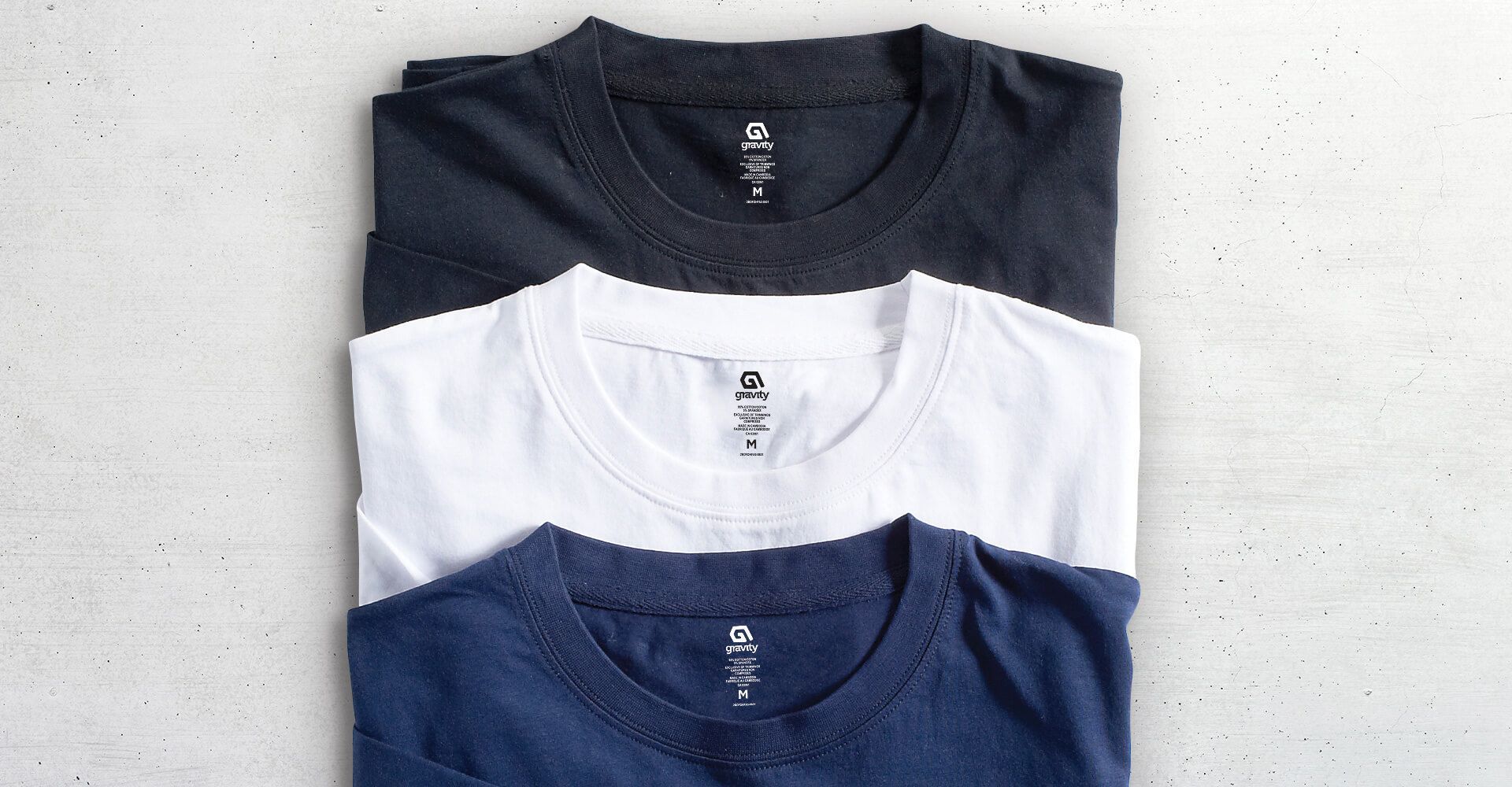
The result was a brand identity that features a customized wordmark with a unique simplicity where the letters of the name ‘gravity’ are all linked. In addition, a stylized ‘G’ icon was established to deepen the brand and work as an element that could be applied to clothing tags and debossed onto zippers. The red and black colour palette was selected to have the broadest appeal knowing that boys will not associate with any brands that feel remotely feminine, and that girls are much more accepting of masculine colours. Overall, the brand projects the cool character of a ‘surf’ brand with mainstream unisex appeal.

A pair of jeans with a tag that says gravity on it
A pair of blue jeans with a tag on the back pocket.
Three t-shirts are stacked on top of each other on a table.

if you like those, you might like...