the burger. the grill. the legend.
Since 1959, Harvey’s has brought a differentiated burger experience to Canadians across the country. Focused on customization and classic Canadiana, Harvey’s newest brand iteration is both legacy throwback and contemporary flash forward for the iconic Canadian brand.
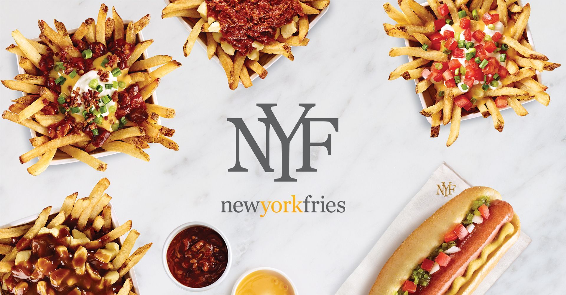
Identity, Packaging, Restaurant Packaging, Restaurant
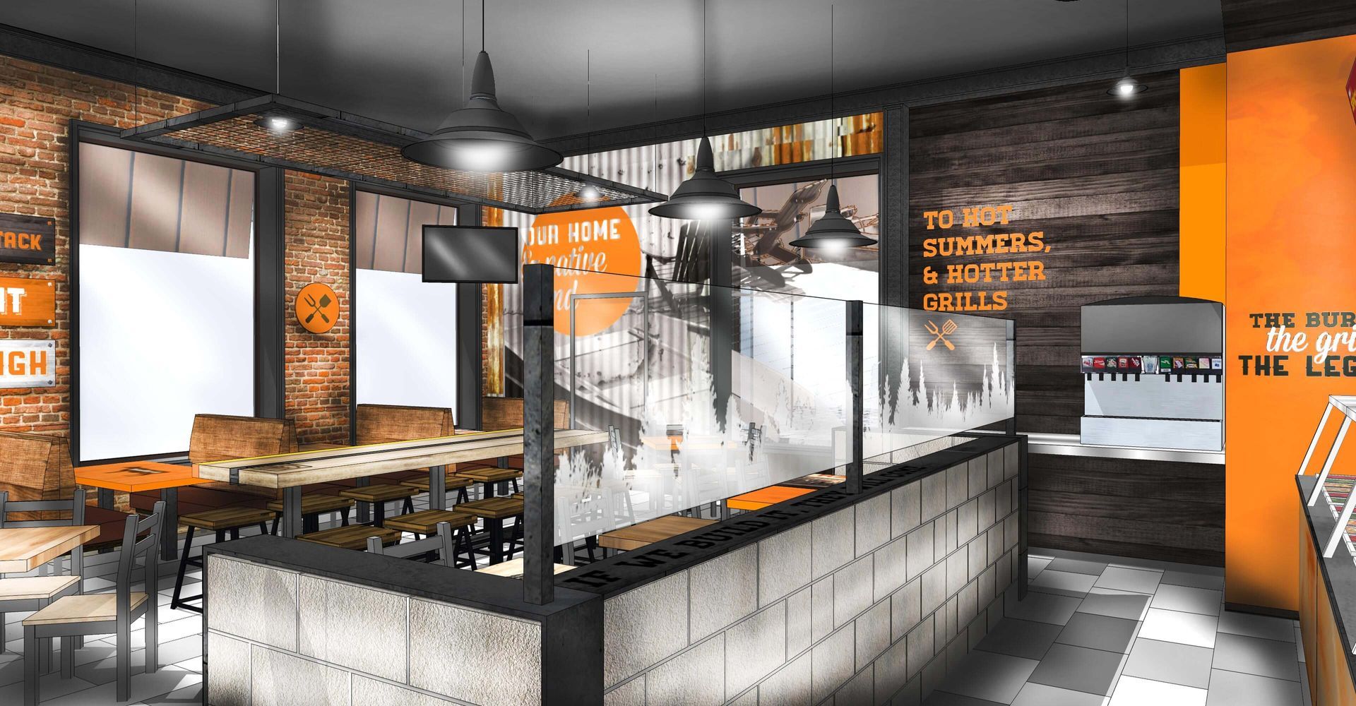
With an ask to rethink the restaurant design package, we embraced the task and owned the positioning of this bold and beloved brand. Understanding that Harvey’s is a value brand in a highly competitive QSR space, ensuring a cost-effective execution of the many new sign elements not traditionally used in construction was key to the project.
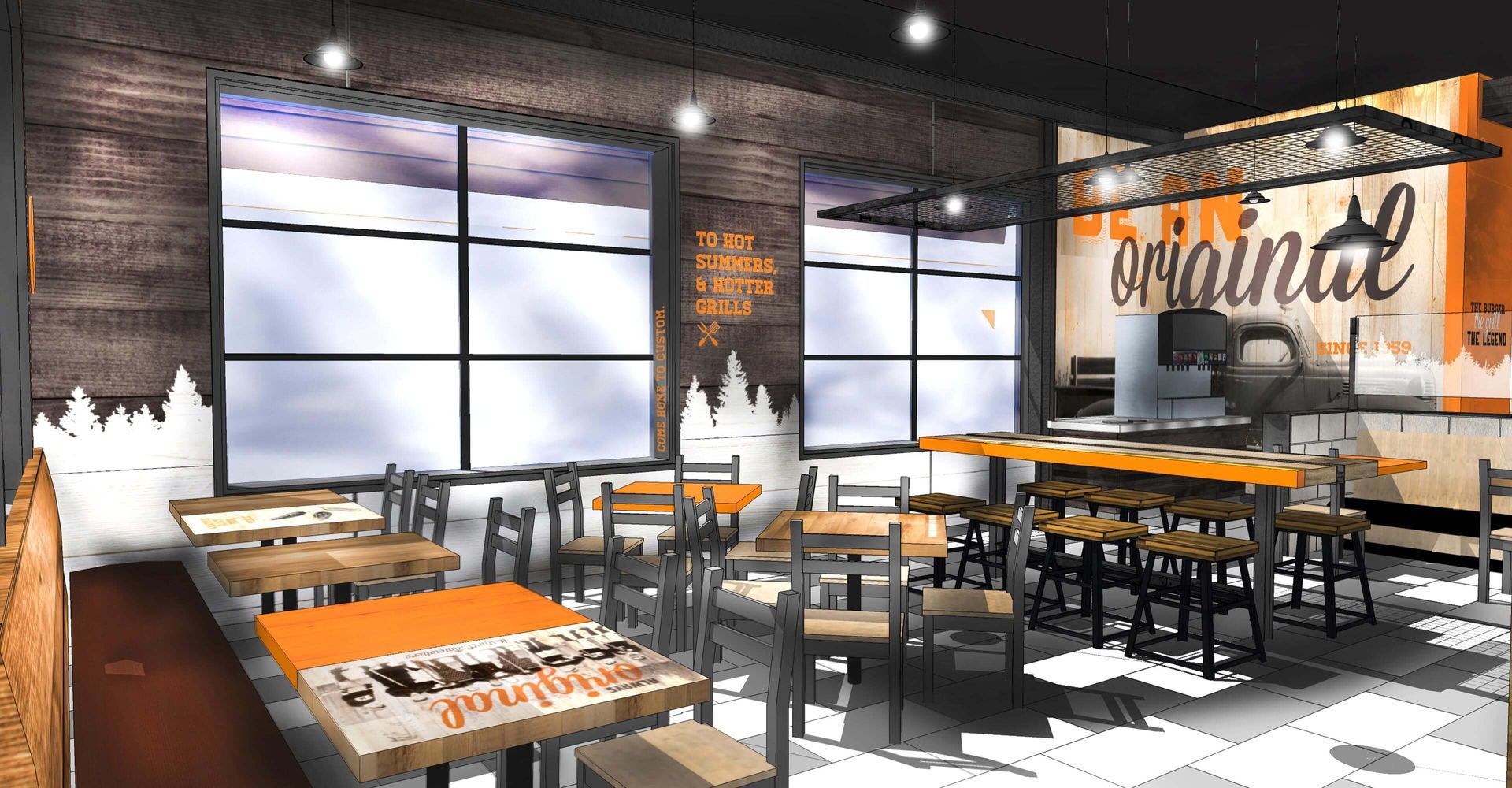
To celebrate Canadiana, we developed the “home and native land” signage series that takes cues from our national anthem applied over localized images that are a familiar source of pride. This nationalistic messaging combined with regional executions are a way for the brand to show appreciation for the local communities that define our national identity

We created the tree line graphic to use as a waterline and/or wainscot around the space, and table artwork has an eclectic mix of branded and unbranded tabletops that show original Harvey’s stores, funny sayings, or images like a vintage hockey team, all in a nod to the Canadian roots of the brand. Finally, we developed a new menu board that made use of their existing food photography but on a rustic, light wood background, with fonts that reflect the spirit of Canadiana.

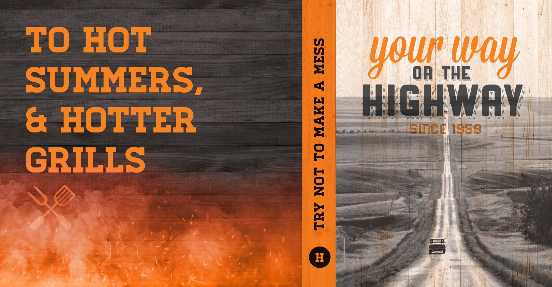
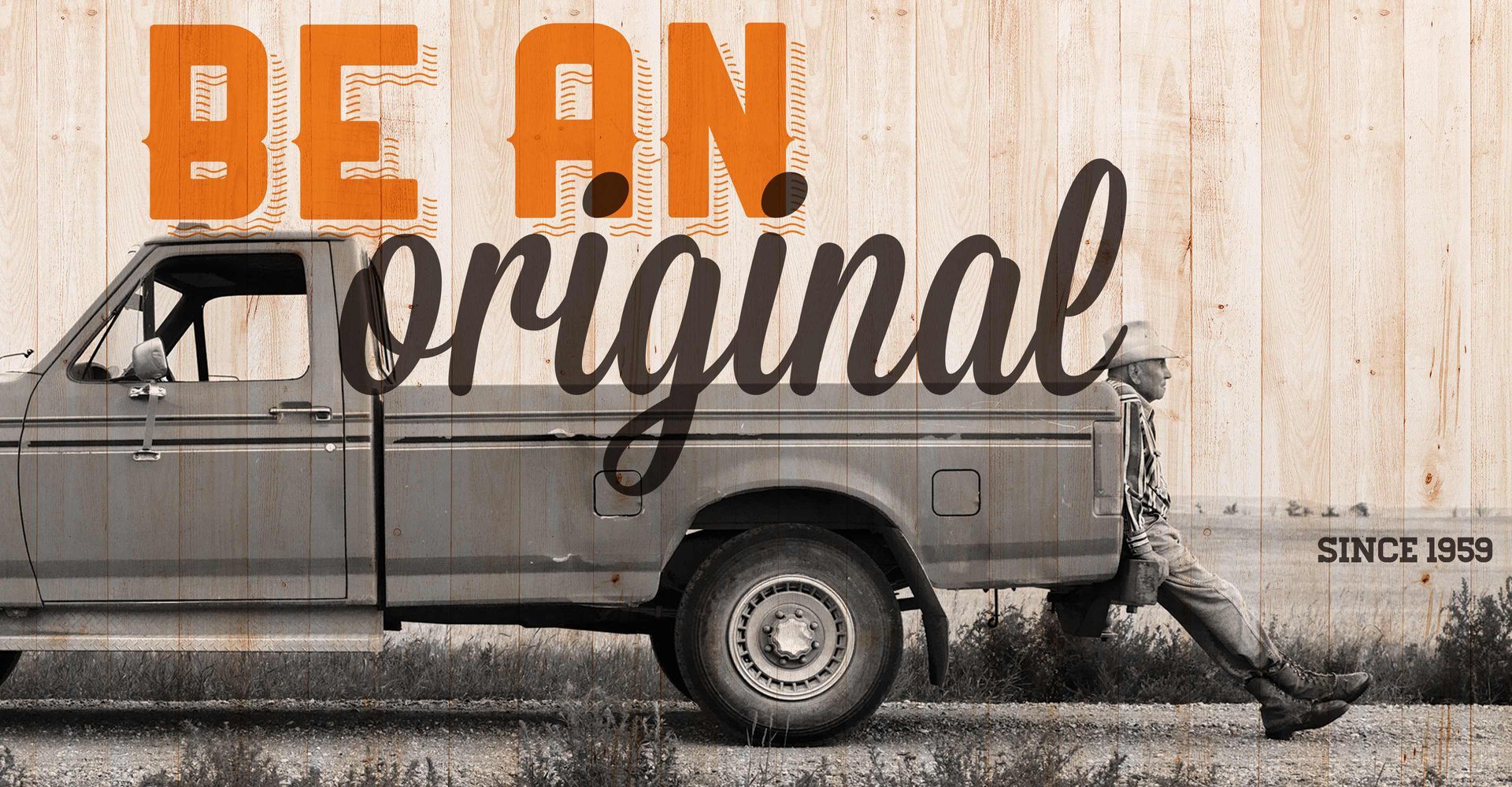
The original home of burger customization, terms like ‘Be an Original’ and ‘Come home to custom’ are powerful messages that are featured along with icons of originality like a 1959 pick-up truck with a hard-working old cowboy resting on the back bumper. In the drive-thru, the ‘Your way or the highway’ brand messaging explains Harvey’s’ no-nonsense, anti-gourmet, get-it-your-way approach, and reinforces their position in the market.
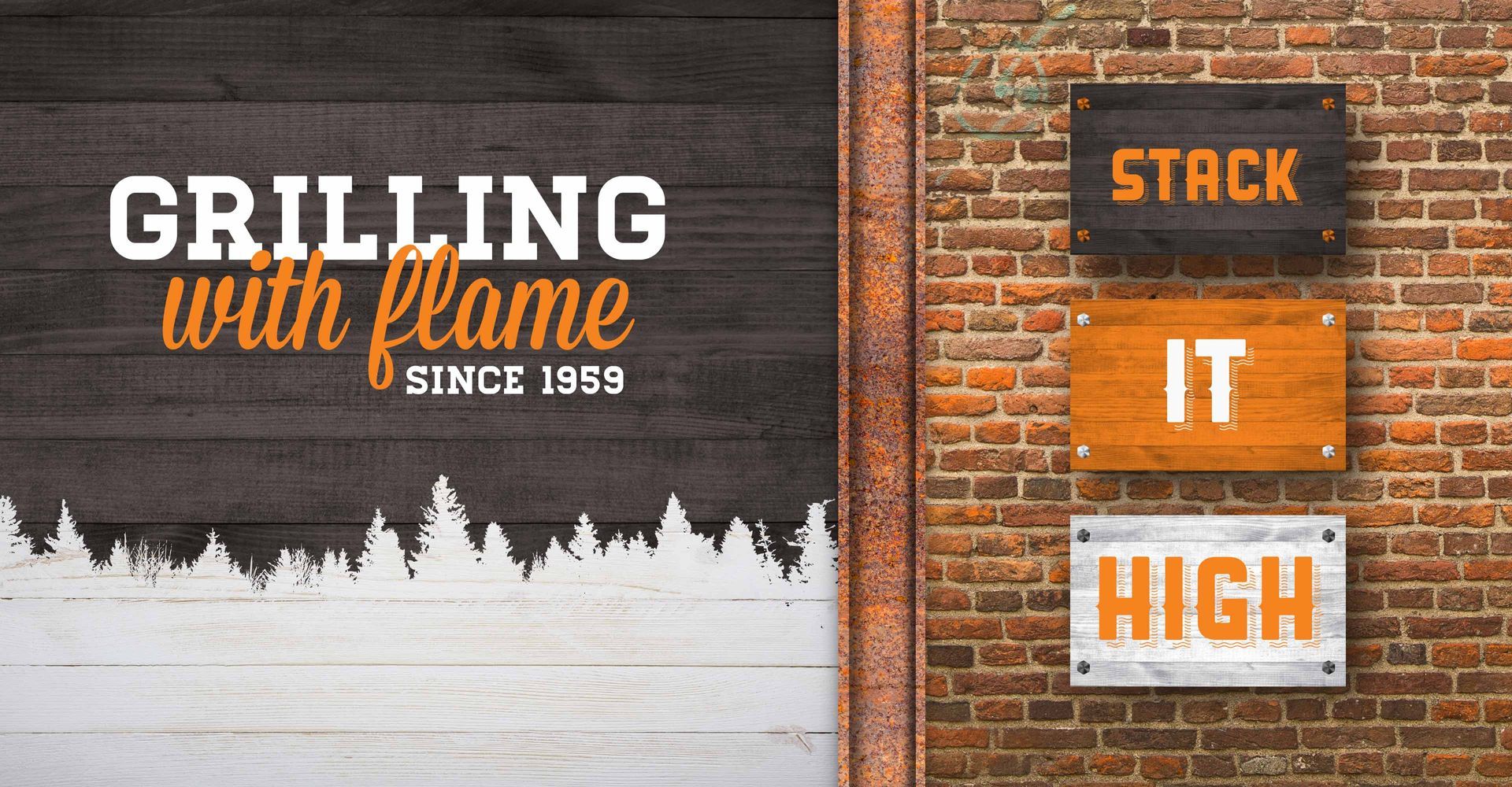
Harvey’s has long positioned their offering as a true, flame-grilled backyard burger.
In order to shore up that sentiment we developed the new ‘to hot summers and hotter grills’ wall artwork, and created ‘the burger, the grill, the legend’ signage in the entry to heighten the customer’s sense of arrival and their anticipation of a great burger.
Throughout the environment we used cinderblocks, hot rolled steel, distressed wood textures, and traditional Harvey’s black and orange colours to create an authentic embodiment of the brand.
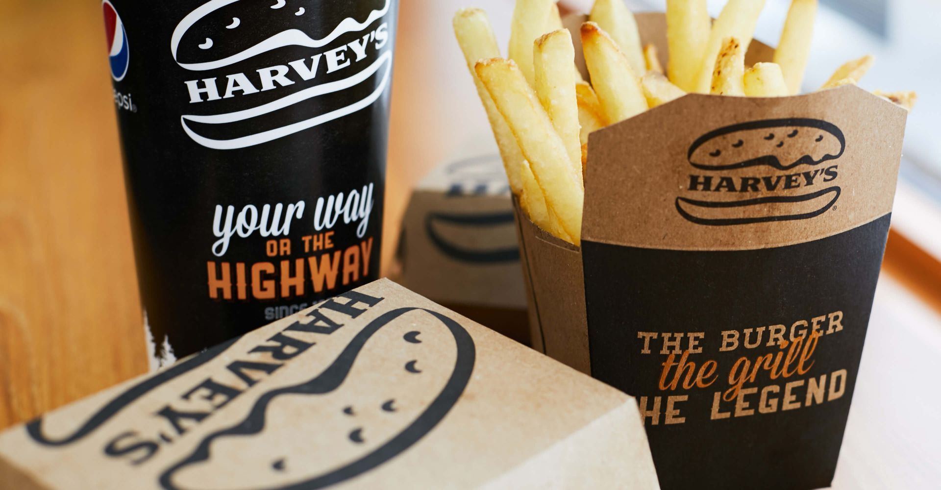
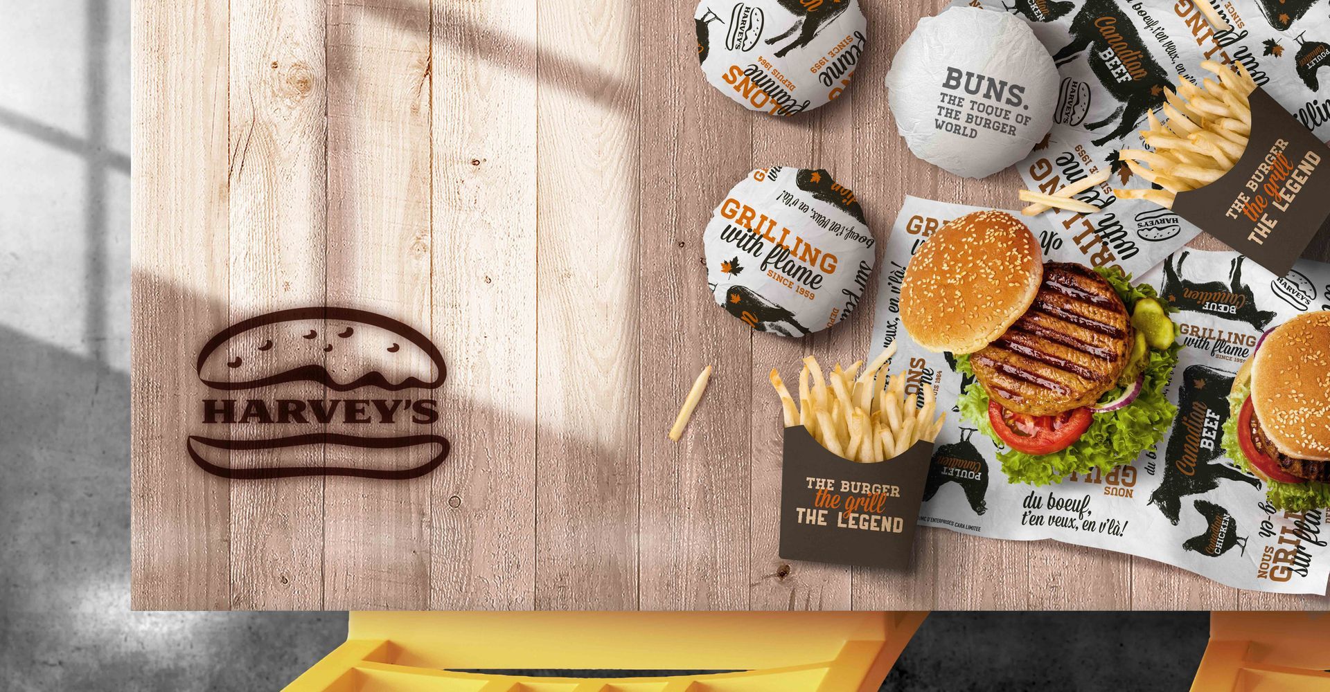
Much of the brand messaging has made its way to the new Harvey’s packaging as well. With messages centred around Canadiana, backyard grilling, and originality, in both English and French, the new Harvey’s packaging extends the life of this beloved brand beyond the physical space.