taste paradise
When we first met Chef Raquel Fox, the founder of Island Gurl, her passion for Caribbean food was immediately contagious.
She wasn’t just selling sauces and seasonings; she was bottling history, love, and flavour.
Identity, Packaging, Photography

Our goal as designers was to capture all of that in a visual experience that felt just as alive as her cooking. We started with the logo—something hand-crafted and full of character. It had to feel approachable and confident, with a bit of that home-cooked charm. From there, we dove into the packaging.

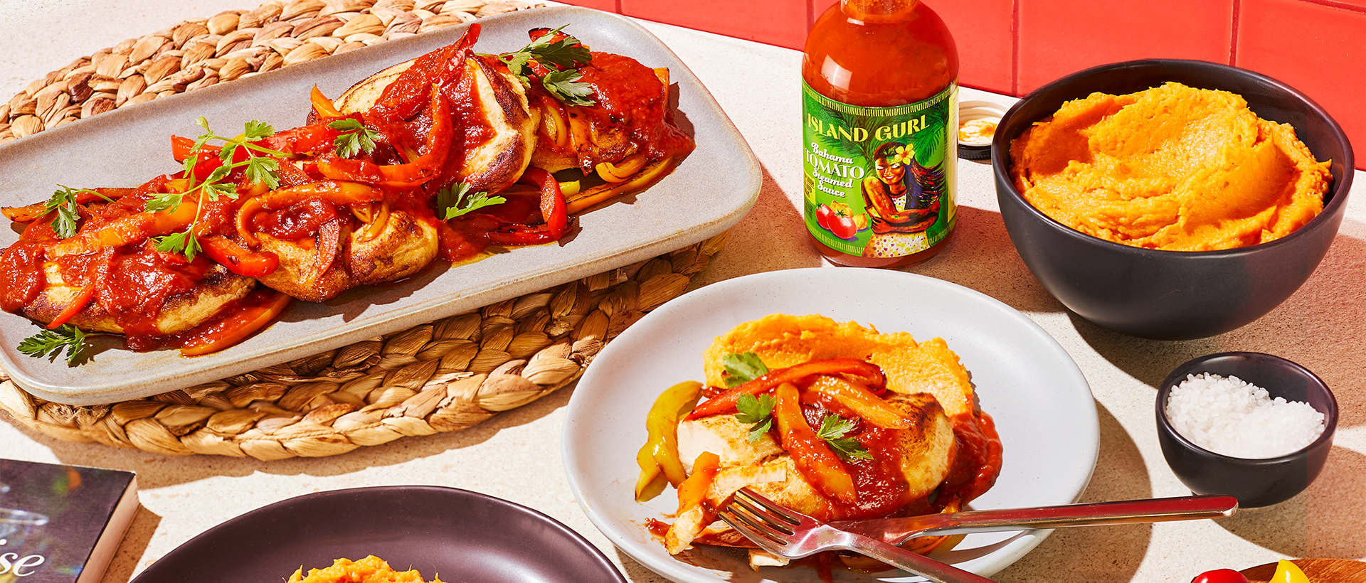
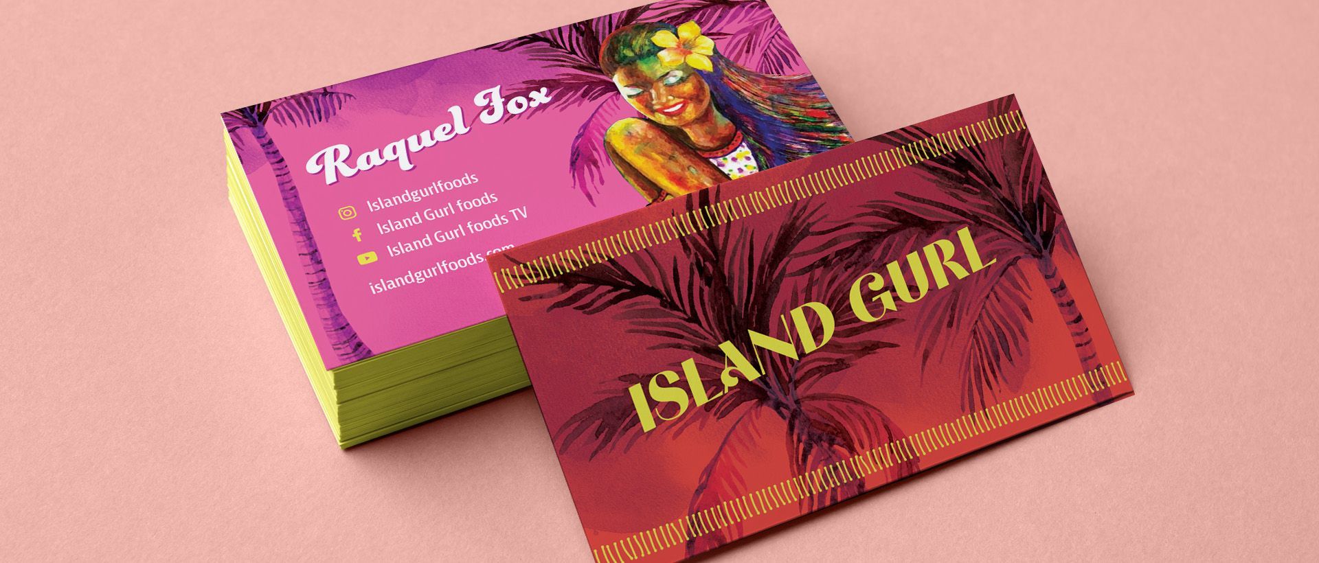
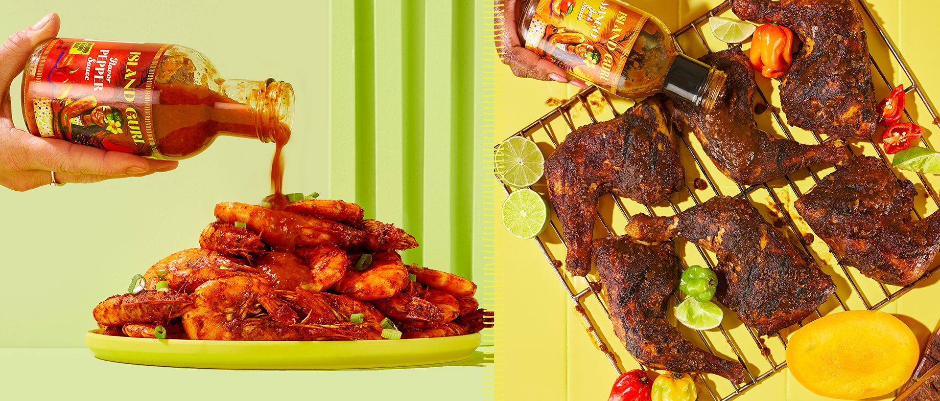
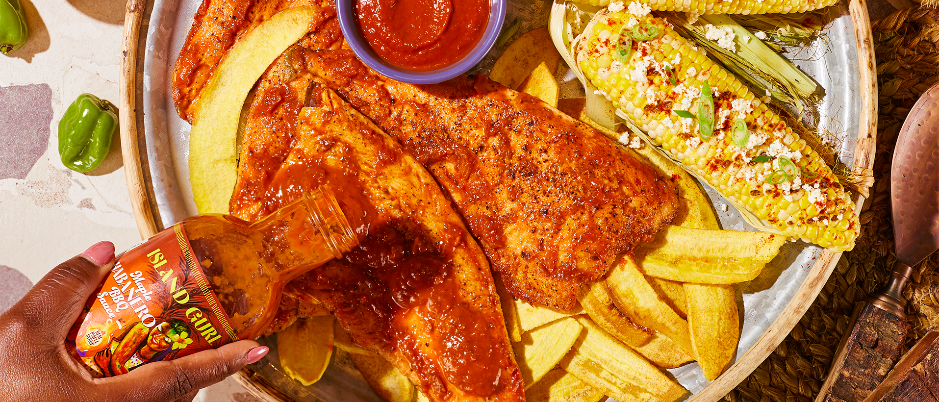
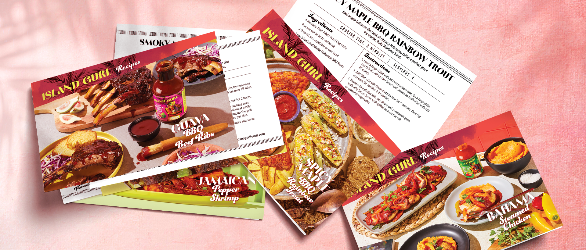
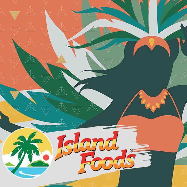
Everything needed to feel tropical, sun-soaked, and rich with texture. We used bold, bright colours—think the kind of palette you’d see walking through a Caribbean market at golden hour. Sunset oranges, ocean blues, lush greens, and vibrant pinks became the foundation. We layered in watercolour textures and soft brush illustrations to give it that imperfect, hand-done authenticity. Nothing too polished—because real island cooking isn’t about perfection; it’s about soul.


Each label—whether it was on a sauce bottle, a tub, a jam, a shaker or a spice pouch—was treated like a mini canvas.
We wanted every product to pop off the shelf and invite you in with its energy. And to complete the experience, we created a set of recipe cards featuring beautifully styled food photography. These cards not only give customers a taste of what they can cook up, but they also serve as an extension of the brand—bright, colourful, and full of flavour.


Working on Island Gurl felt less like designing a product line and more like helping someone tell their story. Chef Raquel’s recipes are rooted in tradition and bold with flavour. Our job was simply to match that, visually. The result is a brand that feels alive—like it could dance and definitely cook up something delicious.

