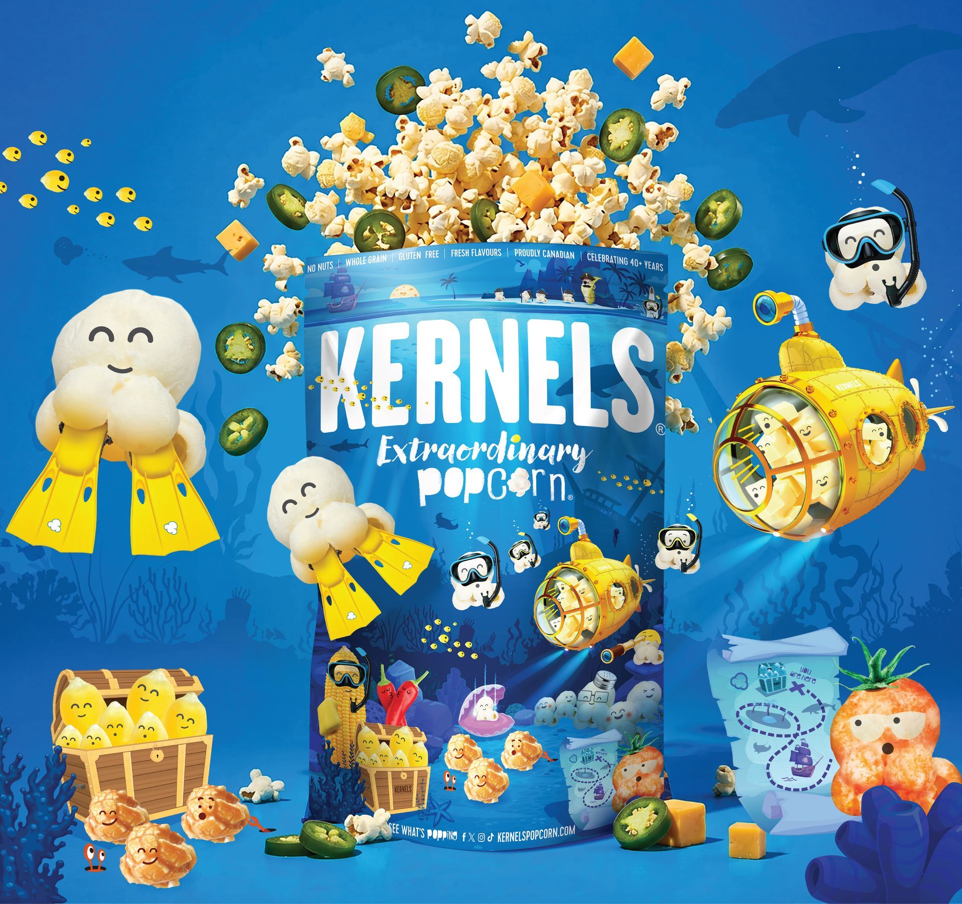
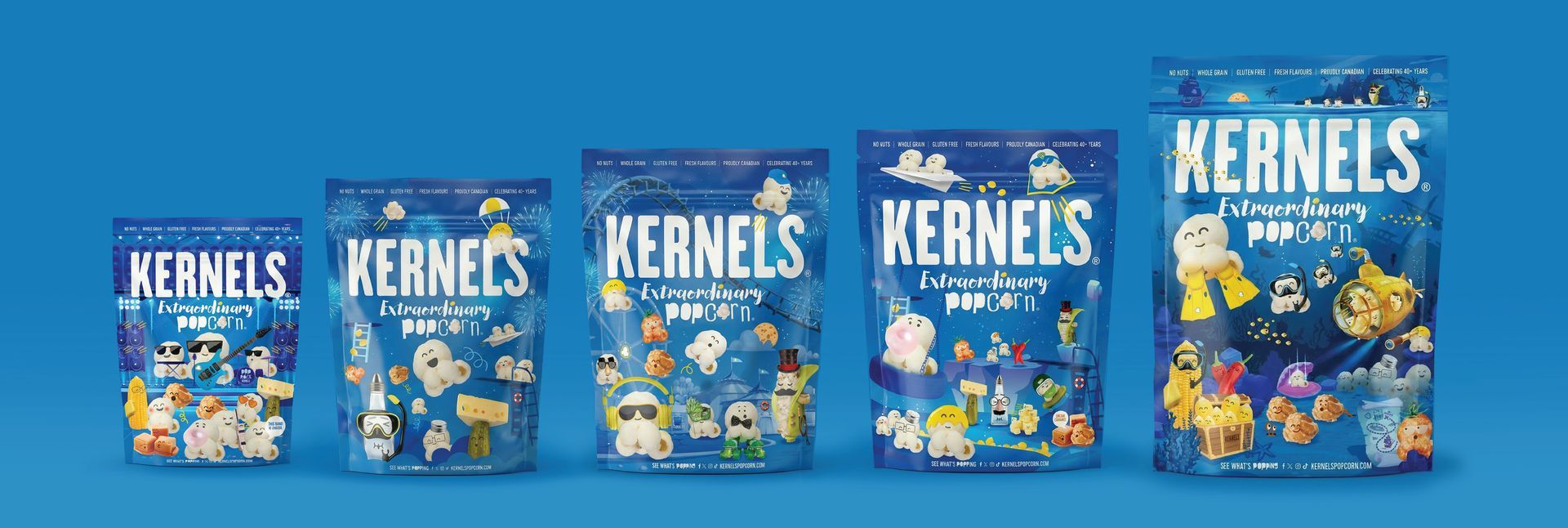
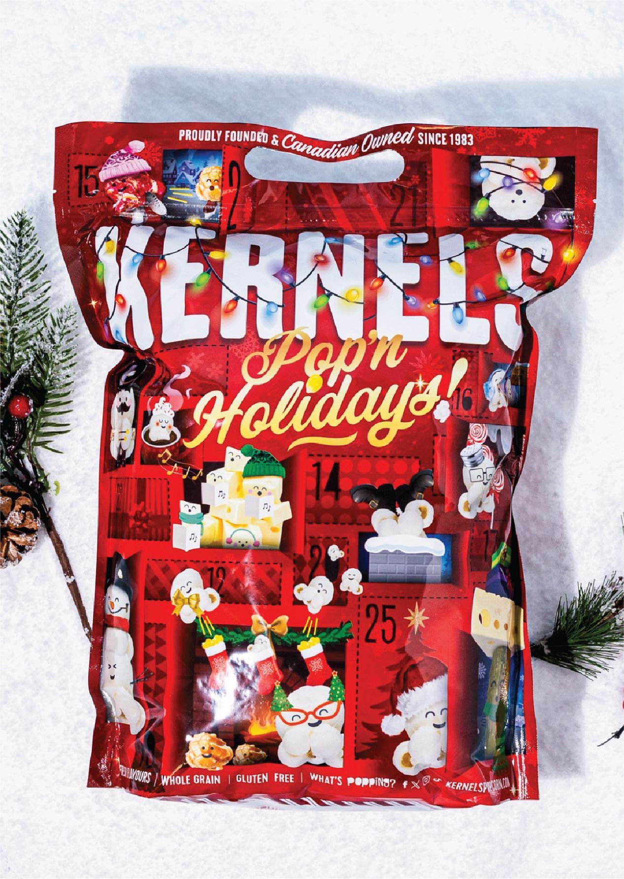
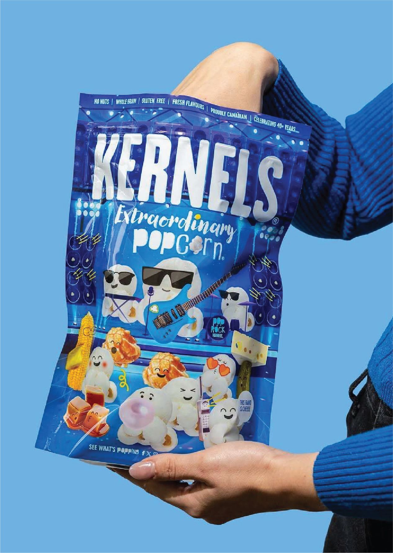
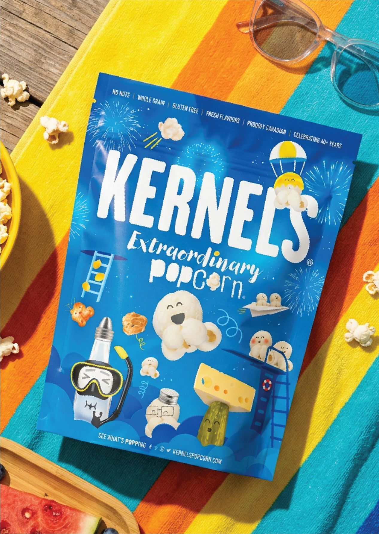
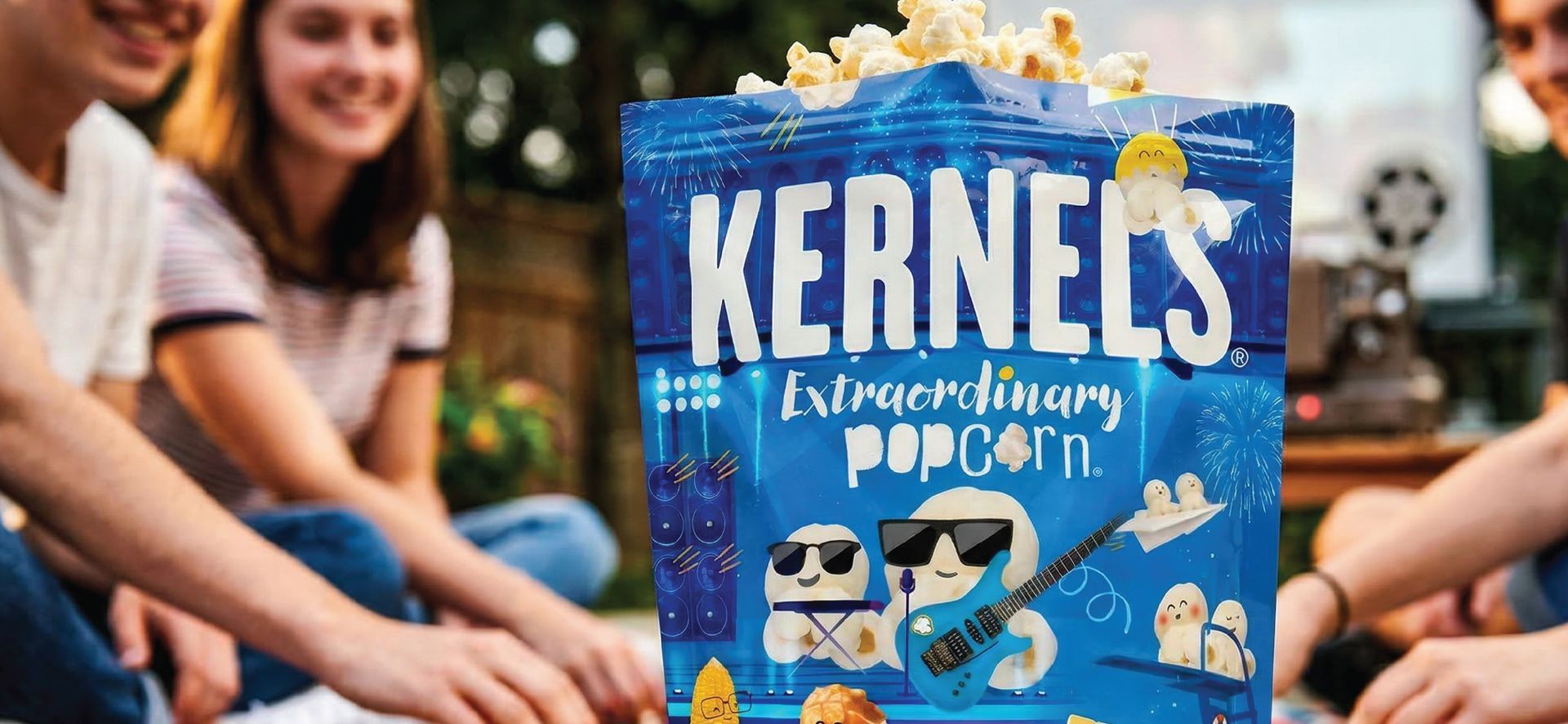
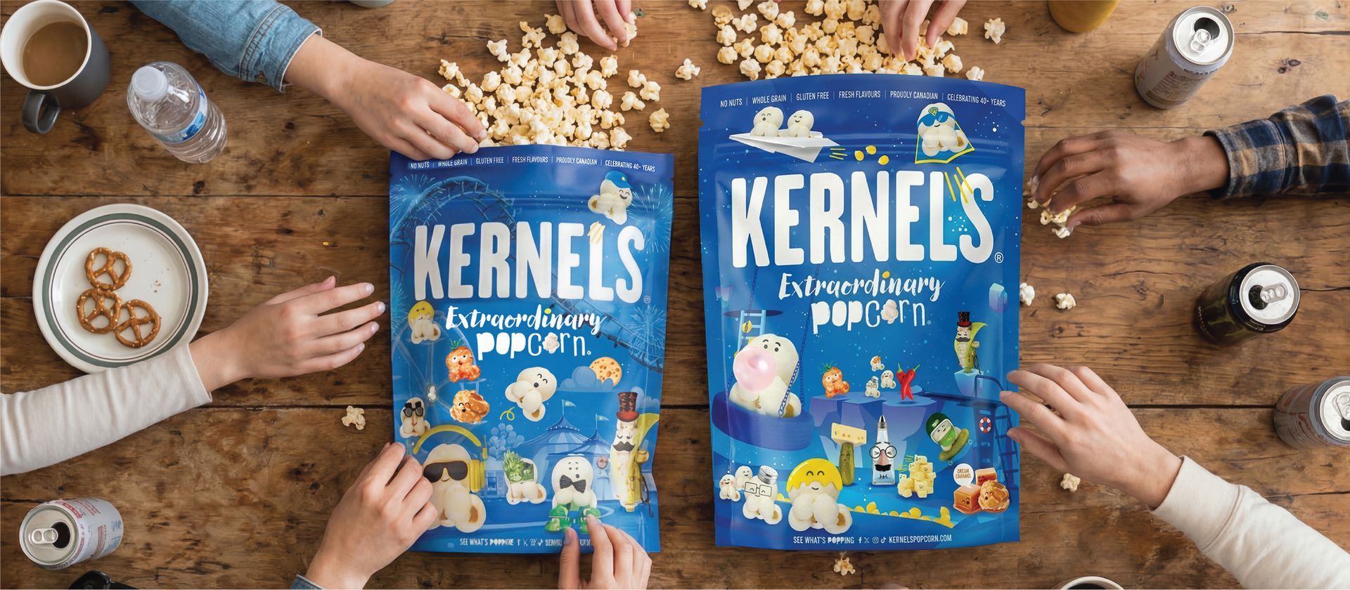
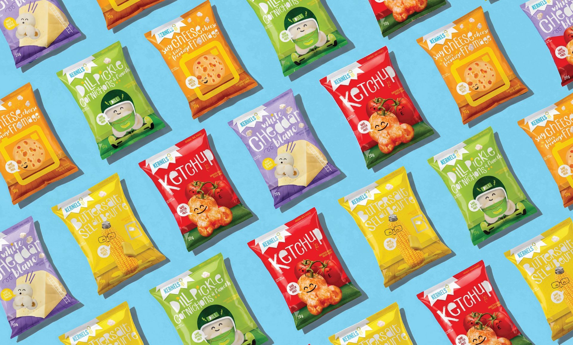
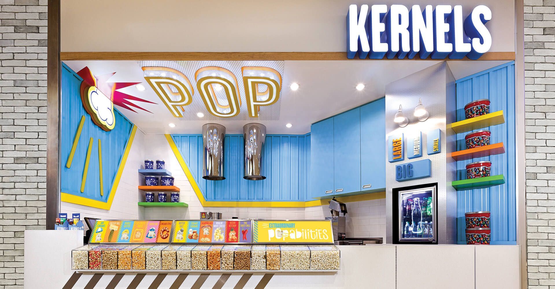
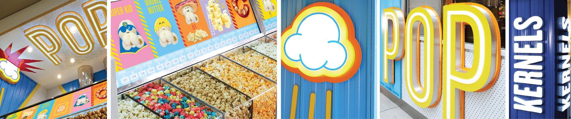
Kernels has been bringing bold flavour and snack time joy to Canadians for decades. But as the retail landscape evolved, the brand needed to feel more modern, energetic, and emotionally connected to today’s shopper. The opportunity was to reintroduce Kernels as more than popcorn and live up to the tagline ‘Extraordinary Popcorn’.
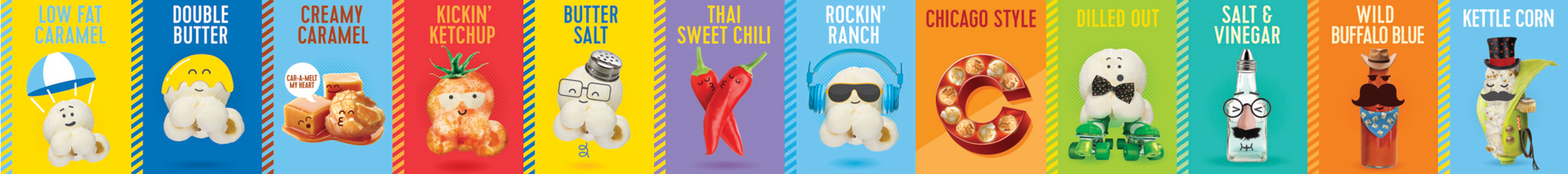
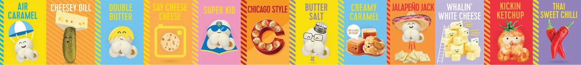
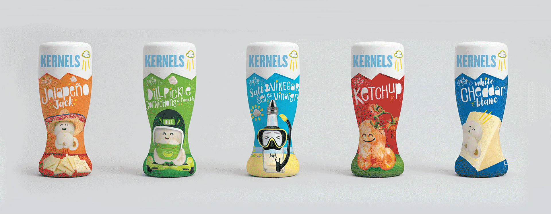
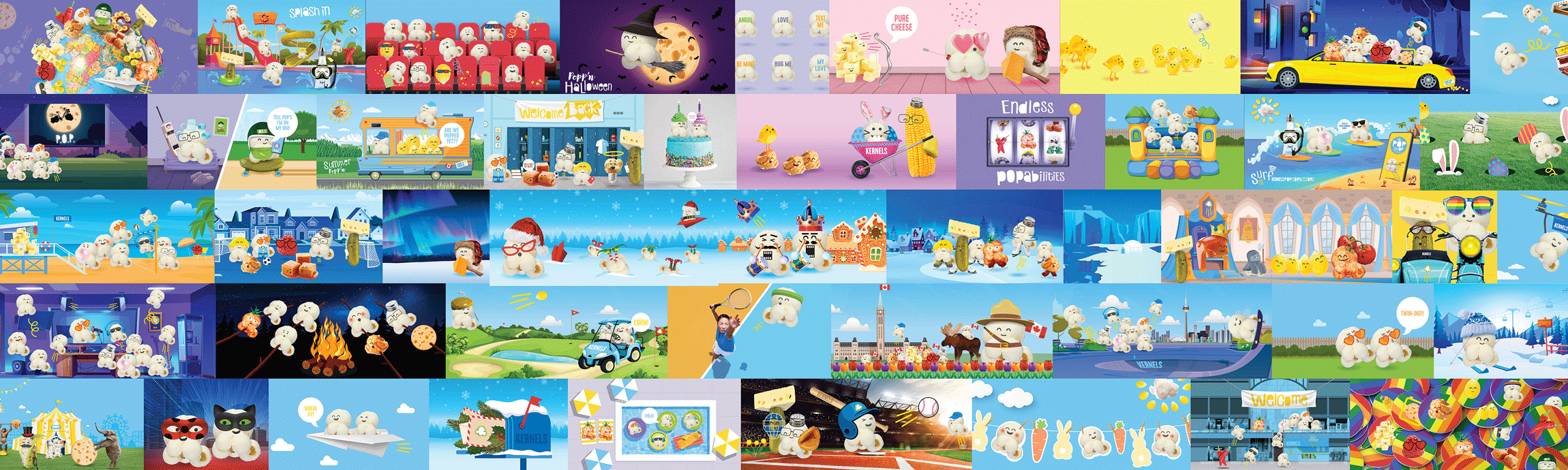
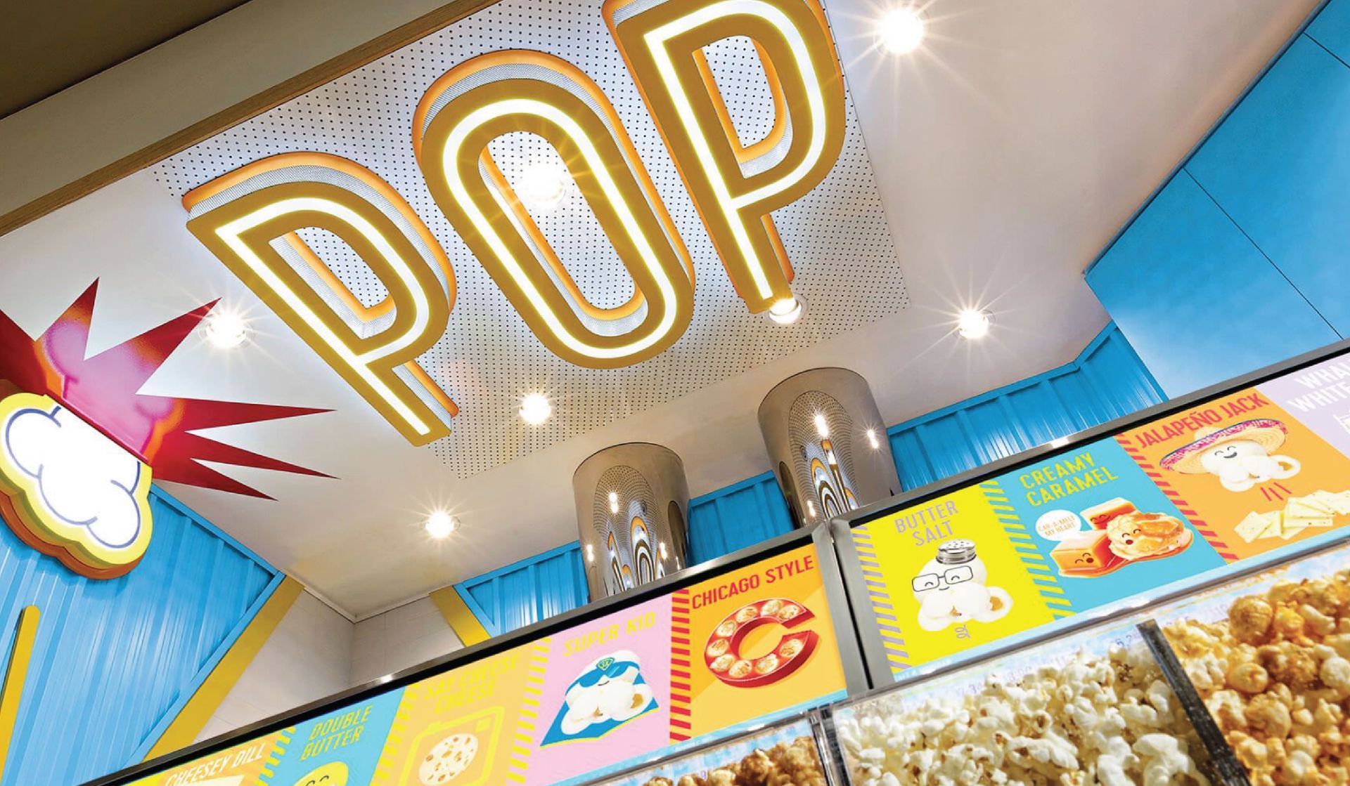
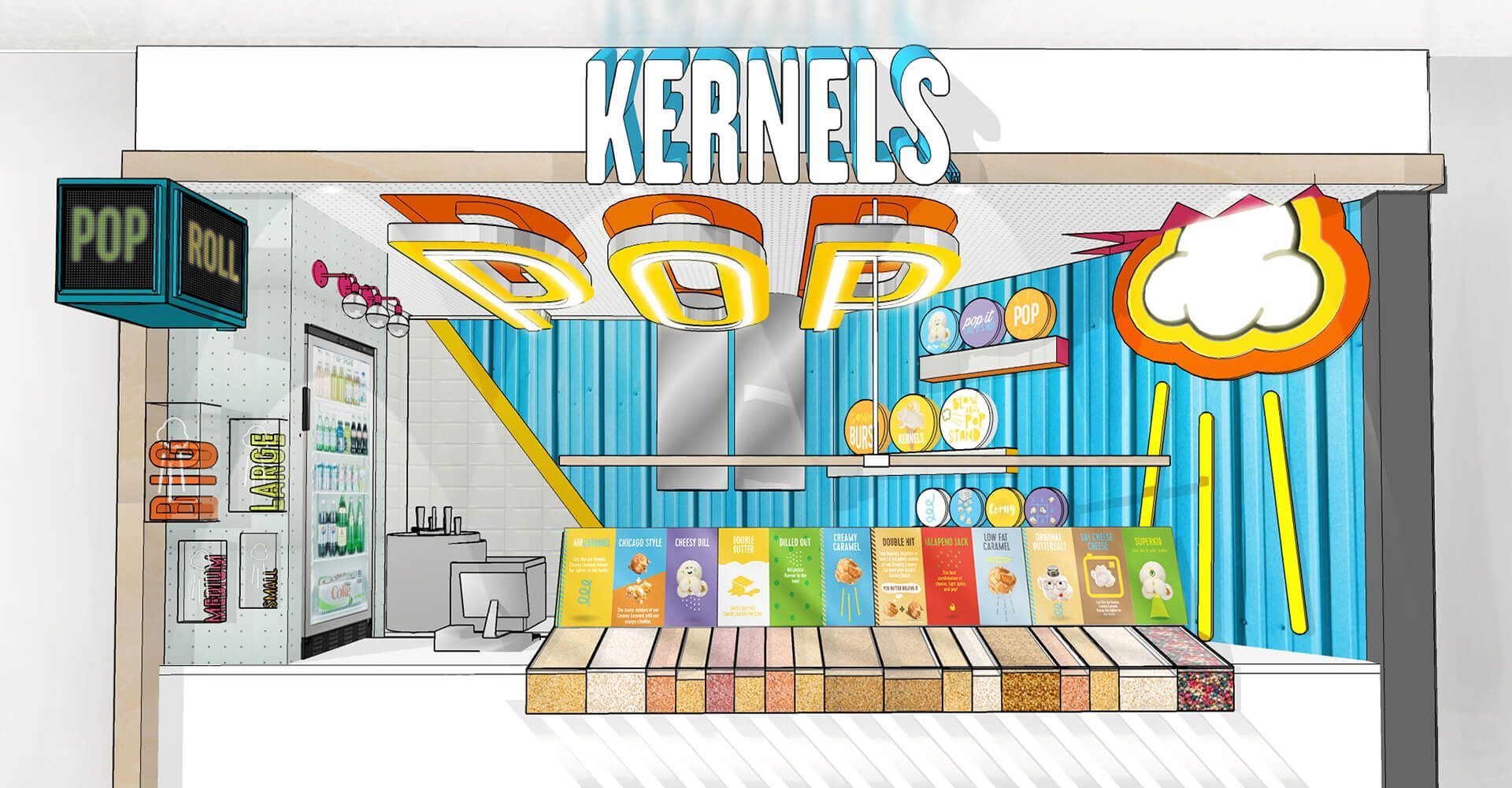
Our partnership with Kernels began over a decade ago with a logo and in-store refresh. That grew into packaging, digital, and retail work across the business. More recently, the focus has been on how the brand shows up visually, especially on packaging. With an objective to be bright, expressive and dynamic, we strove to evoke an emotional response from fans of all ages, from kids to adults. With a legacy brand it was critical to remain immediately familiar to those that have celebrated us for decades, while capturing the hearts and hands of a growing cohort of new shoppers. Fun, flavour, and shared moments were the recipe to delivery extraordinary brand visuals.