load it up

A dynamic take-out restaurant that reimagines the traditional pierogi with a focus on decadent, exploratory flavours and customizable options.

Identity, Packaging, Restaurant Packaging, Photography, Restaurant, Digital

This vibrant eatery takes the classic potato and cheese pierogi and elevates it with an extensive array of premium toppings, from savoury meats and fresh vegetables to artisanal cheeses. Whether customers prefer their pierogi crispy or classic, the endless combinations ensure a unique and satisfying culinary experience tailored to their individual tastes.

Loaded Pierogi logo on olive green background with white text and orange dumpling icon
White “Get Loaded” text on a green grass background
Modern café seating with teal banquette and green wall sign reading “Get Loaded”

The restaurant’s design captures the essence of its bold and adventurous menu through its use of vibrant colours and playful motifs. 

Bold hues dominate the space, reflecting the exciting and diverse flavour profiles that define Loaded Pierogi. Warm wood accents add a touch of comfort and coziness, creating an inviting atmosphere that balances the energetic colour scheme. The seating arrangement is thoughtfully designed to accommodate both small and large groups, featuring flexible, comfortable options that cater to various dining needs and preferences.
Colorful modern restaurant interior with long tables, benches, and bold wall art
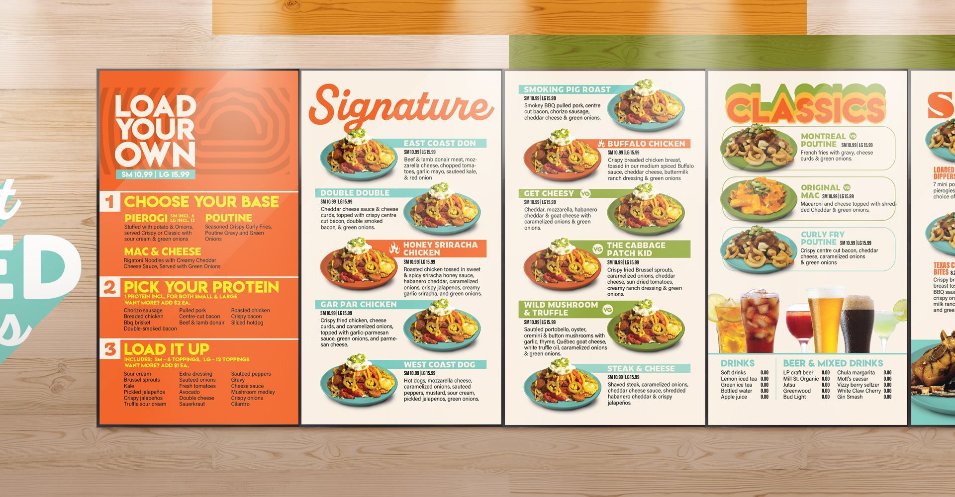
Restaurant menu board with orange, green, and white panels listing sandwiches, drinks, and combo meals
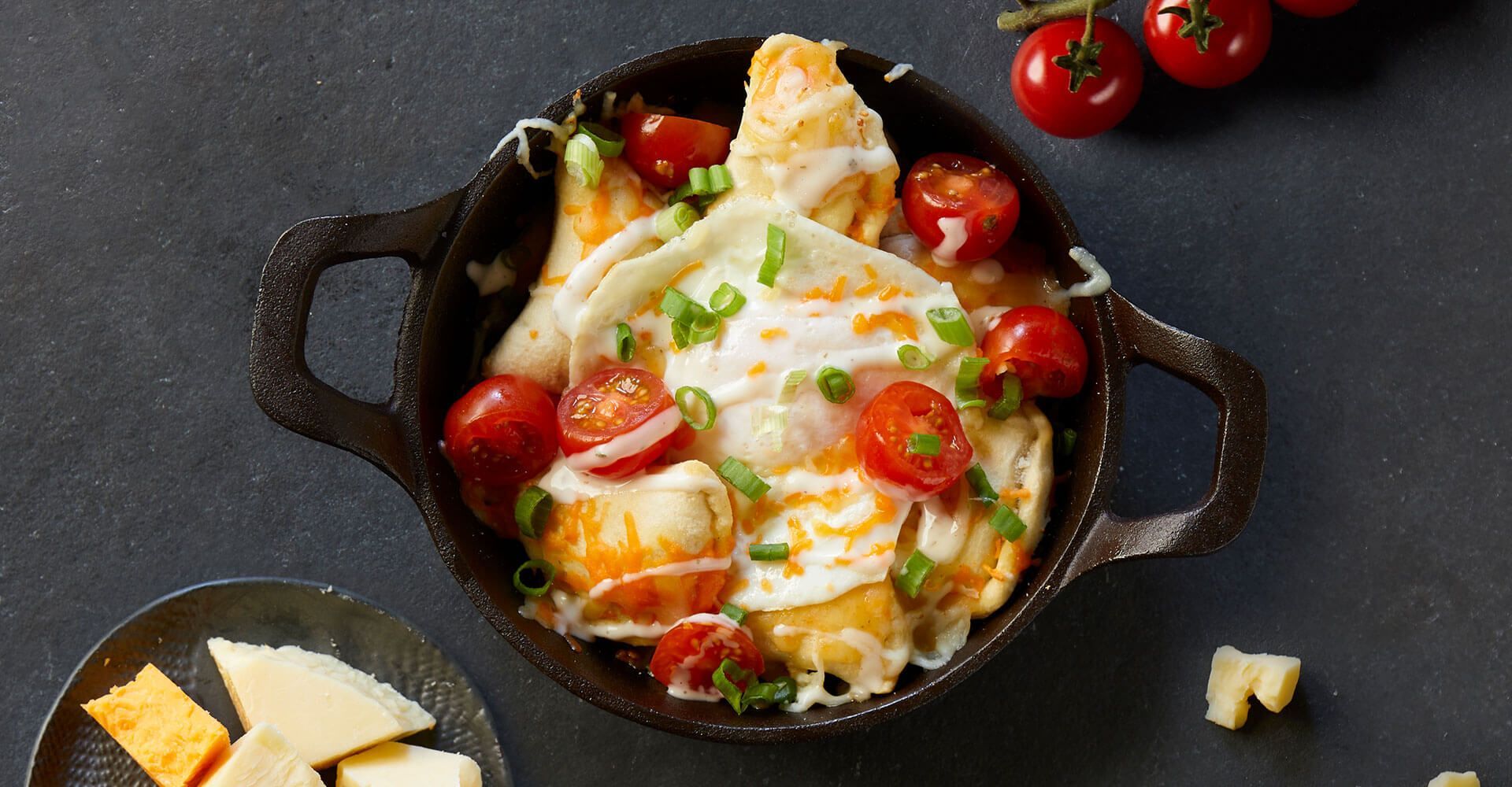
Skillet of baked gnocchi with cherry tomatoes, basil, and melted cheese on a dark tabletop
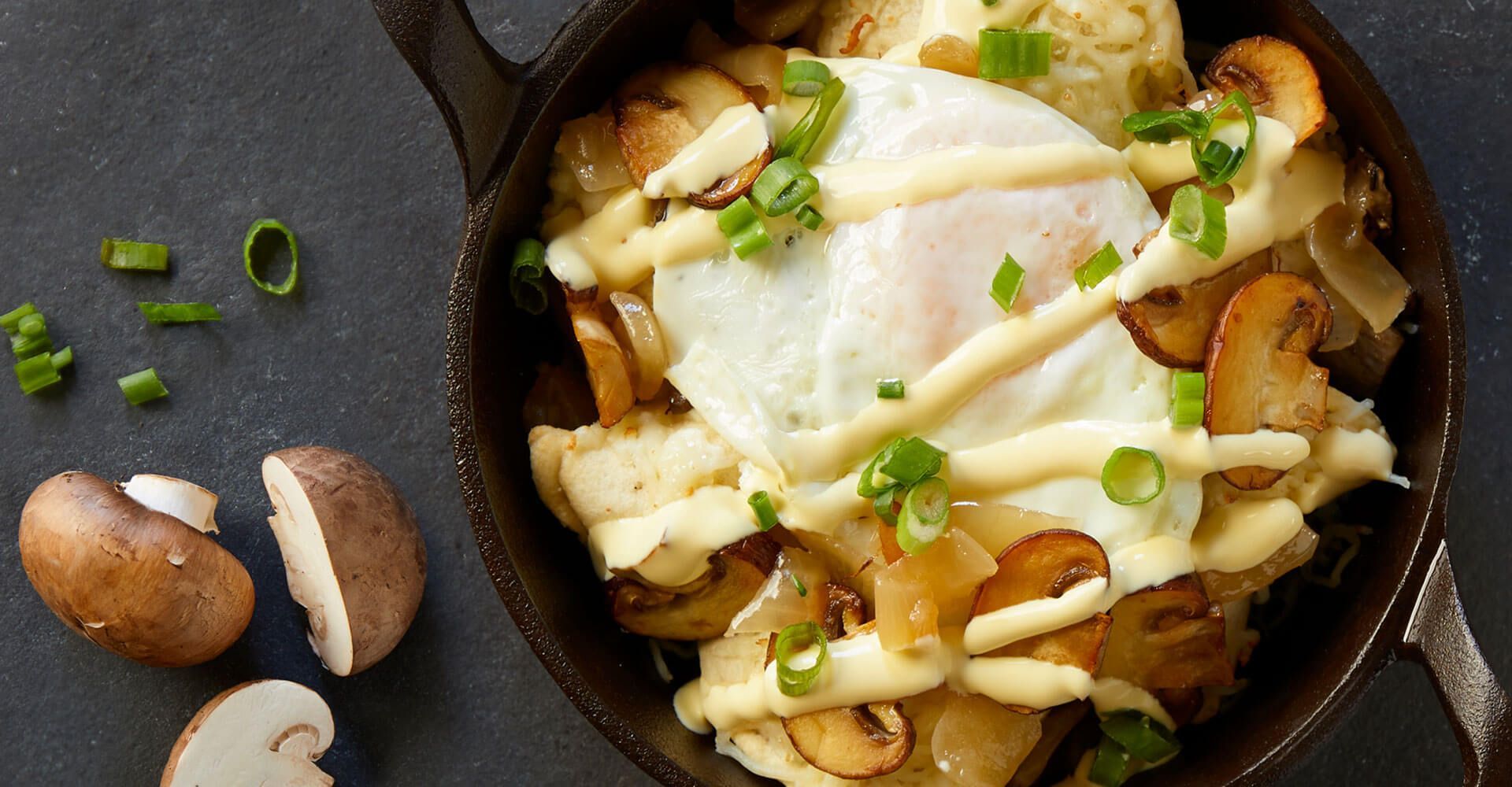
Fried egg over sautéed mushrooms in a skillet, garnished with green onions and bread slices nearby
Skillet of cheesy roasted potatoes topped with sour cream and green onions on a dark table
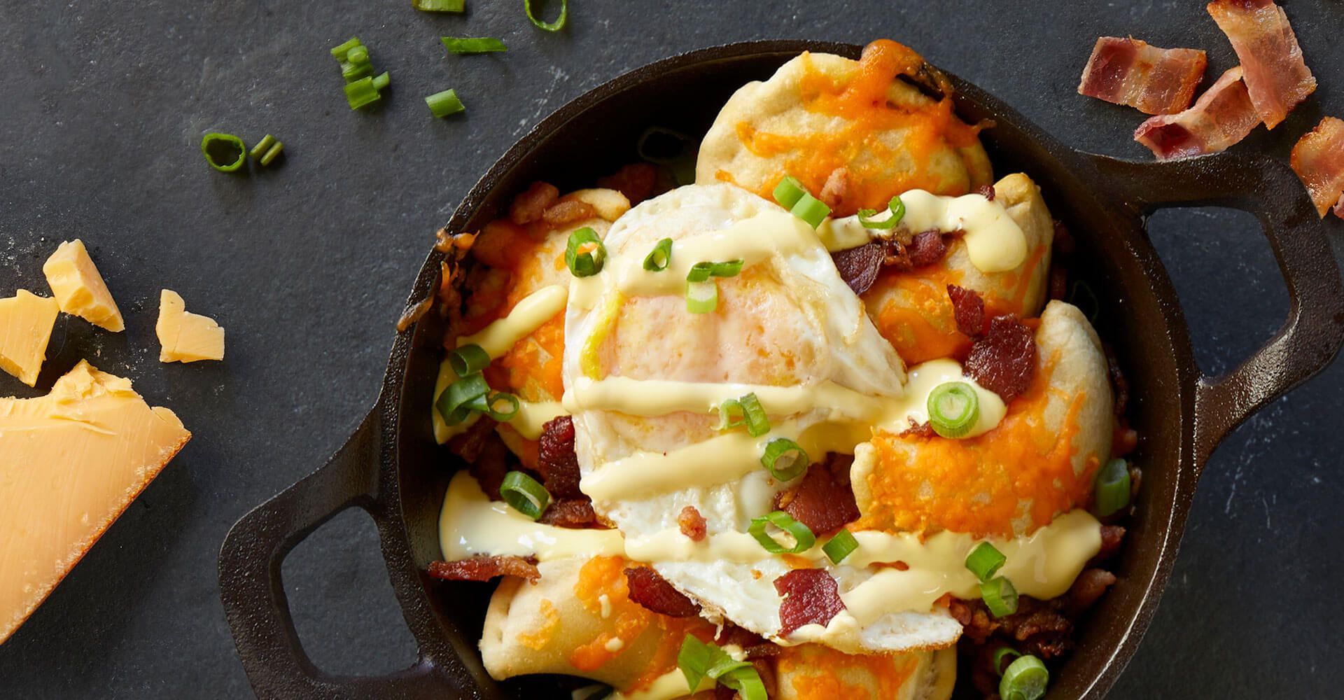
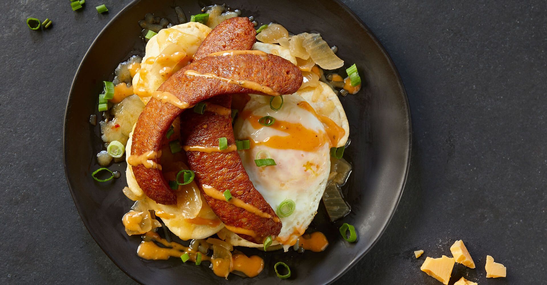
Breakfast bowl with fried eggs, crispy bacon, and vegetables on a dark plate
Pasta with tomato sauce and burrata on a black plate, garnished with herbs and nuts on a dark table.
Bold orange ad for customizable loaded snacks with the text “LOAD IT UP” and “CUSTOM CHOICES FOR EVERY CRAVING”

Potato motifs are cleverly integrated throughout the design, celebrating the humble ingredient that forms the base of every dish.

These playful elements enhance the restaurant’s theme while reinforcing the focus on quality pierogi. The word "loaded" is prominently featured in strong fonts and bold colours, symbolizing the restaurant’s commitment to generous portions and adventurous toppings. This combination of design elements ensures that Loaded Pierogi stands out as a fun, engaging destination for pierogi enthusiasts seeking a fresh and flavourful twist on a beloved classic.

Wall of Famous Ingredients title above four cartoon ingredient faces in brown line art on a cream background
Yellow script text “Come say hi Brantford!” on an olive green background.
Orange poster with yellow text saying “GIVE LOADS OF LOVE” and a small Loaded logo below.
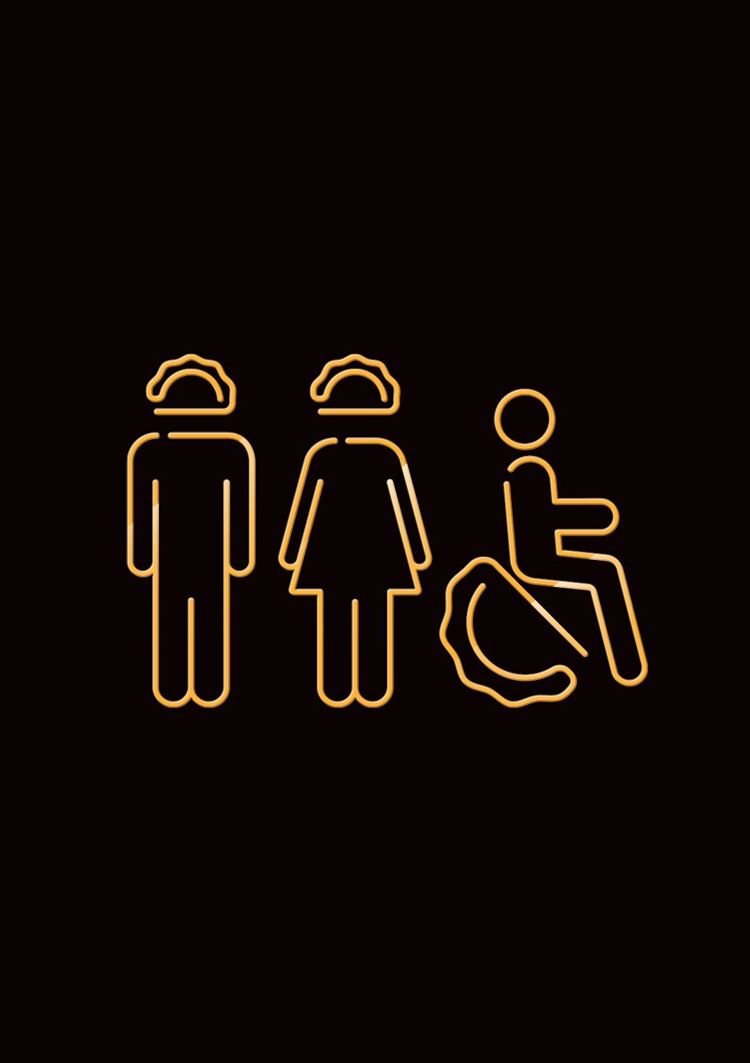
Golden outline icons of a man, woman, and wheelchair user on a black background
Abstract colorful graphic with geometric patterns and bold text in orange, yellow, green, and teal.
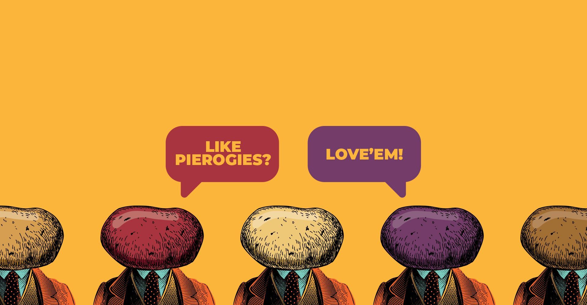
Four colorful pierogi figures with speech bubbles reading “ALE PIEROGI?” and “LOVE’EM!”
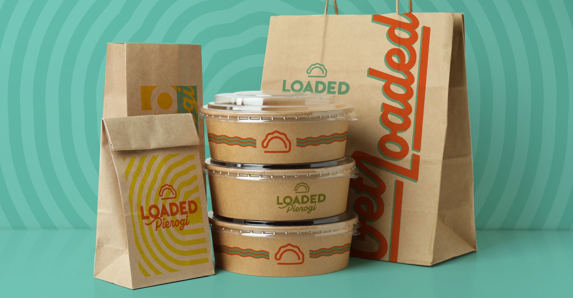
Takeout coffee cups and paper bags labeled “Loaded” on a teal background
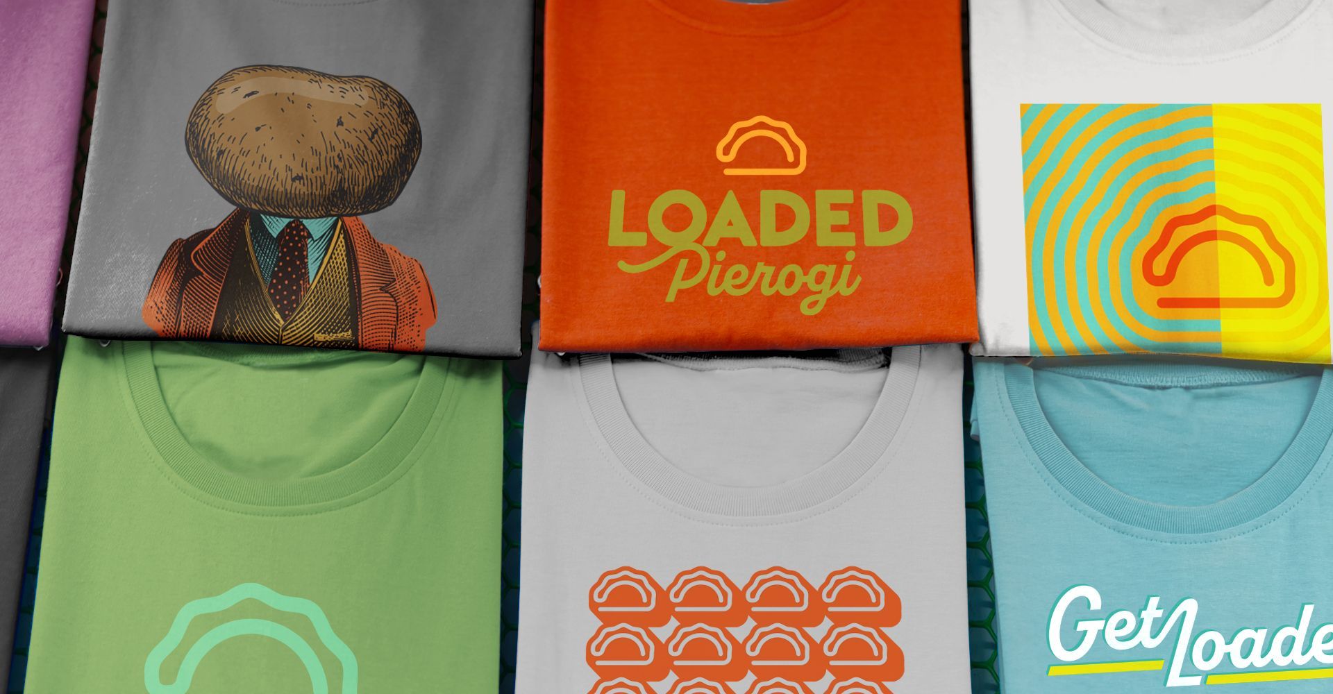
Colorful T-shirts with pierogi-themed logos and text in a 2x3 display.
Glowing yellow neon sunrise icon centered on a dark green background with wavy lines on both sides

explore the website

if you like those, you might like...