Turquoise ocean waves crashing with white foam on the water surface

Slide Title

Slide description
Button

Slide Title

Slide description
Button

Slide Title

Slide description
Button

fashion forward

Maple Lake provides innovative and practical software solutions to the retail industry. They specifically focus on merchandise and assortment planning, allocation and decision support solutions, where their products and expertise can make a significant difference to retailer’s profitability.

Digital, Identity

Assorted colorful “mapleake” logo designs scattered on a white background
Turquoise ocean waves crashing with white foam on the water surface

Slide Title

Slide description
Button

Slide Title

Slide description
Button

Slide Title

Slide description
Button

Maple Lake is a company that prides themselves on their innovative technology and software solutions, and they knew they needed to improve their brand identity and communications to form a credible and cohesive presentation with which to engage new customers.

They approached us first to undergo a substantial discovery session to position their brand through the eyes of their target market. They needed to find the right balance between ‘technology’ and ‘approachability’ to compete in a niche category against much larger names that offered a broader solution set.

Two white boxes with red and blue abstract diagonal design on a light gray background

The clean and contemporary design chosen for the new identity reflects the character of the business and the attributes of their software solutions: the subtle reflective effect reinforces the technological aspect of the business while the warm colour scheme and clean font convey a impression of friendliness and good customer service.

Three white product packets, one partially open with a red and blue label, on a light background

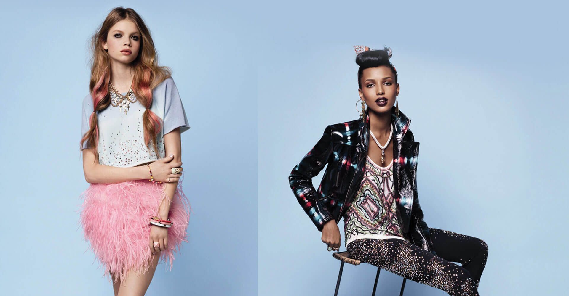
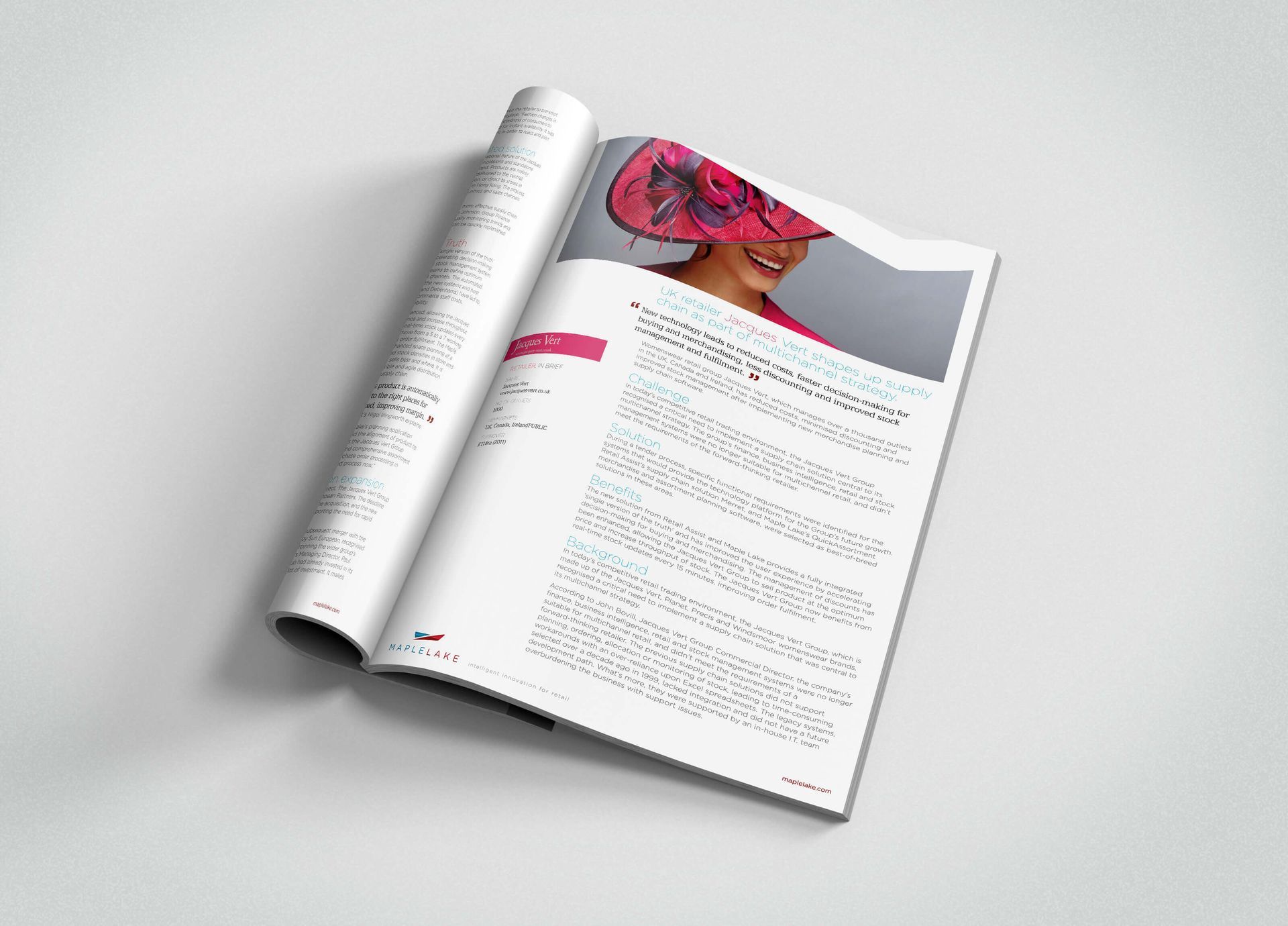
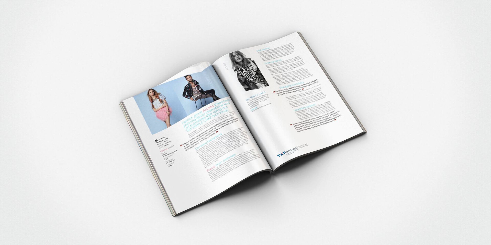
As we extended the design into the corporate stationery and website, we began to build on the communication of ‘innovation’ by finding unique graphic applications and treatments that really left a memorable impression of the brand and helped them stand apart from their competition. The angled die-cut became a signature treatment that was featured on the top of all print material where possible. The stylish website features striking fashion related imagery and is true to the irreverent personality of the two British principles.

Laptop displaying a website with a black-and-red homepage and a left sidebar menu

The new brand identity was implemented through a company wide hard launch and positioned them well to compete against the larger players as an innovative and focused, boutique software solutions provider within the retail industry. Maple Lake was acquired by TXT e-solutions in 2012.

Two fashion models posing against a light blue backdrop, one standing in a white top and pink skirt, one seated in a black outfit
Open magazine or brochure with a pink header on a white background
Open book with photos and text on white background

if you like those, you might like...