the art of cooking

Canadian Tire is a prominent retail destination for cookware, bakeware, BBQ’s and small appliances. Their entry level brand, Master Chef, has been providing consumers with the basic tools to cook indoors and outdoors for many years. It has become a well-known opening price point brand in their portfolio.

Packaging

An aerial view of a large wave in the ocean.

Slide Title

Slide description
Button

Slide Title

Slide description
Button

Slide Title

Slide description
Button

The previous brand styling featured an Asian-inspired script wordmark with packaging that failed to instill confidence in the product quality. Jump was enlisted to refresh the brand to make it more contemporary and appealing but still have it fit an entry level positioning.

A before and after picture of the master chef logo
An aerial view of a large wave in the ocean.

Slide Title

Slide description
Button

Slide Title

Slide description
Button

Slide Title

Slide description
Button

Jump first set about re-designing the Master Chef logo. The final iteration featured a clean, san serif font execution with customized lettering on the ‘h’ and ‘f’ of ‘Chef’ that resemble the point of a knife. This subtle detailing connects the brand to the kitchen or BBQ category and gives is a proprietary look. 

A box of chef 12 piece mix and measure set
An aerial view of a large wave in the ocean.

Slide Title

Slide description
Button

Slide Title

Slide description
Button

Slide Title

Slide description
Button

For the packaging, Jump developed a tri-tone design with a unique red corner panel treatment that features the product in use or food that is commonly associated to the product, from a top-down perspective. 

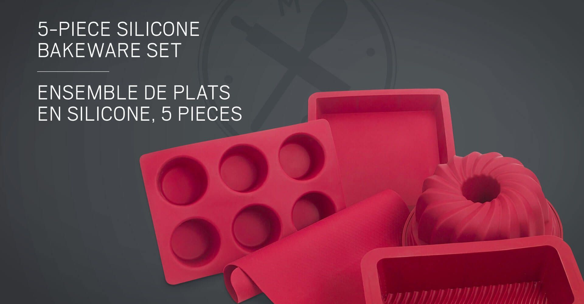
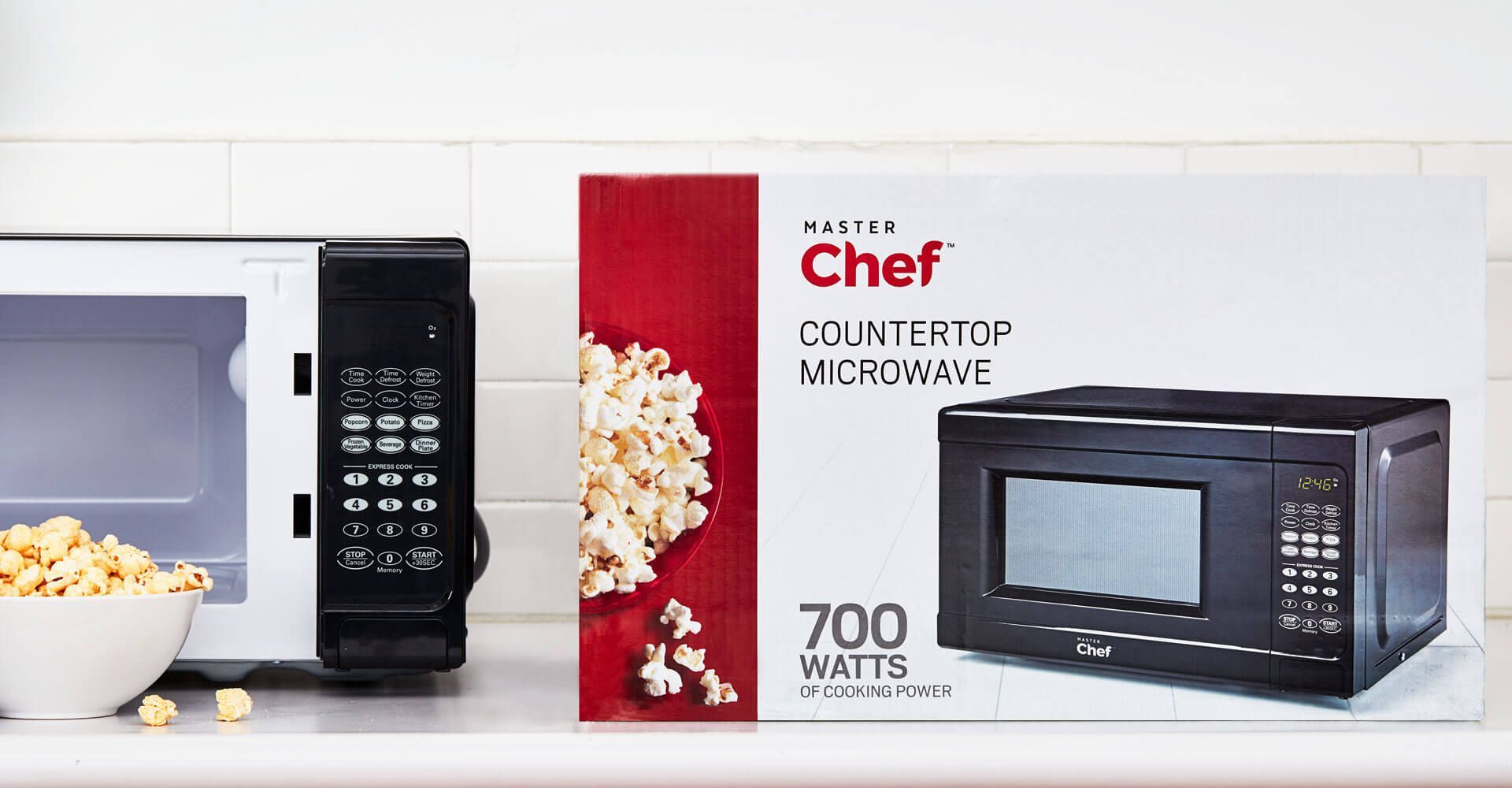
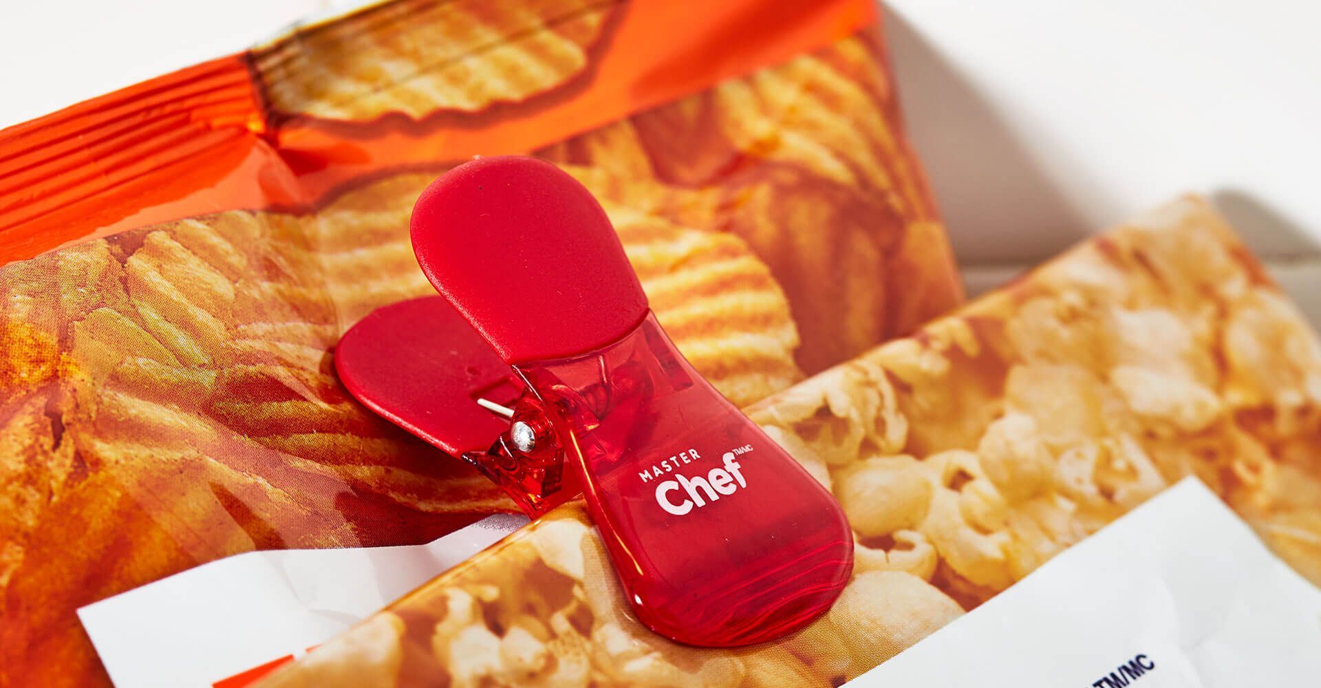
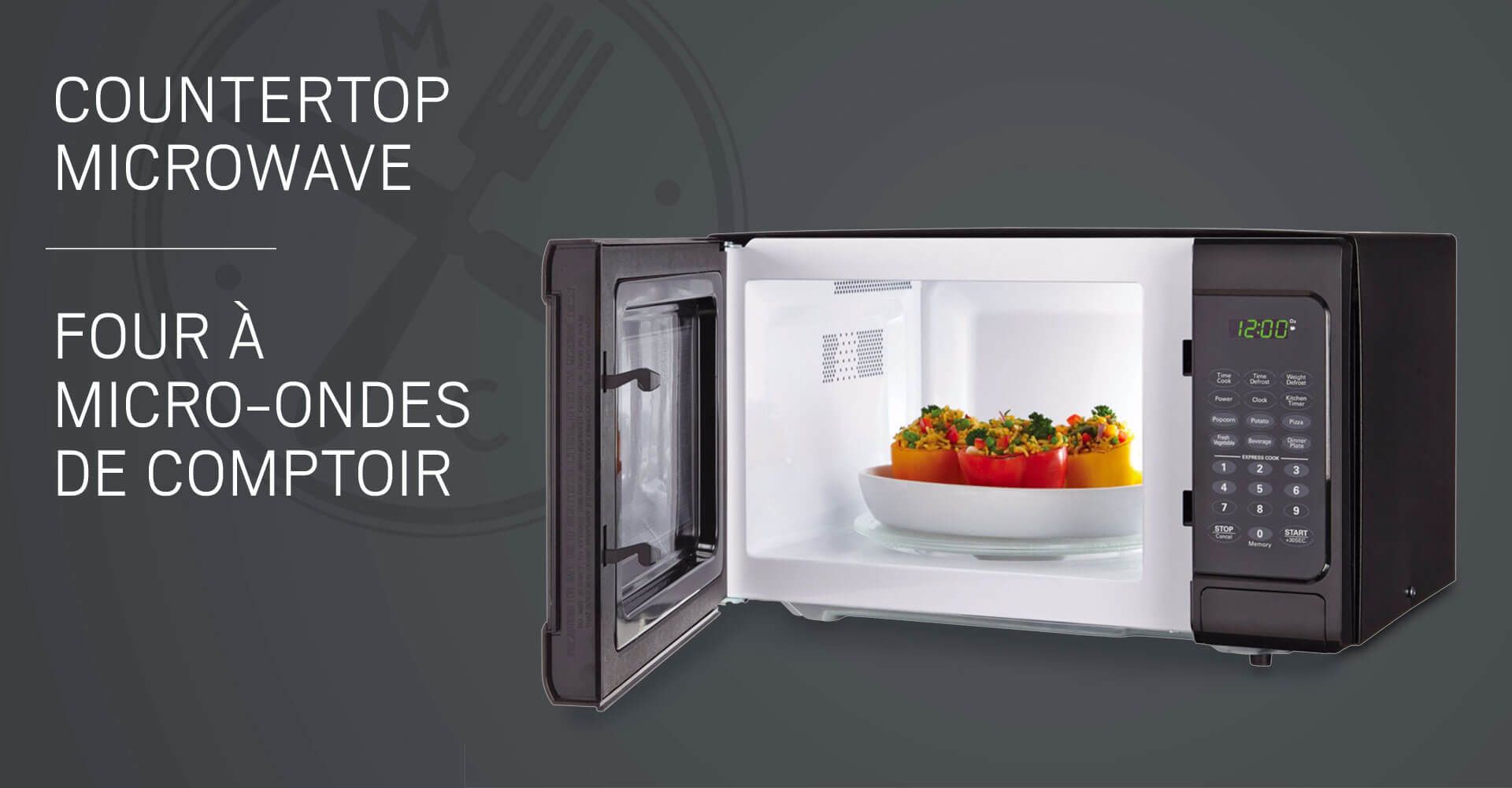
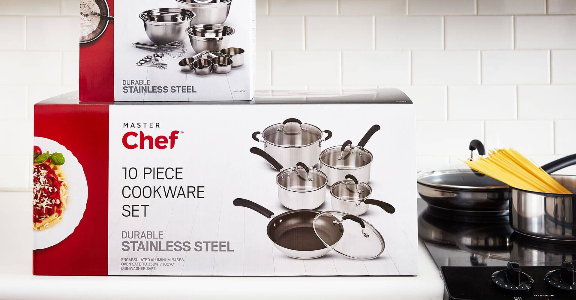
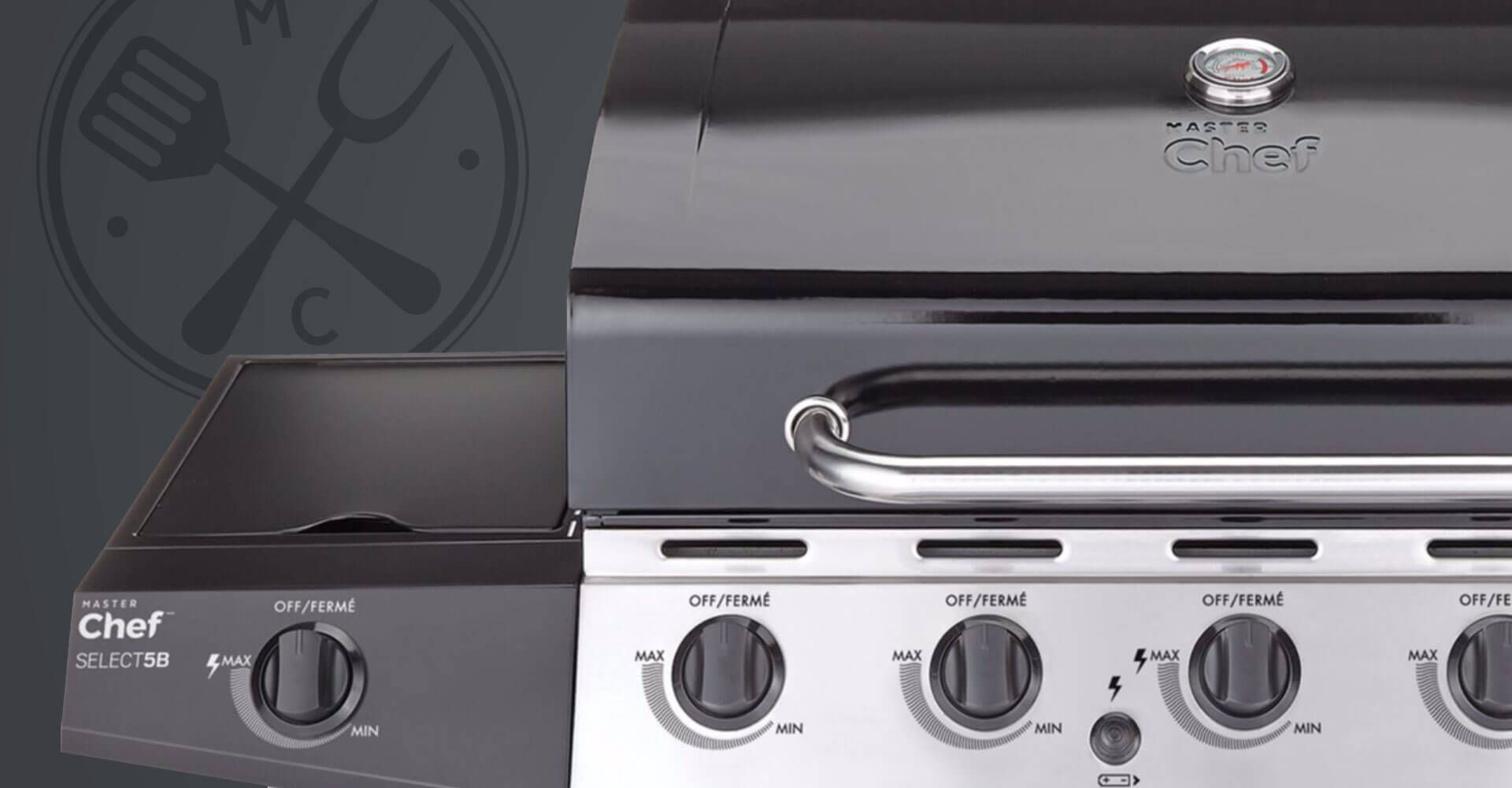
 This is intended to ensure consumers understand the product use and provide inspiration for what they can do with it. On boxed products, it wraps around the corner of the package so that it has presence on both the front and the side panels. The product images are shot on a white wood background to provide a fresh look and to anchor the items in the space, while the charcoal grey top panels deliver a contrasting look complete with category-specific iconology. Together the three elements make a cohesive and distinct package design which appeals to the value conscious consumer.

A slice of chocolate cake on a white plate with a fork
A little girl is measuring ingredients in a bowl.
An aerial view of a large wave in the ocean.

Slide Title

Slide description
Button

Slide Title

Slide description
Button

Slide Title

Slide description
Button

The new look for Master Chef was rolled out to a wide range of products and now is a prevalent brand in stores across the country. It is a vastly improved brand and packaging presentation for Canadian Tire’s good-level kitchen and BBQ label.

5 piece silicone bakeware set ensemble de plats en silicone 5 pieces
A bowl of popcorn is sitting on a red table.
A person is pouring vegetables into a pot on a stove.
A chef countertop microwave with a bowl of popcorn next to it
A red clip is sitting on top of a bag of chips.
A countertop microwave with a plate of food in it
A close up of a plate of grilled vegetables on a red background.
A chef 10 piece cookware set is sitting on top of a stove.
A close up of a grill with a chef logo on it

2018 — Davey Awards (Silver Award)

awards

if you like those, you might like...