An Apple A Day
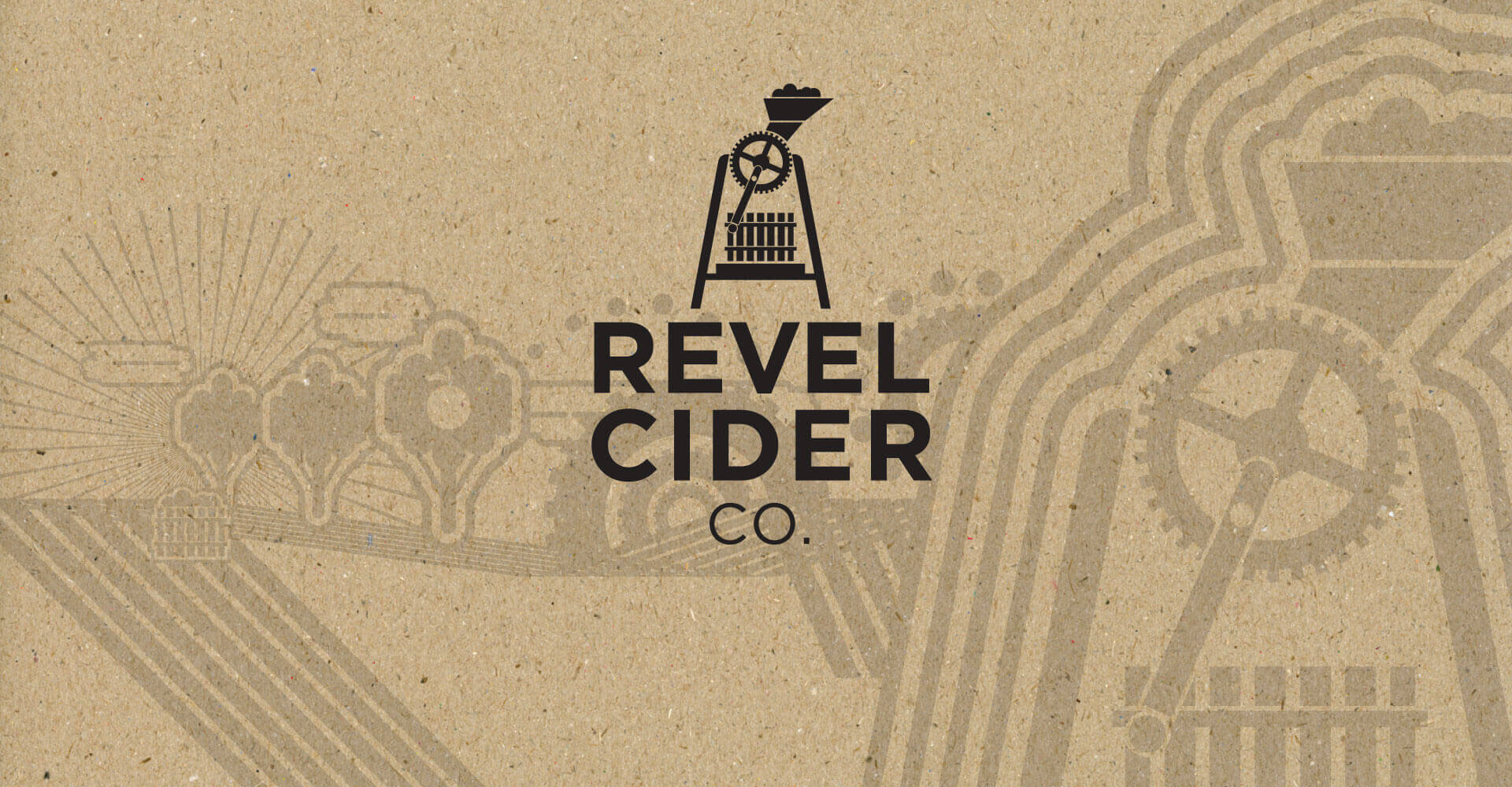
Revel Cider
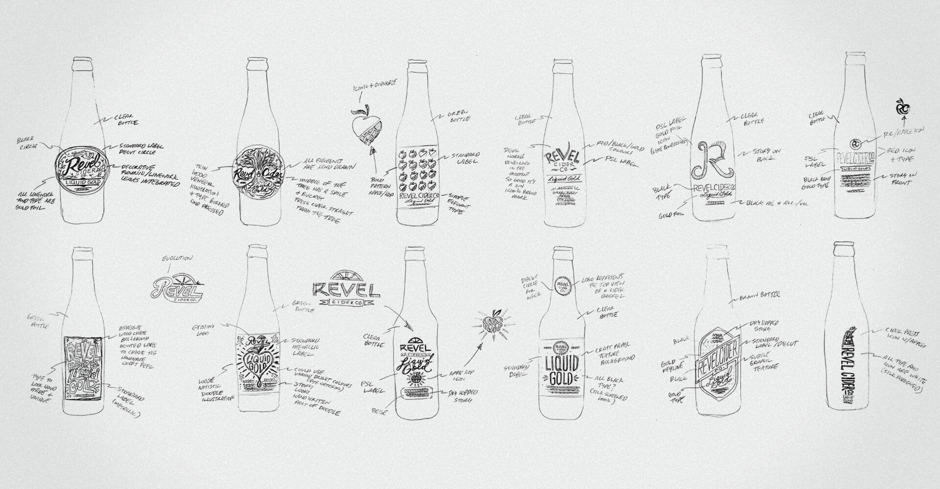
When Tariq Ahmed, a young student from the Agriculture program at the University of Guelph, approached us with a dream to make his own cider and some initial logo sketches, we couldn’t resist. We convinced him to let us bring our beverage category experience to bear on his brand, and Revel Cider was born.
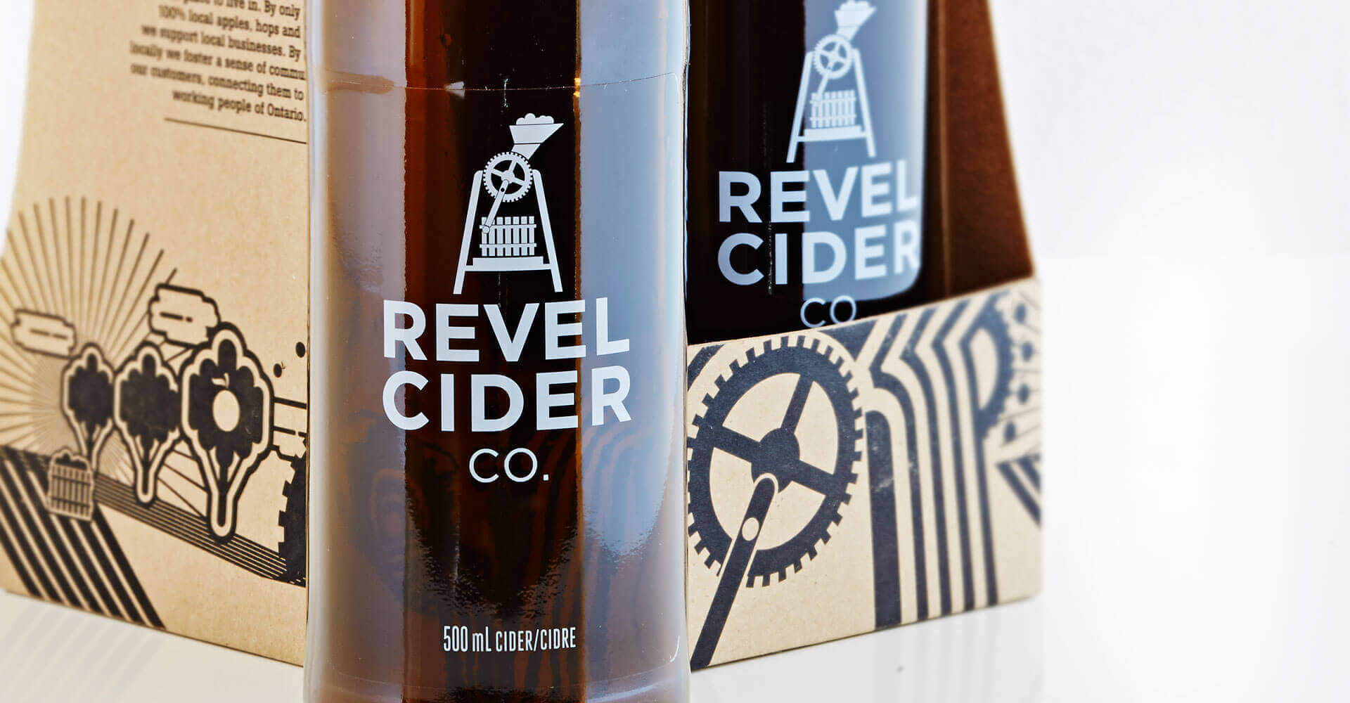
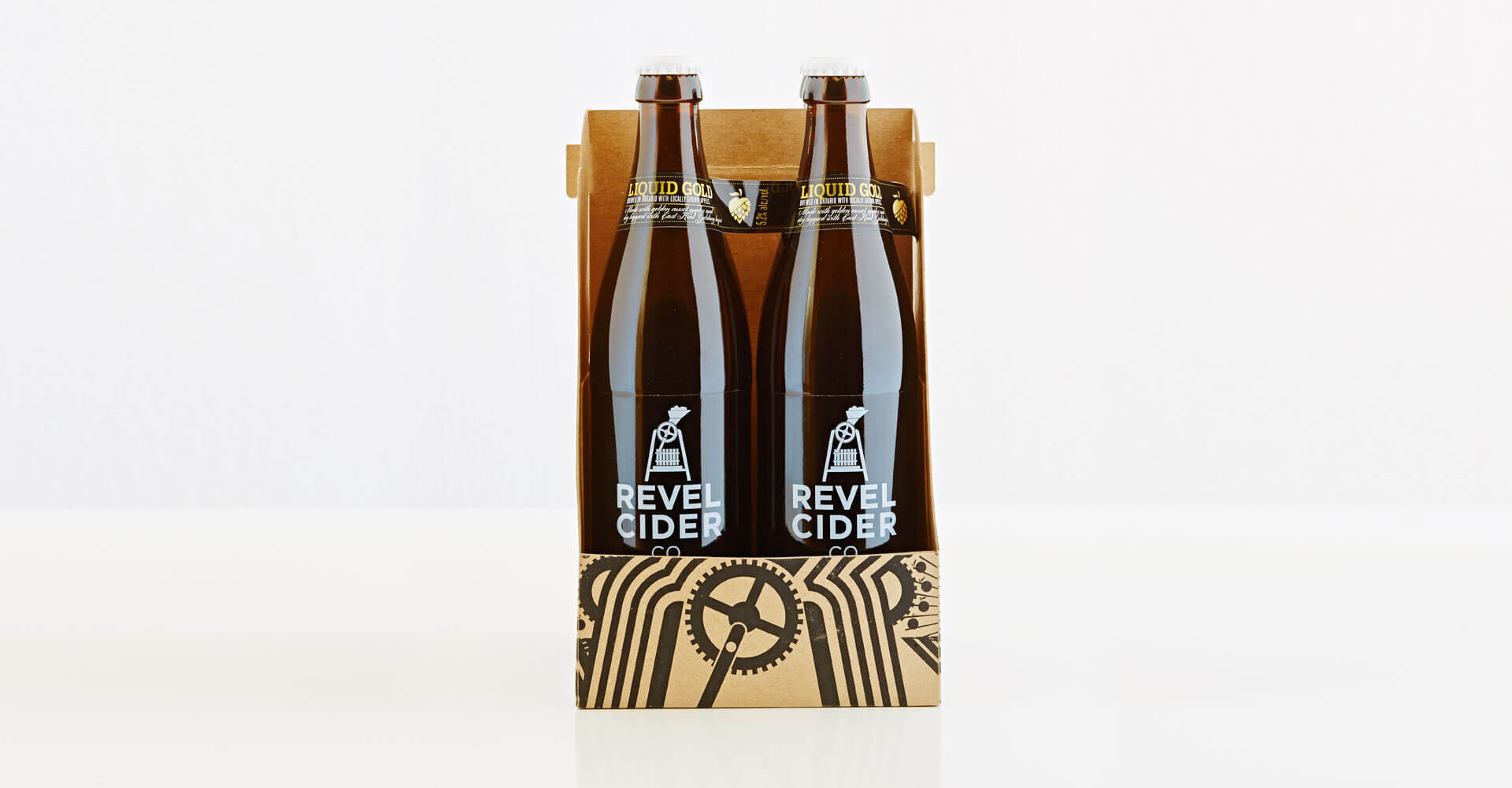
We worked with Tariq to develop a new visual identity and 3 different SKUs for Revel Cider, introducing a unique bottle to differentiate it, and creating a design program that used a standard body and carton label, and differentiates SKUs with the neck label. This saved money in production, as did the unique carton design, which provides visibility to the bottle labels to communicate the brand without having to print it on the carton.
Hops, Step, and Jump
It was important for us to work with Tariq to really highlight the unique point of difference of Revel Cider, while developing packaging that would create instant appeal. We convinced Tariq that we would need to start from scratch by reimagining the Revel brand. We changed the name from Revel Farms to Revel Cider Co. to shift the emphasis from the farm to the production techniques, and lend a craft, heritage feel to the brand. This was important because it is the production process that really sets Revel apart from other cider manufacturers, as they have introduced hops into the brewing process to create a “dry hopped” cider – one of the first in Canada.
A Bigger Bottle
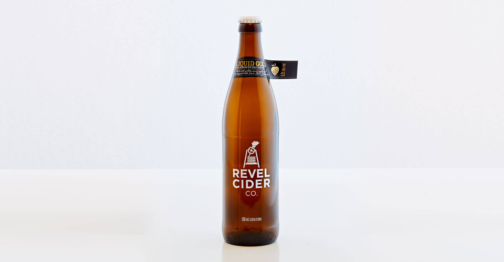
We worked with Revel on refining the presentation of the product to give it more of a craft quality feel, so bottle selection was important. In the end, we chose a brown 500ml bottle. The larger size was more unique and in keeping with the craft nature of the brand, and the brown bottle gave it credibility.
Crafting the Carton
In the design, we featured an antique cider press, and a bold font that represented the strength of the cider. Printing on a pressure sensitive label gave the bottle a cleaner look than paper labels, and the one-colour mark really popped. The bottles were sold in a 4-pack and as draft, so a carton and keg taps were also required. The 4-pack carton is printed on craft paper to fit the brand, and features a unique design that used a cutaway to showcase the bottles themselves, rather than printing on the carton. The unique neck label communicates the varietal, meaning that each different type of Revel Cider is packaged in an identical bottle, and is only distinguished by the neck label. This saves money in production of both the main bottle labels and the cartons, as they can remain generic.
What’s On Tap?
The tap handle was another important element, as strict LCBO regulations make ciders difficult and expensive to list in their stores, so at least in the beginning, Revel Cider would earn its brand reputation at the bar. It was critical to design a tap handle that would evoke curiosity and encourage trial, and make Revel stand out, not only among other ciders, but from the beers on tap beside it. The angular wood block with raised stainless steel letters makes quite a bold impression, and the Revel icon burned into the wood at the base is a signature that speaks to the craft nature of this beverage.
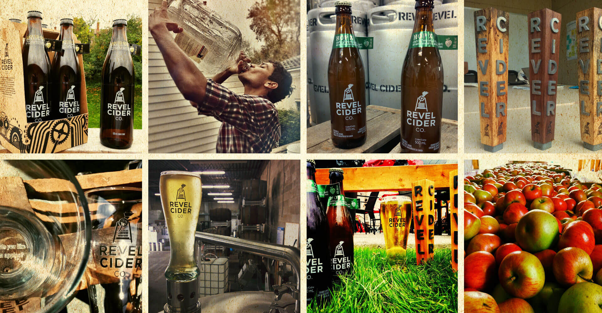
Revel Cider is available at select establishments across Southern Ontario. Check the Revel Cider website for details.