your everyday tumeric co.
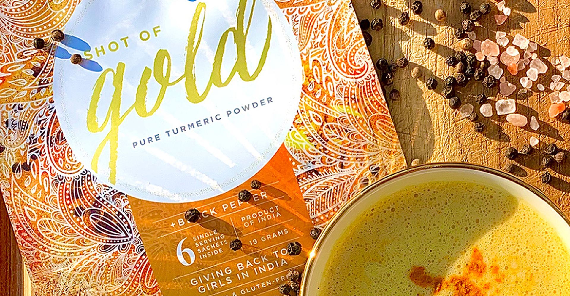
When Marissa Bronfman moved to Toronto from Mumbai, she wanted to start a social impact brand in the health food space that would keep her connected to India and allow her to give back to girls from the region. She established Shot of Gold as the first turmeric single-serve additive on the market.
Packaging, Retail Packaging, Retail
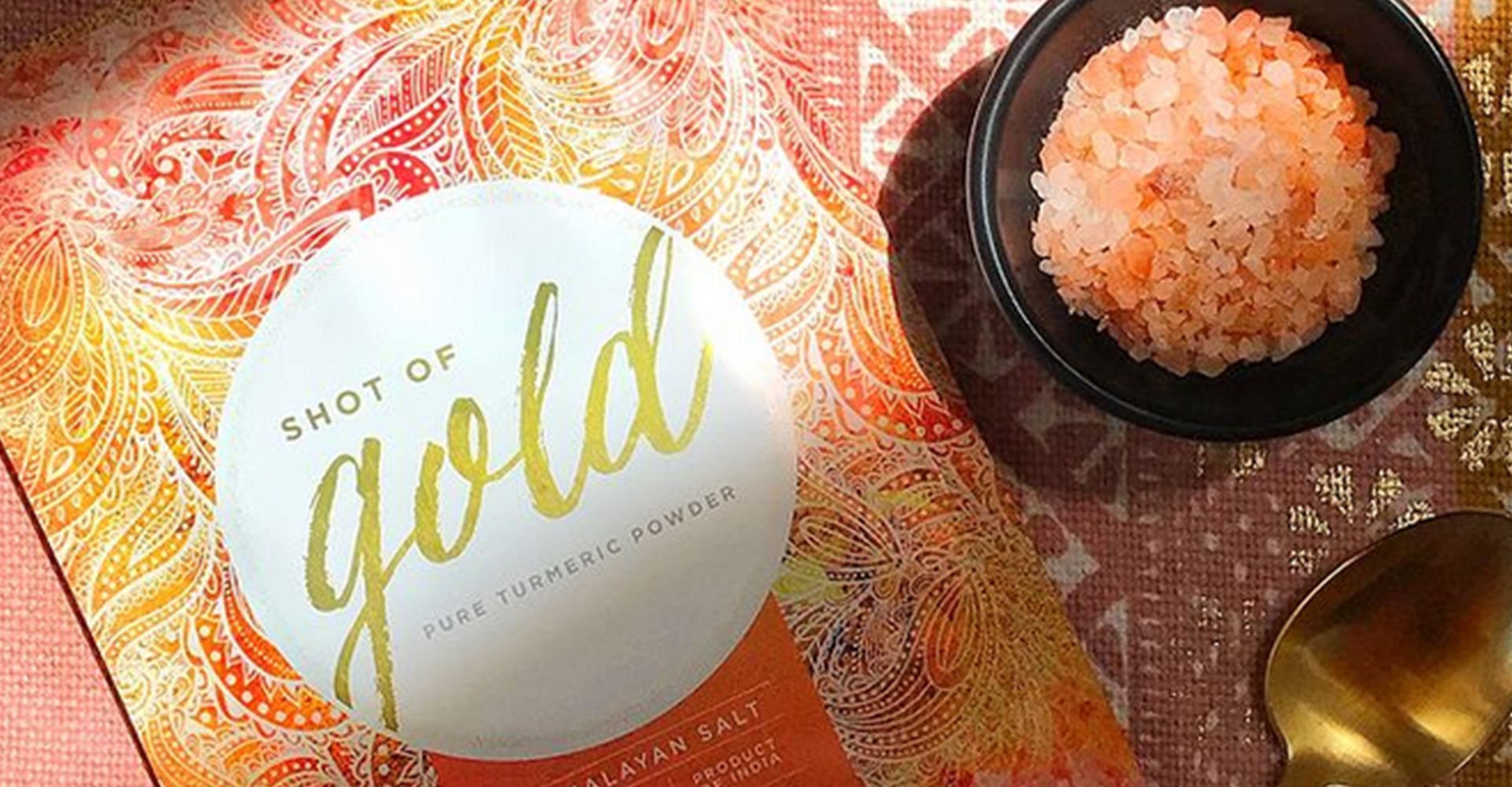
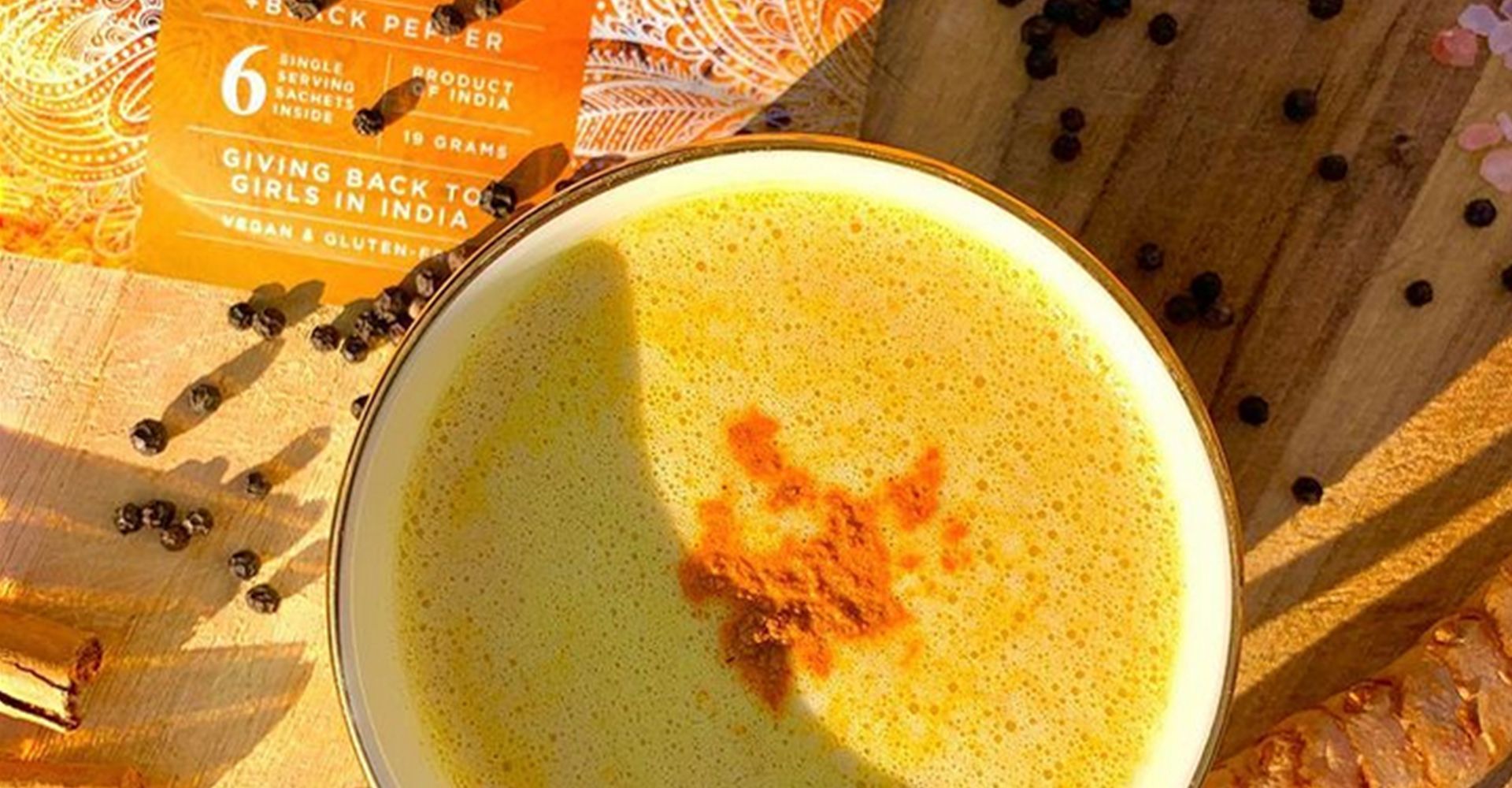

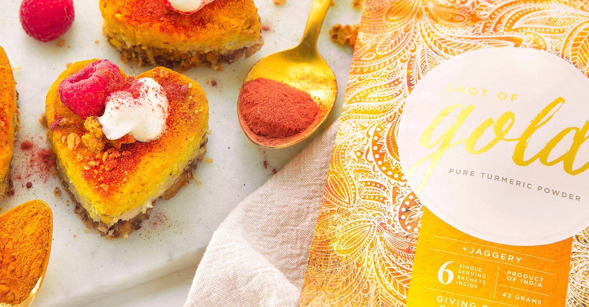
Turmeric is traditionally used as a spice for cooking in many Southeast Asian recipes. Shot of Gold is new proposition for consumers, providing a pure turmeric powder in single-serve pouches to be used as a health additive to drinks and prepared dishes. The challenge was educating consumers on the health benefits of this superfood and how it can be used as an on-the-go flavour enhancer that helps to boost immunity and fight inflammation. The packaging had to work hard to communicate the convenient single-serve format of the product, explain how it should be used, and convey the health benefits of the powder.
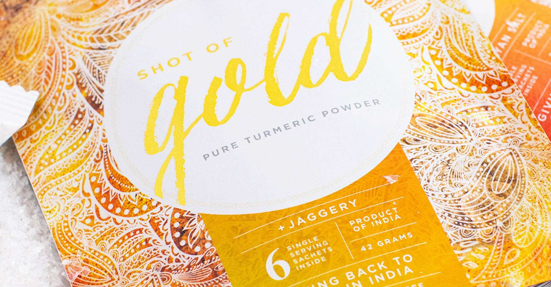
The graphics were designed to pay homage to the Indian origins of the product with henna-inspired patterning. The bright orange, yellow and pink background colour blends are also reflective of the colourful Indian textiles and sari’s. The premium design appeals to ethnic and mainstream audiences alike with the use of its illustrative and photographic layering. As a social impact brand, it was important to prominently communicate the campaign of ‘Giving back to the Girls of India’ on the front of the package. We used a clean, contemporary styling for the font on the front of the packaging, complimented by informative illustrations on the back panel that provide a visual representation of how to enjoy the product.
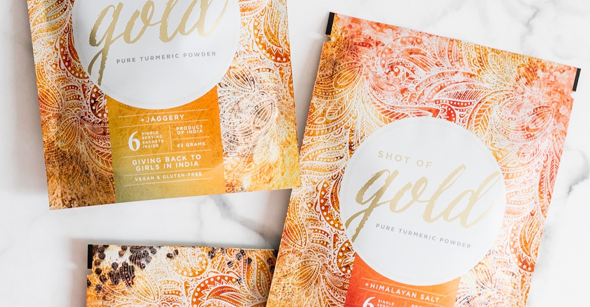
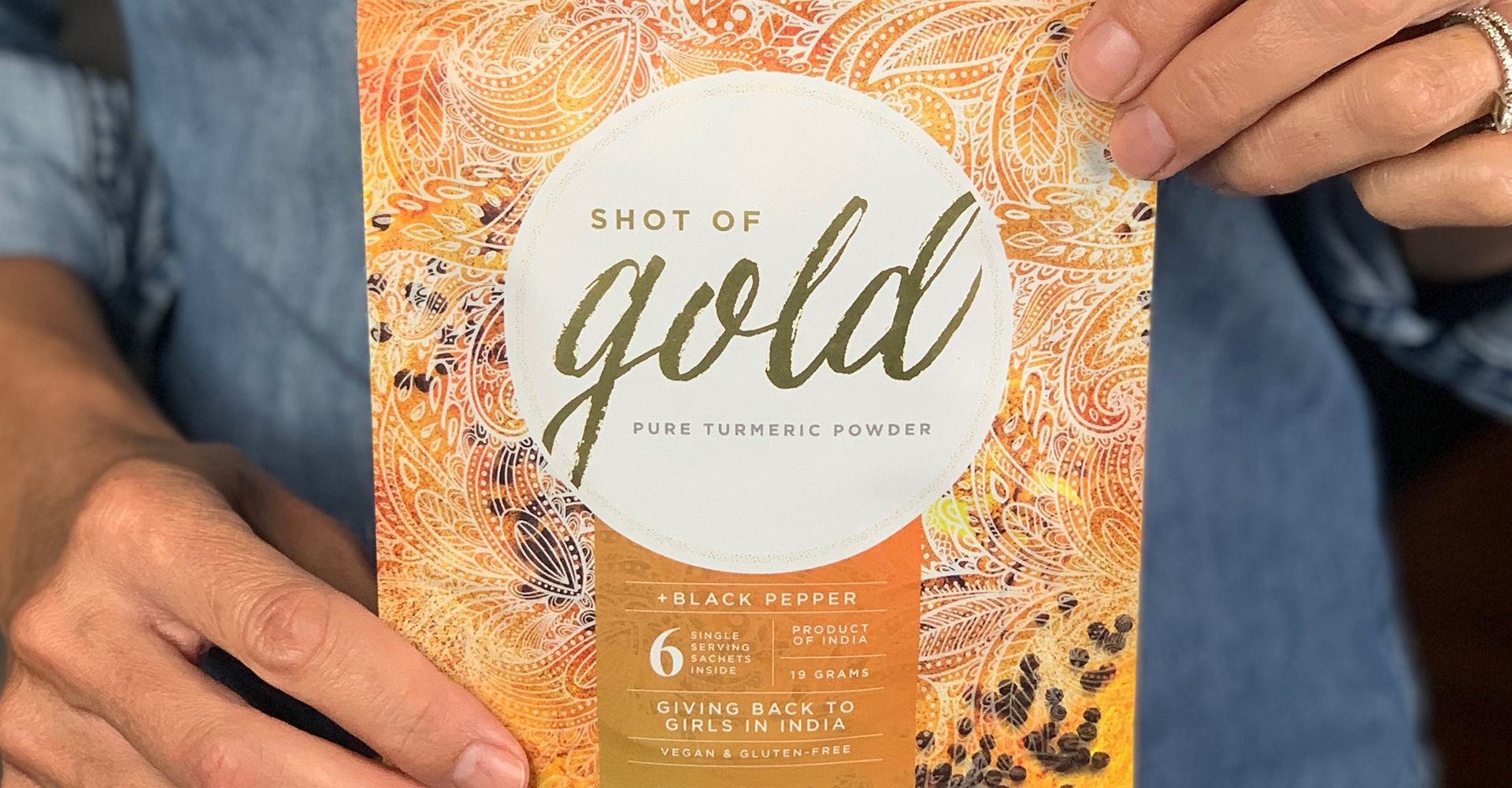
The elegant packaging stands out against the competitive set with its striking metallic gold wordmark that supports the brand name.
The pure white circular containing shape acts as a visual target that draws the eye to the logo and provides just enough quiet space to balance the intricacy of the patterning. Unlike many of the competitors, photography of the product is not placed at the forefront of the packaging, allowing the beauty of the design to draw the customer in.
Although the packaging is comprised of recyclable material, it is their commitment to giving back that embraces the spirit of the circular economy; the Shot of Gold brand sends 5% of all profits back to India to support the education and empowerment of Indian schoolgirls.
Early sales results and feedback are very encouraging for this newly launched health food brand. It has gained listings across the country in national retailers such as Healthy Planet and is poised for significant growth.