The storage and organization section of the Canadian Tire store was fragmented with a large variety of national and owned brands living side-by-side. Canadian Tire recognized the opportunity to streamline the assortment by creating a new, innovative storage and organization brand and reducing the clutter on shelf.
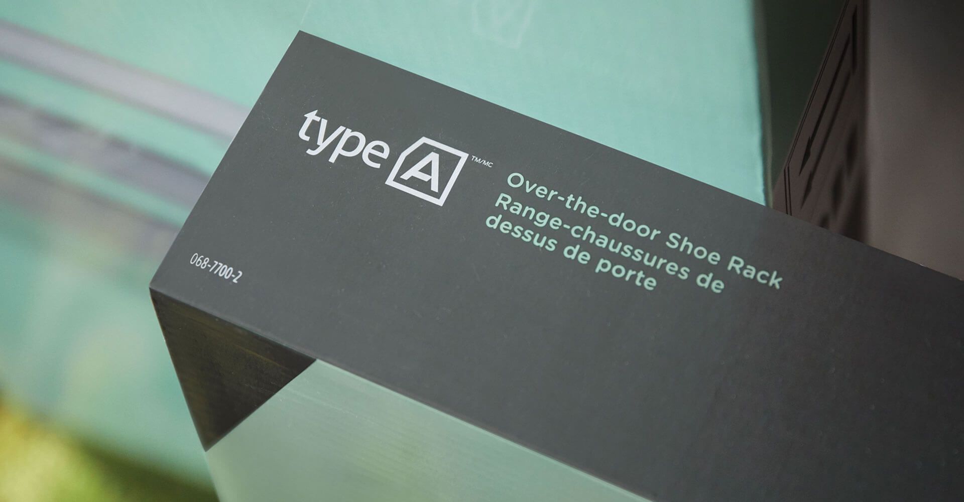
They turned to Jump to build this brand from the ground up. The process began with an extensive brand name generation exercise. We established a series of naming ‘buckets’ that could fulfill the desired brand position. We then explored names that would be fun and catchy to turn any negative associations surrounding the chore of storage and organization into positive, gratifying associations. The name Type A was chosen to do just this. It is a light-hearted play on the personality type that gets great satisfaction out of maintaining a neat and well-organized home.
The logo Jump designed for the brand utilizes a clean, chiseled type face with a box surrounding the ‘A’ that signifies the concept of storage. The package design also has a contemporary style that features playful, ‘doodle’ sketches over top of the product imagery to convey the intended use of the product. The eucalyptus and charcoal grey colours create a soothing appearance that is a nice fit for the category.
Jump also worked with Canadian Tire to produce a series of collateral materials including a detailed graphic standards guide, instructional pamphlets and a promotional video.
The Type A brand was launched in stores across the country in 2019.