An aerial view of a large wave in the ocean.

Slide Title

Slide description
Button

Slide Title

Slide description
Button

Slide Title

Slide description
Button

wrapping up gourmet

With a successful food court prototype store under their belts, z-teca needed a partner that could help them extend their brand as they rolled it out to more corporate stores and eventually franchises. z-teca wanted to establish a niche within a growing Mexican-inspired QSR market by providing a superior quality product in an elevated environment.

The restaurant was positioned as the “Two-Fisted Gourmet”. The design needed to strike a balance between the portion size of the handheld product offering and the quality ingredients and sumptuous flavours of their premium burritos. The environment that we created mimics this balance by employing coarse industrial materials through architectural detailing, creating a rough but refined interior. Working with an energetic colour palette and raw, contemporary material selection, we strategically introduced industrial products like Tru-spec as finish materials, along with poured concrete counters, polished concrete floors, and stainless steel. Exposed fasteners provide strength and contribute to the industrial character that makes the space so unique.

Marketing, Restaurant

A restaurant with tables and benches and a trash can
An aerial view of a large wave in the ocean.

Slide Title

Slide description
Button

Slide Title

Slide description
Button

Slide Title

Slide description
Button

To reinforce brand attributes like freshness and customization we created transparency into the kitchen and established visibility of the grill to the consumer.

A table topped with bowls of food including guacamole and salsa.
The inside of a restaurant with a counter and a refrigerator.
An aerial view of a large wave in the ocean.

Slide Title

Slide description
Button

Slide Title

Slide description
Button

Slide Title

Slide description
Button

In keeping with the simplicity of the concept, the clean menu highlights the ease of ordering and explains the process to the consumer.

A poster that says save the children eat burritos
A seamless pattern of cartoon characters and objects on a yellow background.
A restaurant with tables and chairs and posters on the wall.

Artwork is specific to each store, and merges neighbourhood references (eg. Theatre District movie posters) with the brand and its product, infusing a localized influence.

A large room with tables and benches in it
A brick wall with a row of pictures on it

Elements of discovery are featured throughout the space, such as the “hidden Z” artwork and “Z” inspired chair frames which leverage their distinctive name and discretely inspire brand loyalty.

A collage of four pictures of people and food with the words `` wow this burrito is delicious but it 's filling ''.

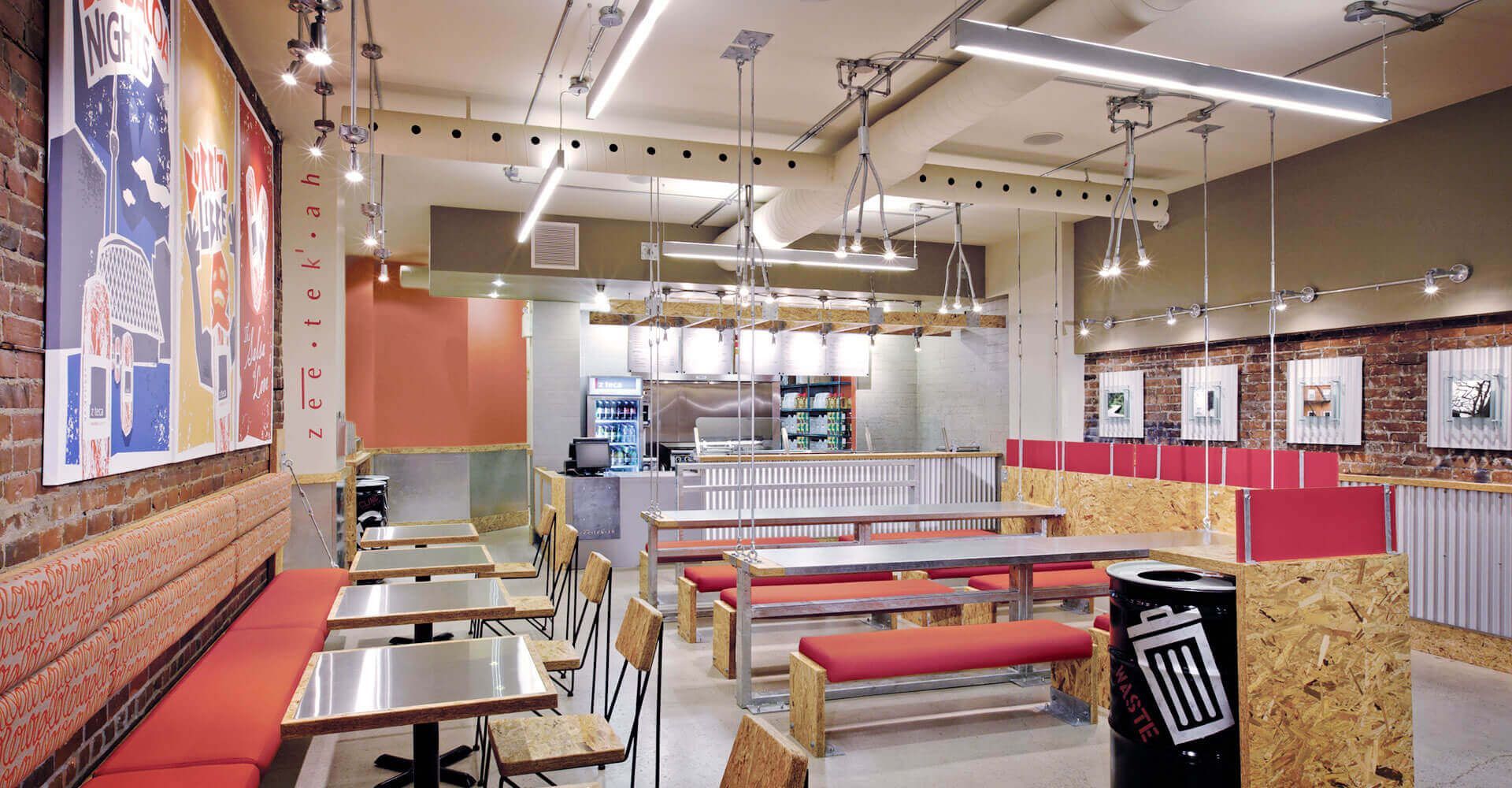
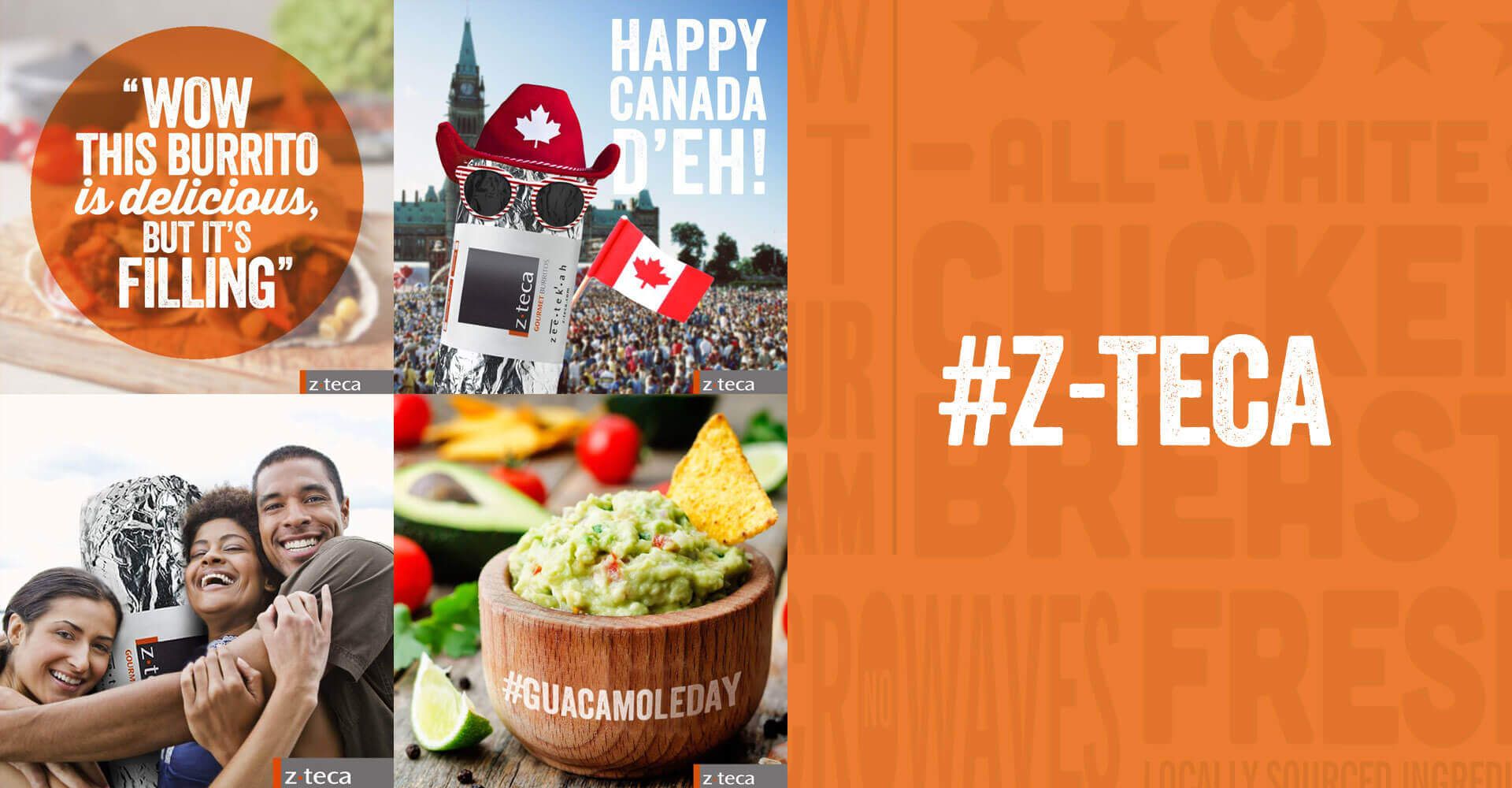
Z-Teca now has multiple locations throughout the GTA, including their store at BMO Field, where they help hordes of hungry fans cheer on Toronto FC of the MLS, and a restaurant in York Lanes at York University. We continue to support z-teca as they develop new stores, and through the management of their social media accounts. Through them we communicate with a community of loyal z-teca brand followers, reinforcing the z-teca brand, promoting new product awareness, and establishing z-teca as Toronto’s pre-eminent burrito brand.

if you like those, you might like...