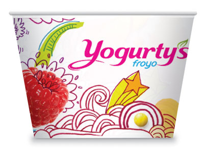
Jump’s Yogurty’s packaging design highlighted by platoputas.com
29, Jun. 2012
Plato Putas, a popular website celebrating all things food and the joys of eating, recently did a feature on Yogurty’s. Visiting the Bloor Street location in Toronto’s Annex district, the article looks at how Yogurty’s stands out, with both their froyo and their retail space, amongst the self-serve frozen yogurt shops that occupy the Bloor West strip.
The sixteen flavours of the Yogurty’s froyo bar certainly help. From plain tart to cotton candy and red velvet cake, the selection caters to all palettes and delivers with flavours that taste exactly as they are named. When Jump was engaged to create an environmental and packaging design for Yogurty’s, this extensive selection, alongside the abundance of colourful toppings, served as a big point of inspiration.
When you walk into each location, the environment pops with bright hues and vibrant, mixed-media graphics. The ladies at Plato Putas were particularly drawn to the design of the serving bowls. Although it might seem minor, in the hyper-competitive froyo market details like this really place Yogurty’s ahead of the competition. The bowls bring out the fun, fresh feeling of the froyo inside and as Plato Putas points out “feel like they’re screaming: grab me. fill me”.
Fill up on the full article on platoputas.com, and make sure to savour in all their postings on the best food in the city and around the world. Also serve your appetite for Yogurty’s with an interesting tidbit on their Bloor location and be sure to check out more of Jump’s innovative packaging designs.
