An aerial view of a large wave in the ocean.

Slide Title

Slide description
Button

Slide Title

Slide description
Button

Slide Title

Slide description
Button

back to their roots

Creemore Springs came to us in 2012, looking for a new agency of record for their beer packaging. The brewery, established in 1987 and purchased by Molson Coors in 2005, had a loyal following, but the emergence of a robust craft beer market threatened growth. What’s more, while their adherence to the strictest German beer-making techniques is what made the brand so beloved, Creemore felt that the opportunity existed to explore some beers outside of their traditional set.

Packaging, Retail Packaging, Retail

A can of lot 9 pilsner beer is sitting on a wooden table.
An aerial view of a large wave in the ocean.

Slide Title

Slide description
Button

Slide Title

Slide description
Button

Slide Title

Slide description
Button

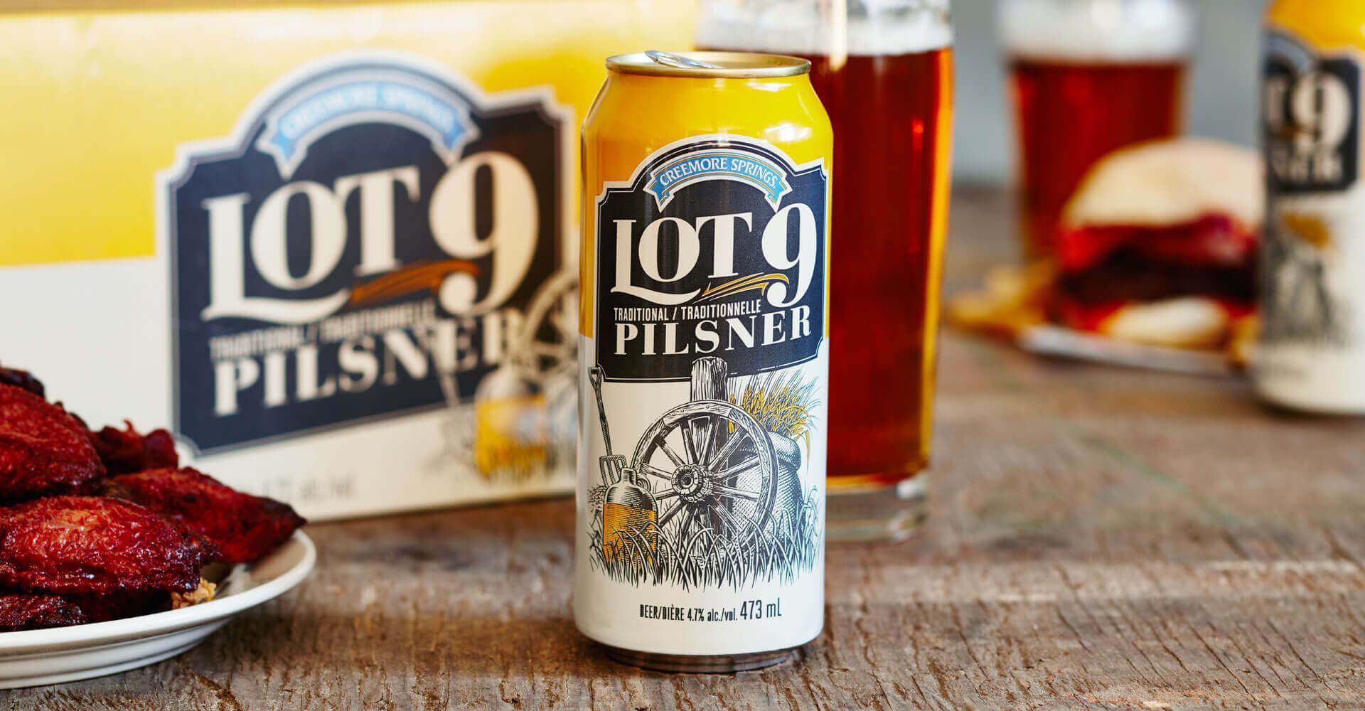
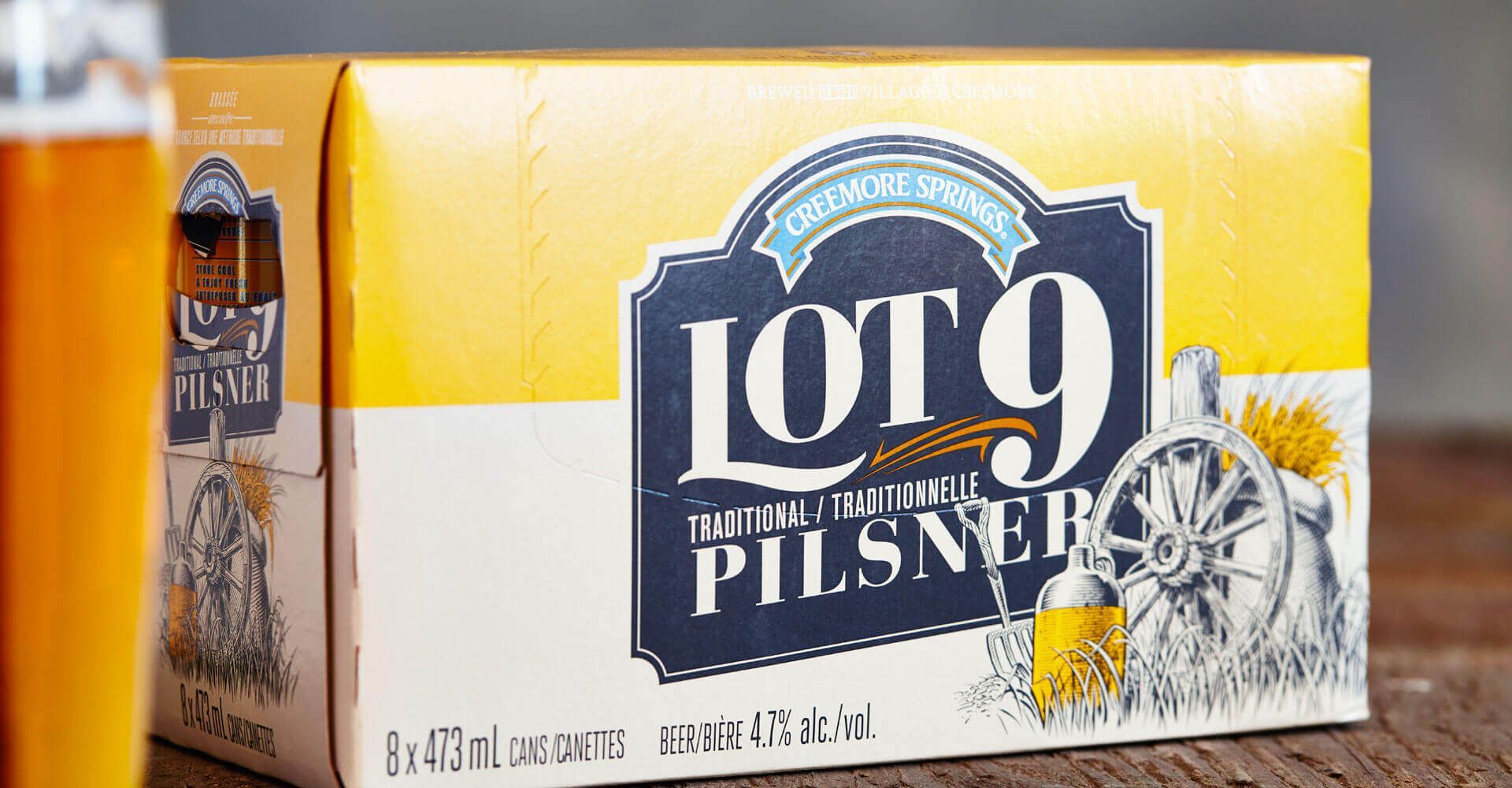
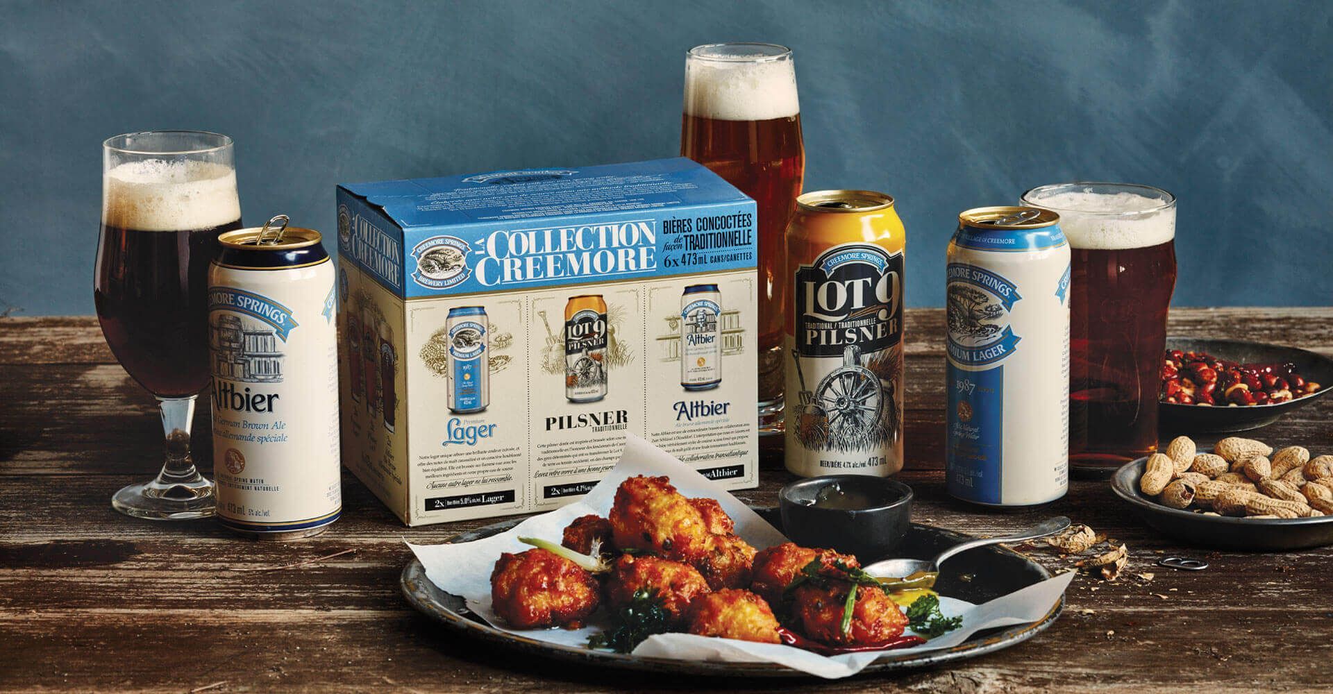
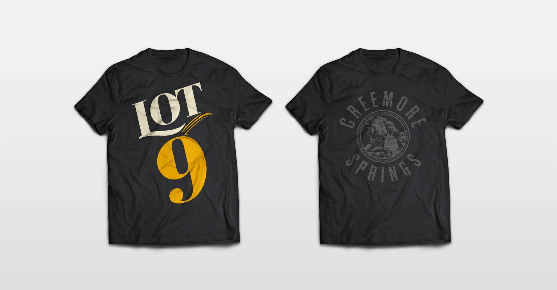
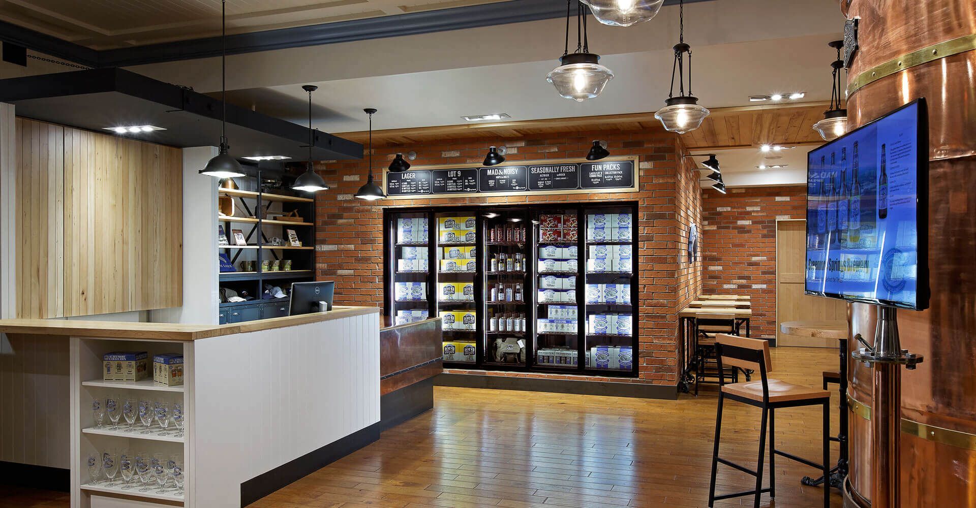
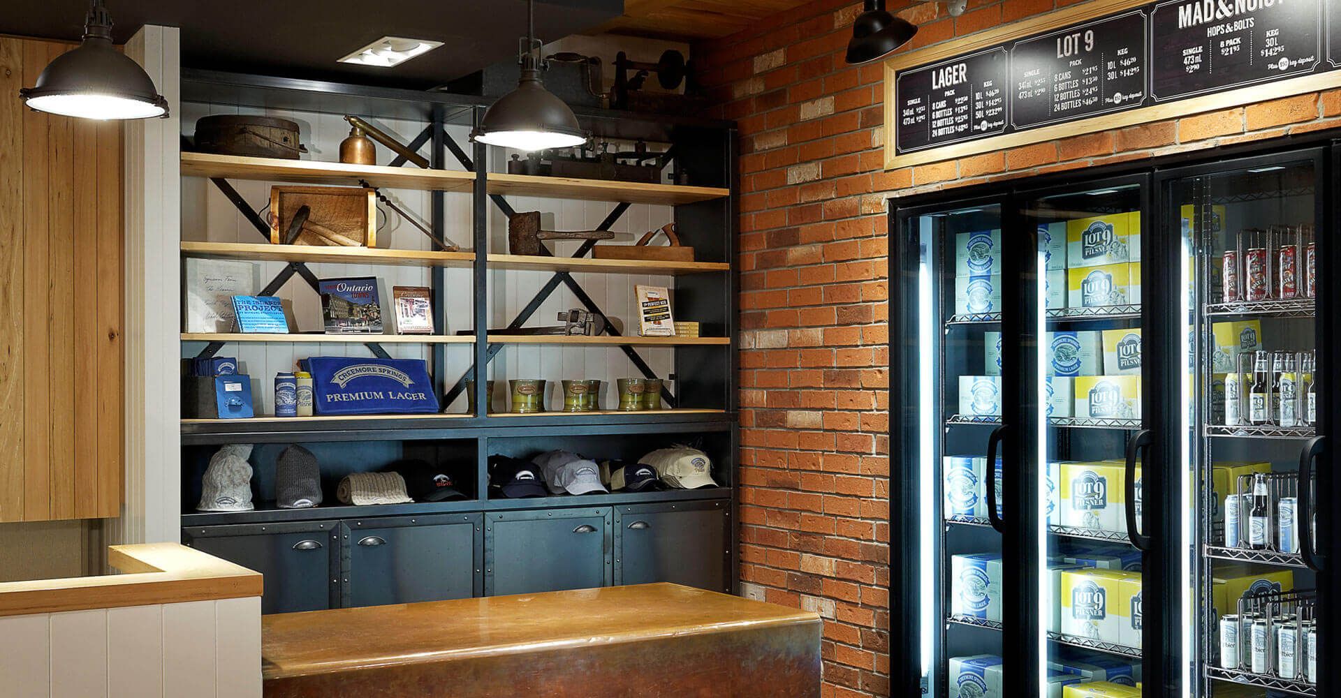
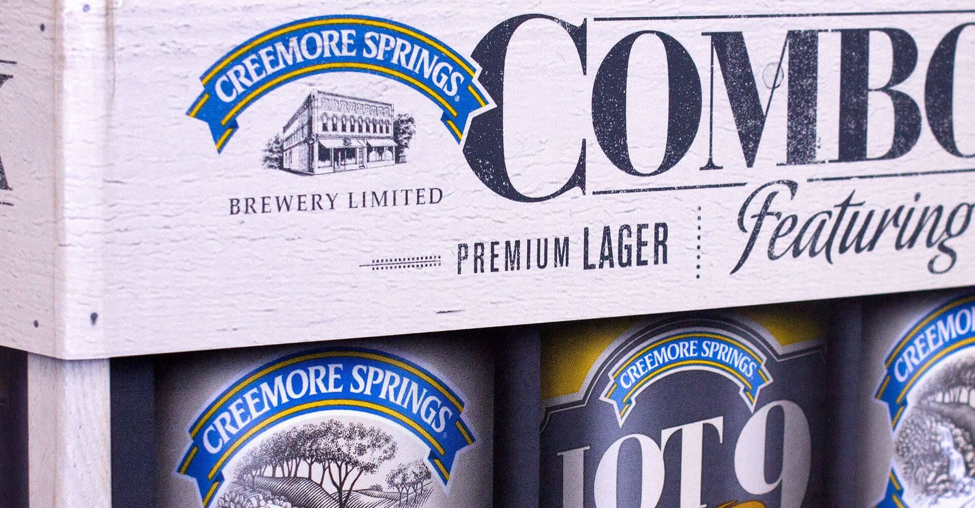
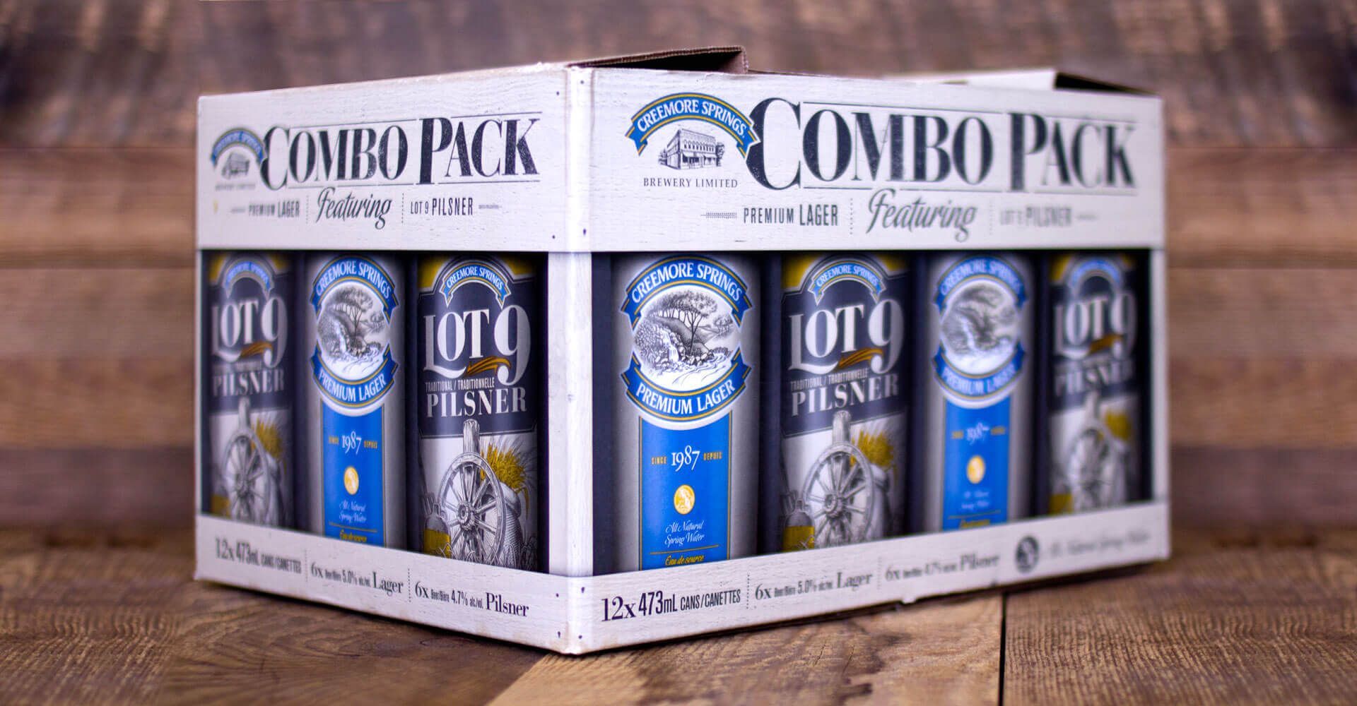
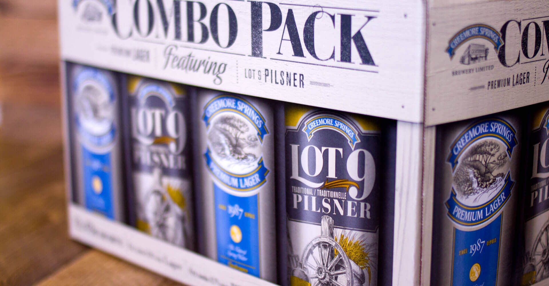
Differentiating Lot 9: With their Lager comprising 95% of total sales, next up for Creemore was a rethink of their Pilsner beer packaging. We encouraged them to differentiate the Pilsner by creating a separate brand that could be more easily distinguished from the Lager, and Lot 9 was born. The name derives from the plot of land on which the town exists; we scoured through town and brewery histories to arrive at a name the brewery and the town could own, and be proud of. Lot 9’s packaging design speaks to the history of Creemore, and the hit of yellow delivers wheat cues, and captures the lighter taste of the Pilsner.

A box of lot 9 pilsner beer is sitting on a wooden table.
An aerial view of a large wave in the ocean.

Slide Title

Slide description
Button

Slide Title

Slide description
Button

Slide Title

Slide description
Button

In the first 10 months after launch, Lot 9 has grown from being just 4.5% the size of the flagship Lager, to 12% its size (and the Lager is up 7% over the same period). The new Lot 9 was one of the TOP 10 selling craft beers at the LCBO in the 473ml tall boy size, and was named one of the most successful craft innovations of 2015. It saw an increase in sales of 40% over its predecessor, the Traditional Pilsner.

A box of beer is sitting on a wooden table next to a plate of fried chicken.
An aerial view of a large wave in the ocean.

Slide Title

Slide description
Button

Slide Title

Slide description
Button

Slide Title

Slide description
Button

Adding to the Collection: In addition to developing the Lot 9 packaging, we also designed the Collection pack, that features the two flagship brands along with one of Creemore’s seasonal beers.

A person is drawing a building with a pencil on a piece of paper.
An aerial view of a large wave in the ocean.

Slide Title

Slide description
Button

Slide Title

Slide description
Button

Slide Title

Slide description
Button

We created illustrations for each brand that evoke the tradition and heritage of Creemore.

A can of altbier beer next to a box of chicken wings and a glass of beer.
A box of creekmore springs altbier beer is sitting on a wooden table.

Aligning Altbier: The Altbier is one of Creemore’s seasonal beers, and we applied similar styling to its design in order to keep the family in line.

A kitchen with a long blue counter and stools

Redefining the Brewery Experience:

Creemore also realized that if they were going to entice visitors to the brewery, they needed to develop a better tour and tasting experience, and they called on us to assist. The new tour needed to provide more of an experience, and the new tasting room had to encourage beer and merchandise sales, and leave the visitor with a lasting connection to the brand.

A man is wearing a gray t-shirt with a tree on it.
A black t-shirt with the number 9 on it
A store with a table , shelves , and a cash register.
An aerial view of a large wave in the ocean.

Slide Title

Slide description
Button

Slide Title

Slide description
Button

Slide Title

Slide description
Button

Redeveloping an old hardware store at the front of the brewery put the retail operation front and centre, and allowed Creemore to maintain their connection to the neighbourhood.

A chandelier made out of beer bottles hanging from the ceiling
A row of beer bottles are lined up in a circle.
A large room with a brick wall and a refrigerator.

The larger tasting room is a place where both locals and visitors could stop in and meet, and buy beer, with increased refrigerator capacity for bottles, cans, and kegs.

A restaurant with a brick wall , a counter , and a refrigerator filled with beer.
An aerial view of a large wave in the ocean.

Slide Title

Slide description
Button

Slide Title

Slide description
Button

Slide Title

Slide description
Button

The tasting counter allows them to offer food pairings that elevate the perception of their beer, and reach-in coolers and merchandising displays have helped to increase sales.

A large copper tank is sitting in a room next to a window.
There is a large copper barrel in the middle of the room.
A large copper barrel is sitting in front of a window.
A table with three glasses of beer on it in front of a brick building.

A pass-through window to a beer garden connects Creemore with its German beer-making roots, and the refurbished original copper kettle was cut in half, placed on the inside and outside of the building, and etched with brand messaging to create further nostalgia around the brand and firmly root the brewery to its past.

A box of mad & noisy lagered ale next to a glass of beer and onion rings
A logo for hops and bolts on a red background
A sunny share logo on a yellow background

Innovation and Imagination: In 2012, To capitalize on the relatively new craft beer sensation, Creemore created an offshoot brewery, Mad & Noisy Brewing (named after the Mad and Noisy Rivers which collide in the village of Creemore, and produced two highly imaginative new beers – Hops & Bolts, and Sunny & Share.

A can of beer is sitting on a table next to a glass of beer.

These gave the Creemore brewmasters permission to experiment with their traditional recipes, and Creemore asked us to explore packaging that pushed their boundaries as well. The packaging is designed with a Barnum & Bailey meets steampunk style. Key illustration elements take their cues from the beers’ quirky style while strong packaging colours aid in shelf blocking.

A can of beer is sitting on a table next to a bowl of lemons.
An aerial view of a large wave in the ocean.

Slide Title

Slide description
Button

Slide Title

Slide description
Button

Slide Title

Slide description
Button

The hierarchy of the design establishes a consistent, recognizable structure. We worked closely with Creemore Springs Brewery, Cleansheet Communications, Master Packaging, ASL and Crown and Metal Packaging to achieve a very complex illustration across a wide spectrum of packaging formats. This “Imagination” series was well received and continues to sell in a highly competitive market.

A crate of creemore springs combo featuring premium lager
An aerial view of a large wave in the ocean.

Slide Title

Slide description
Button

Slide Title

Slide description
Button

Slide Title

Slide description
Button

Two Great Beers, One Great Package: The Combo Pack brings together the two flagship brands in the Creemore stable: their top selling Premium Lager and the new Lot 9 Pilsner.

A combo pack of beer cans is sitting on a wooden table.
An aerial view of a large wave in the ocean.

Slide Title

Slide description
Button

Slide Title

Slide description
Button

Slide Title

Slide description
Button

The package design needed to communicate effectively about what was offered inside, but in a rustic way that would build on the heritage of the brand. The final pack was designed to feel like a wooden crate like those found in old hardware stores, in keeping with the history of the brewery.

A box with a red car on it is sitting on a wooden table.

Celebrating Craft from Coast to Coast: The East meets West pack brings together two historic Canadian breweries from opposite ends of the country – Creemore in the east, and Granville Island in the west.

A box that says east meets west on it
An aerial view of a large wave in the ocean.

Slide Title

Slide description
Button

Slide Title

Slide description
Button

Slide Title

Slide description
Button

The packaging is reminiscent of old luggage cases, complete with stickers on top.

A red truck with barrels of beer in the back
An aerial view of a large wave in the ocean.

Slide Title

Slide description
Button

Slide Title

Slide description
Button

Slide Title

Slide description
Button

The illustration shows an old red pickup truck (nothing more Canadian, eh?) approaching a signpost indicating direction and distance to the two breweries. The street scene behind is of Saskatoon, as marked by the old Broadway Theatre. Creemore is represented visually by the waterfalls on the right side, and BC is represented by the mountains on the left.

A black and white drawing of an old truck with barrels in the back.
A close up of a map of east and west

2018 — Davey Awards (Silver Award)

awards

if you like those, you might like...