get in the game
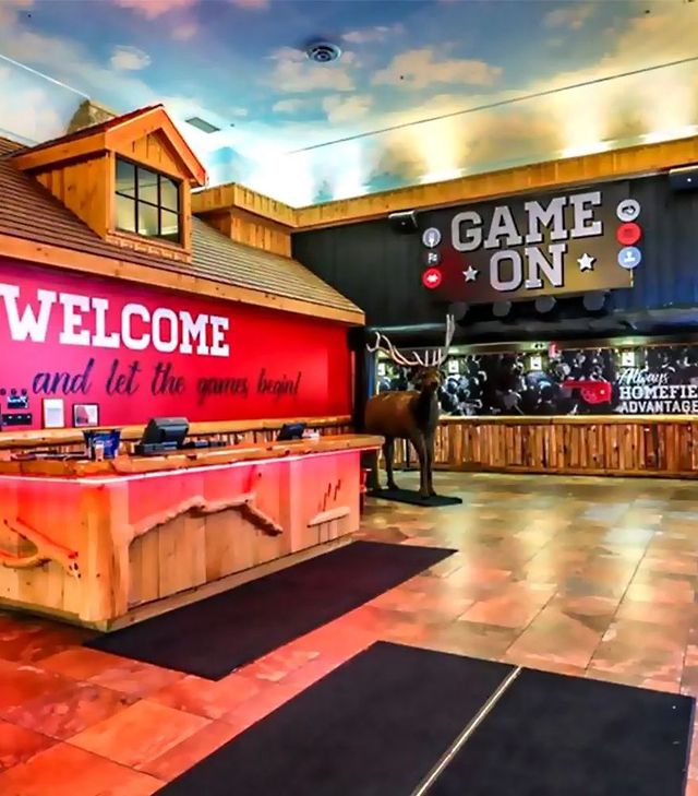
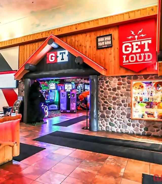
Game Time is a large scale restaurant and gaming destination that is lively and full of action. The 20,000 + sq. ft. model features a restaurant/bar side to eat and watch sports and a gaming side where you win tickets that can be cashed in for prizes. Their goal is to be the go-to destination for event viewing and family fun in rural markets across Ontario.
Restaurant, Retail

Game Time was previously a concept known as Wacky Wings. With only a handful of locations in Southern Ontario, they recognized the opportunity to develop a new brand that would better convey their full offering. Armed with the name Game Time, Jump was enlisted to reinvent the concept into a more modern and relevant brand that would be poised for growth and expansion.

Jump began the exercise by developing the brand identity for Game Time. It was designed to have a collegiate feel that would appeal to a male audience and help to convey the sports aspect of the offering. The ‘GT’ icon features a ticket shape and ‘play’ symbol that are relevant to both sports and gaming.


For the two initial locations, Brantford and Mississauga, we were working with existing architecture.
These two Wacky Wings locations previously featured a log cabin decor with the walls covered in hundreds of pieces ‘Canadiana’ knickknacks. The gaming sides of the facilities were a mass of neon and random palm trees. After stripping the walls clean, we worked to develop a series of large graphic moments that were sports related for the restaurant side, video game specific for the gaming side and more neutral in the lobby area. We gave the restaurant artwork a humourous and irreverent flavour, paying homage to the fan. We also developed a series of menu’s that fit the branded theme and featured the same whimsical tone of the new art package.
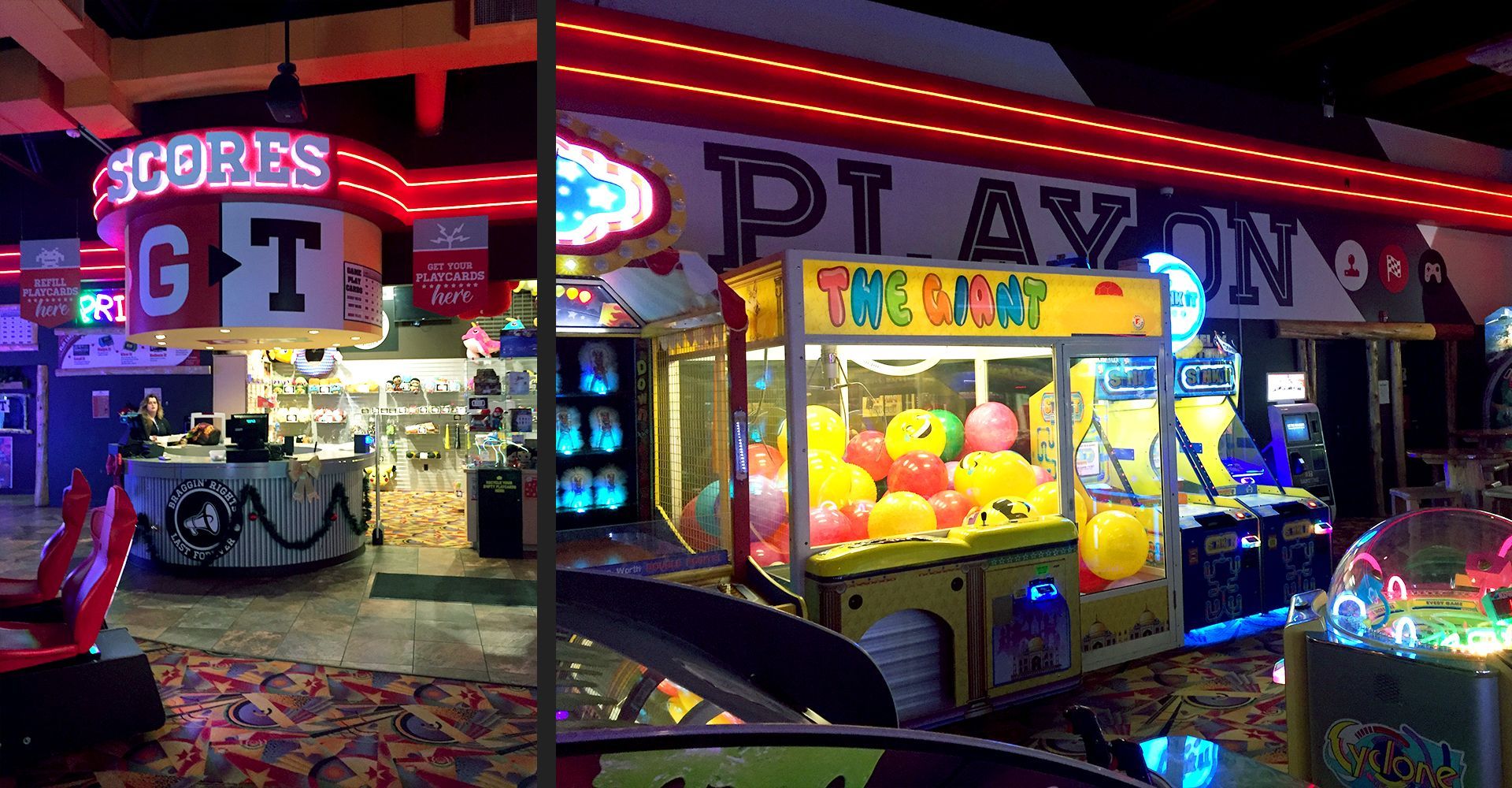
For the gaming side, the wall art was designed to be more bold and graphic to work within the busy environment. Jump developed a branded redemption store within the gaming area named ‘Scores’ and made this the focal point of the space. We used glazing on the facade to open up the sight lines to the prizes and to help draw customers in.


Overall, the transformation of the initial locations was remarkable given the budget they were looking to stay within. The red and black theme now permeates the space with the large branded moments adding character and a proprietary element. The concept has been well received and their plans for expansion to numerous other rural markets is now underway.