
limited edition
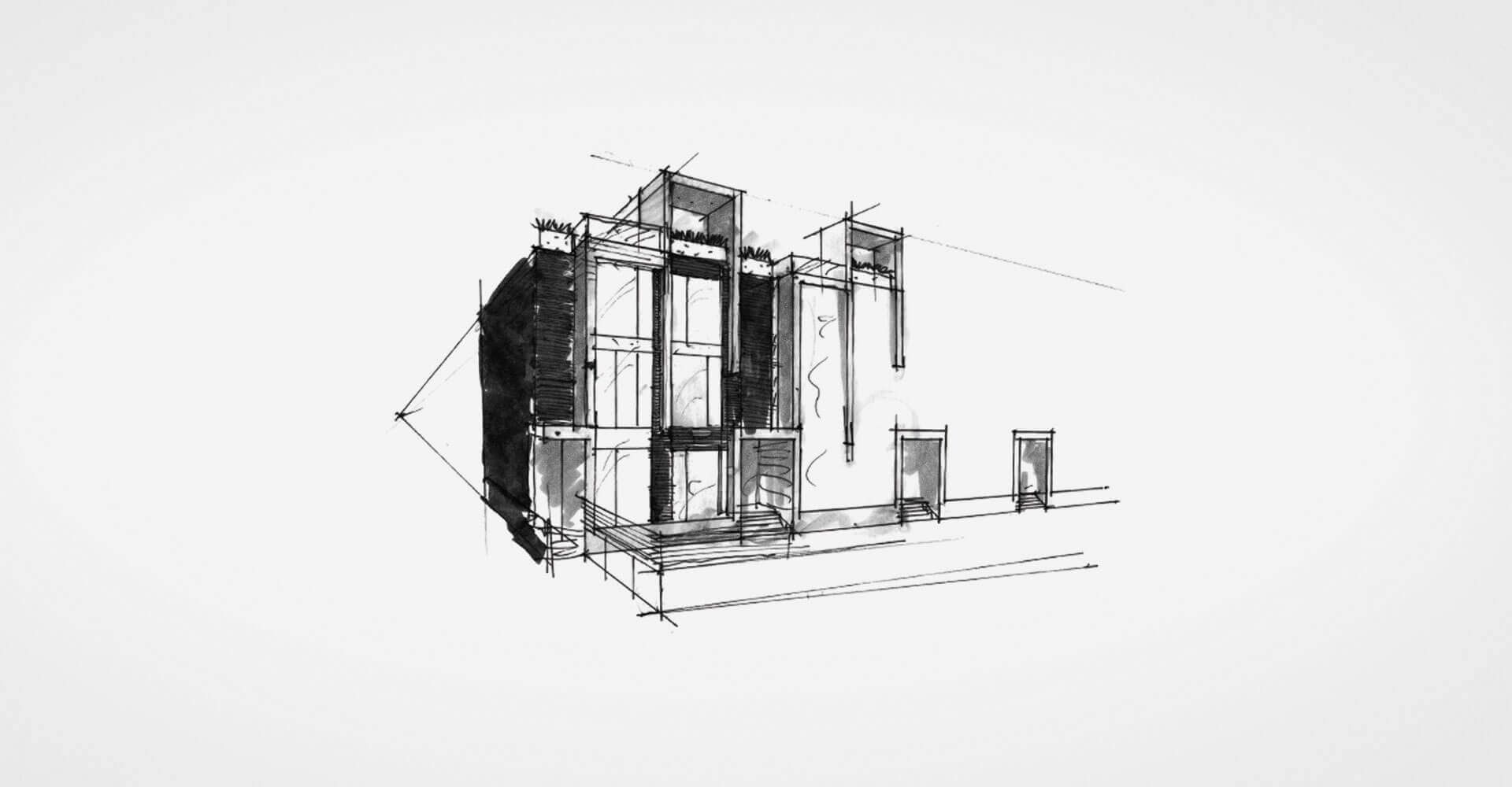
Offering more than a location, but a lifestyle, the property market in Toronto’s impossibly hip, newly gentrified Queen West neighbourhood continues to boom. Curated Properties broke ground in fall 2011 with the announcement of their Edition/Richmond development, offering twenty customized luxury residences in the heart of Trinity Bellwoods.
Identity, Retail, Marketing

We delivered the essence of a limited edition luxury residence development that fits in and stands out in the gritty transitional neighbourhood of Trinity Bellwoods.

The branding program initiated encompasses logo, stationary, showroom signage, a project book, advertising and marketing materials. The deliverables balance the exclusive, clean, customized luxury of Edition/Richmond with a Queen West approach. Our logo design underscores the development’s limited nature, curated messaging and chic setting. The employment of clean, contemporary typography and a diverging word placement reconstructs the sleek intersecting lines of the exterior architecture to produce a consistent branded experience. ‘Edition’ meanwhile supports the unique character of each residence.


Supporting the launch, Curated Properties jettisoned a standard sales space in favour of a gallery-inspired Sales Centre.
Fashioned from an on-site refurbished transmission shop, the interior, as designed by Cecconi Simone, is completely whitewashed. Appropriate to the context, our design of the exterior signage follows the logo’s deconstructed, contemporary aesthetic with an understated appeal. In homage to the exclusivity of the offering, numbers one through twenty are stenciled in rows along the exterior, creating an artistic statement and heightened curiosity. Inside, found objects, including vintage cars and auto parts, transform into art installations. From this, we pitched the idea of curating the neighbourhood to create a gallery space. After all, buying a residence is essentially buying into the neighbourhood.


In partnership with PR firm Kim Graham, who conducted a series of interviews with local businesses, we commissioned local photographer Graham Powell in photographing the interview subjects, the neighbourhood, and assorted locals. Our selections from this body of work were used to create a collection of 20 limited edition 4X8’ canvases that transformed the sales centre into a gallery. The bold black-and-white images of the ‘Neighbourhood Edition’ exhibition capture the lively culture exclusive to the area while perfectly countering the whitewashed interior. Resulting is a visual construction of what you get not only walking into Edition/Richmond but also the possibilities offered right outside. The functional space successfully utilizes key strike zones and way-finding systems – maximizing the buyer experience and fostering connections beyond the physical environment. The success of the gallery design has welcomed the adaptation of the space as an exclusive venue for special events. Among the celebrations held within include three major TIFF parties and even a wedding.

As part of our mandate, we created a takeaway designer-quality project book for prospective buyers. The modern layout tells the story of the Trinity Bellwoods neighbourhood and features curated listings of the neighbourhood shops and restaurants. Hand written quotes from shop owners are displayed against the gritty black and white photography of the neighbourhood and the business owners. The first half of the book moves from day to night, in only black and white. Then, near the end, the full colour renderings are finally revealed, successfully capturing the essence of a neighbourhood in transition. The book offers buyers an opportunity to take home and continue to connect with the Queen West culture. As the launch date neared, we further generated buzz online. Jump designed a website to offer registration for Edition/Richmond’s Vernissage opening with a stream of updated images to spark interest. Designed to tease the upcoming project, the site successfully saw a huge turnout for the opening event and continues to draw Sales Centre traffic.
The team at Jump were an integral part of the launch of Edition Richmond. From early on they grasped our concept which was to create a limited edition luxury brand that would have to fit in and stand out within an urban transitional neighbourhood – no easy task. Their creative approach and strategic vision enabled them to produce a branding program that differentiated us within our category. They were unselfish and responsive team players whose goal was the undeniable success of our brand.
Adam Ochshorn, Co-Founder Curated Properties


The response was exceedingly positive. The property sold well and also sparked tremendous press interest with feature articles in the media on the gallery space and Graham Powell’s photography exhibition. Curated Properties would also later engage us on the re-branding of their own logo and website design.