Good Served Here
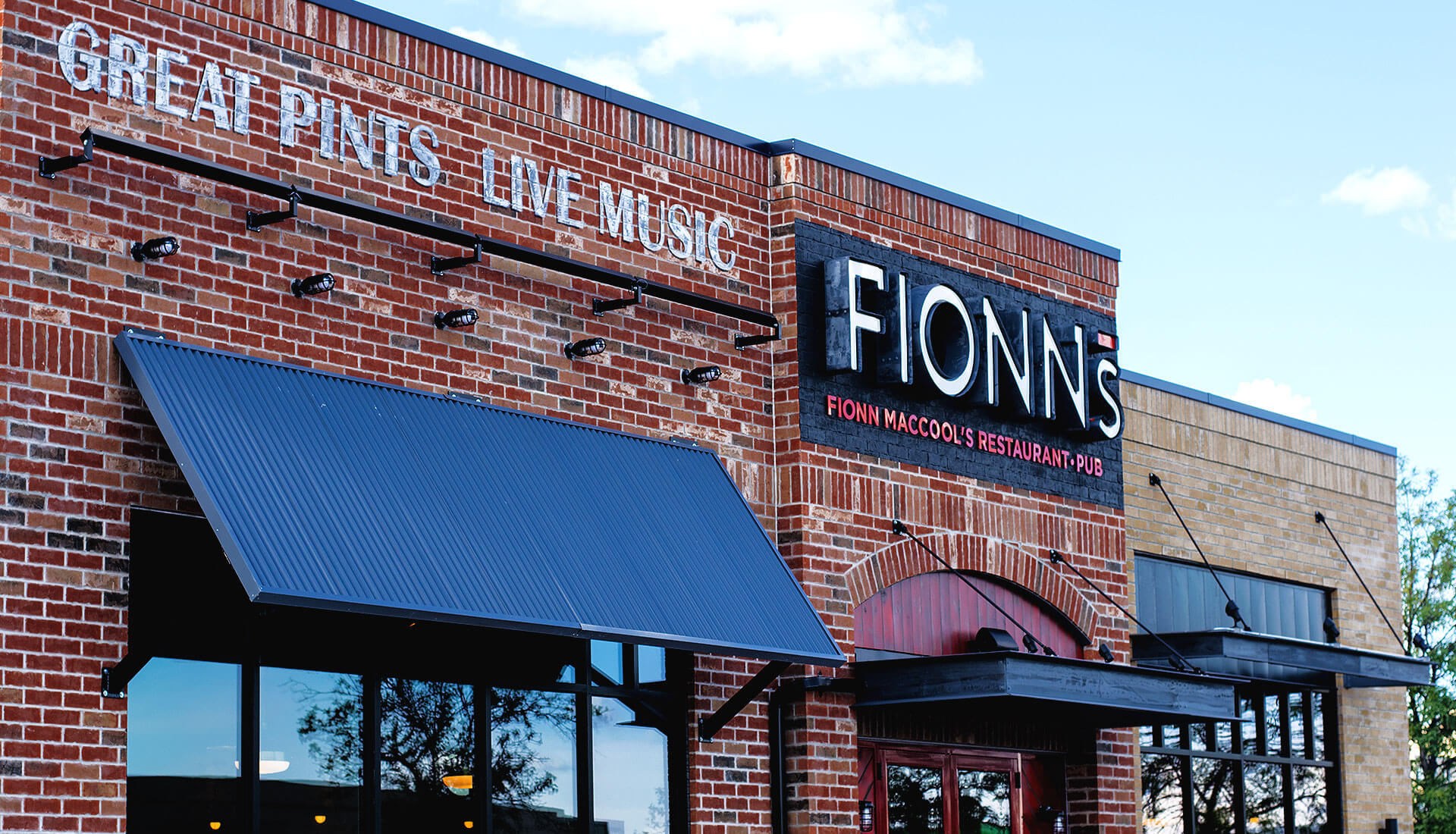
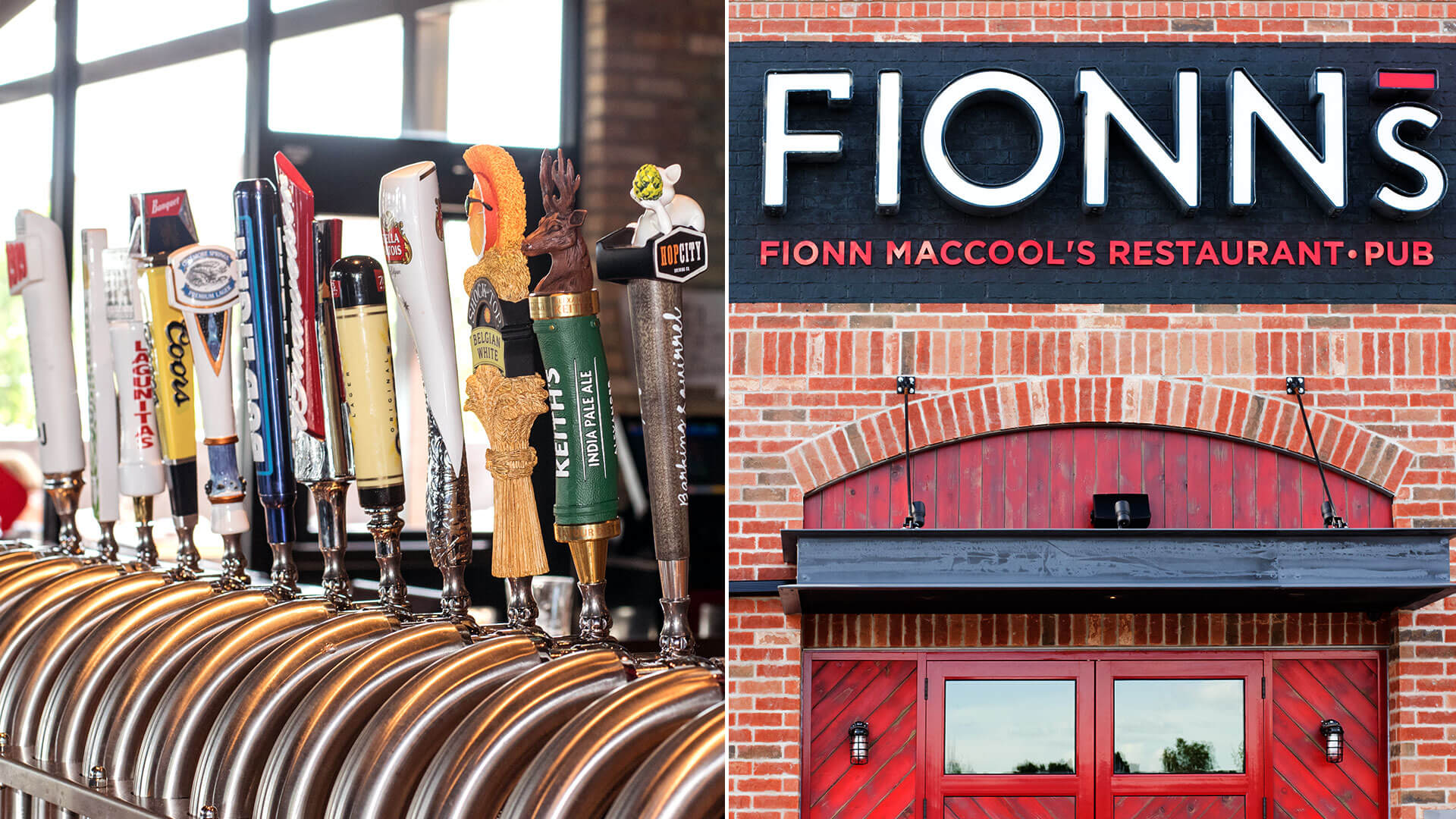
Fionn's
Fionn’s has been serving up Irish pub fare and festivities across Canada for over two decades, and it was time for a refresh of the iconic pub chain. Starting with a change in name – dropping ‘MacCool’s’ in favour of the simplified ‘Fionn’s’ – we were called upon to develop a new logo, sign program and menu that captured the renewed spirit of the brand.
At the core of our effort was revitalizing the essence of the traditional Irish Pub that is synonymous with the Fionn’s brand. In order to differentiate Fionn’s from the traditional Irish corner pub, it was essential that we bring a sense of modern fun and brand language that spoke to the restaurant’s Irish origins, told the back story of the legendary Fionn MacCool, and unapologetically remind customers of the pillars of Irish pub tradition – food, drink, and fun.
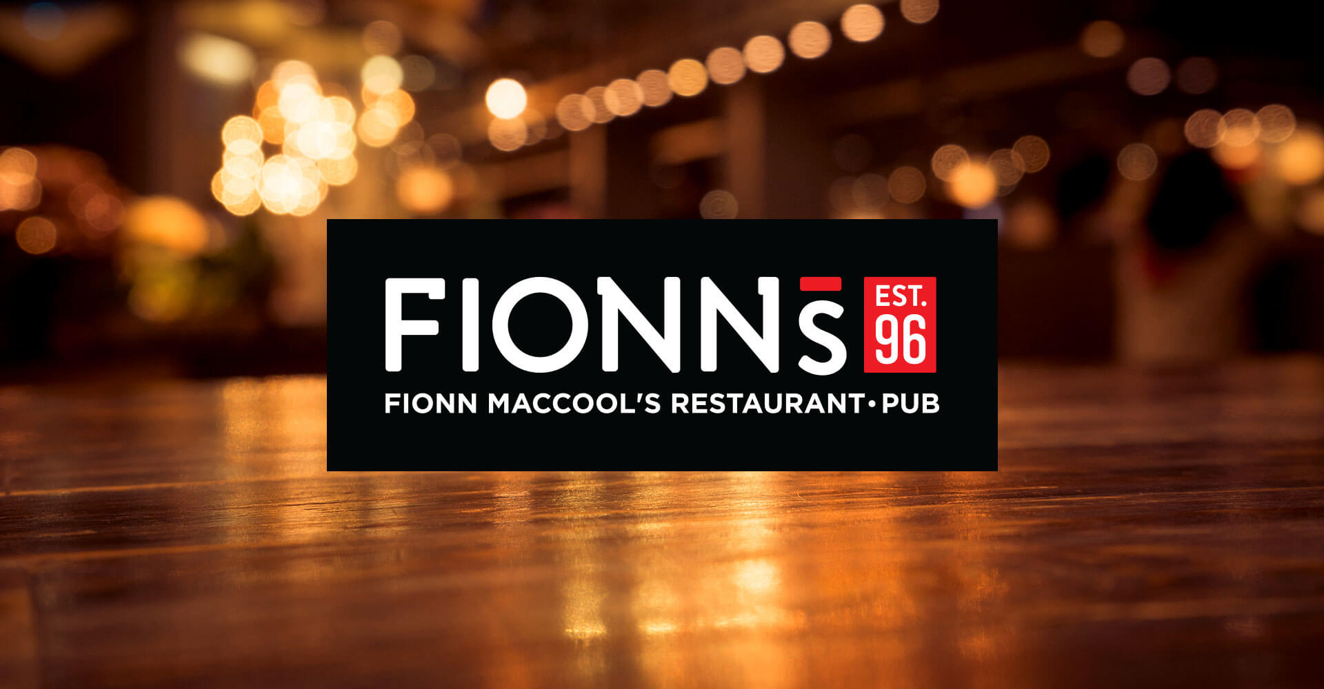
Starting with the logo, we stripped away the classic but expected celtic typeface in favour of a more contemporary, proprietary execution. Using a sans serif font with some deliberately placed serifs that add style and hearken to the gaelic roots of the brand makes make the mark ownable. We simplified the logo while maintaining the black on white execution, using red as an accent colour in place of the tired gold. The red diacritical macron above the “S” in Fionn’s stands in place of the apostrophe, and denotes a roof or “safe haven”, a role the Irish pub traditionally serves.
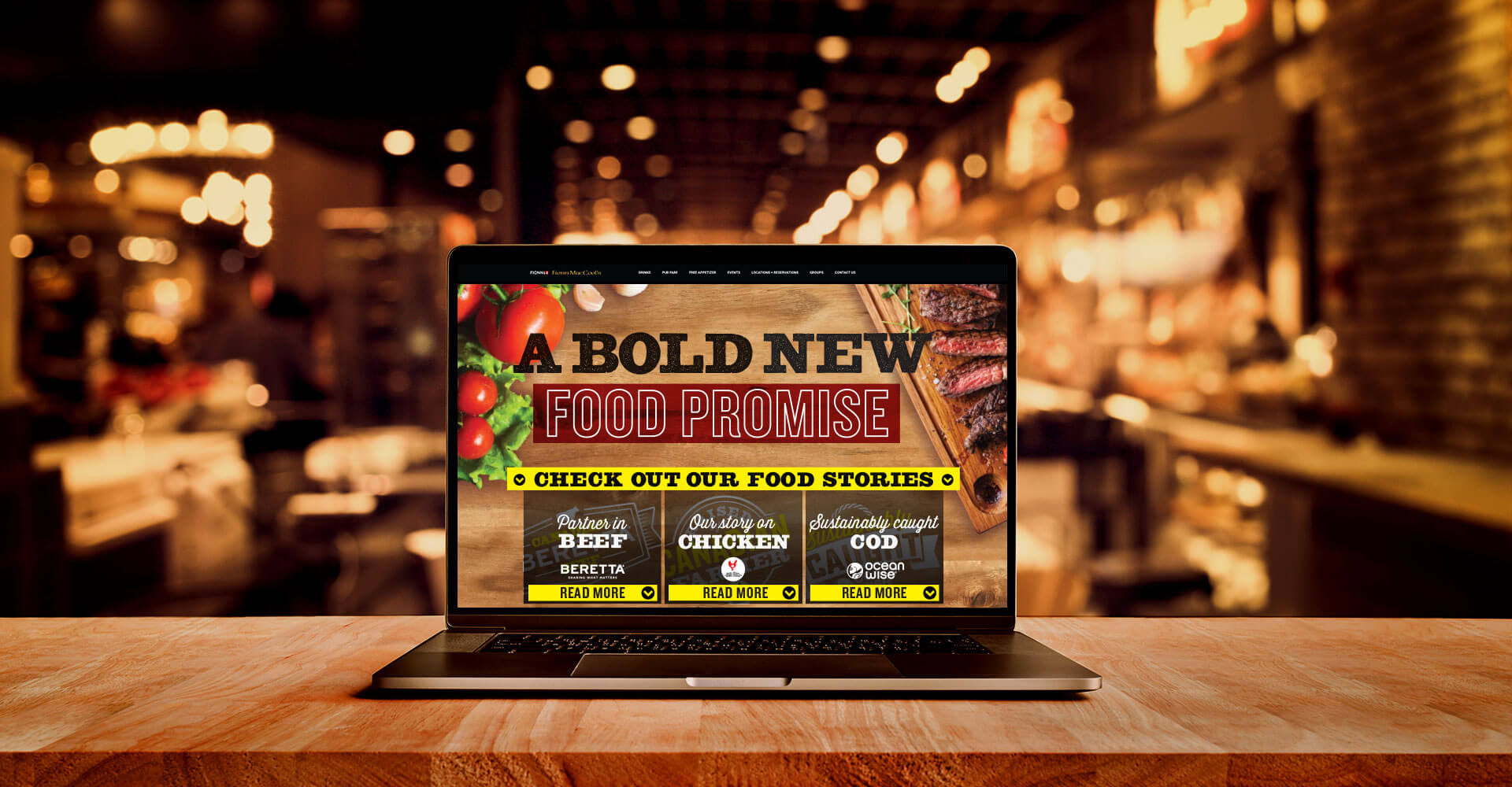
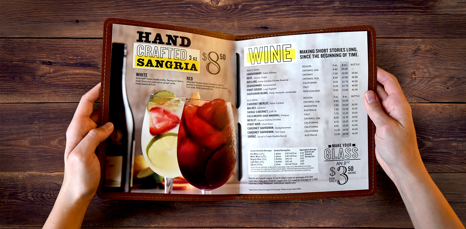
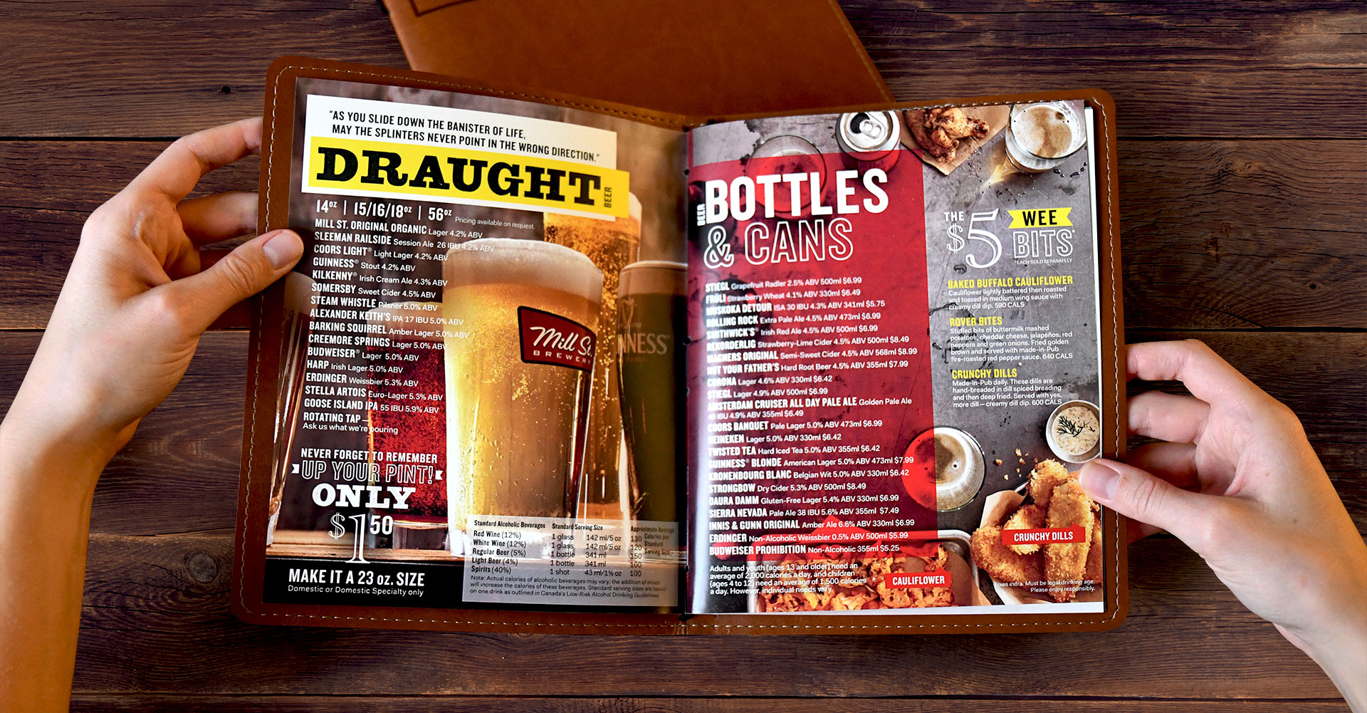
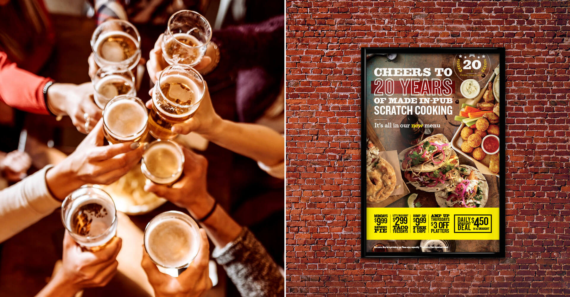
Fionn’s has gone a long way to sourcing better foods and needed to do a much better job in telling their story. The previous menu was stark, the photos uninspiring, the format rigid and cold, and the food story untold. Pubs often cook by deep frying frozen foods, but Fionn’s works to prepare and cook real food in their kitchen, like their made-in-pub savoury pies and burgers.
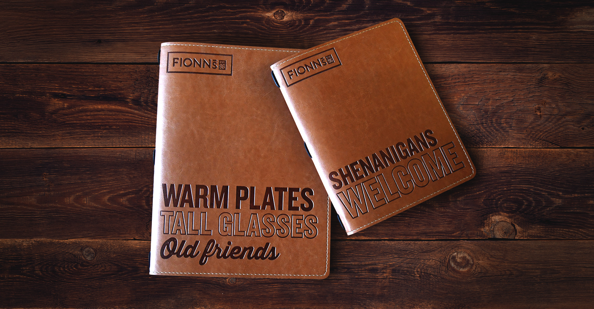
While the food overhaul started with the offering, the new leather-bound menu, worn like an old catchers mitt, is warm and friendly. The traditional pub story on the interior menu flap now tells the story of local food sourcing, with a connection to a local family farm, one of their valued suppliers.
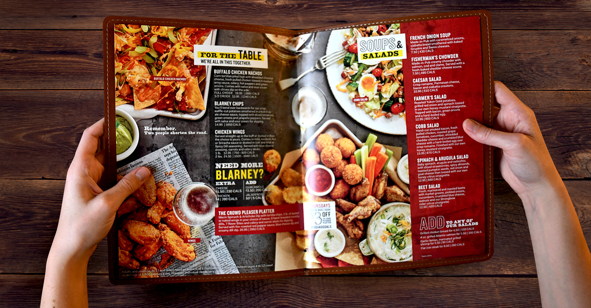
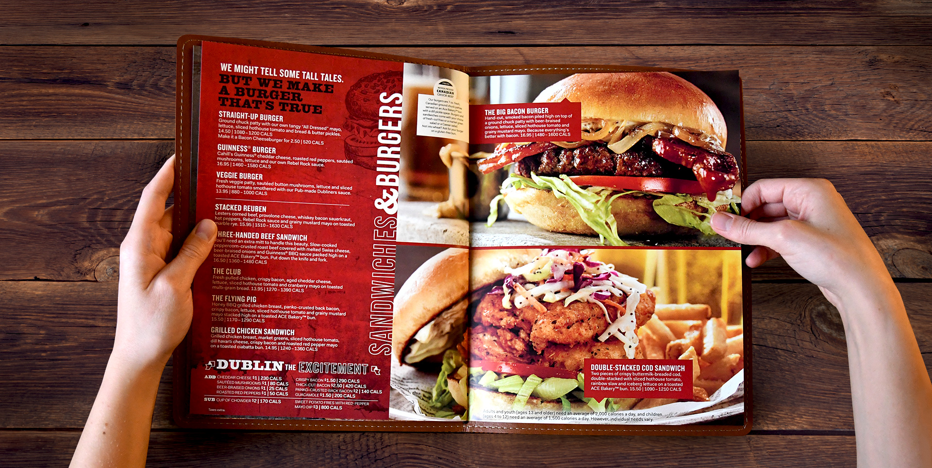
The revised format required new food photography, and we directed the new shots to capture the flavour and story of a night at the pub. The sense of texture in the photos brings a pub feel to every pic, with permission given to have a drink with your meal in every shot.
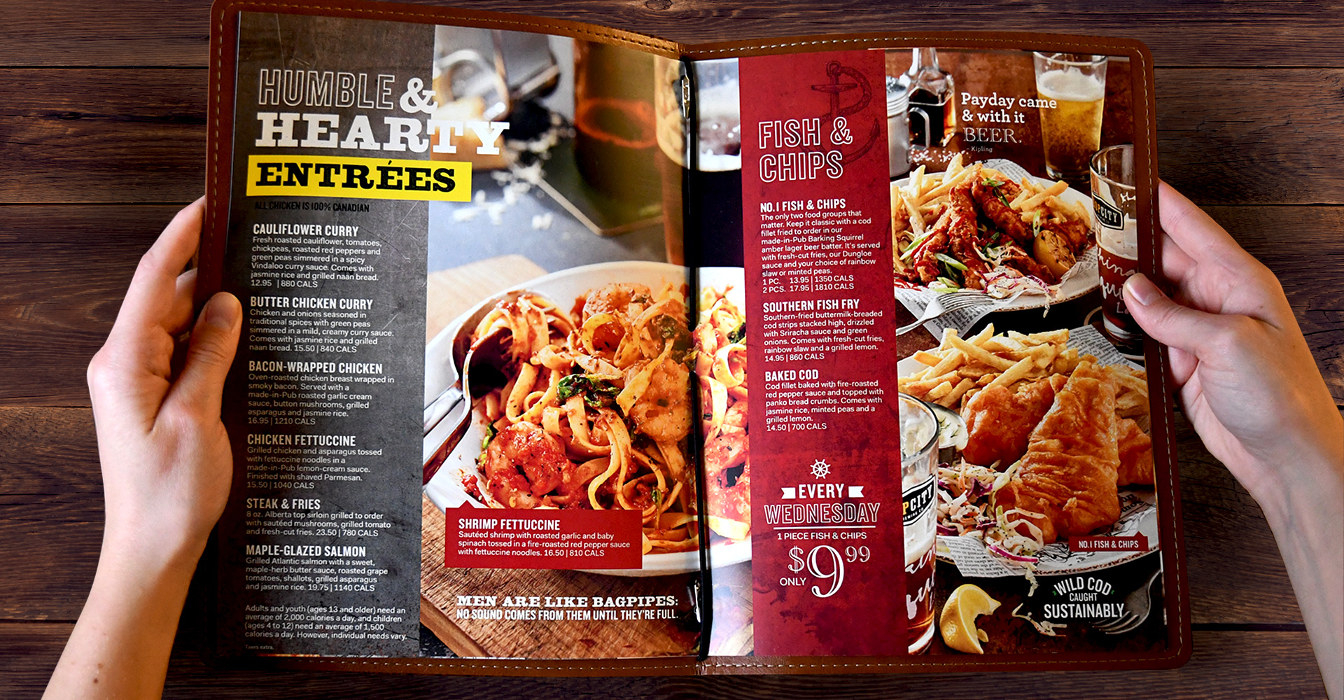
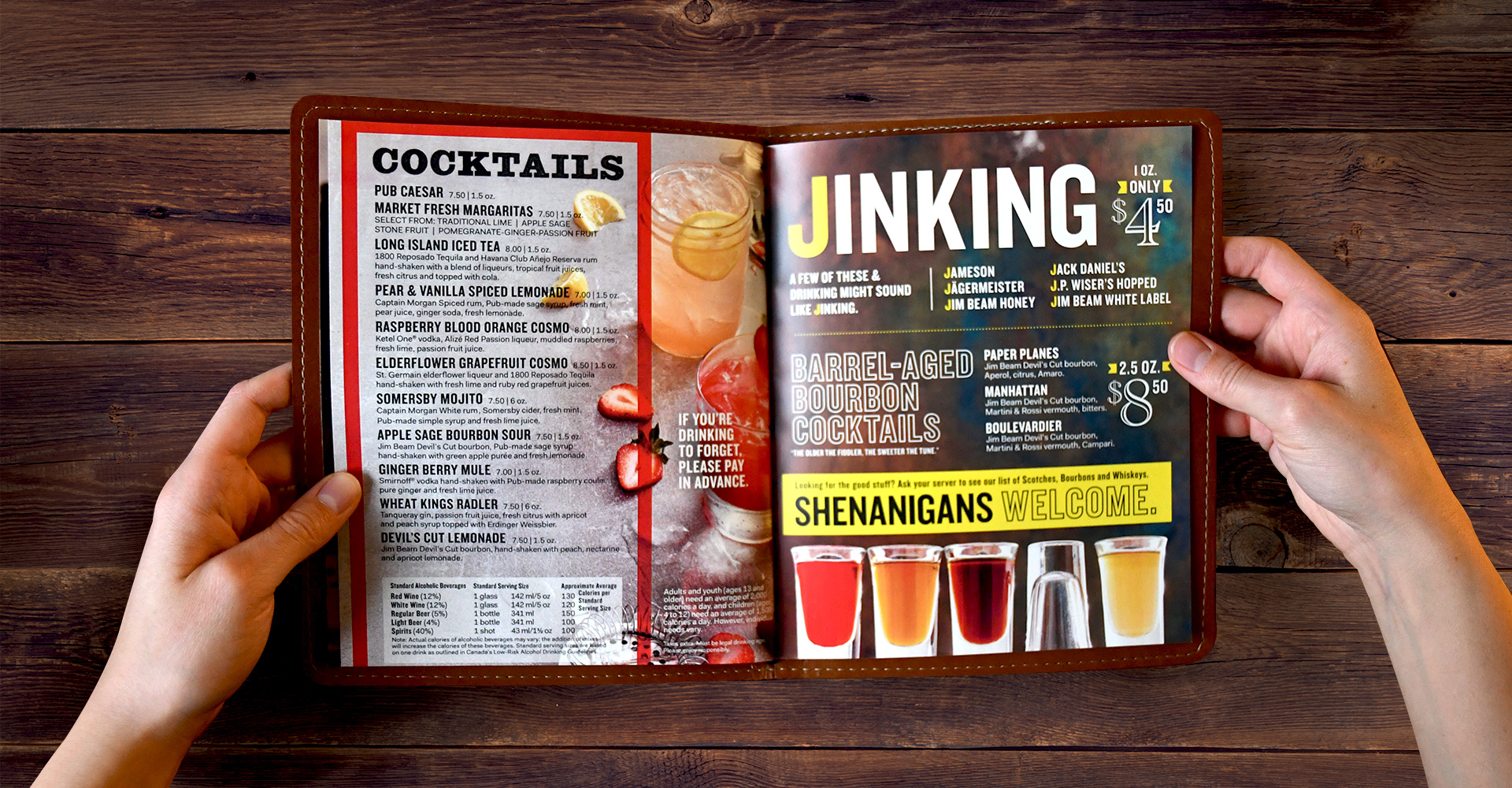
Food captions better describe the taste and quality of the food, and renewed food descriptions developed by our team align with the brand story. These create appetite appeal through rich language that heightens expectations, with all of the Irish charm and humour you’d expect from the brand.
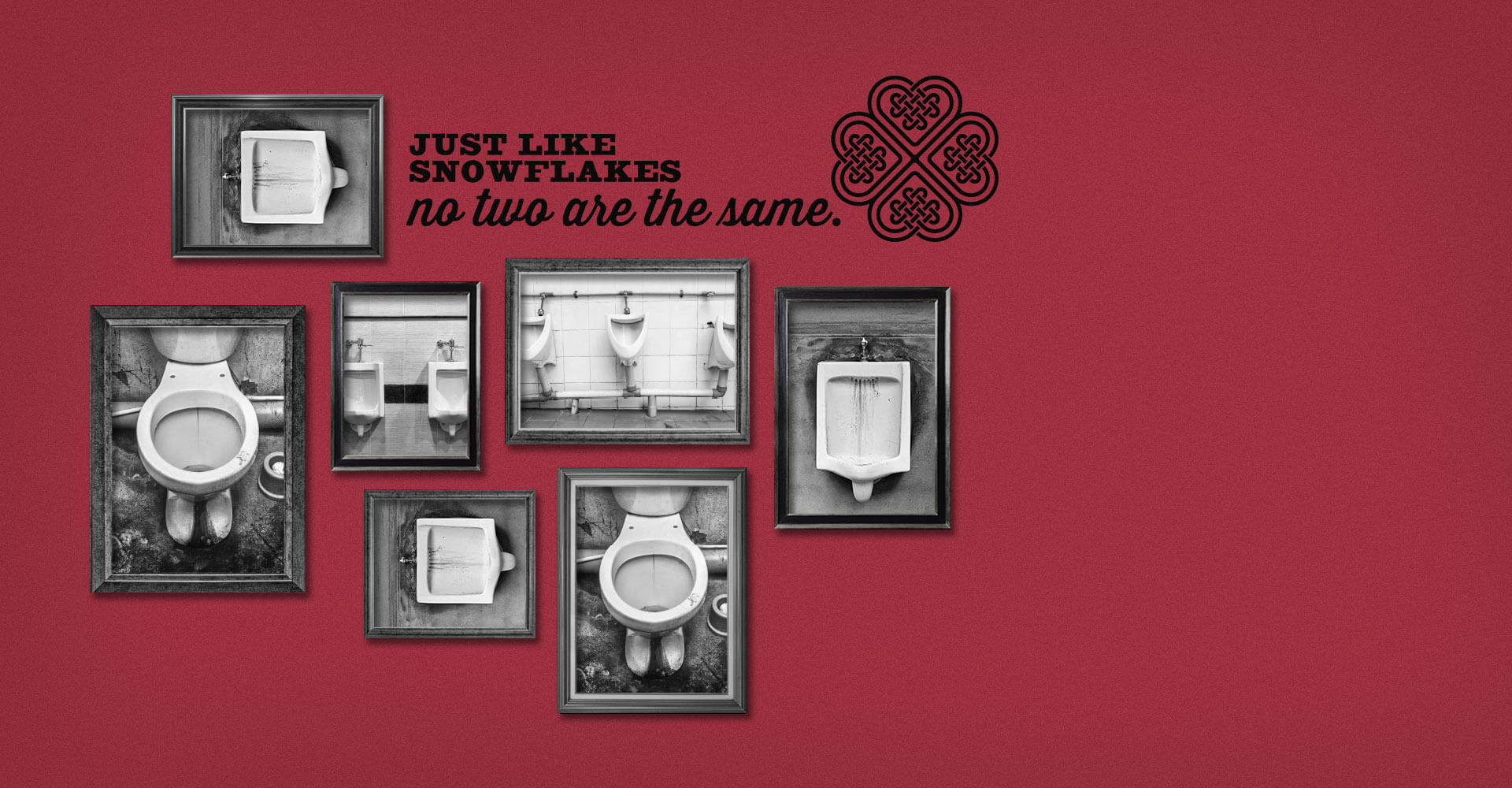
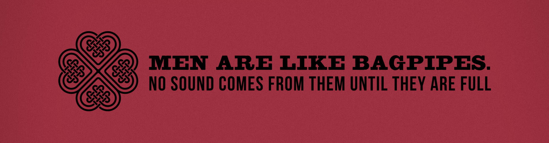
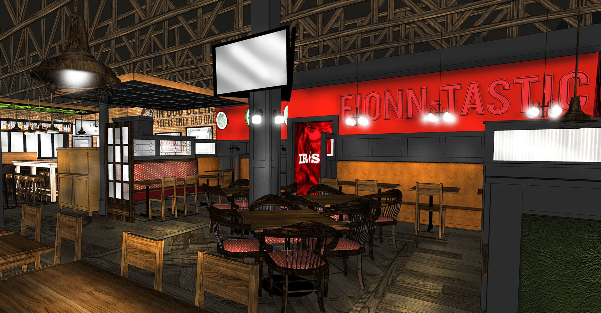
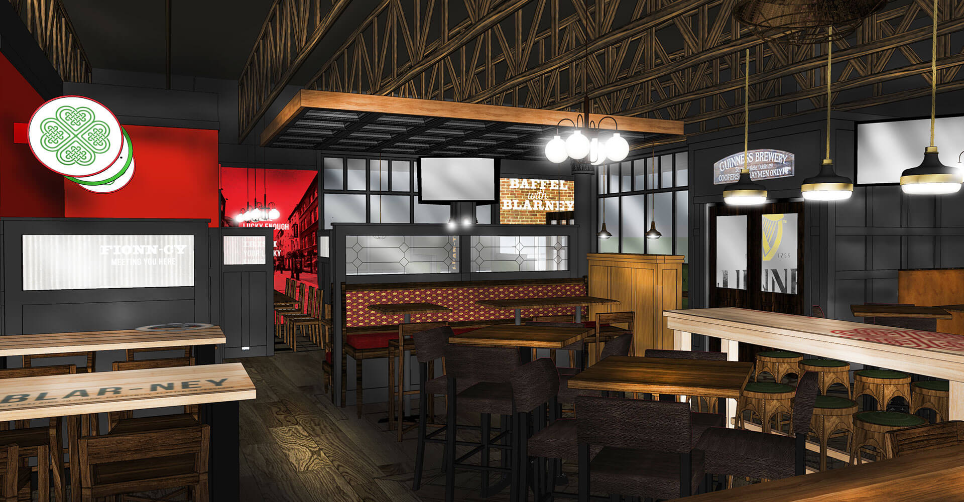
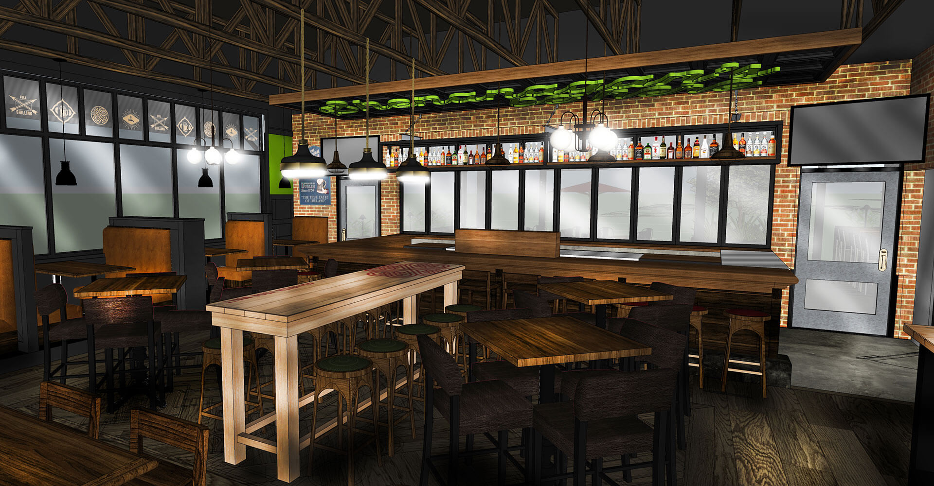
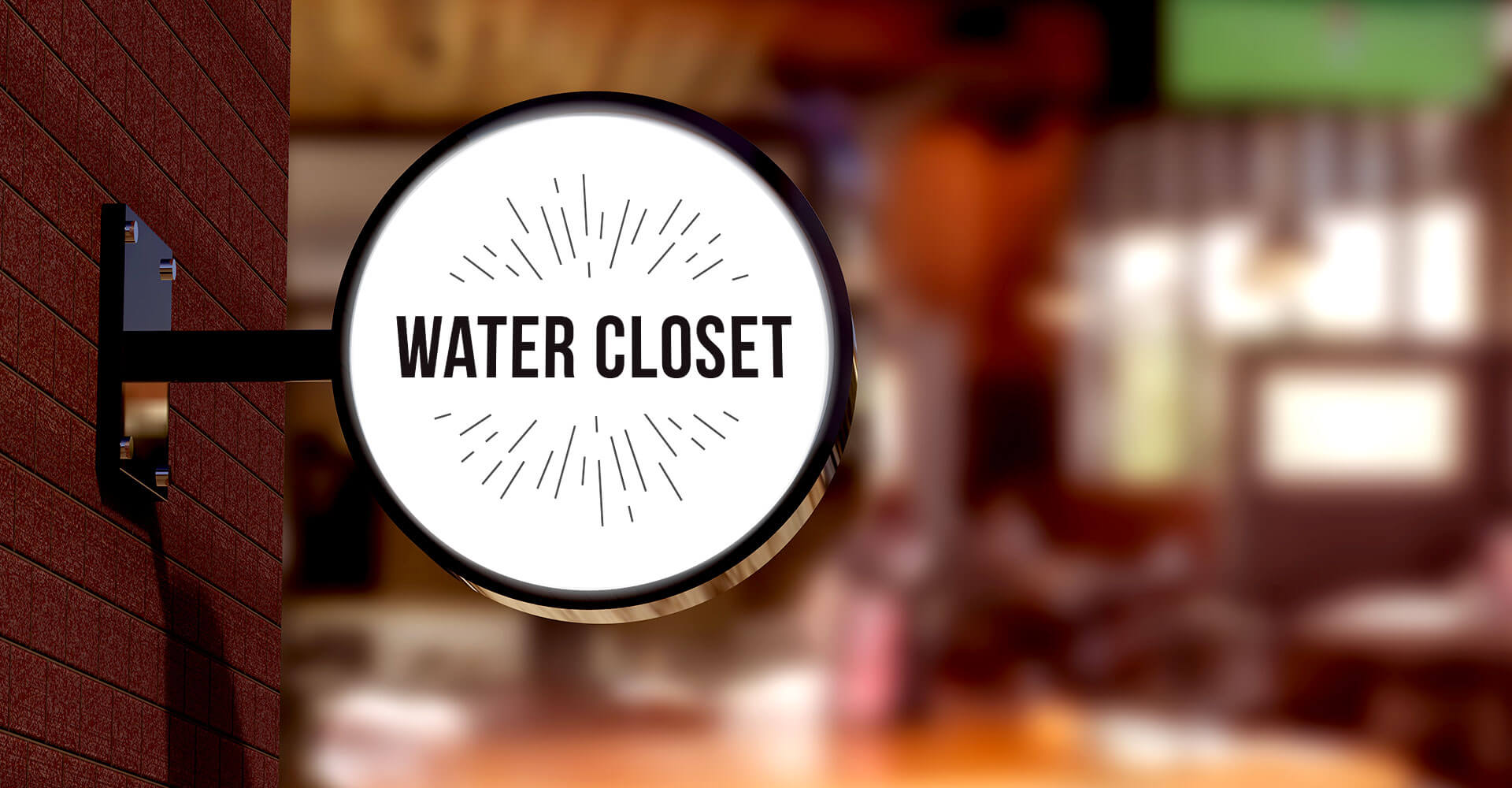
Inside the restaurant, brand messaging greets the customer from the moment they step into the vestibule. Daily beer specials set the tone for what’s to come, as does a large wall graphic clarifying the pronunciation of Fionn’s in a cheeky and light-hearted way, helping to put guests at ease.
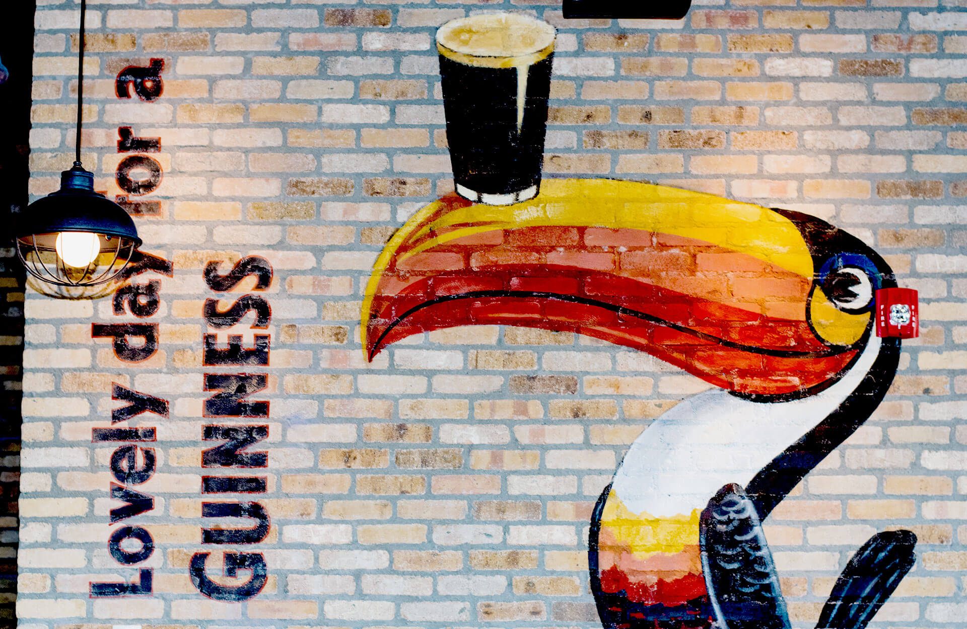
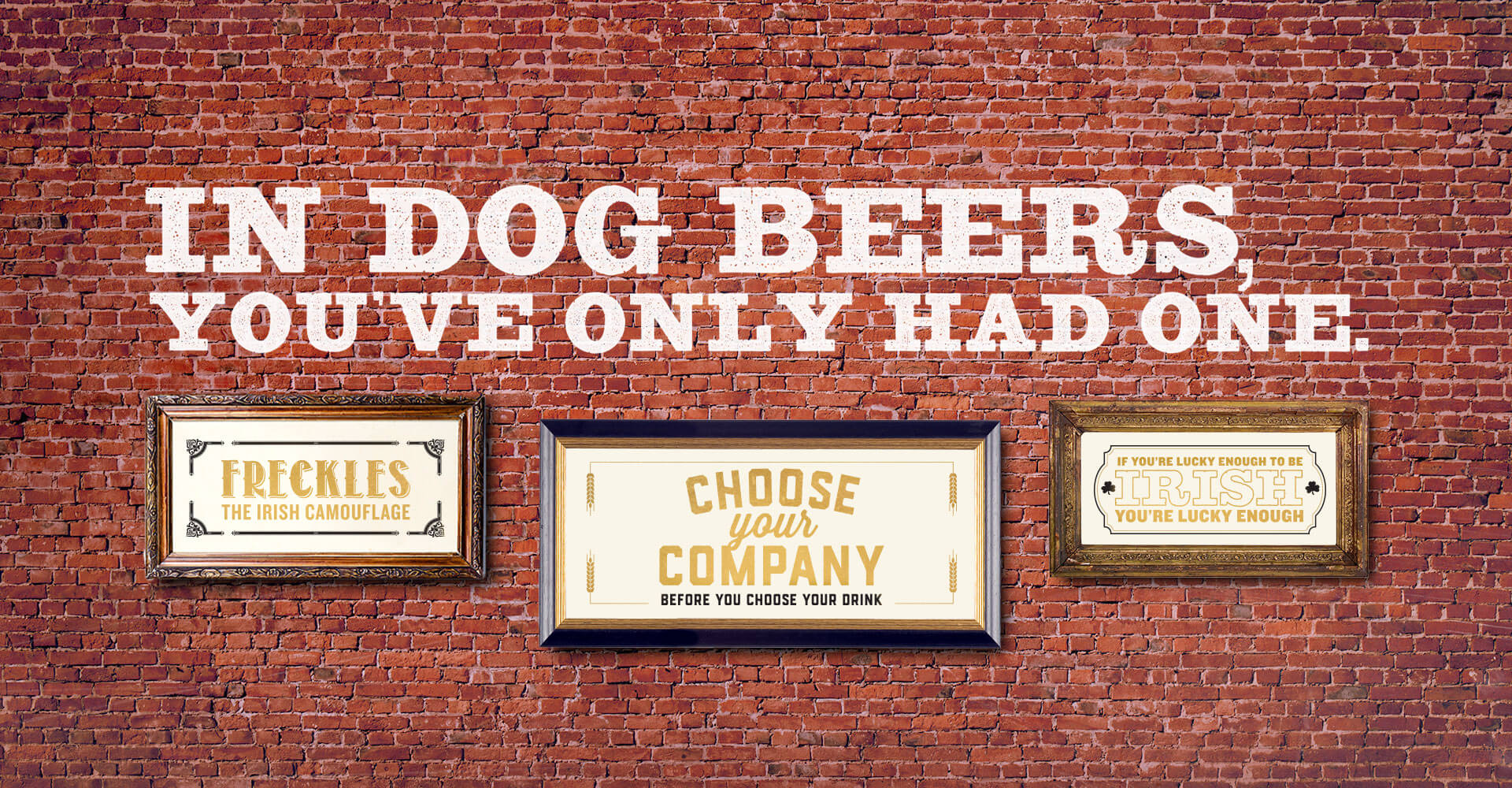
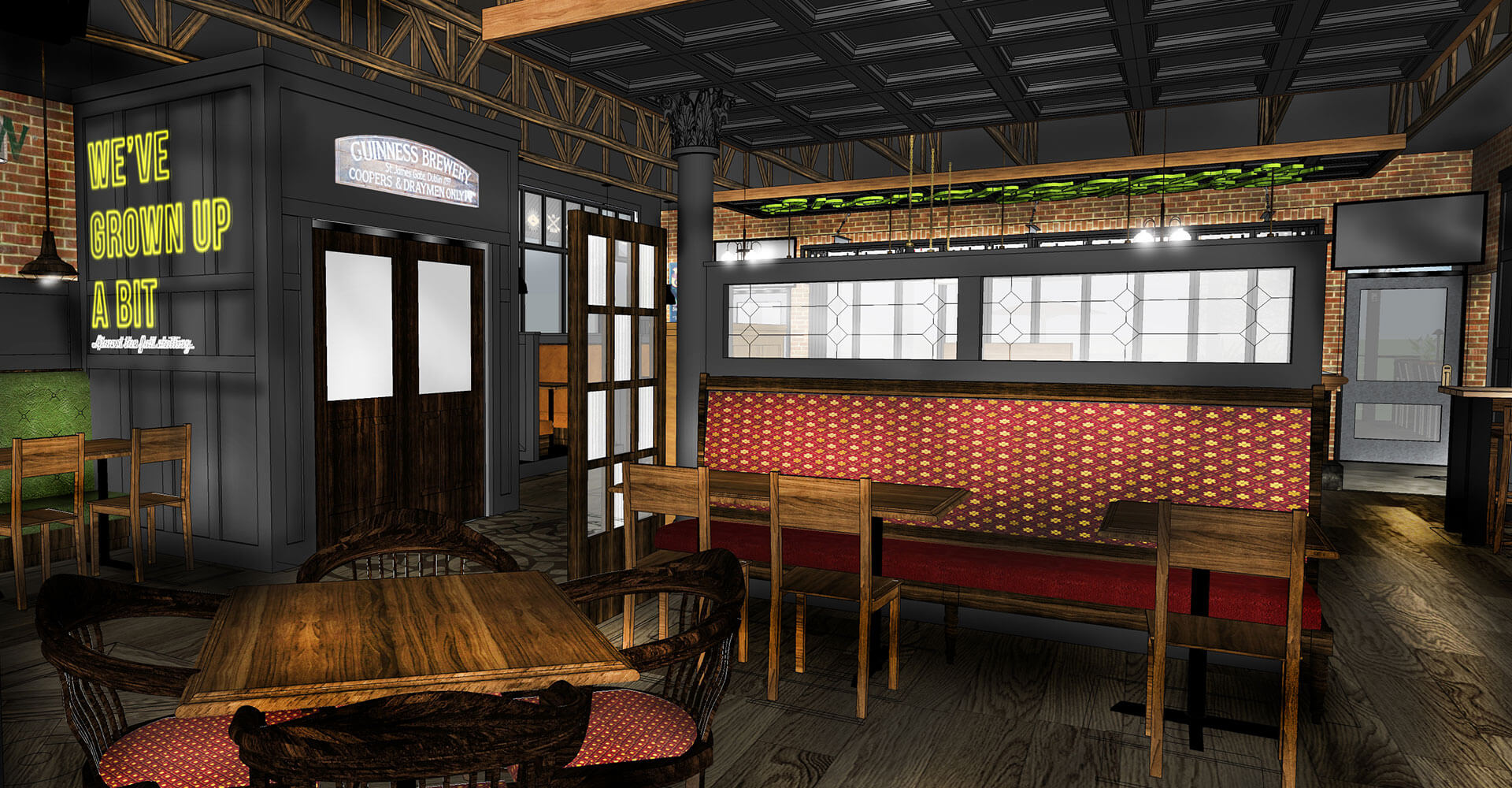
A full wall graphic tells the legend of Fionn and the Scottish Giant Benandonner, displayed over a tone-on-tone image of the Giant’s Causeway in Ireland. Other messaging playfully claims ownership of Irish stereotypes in an irreverent but friendly tone, and advertises Irish favourites like Guiness and Jameson’s whiskey.
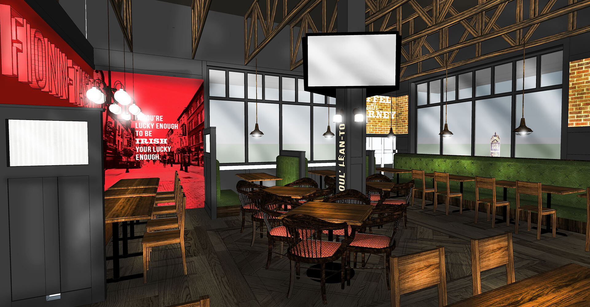
A large sign over the door on the interior claims the heritage of the brand, stating “If you’re lucky enough to be Irish, you’re lucky enough”.
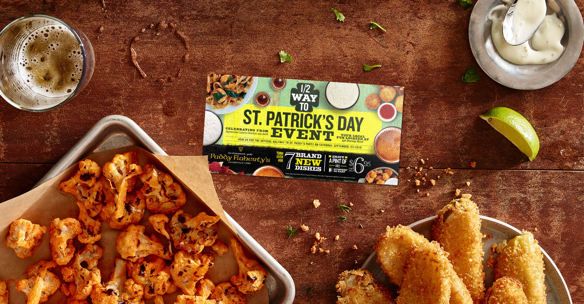
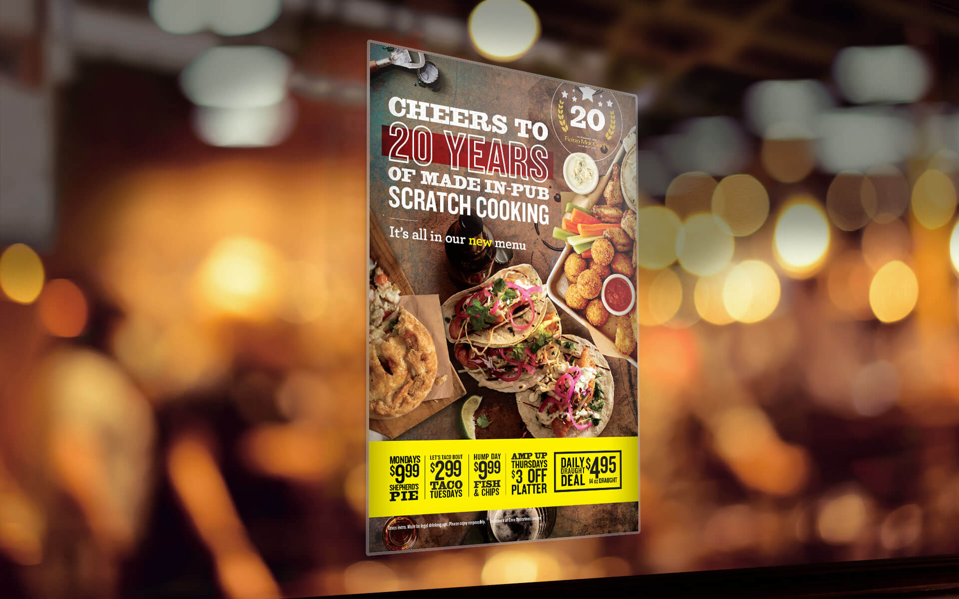
To celebrate occasions like St. Paddys day, the summer menu, and Fionn’s 20th anniversary, we developed promotional direct mail pieces that were also rolled out in-restaurant on table tops and at the bar. These were intended to introduce the rebranded Fionn’s and the renewed menu offering to customers new and returning.
The new Fionn’s brand and restaurant design package began rollout in the spring of 2017.