bringing the garden to life
The bloom had come off the Garden Gallery brand, and we were there to nurture it back to life. Now it’s healthy and thriving, and generating more customers to a company for whom growth is at the root of their business.
Garden Gallery is a group of independently owned garden centres in Ontario that share the goal of providing gardeners with everything they need to enhance the enjoyment and value of their homes and property. Each Garden Gallery location is locally owned and operated and offers quality products, friendly service and expert advice. Together, they’ve developed a line of branded Garden Gallery products to best serve growing conditions in their service area. Garden Gallery owners are members of the community and take pride in helping their neighbors beautify their surroundings.
Digital, Identity, Photography
putting the use experience first
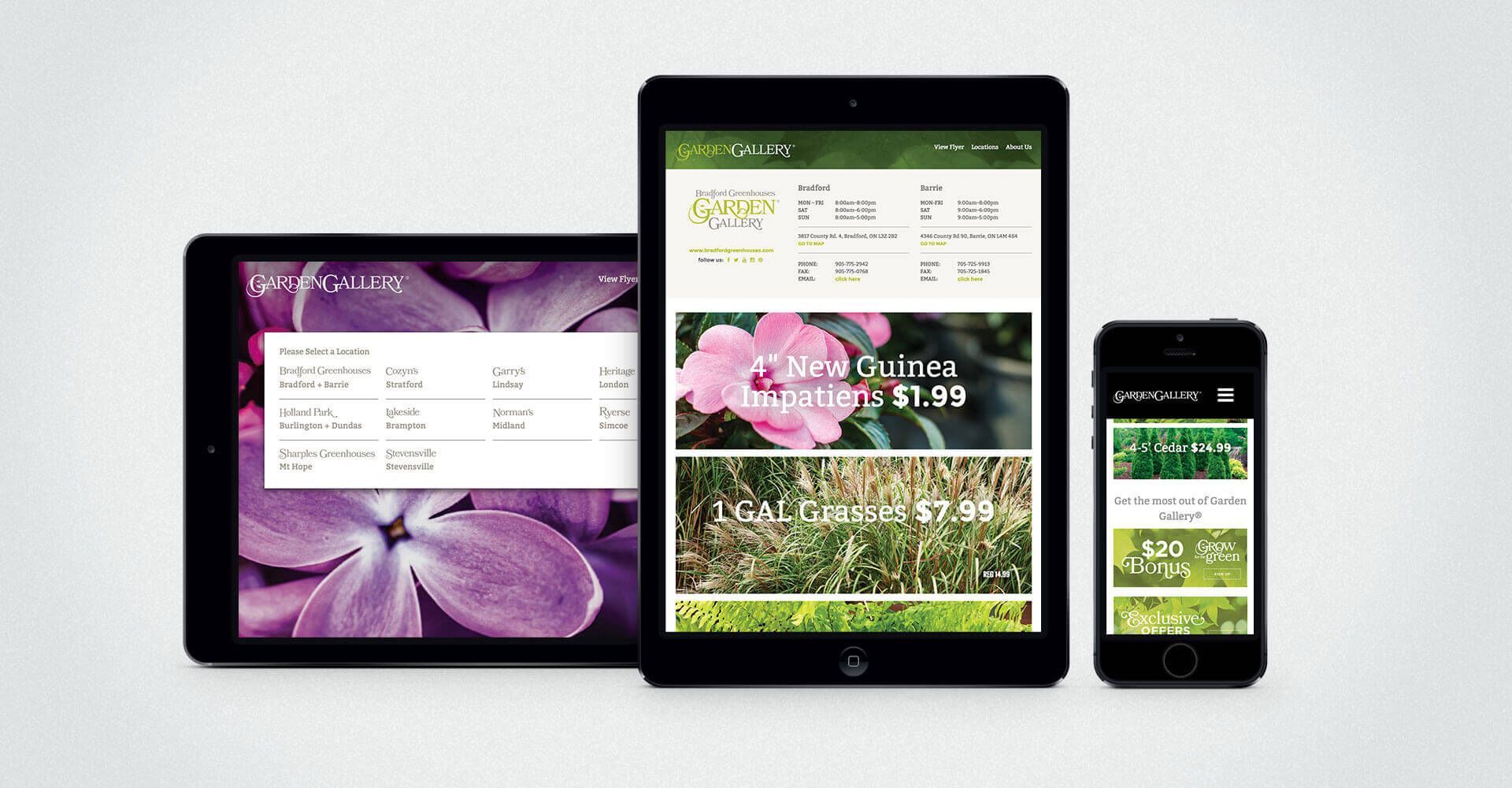
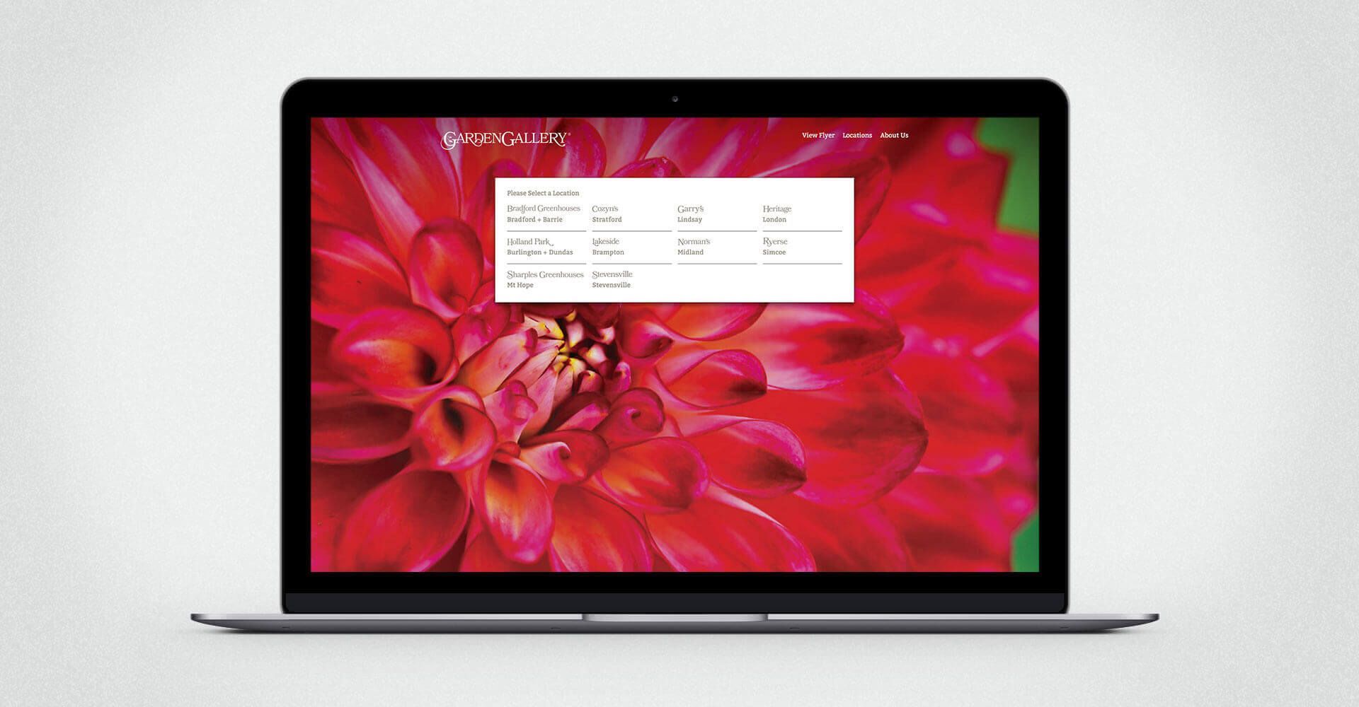
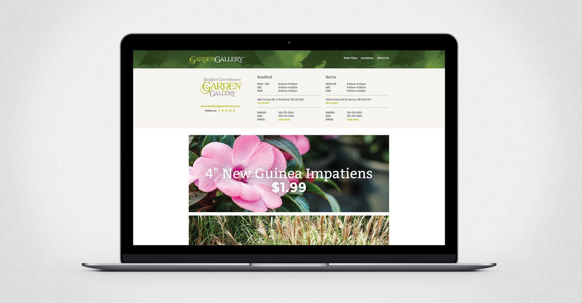
Our latest Garden Gallery project was to revitalize the website. The old site was more corporate than community, and failed to leverage the assets that have elevated the other Garden Gallery promotional materials and helped to establish them as a premier gardening destination in the communities they serve. Our redesign of the site reimagined the user experience, allowing visitors to first identify their local store in order to view relevant promotional items and information. Prior to this, visitors would have to navigate to each of the information pages, then to relevant store info. Finding the information they need is now much easier, and gives them a platform from which they can better explore the Garden Gallery offering.
letting the beauty of the products shine
Visually, the site is stunning, with full-size plant and flower photography stealing the show. The homepage reflects the seasonal nature of the offering, with photography geared towards items that are relevant to the different growing seasons in Ontario, and are easily swapped out for new ones. The monthly flyer is now a visual feature on the site, rather than a nondescript link to a PDF, giving visitors a visual preview before clicking to open it. Overall, large-format images tell the Garden Gallery story so much more effectively than the previous iteration of the site could, and inspire and encourage gardeners to beautify their outdoor spaces.
giving back ownership
For the individual stores, they now have control over their own messaging. The corporate office can populate store pages with company-wide sales, but stores also have the ability to advertise local promotions. The store pages can be catered to each member, but with a uniform Garden Gallery branded persona. Stores can schedule local marketing activity ahead of time, and set it to publish. A site that was corporate-centered is now geared towards the member stores, giving the head office all of the tools they previously had (and some new ones) while allowing autonomy for their member stores.
gardengallery.ca
explore the website
from flyer to magazine
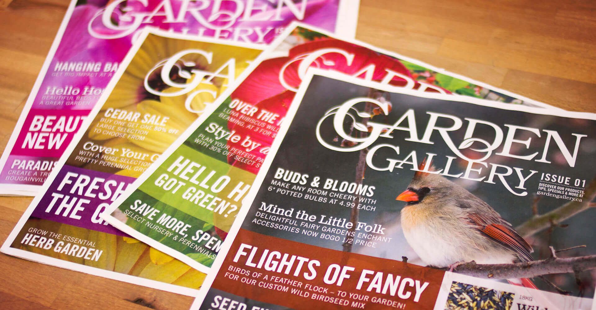
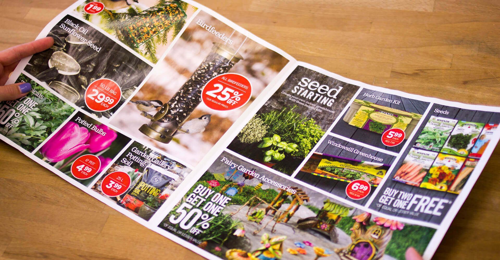
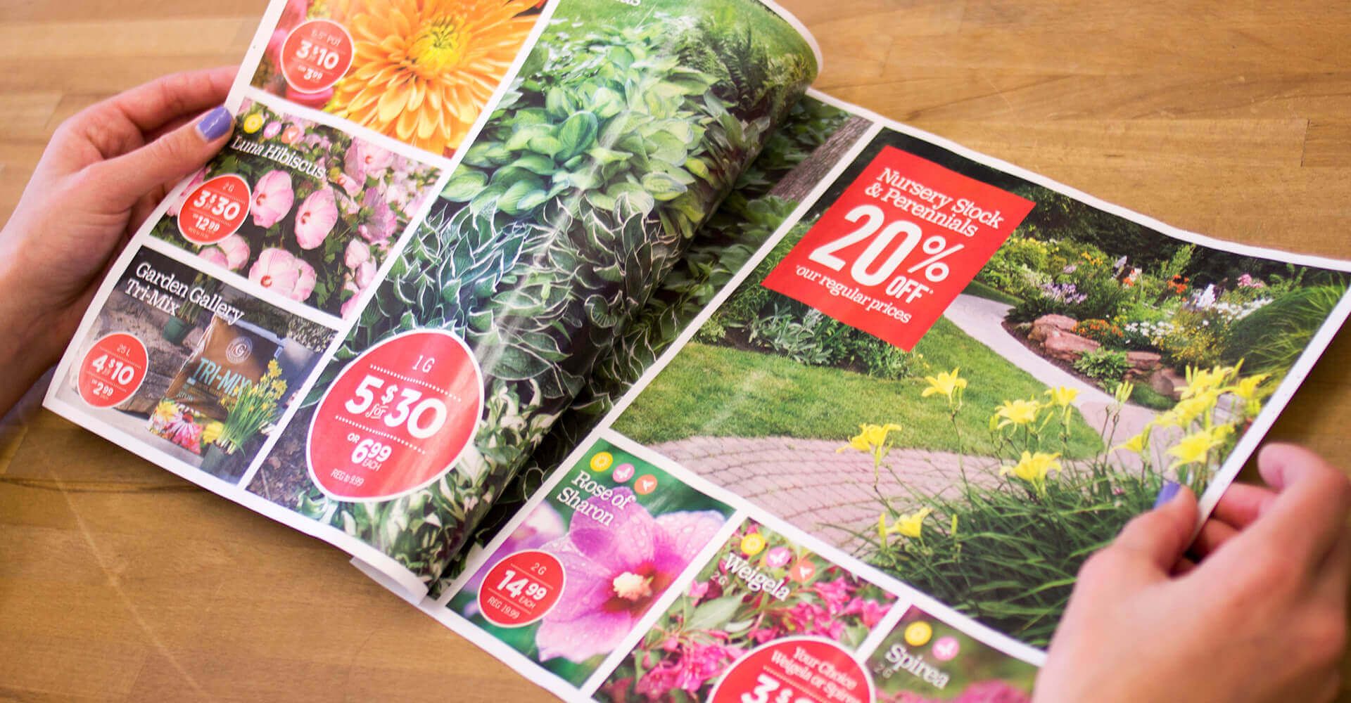
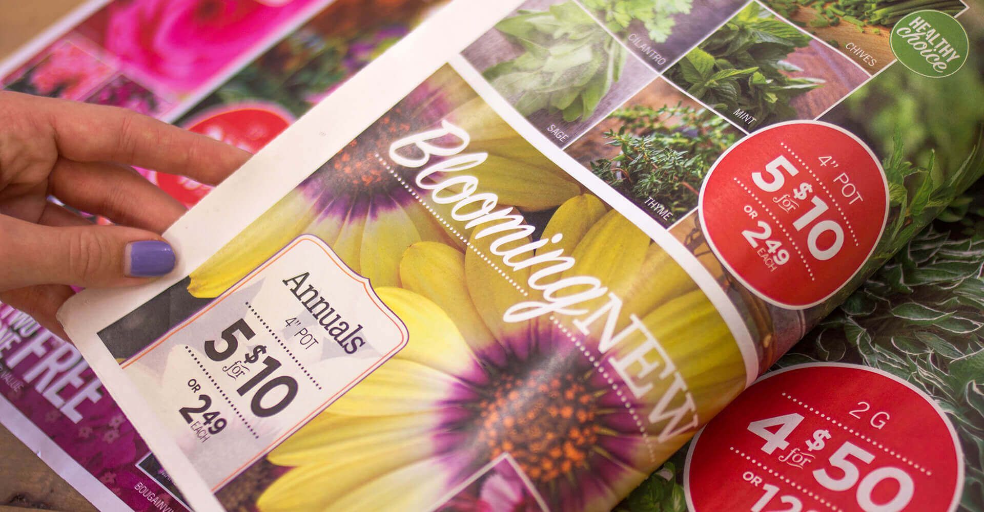
Our work with Garden Gallery began in the winter of 2013-14, when their flyer needed a makeover. The content had become stale and expected, and it was packaged in such a way that gave the recipient no real reason to give it a second look. As a key promotional vehicle for the company, it was imperative that we get this printed piece back on track.
To do so, we started by compiling a list of more than 25 areas in which we felt the flyer could be improved. Chief among those was to reinvented the simple flyer as a magazine, complete with a large, iconic cover image, a seasonally relevant and compelling message, and smaller details like issue numbers that make the piece feel special and part of a thoughtful series, rather than just a throwaway piece of junk mail.
The cover also features lead ins to articles on the interior, with teaser headlines intended to prompt further discovery.
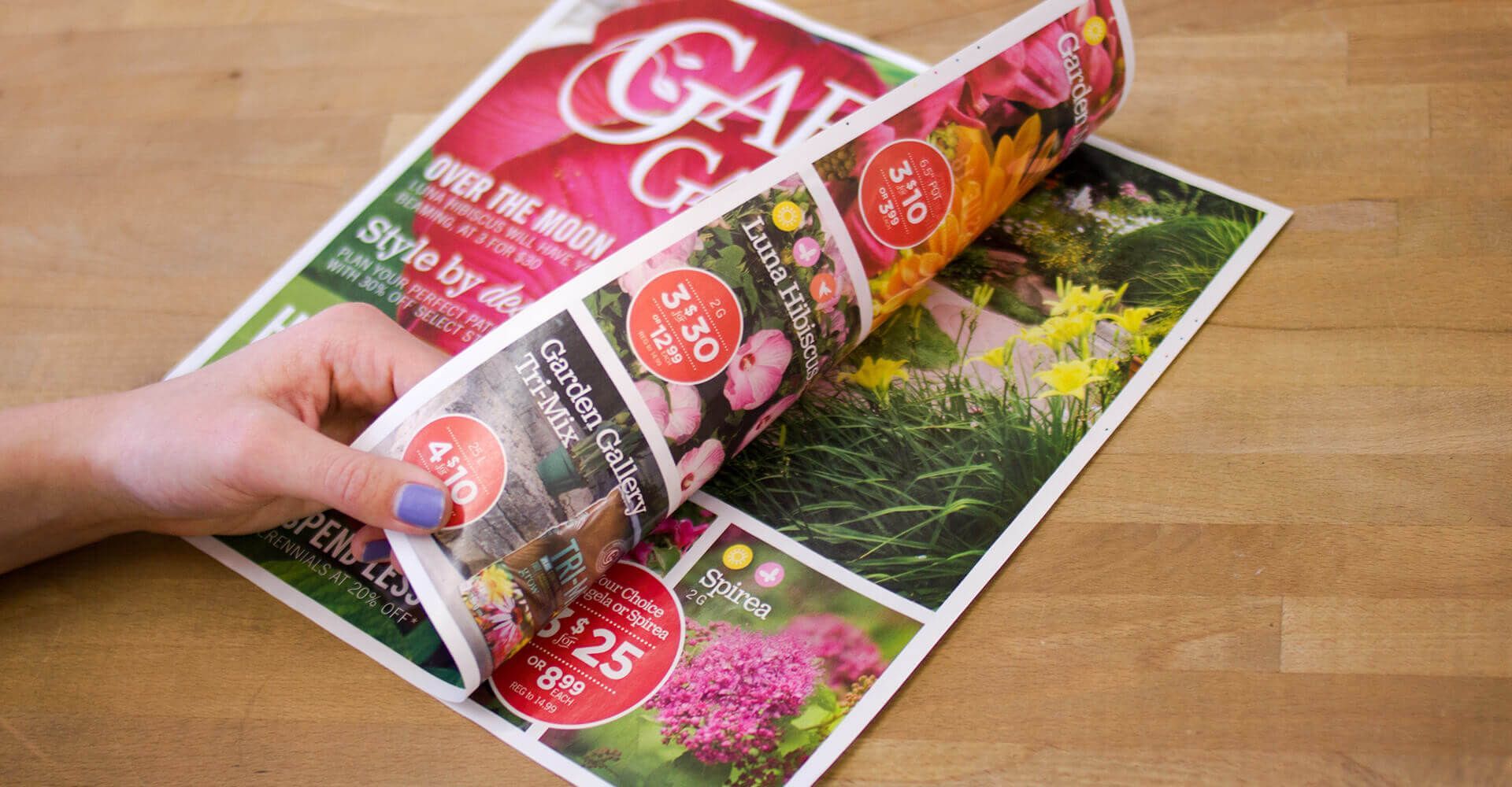
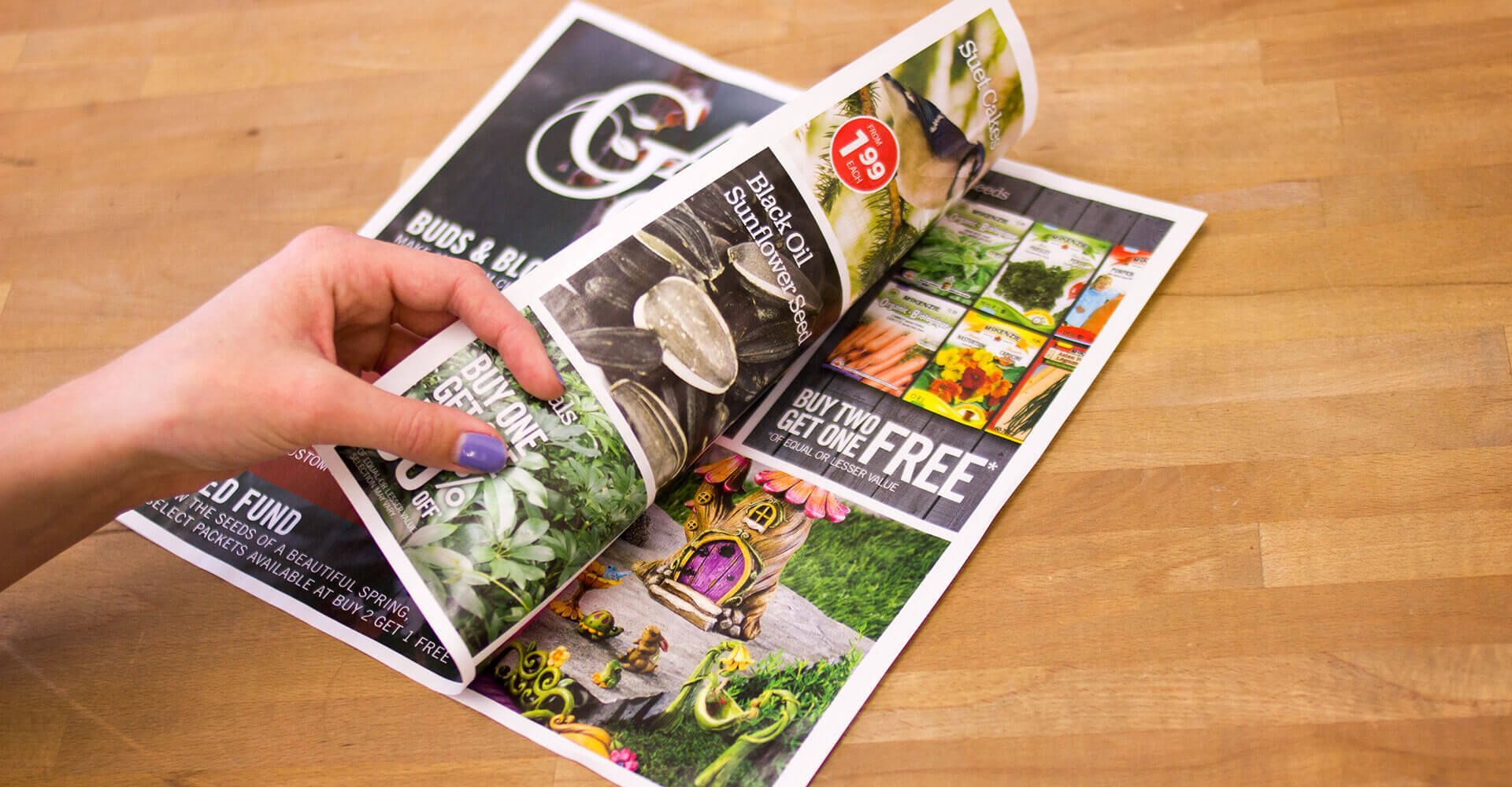
Overall, we humanized the piece, focusing not on static product photography but instead on the customer experience, capturing products in use to show context, break down barriers to use, and to create expectation. The result is a piece that is much more lifestyle-focused and highlights the Garden Gallery benefit and point of difference.
We established do-it-yourself features where Garden Gallery could give advice on how to accomplish various gardening projects, to enhance the perception of Garden Gallery beyond that of a simple greenhouse to a trusted advisor on enriching the gardening lifestyle, for beginners and experts alike. Educational articles empowered shoppers by providing gardening knowhow on everything from pest control to proper plant selection for soil types and climates.
We continue to work with Garden Gallery to design and produce their monthly marketing magazine. Our team manages all aspects of production and timing, ensuring that Garden Gallery promotions and sales are effectively communicated at this very important touchpoint, all while continuing to act as steward as we work together to build the Garden Gallery brand.
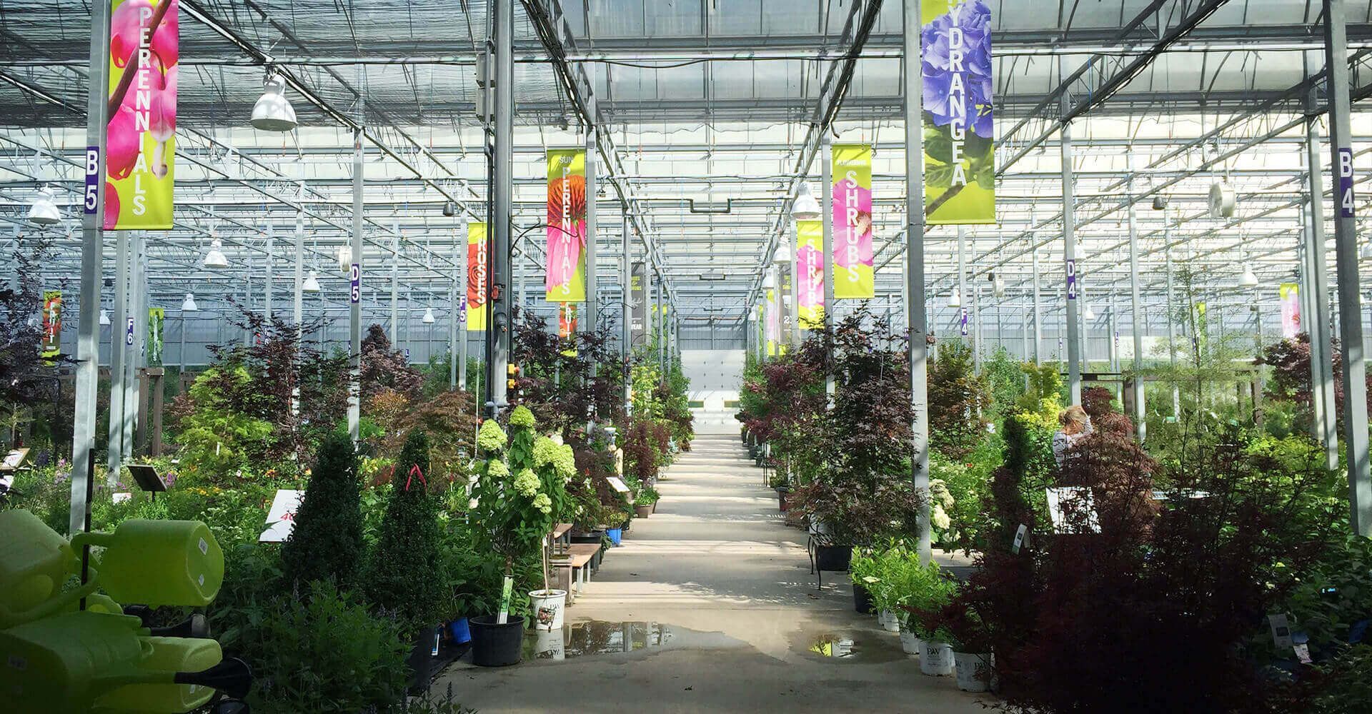
The Garden Gallery flyer makeover was a big success, bringing lifestyle and a brand voice to the company that was later manifested in updates to the retail space.
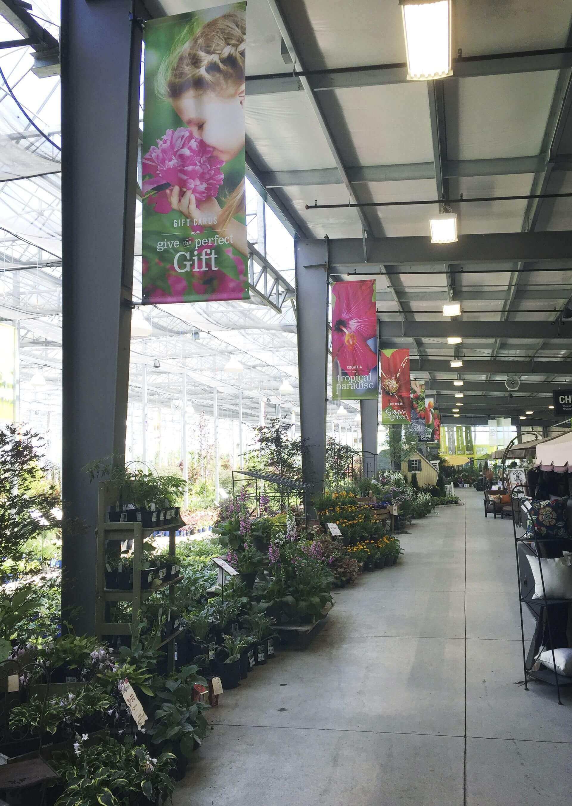
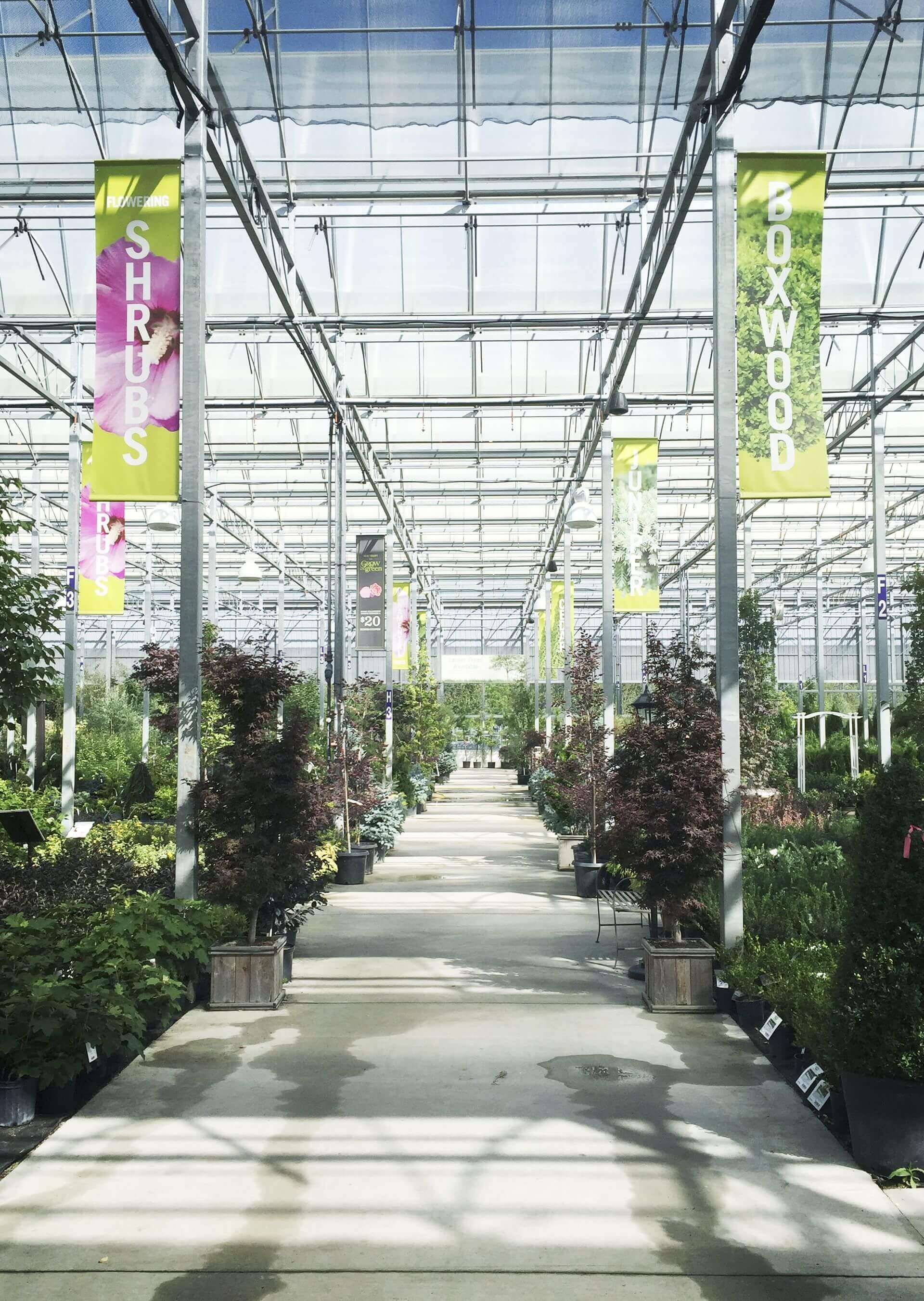
Banners throughout the greenhouse served as both promotion (gift cards, mailing list signup) and lifestyle, brand moments.
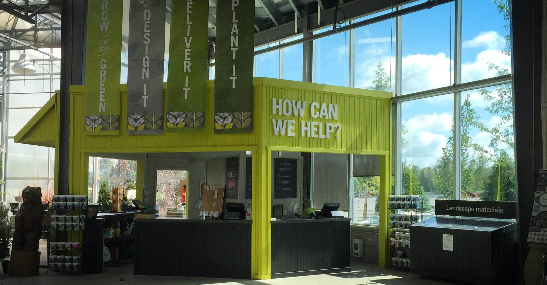
The service desk was invigorated with a bold green surround, and messaging that promoted the various Garden Gallery services beyond the greenhouse.
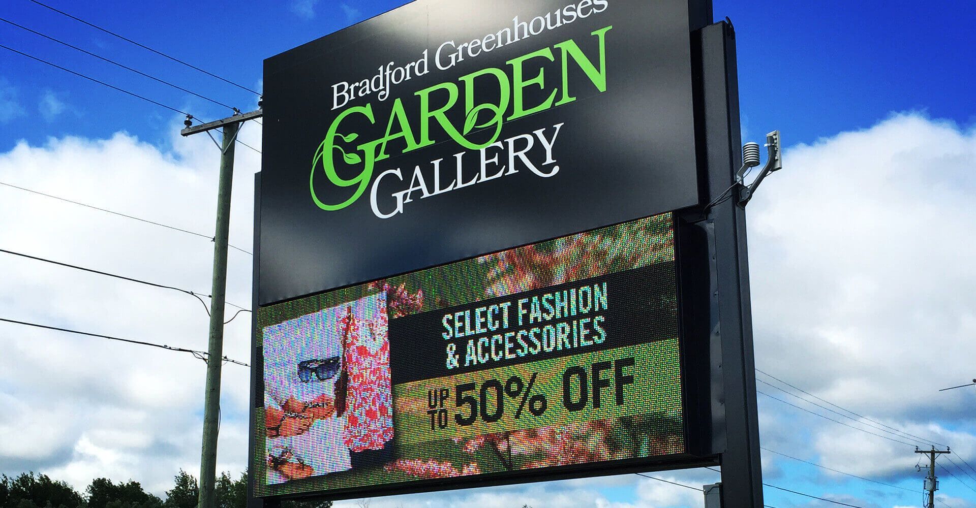
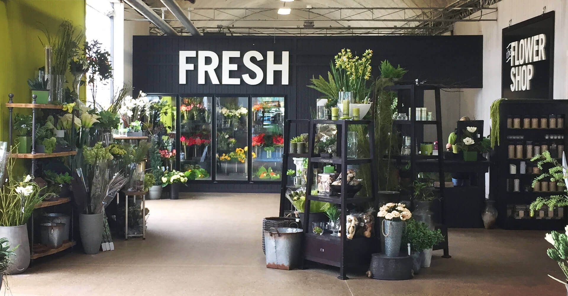
Bold new signage highlighted the new direction, and graphics for the magazine are repurposed on the digital sign board.
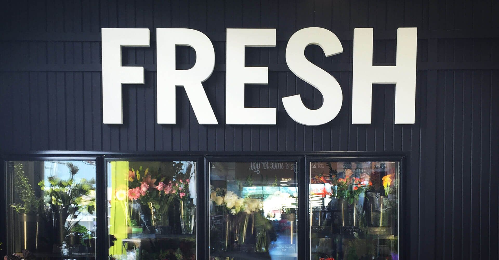
Large white lettering in the flower shop reinforces the brand and sends a clear message about customer expectation.
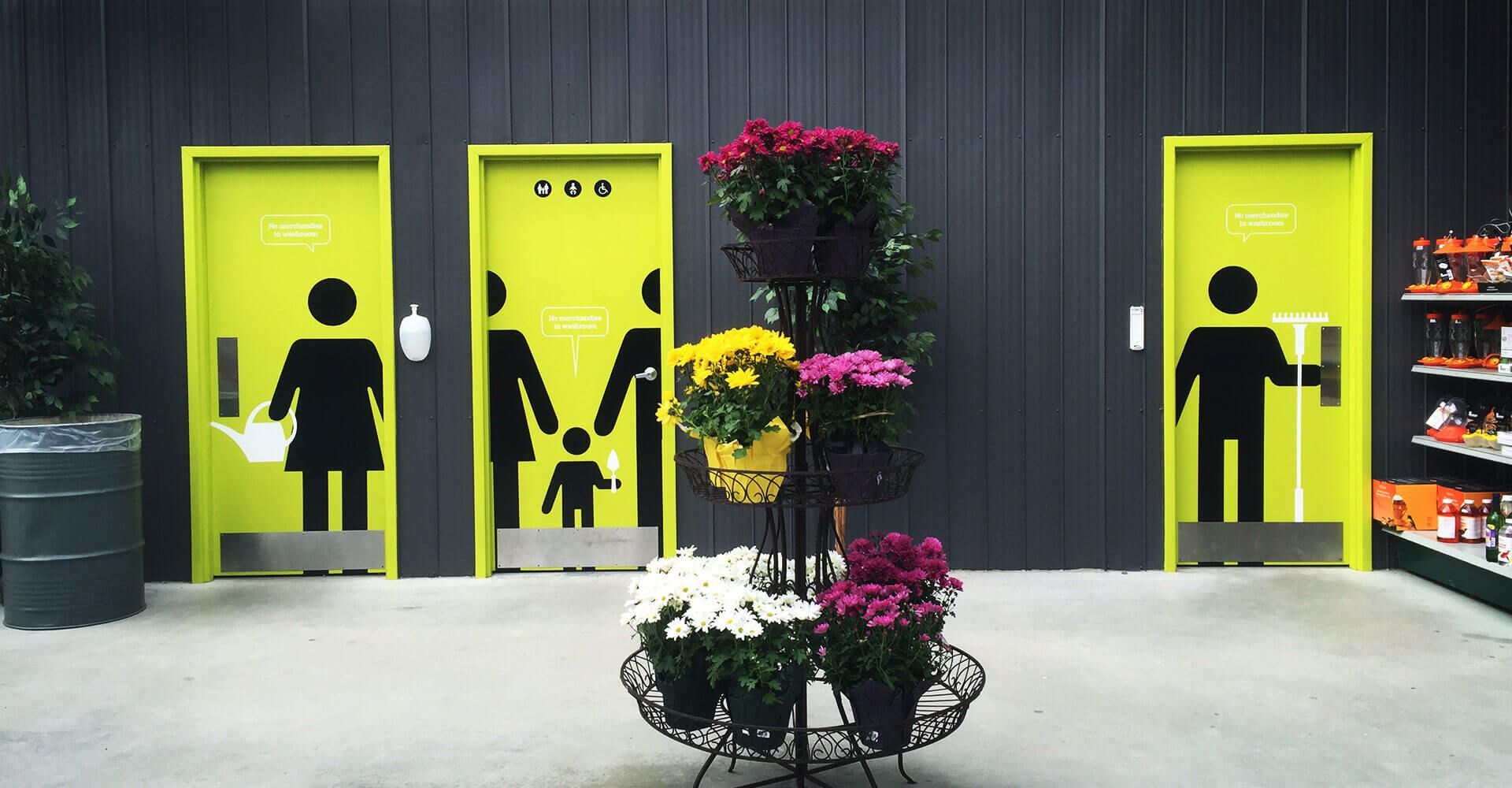
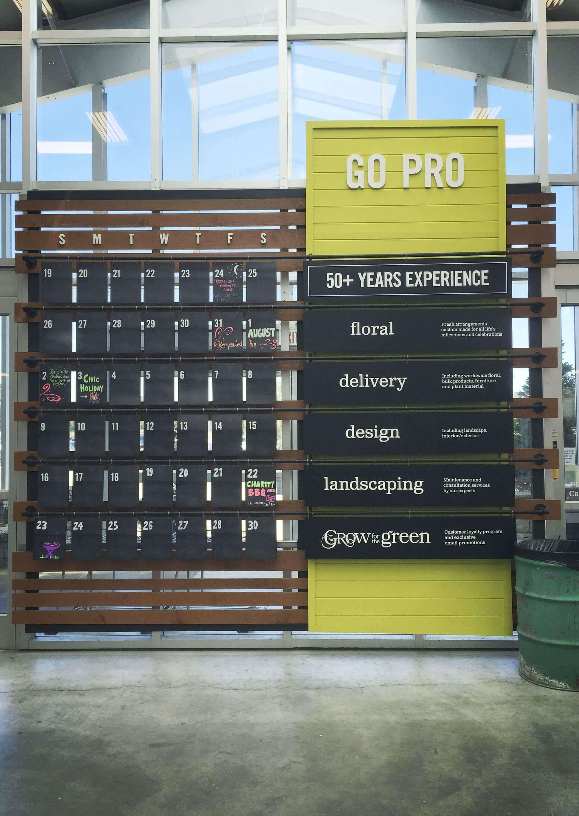
Bathroom doors are a playful brand moment, and even anti-theft instructions are integrated in the speech bubbles to soften their delivery and to keep all signage purposeful and well thought out. The chalkboard calendar gives the space a craft, do-it-yourself feel, while the signage highlights the service offering.
In the end, we nourished the Garden Gallery brand to life, nurturing the warmth and personality of this growth-centred brand back to full bloom.