An aerial view of a large wave in the ocean.

Slide Title

Slide description
Button

Slide Title

Slide description
Button

Slide Title

Slide description
Button

for a better, healthier life

From modest beginnings as a bulk food retailer, Healthy Planet has experienced exponential growth to almost 30 stores across Ontario and strength from their e-commerce platform. Healthy Planet has continued to evolve and meet the changing demands of its loyal customer base.


With 3 stores open in 2012, Healthy Planet engaged Jump to redefine their brand identity, store design, and decor sign package in order to deliver a more compelling guest experience. Fast forward 7 years, and Healthy Planet once again turned to Jump to refresh the brand.

Digital, Identity, Branding, Retail

A beauty store with a pink wall and a blue ceiling.
An aerial view of a large wave in the ocean.

Slide Title

Slide description
Button

Slide Title

Slide description
Button

Slide Title

Slide description
Button

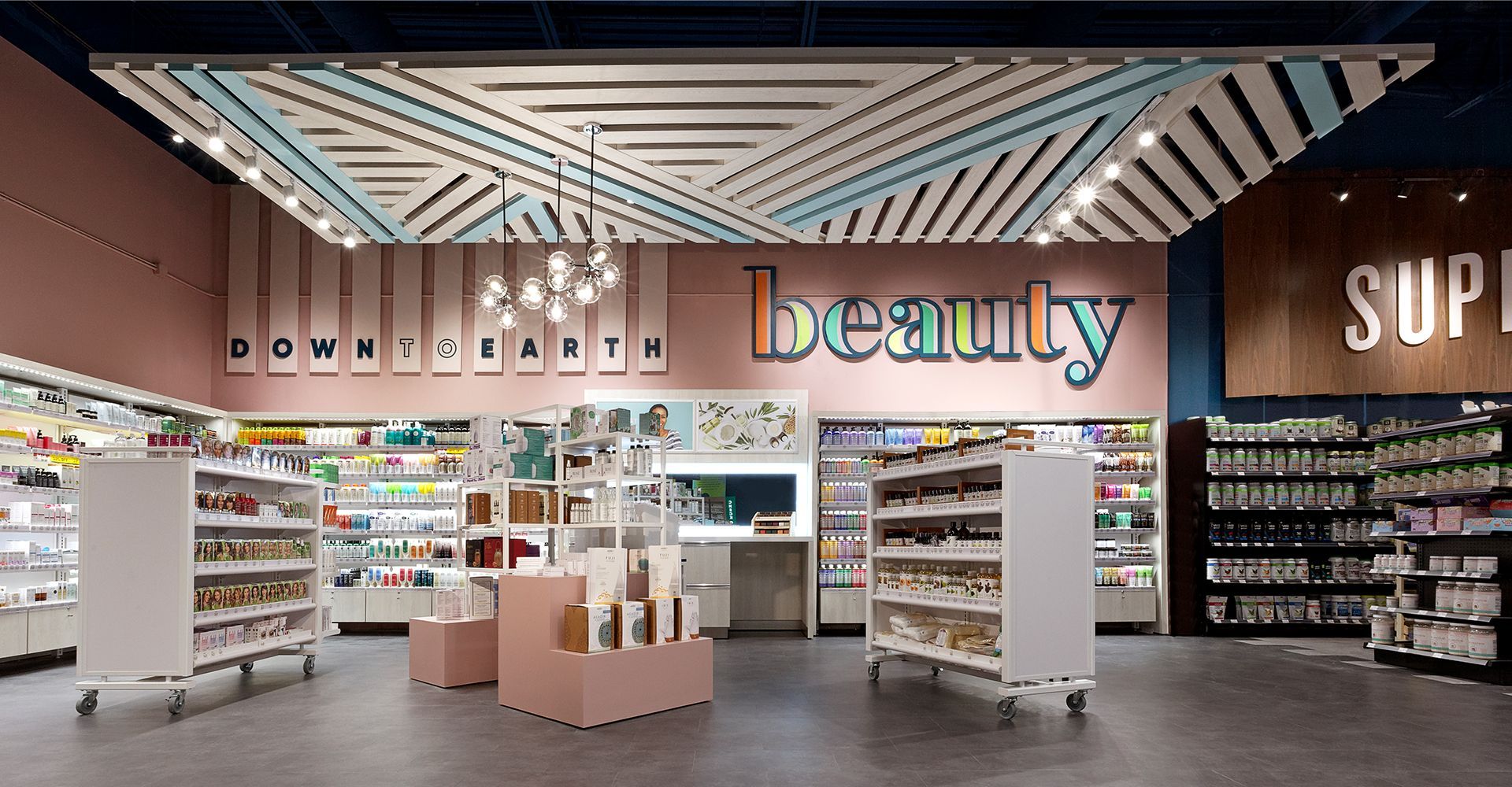
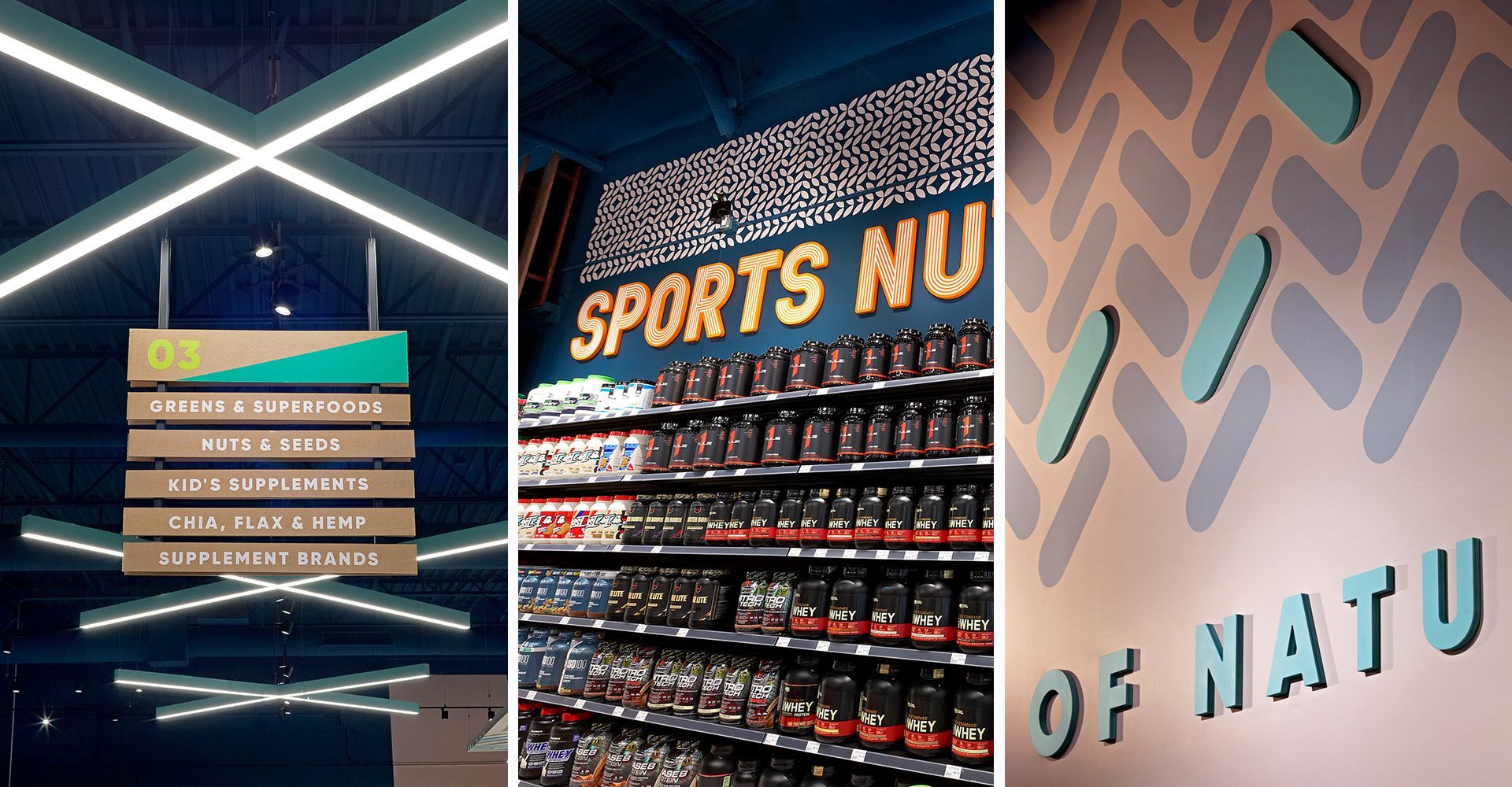
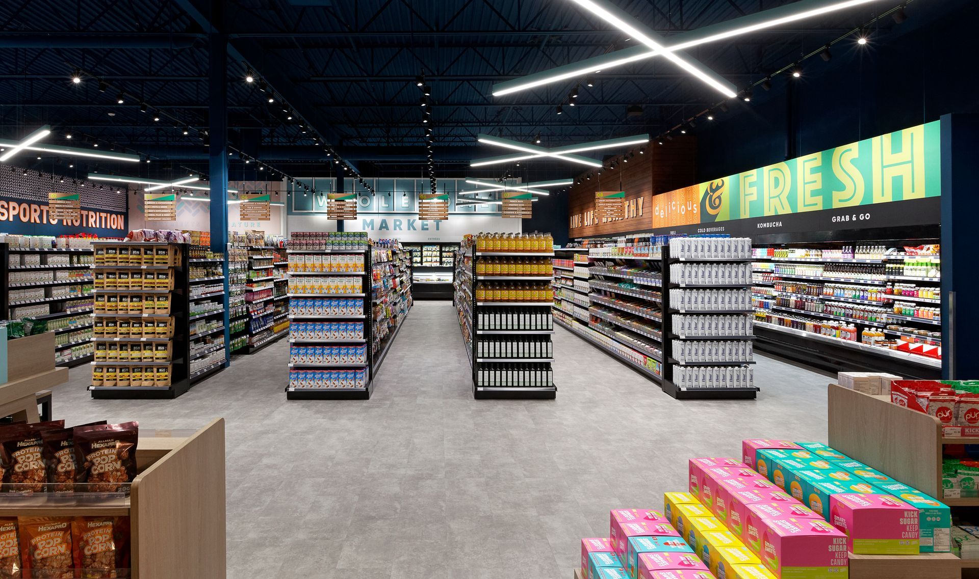
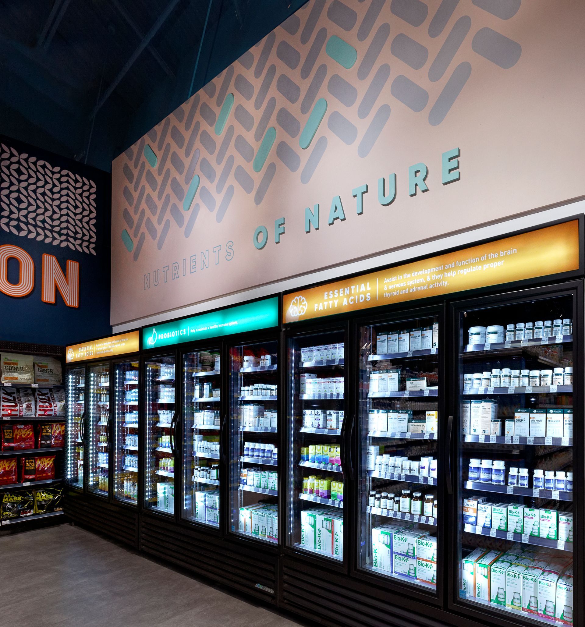
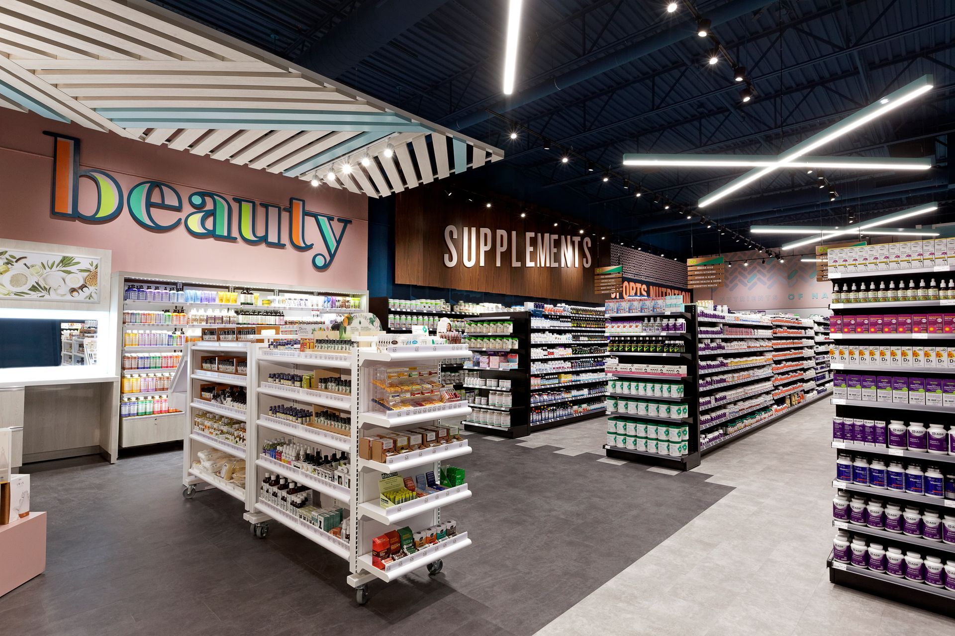
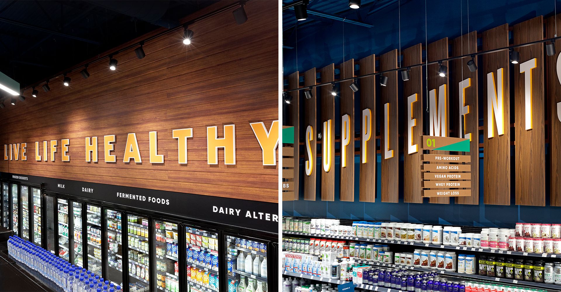
After being engaged by Healthy Planet, Jump began by visiting their locations and conducting interviews with key stakeholders: the ownership group, store managers, and various staff. Upon synthesizing the feedback, we were able to see Healthy Planet’s key points of differentiation: care, product knowledge, curated product assortment validated by customers, and value pricing. With a service style that is needs-oriented, honest, friendly, caring, and knowledgeable, these attributes certainly did not come through in the existing brand, environment, or existing signage program. It was no longer enough, we needed to develop a bold decor program that would elevate the shopping experience.

A collage of three pictures of a sports nut store
An aerial view of a large wave in the ocean.

Slide Title

Slide description
Button

Slide Title

Slide description
Button

Slide Title

Slide description
Button

The resulting branding and signage program is bold, approachable, and creates a feeling of association. The new logo developed by Jump is bold and legible with quality cues that reinforce the Healthy Planet brand as an established, credible authority for health and wellness products. This new logo was developed to create a bold colour block on pylon and storefront that stands out and gets noticed.

A wholesome market sign hangs from the ceiling of a grocery store.

Jump’s signage program uses large, stylized, dimensional category expressions on the interior walls that create energy and excite the eye. The deep blue ceiling and modern lighting adds a dramatic effect to the space that feels fashionable and exciting. The street facing windows of the store call attention to the various categories offered within, and beckon pedestrian street traffic inside.

A blurry picture of a blue background with a row of lines.
An artist 's impression of the inside of a grocery store
A sign in a store that says live life healthy
A sign on a wall that says down to earth
An artist 's impression of a grocery store filled with lots of products.
A rendering of a pharmacy with lots of shelves and a counter.
A blue background with a blurred pattern of vertical lines.
A bunch of healthy planet logos on a white background.
A woman is holding a tote bag that says `` live life healthy ''.
A man and a woman are standing next to each other in front of an orange wall.
A collage of three business cards and a gift card.
A blue bus with the words healthy planet painted on it
A thank you card with trees and clouds on a blue background

if you like those, you might like...