A modern expression
of culture
Jaffna Street Food brings the vibrant flavours, culture, and energy of Northern Sri Lanka to the heart of downtown Toronto.
Identity, Photography, Restaurant
Toronto is one of the most diverse food cities in the world, yet authentic Jaffna street food remains largely undiscovered by many consumers. Jaffna Street Food set out to change that.
The challenge wasn't simply introducing a new restaurant. It was creating a brand that could celebrate Tamil culture and authenticity while remaining approachable to a broad downtown audience. The experience needed to feel rooted in heritage, yet modern enough to compete in Toronto's fast-moving food scene.
Our goal was to create a brand that captured the energy of the streets of Jaffna while reflecting the spirit of a new generation of food entrepreneurs bringing their culture to the city.
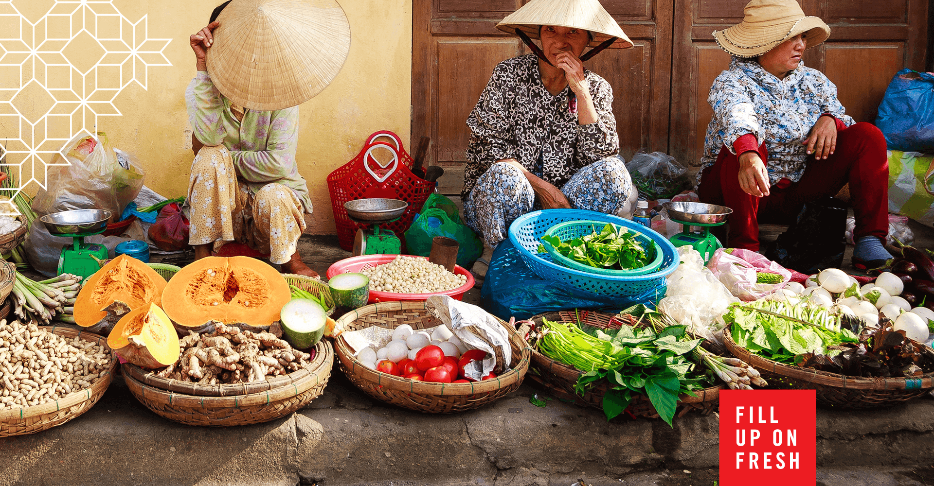
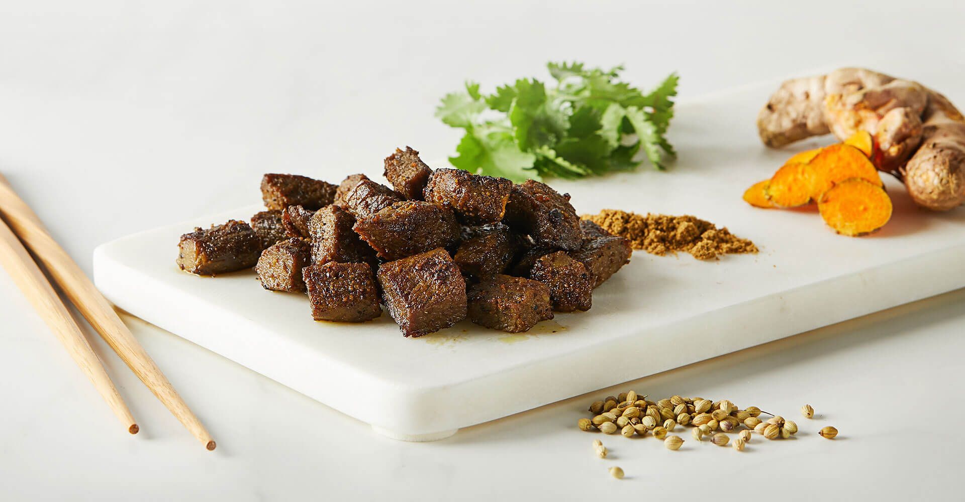
Jaffna Street Food is built around bold flavours, family traditions, and the unmistakable theatre of street food. From the rhythmic chopping of Kothu Roti to the vibrant colours and aromas of freshly prepared curries, every interaction is full of energy.
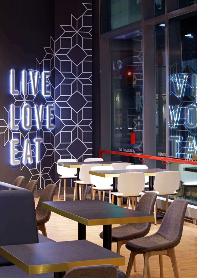
The identity system was designed to reflect that same movement and excitement. Bold typography, expressive colour, and playful brand elements work together to create a personality that feels welcoming, memorable, and full of life.
The result is a brand that feels as vibrant as the food itself.

The identity draws inspiration from the visual language of Tamil culture while reimagining it for a modern audience. At its heart is a custom hand-lettered wordmark inspired by the intricate flow and character of Tamil cursive. Every curve and connection was carefully crafted to create a mark that feels both contemporary and deeply rooted in place.
The result is an identity that feels unmistakably local while confidently introducing Jaffna culture to a wider audience.

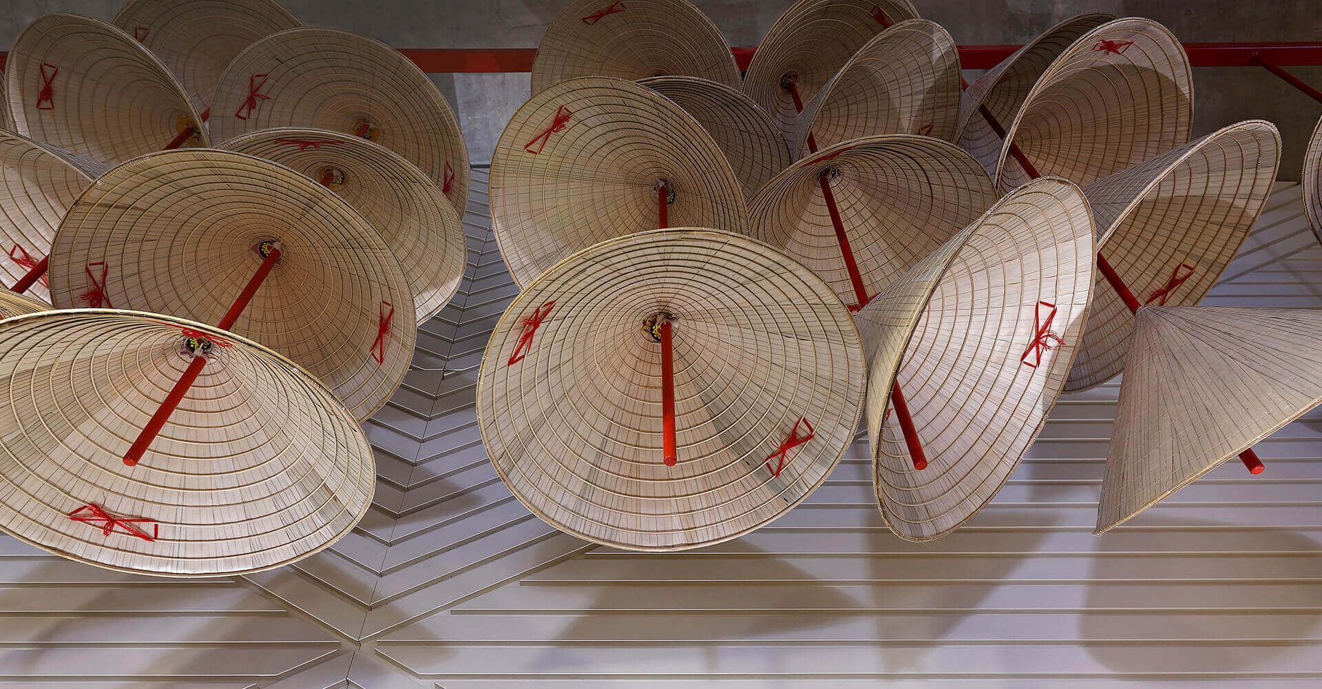
To further ground the brand in its roots, we developed a collection of custom iconography inspired by cultural and natural elements synonymous with the Jaffna region.
The palmyra tree became a recurring motif throughout the identity, representing resilience, heritage, and a deep connection to Northern Sri Lanka. Alongside it, we looked to traditional kolam patterns for inspiration. Their continuous looping forms informed a family of custom icons that feel interconnected and endlessly adaptable across the brand.
The Kaethigai flower, a lily native to the region, became another key source of inspiration. We drew from its distinctive form and flowing contours to create a series of striking graphic elements. Wavy lines echo the unique shape of the flower, introducing movement, rhythm, and a recognizable visual language that appears throughout the identity system.
Together, these elements create a brand that celebrates culture through contemporary storytelling, balancing heritage, symbolism, and bold graphic expression.

Jaffna Street Food is anything but quiet.
The colour palette was designed to capture the vibrancy of Tamil cuisine while remaining grounded in the natural landscapes and cultural textures of Northern Sri Lanka.
Rich greens form the foundation of the palette, drawing inspiration from the banana leaves featured throughout the photography and food presentation. They introduce an earthy quality that feels fresh, natural, and deeply connected to the ingredients and traditions behind the cuisine.
A deep magenta references the striking Kaethigai flower, adding richness and visual contrast throughout the identity. Paired with a bold orange inspired by the warmth, energy, and cultural significance found throughout Sri Lankan life, the palette creates a vibrant yet balanced expression of the brand.


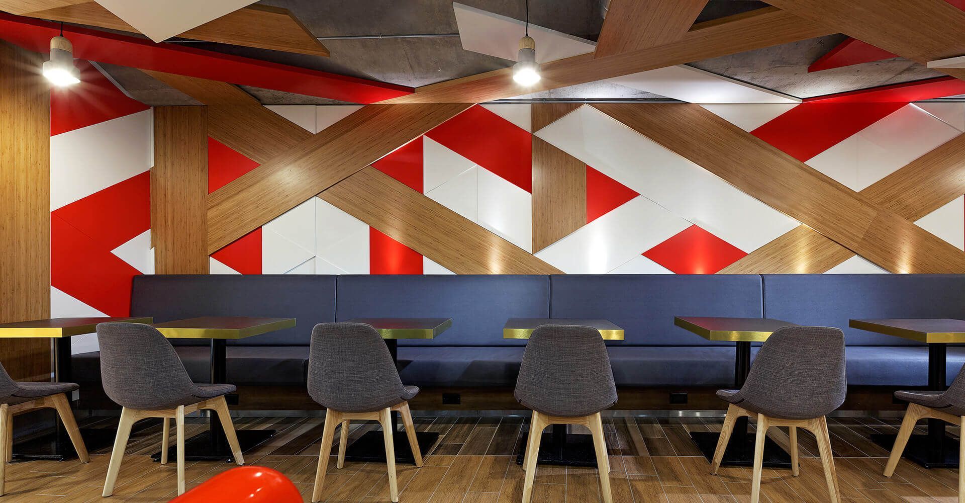
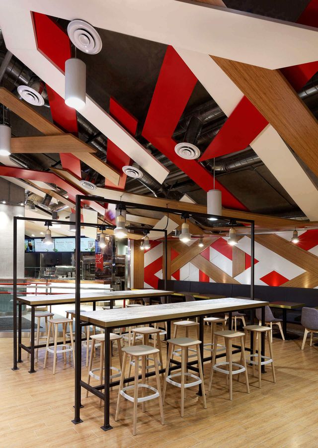
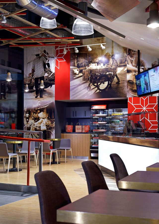
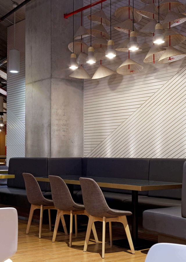
At the centre of the restaurant experience is the craft behind the food.
The owners wanted guests to experience the culinary artistry that makes Jaffna street food unique. Inspired by the rhythmic chopping techniques used to prepare dishes like Kothu Roti, the interior environment was designed to celebrate movement, craftsmanship, and performance.
Open sightlines, expressive graphics, and carefully considered brand moments help transform food preparation into part of the guest experience. Rather than hiding the process, the space invites customers to witness the skill, energy, and passion behind every dish.
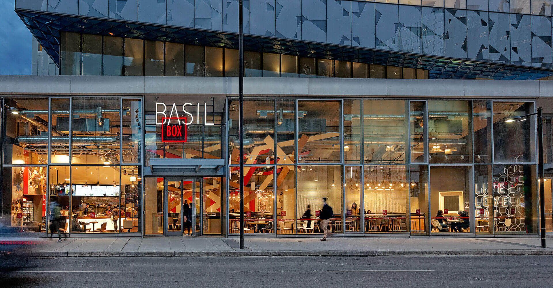
The result is a restaurant that feels as dynamic as the streets that inspired it.
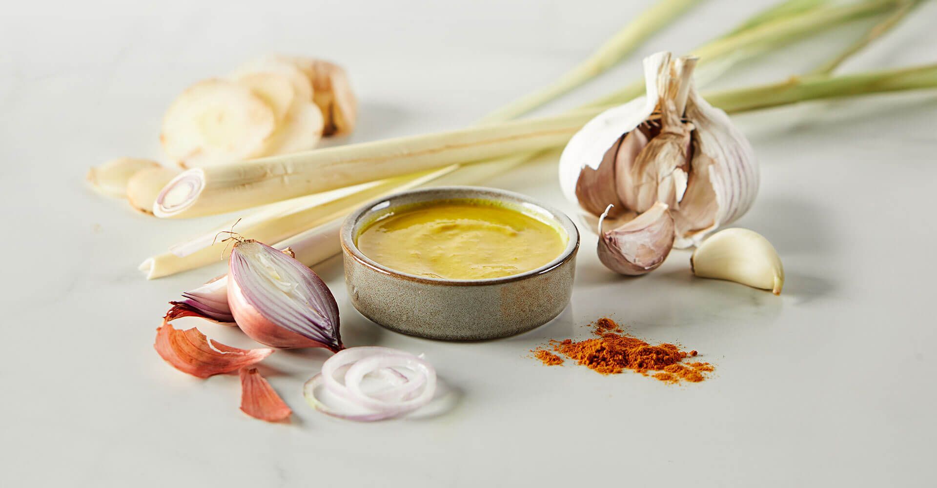
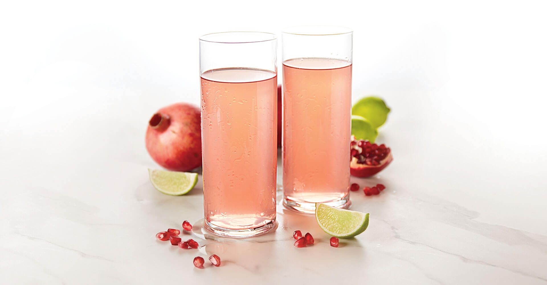
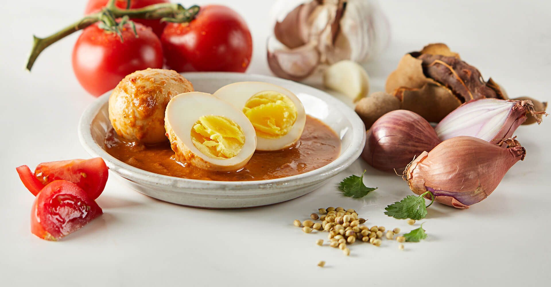
Capturing the energy behind every dish.
The photography celebrates the colour, texture, and craftsmanship behind every dish while reinforcing the broader brand world. Rich ingredients and striking presentations take centre stage, complemented by natural elements like banana leaves that connect back to the identity system and its cultural influences. The result is a cohesive visual language that feels fresh, energetic, and authentic across menus, packaging, social media, and the restaurant environment.


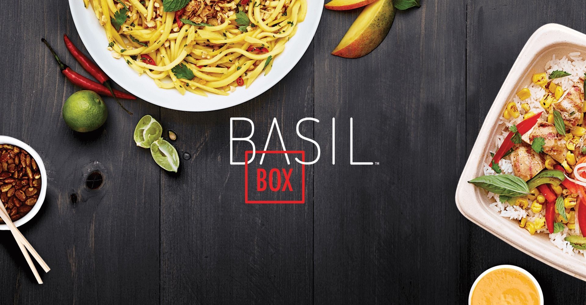
Working with Jump was easy. We know how to execute on the food side, but their understanding of the consumer mindset challenged our preconceptions about Basil Box and in the end delivered a much better restaurant for our guests. They have positioned us for growth out of the gate.
Working with Jump was easy. We know how to execute on the food side, but their understanding of the consumer mindset challenged our preconceptions about Basil Box and in the end delivered a much better restaurant for our guests. They have positioned us for growth out of the gate.
Peter Chiu, Founder & Chief Basil, Basil Box
if you like those,
you might like...
Masalawala
Raahi