nanashake

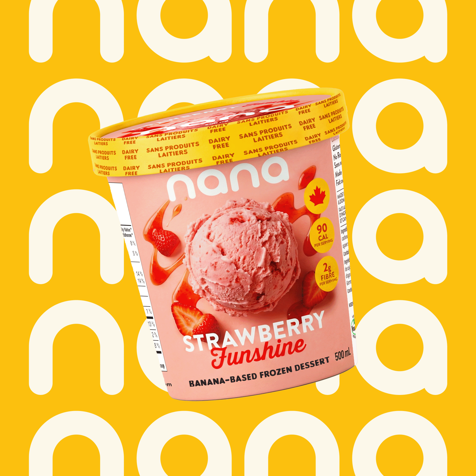
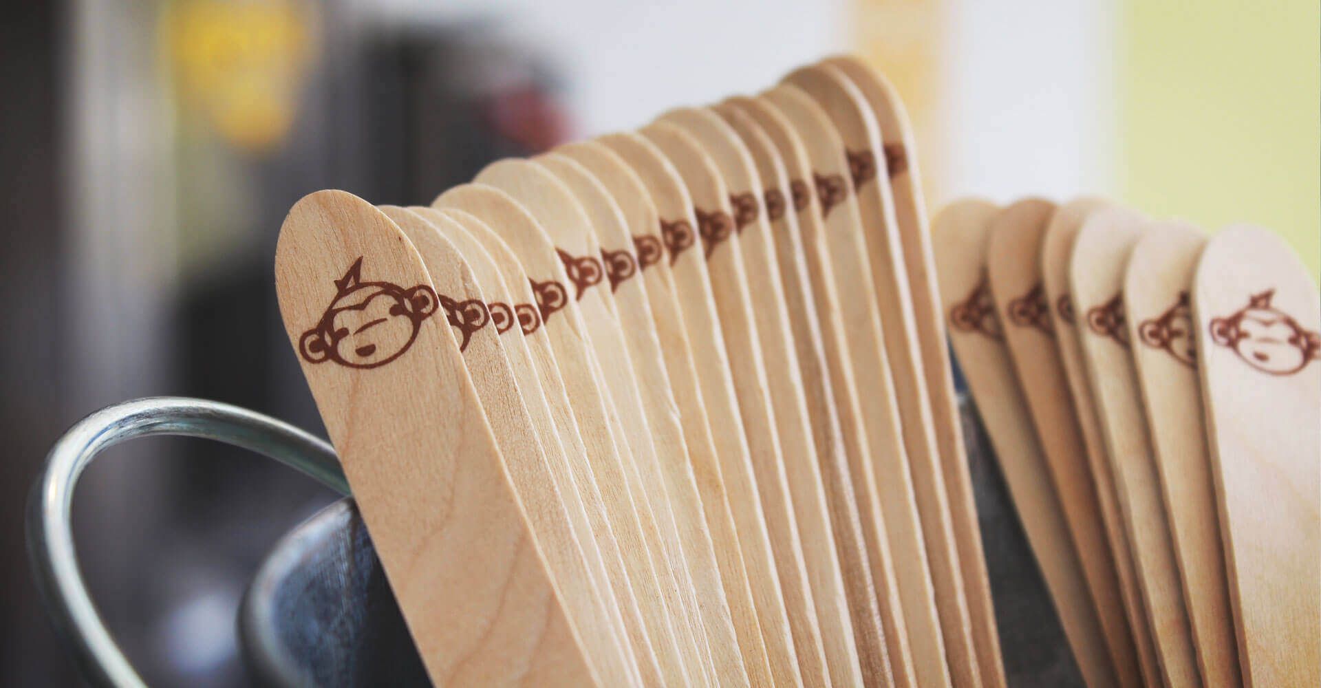
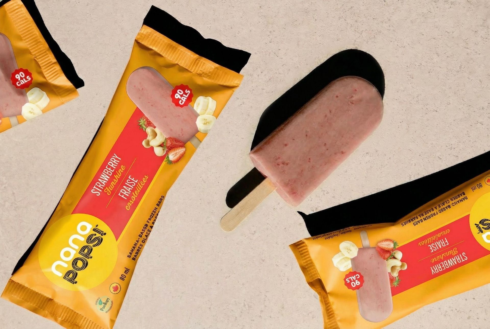
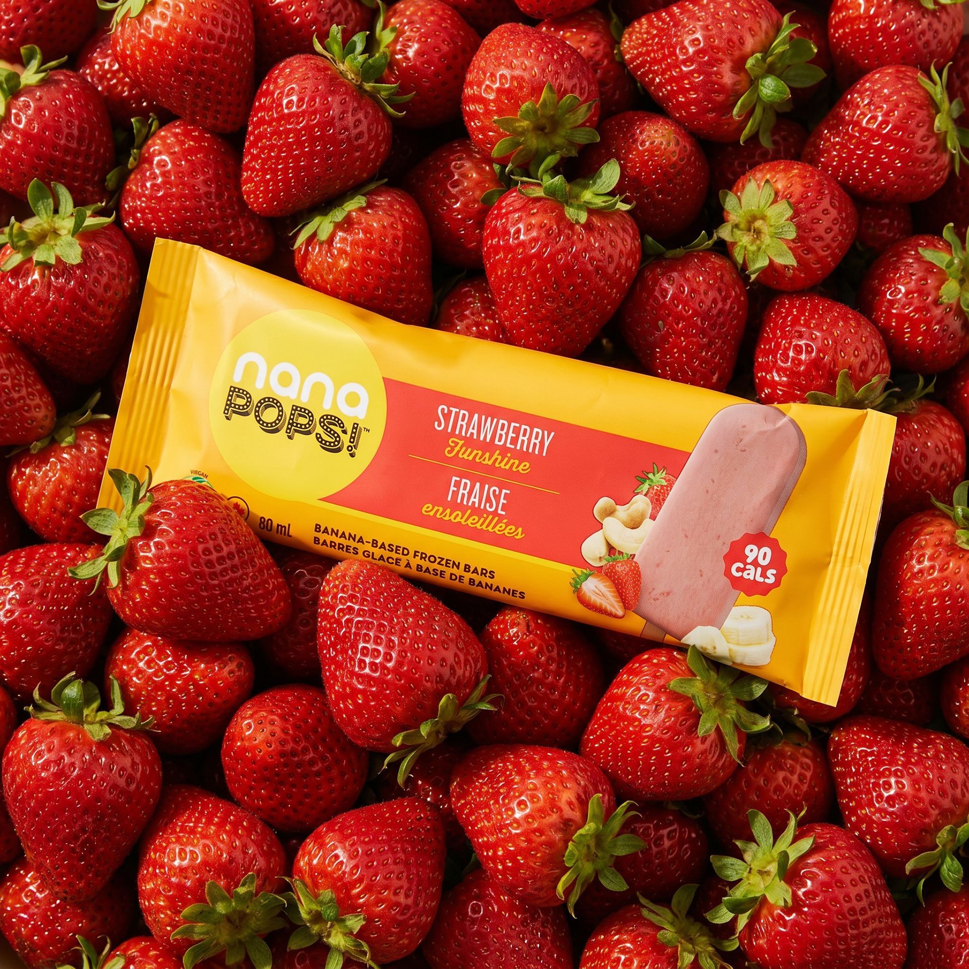
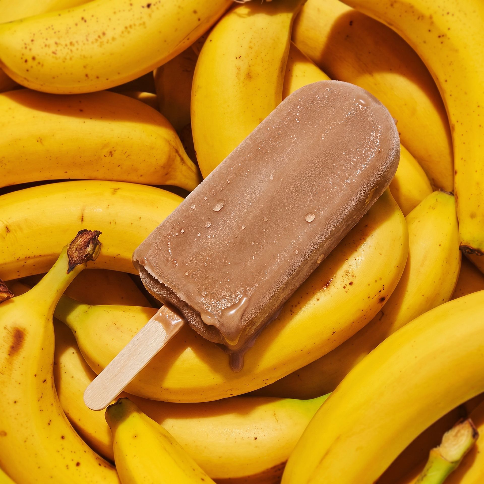
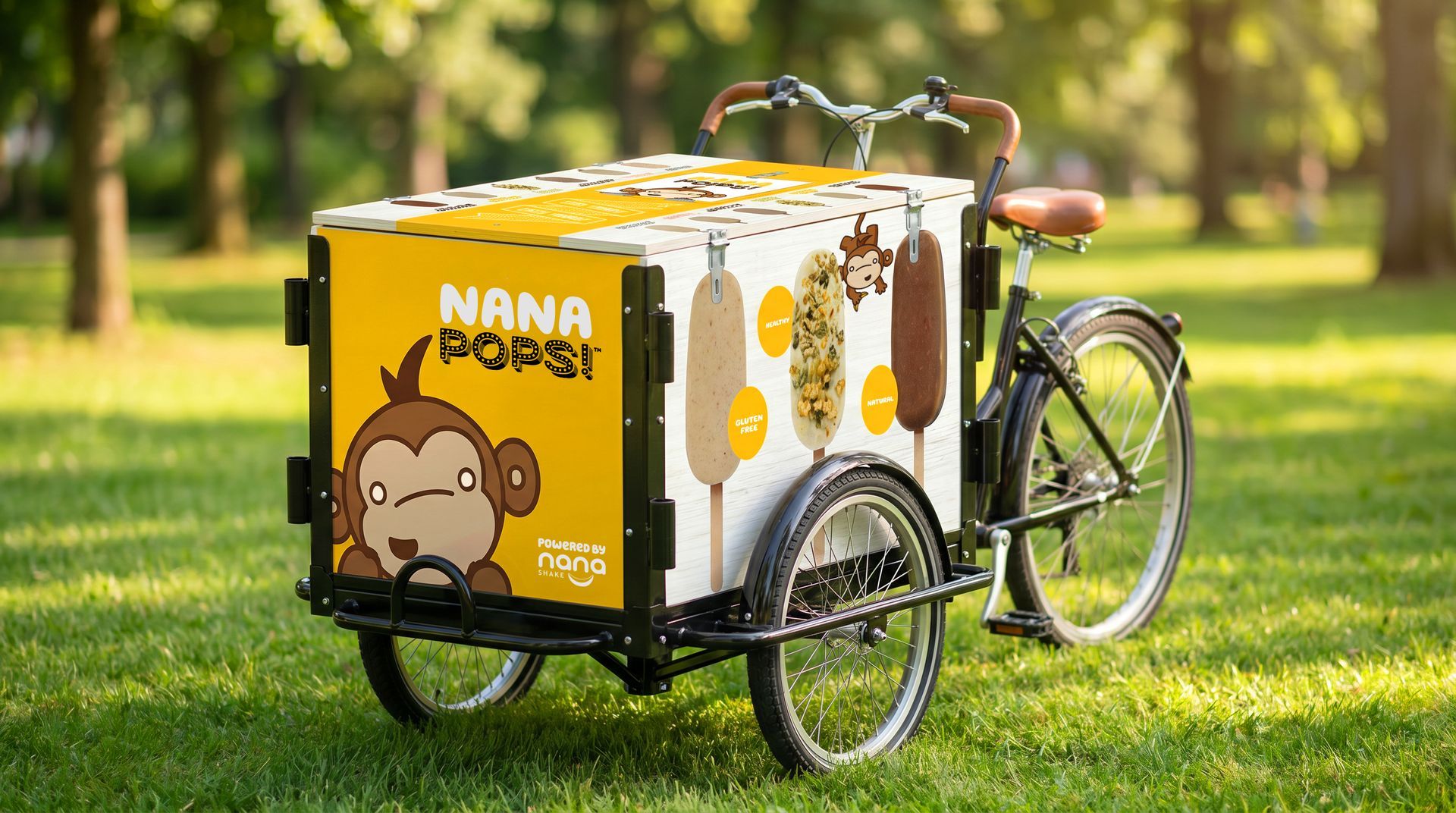
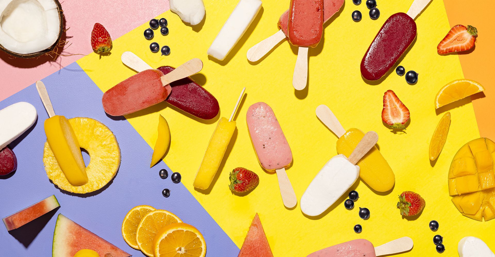
When the good folks from nanashake walked into our office, we were as skeptical as the next person about their claim. Vegan dessert made with all natural ingredients? Sounds delicious.


You know what? We were wrong. Delicious doesn’t even begin to describe how good it is.


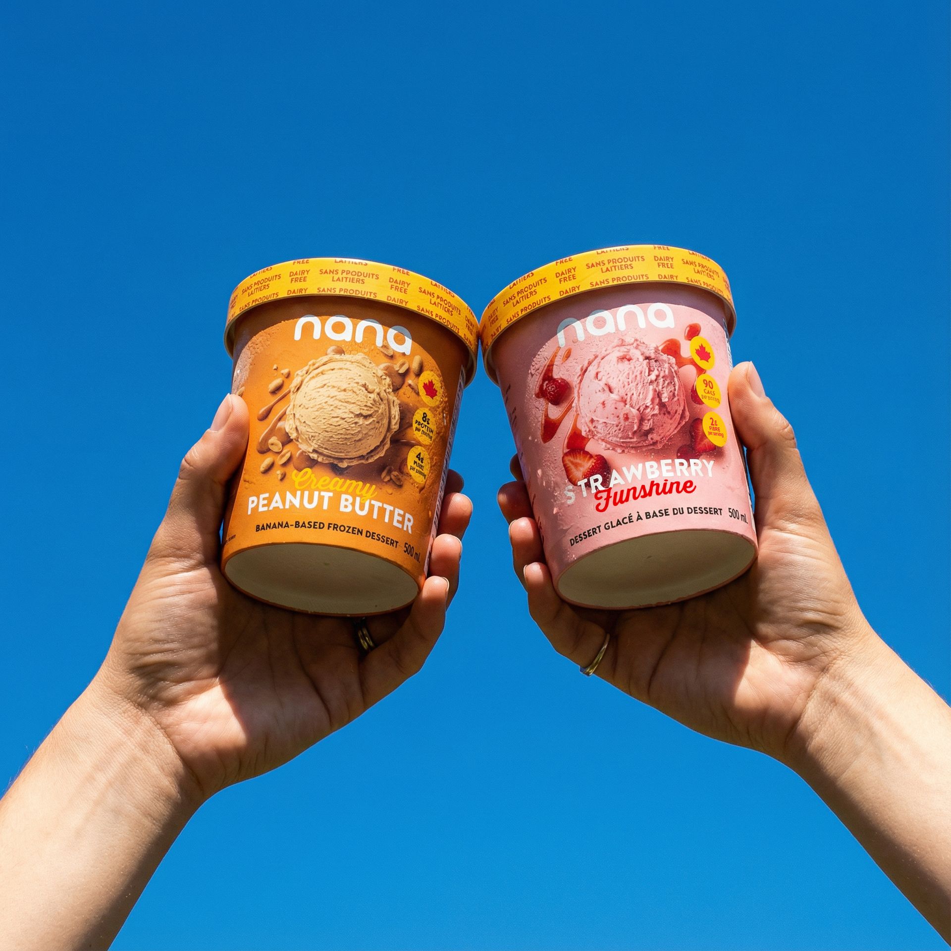
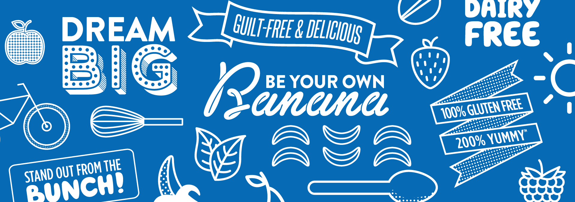
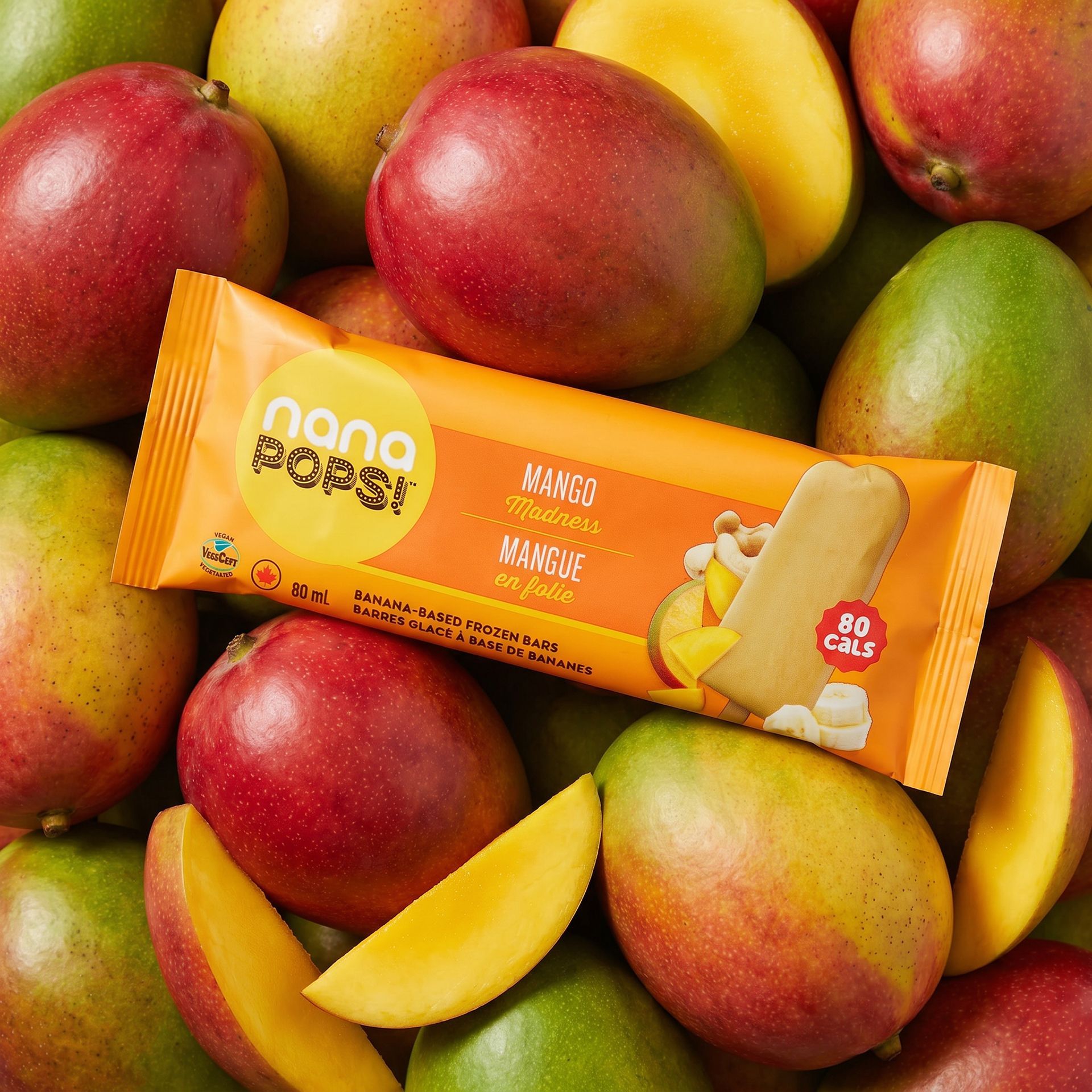
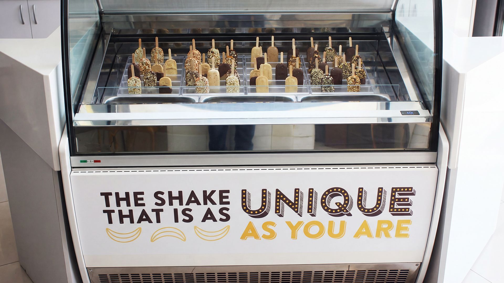
So there’s the challenge. You’ve got a delicious dessert offering that is also healthy. It’s so complete, you can eat it as a breakfast replacement. Sounds like the easiest thing in the world to sell, right? Not so fast. How do you get the non-vegans to try a premium dessert offering that the vegans are going bananas about? And how do you get the vegans to continue to support you once the non-vegans figure out how good it is? It’s a slippery peel…ahem, slope.

Digital, Identity, Photography

A person is writing on a piece of paper with a marker.
A bunch of logos for nana shake are on a white surface.

bananas are fun

To start, we deconstructed the existing nanashake logo, removing the multiple colours that gave it a cartoonish feel, and simplified the mark by combining the letterform onto two lines from three, bringing cohesion to the name. In the old logo, the stacking of the syllables and the emphasis on na-na gave it a negative connotation that contradicts the positive health and flavour benefits of the product, and also the positive energy and messaging of the brand. Including the banana below the word mark creates a natural smile, generating warmth and giving the mark personality.

Two business cards are sitting on a wooden table.
Two nana shake cards are sitting on a wooden table.
An aerial view of a large wave in the ocean.

Slide Title

Slide description
Button

Slide Title

Slide description
Button

Slide Title

Slide description
Button

The duotone yellow simplifies the mark, and amps up the importance of the brand’s primary ingredient. It also sets the stage for a warm yellow store interior, which breathes life, health, and natural beauty into the brand.

A monkey holding a banana with a speech bubble that says it 's the year of the monkey

going bananas in the store

From there we moved on to develop a design intent package for the store. It was important for the proprietors of nanashake to communicate the wholesome goodness and unique nature of the offering – despite having a strict recipe for how nanashakes are made, the all natural ingredients allow for a small variance in the taste of the final product, meaning that the nanashake you have today might taste slightly different than the one you had yesterday. nanashake wanted to celebrate the lack of homogeneity of their product and emphasize the benefits of eating real food with fresh ingredients.

A bunch of plastic cups stacked on top of each other.
A bunch of wooden spoons are sitting in a metal bucket.
nanashake interior wall
A wooden sign that says 100 % vegan and 200 % yummy
A sign that says dairy free with a monkey on it
A display case that says the shake unique that is as you are

We developed an in-store graphics package that tells that story, and celebrates not only the delicious flavour of the nanashake, but also the important nutritional benefits of the dessert.

A person is holding a cup of ice cream in front of an ice cream display case.

the shake with appeal

It was important to us, first and foremost, that the product be able to sell itself. We directed photography that captured the desserts in a very appetizing way, which then allowed us to use that photography elsewhere in their environment. One of those areas was their digital menu boards, which not only provides price and selection information to guests, but encourages trial of different flavours and enables promotion.

A display of different flavors of ice cream on a wall

attracting diverse markets

The Yonge-Sheppard office tower location give nanashake an opportunity to capitalize both on office worker traffic inside, but also foot traffic on the sidewalk outside, and the bold colours and simplified messaging around the treat will draw people in. Their target is health-conscious office workers and families from the surrounding condo buildings and residential neighbourhoods. The bright, airy space screams fun, and the many flavour choices and nanapops provide something delicious for everyone. Exterior signage invites in even the most reluctant sweet tooth, while the menu system simplifies the offering and differentiates their multiple flavours.

A chalkboard that says mix it up mixed berry
A person is holding a cup of ice cream with a straw.

.nanashake.com

explore the website

In addition to the brand identity and store environment, we helped nanashake with their online presence, creating a pre-launch website to garner attention, and a complete final site to drive traffic and awareness of the brand and nutritional information about the product. We also helped design social media posts, e-blasts and flyers announcing their opening, colouring sheets for young guests, business cards, and loyalty cards for their customers.

A laptop is open to a website called nana
A laptop with three cupcakes on the screen.
A tablet and a cell phone with ice cream on them
A collage of images with the words

did you know?

The idea for Nanapops came from none other than our Strategic Director Jason Hemsworth, who’s experience making pops at home led him to conclude that the nanashake dessert would be perfect in pop form!

if you like those, you might like...