A Knight's Tale

Paladin

Project Paladin was a new brand of edgy and progressive jewelry geared towards young men. The craftsmanship and attention to detail that went into the high-end designs was impeccable, making it a very unique offering in the market. They engaged Jump to refine their logo and to build a brand identity that could be leveraged across all consumer touch points and was as unique and inspired as their jewelry.

Paladin

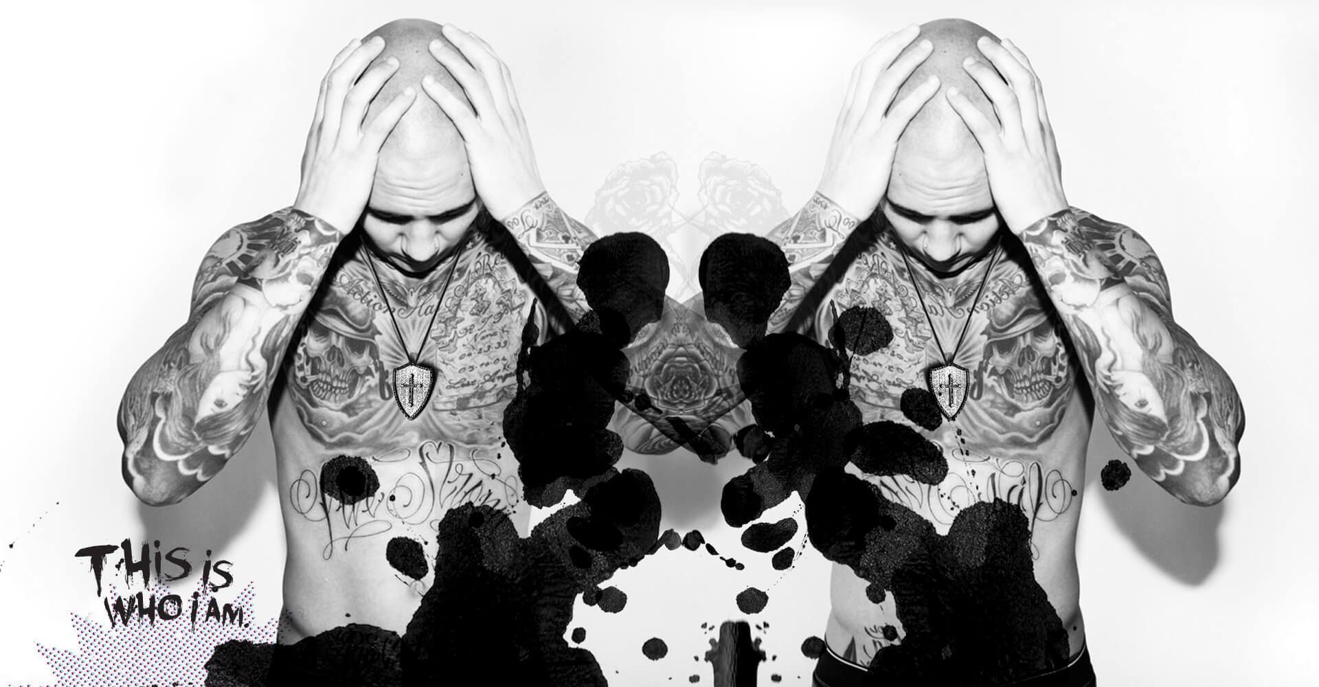
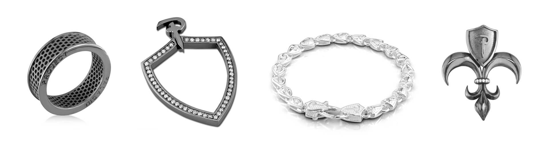
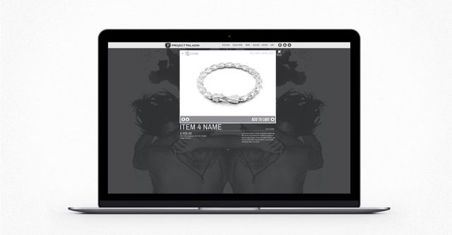
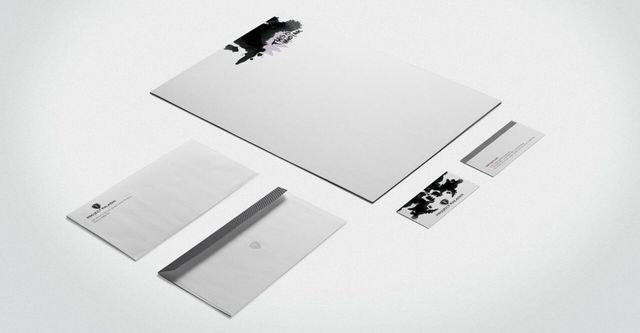
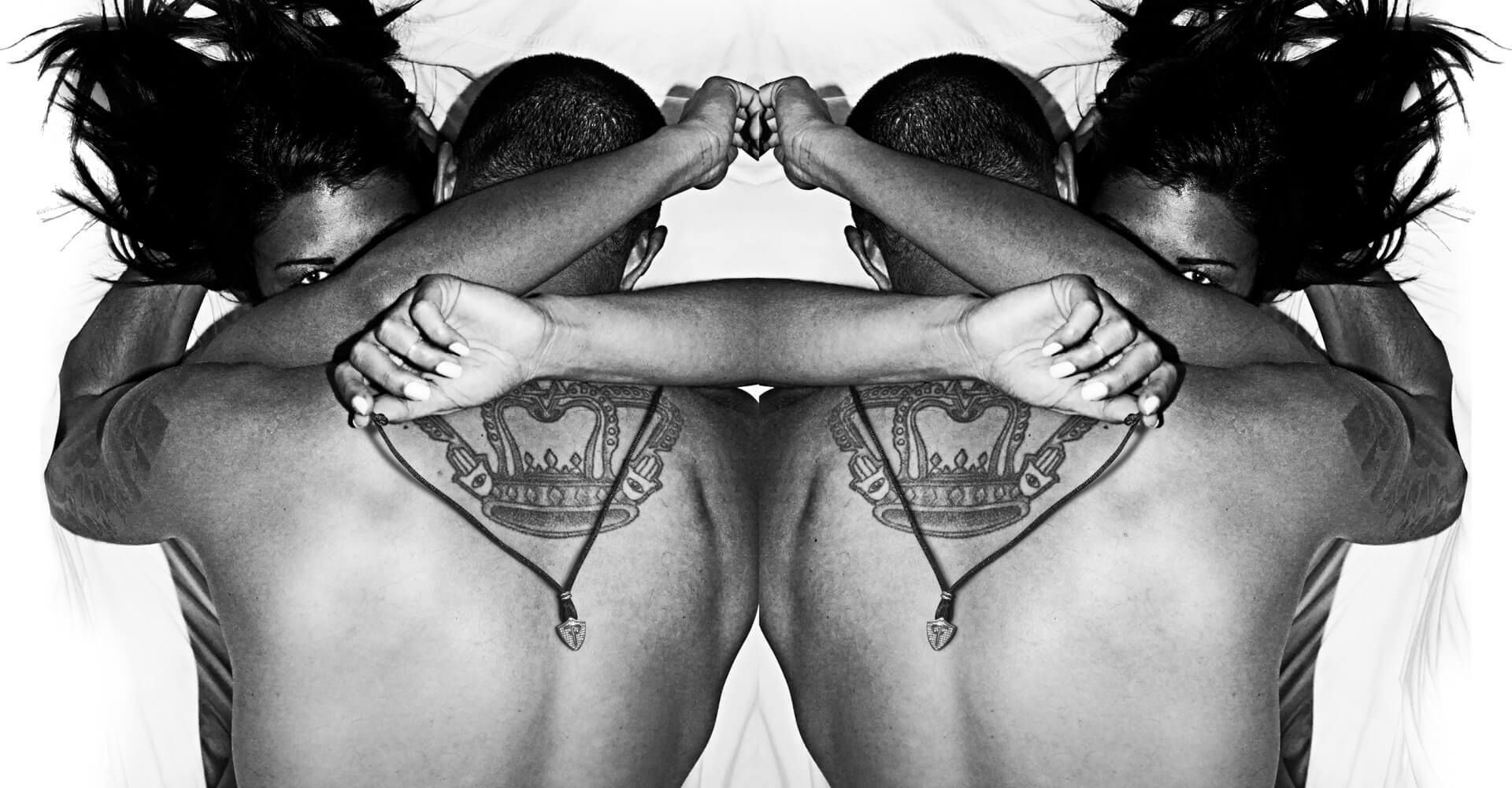
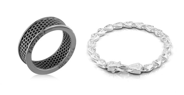
The new brand program was built on the concept of individuality – finding the right piece of jewelry to express your confidence and style. The butterfly effect, ink blot pattern was an abstract expression that became the centre piece of the brand that was distinct and recognizable. People could interpret them in their own way. This graphic became a series that was applied to their packaging and throughout their website and marketing material.

Paladin

We developed custom packaging for the jewelry that was a matchbox style container that was adaptable for a wide variety of their jewelry. The outer packaging features the ink blot pattern as a spot varnish over a matte black substrate with the logo embossed in metallic silver. The box inside was designed with some intricate line detailing and engineered to have a nice tight fit.

Paladin

We also developed a proprietary POS display that would work in their retailers displays yet stand out as polished and unique. It features a combination of stainless steel, coloured plexi and acrylic to create a dynamic backdrop for the jewelry. The interchangeable backer graphic also helps to convey the brand personality within the retail environment.

PaladinPaladin

.projectpaladin.com

explore the website

PaladinPaladinPaladinPaladinPaladinPaladin