going pro
When Canadian Tire acquired Part Source, it looked to convert its Pro-Series brand into a stand- alone entity. The brand was widely known in the automotive trade for its high quality car parts and there was an opportunity to build on this equity.
Packaging
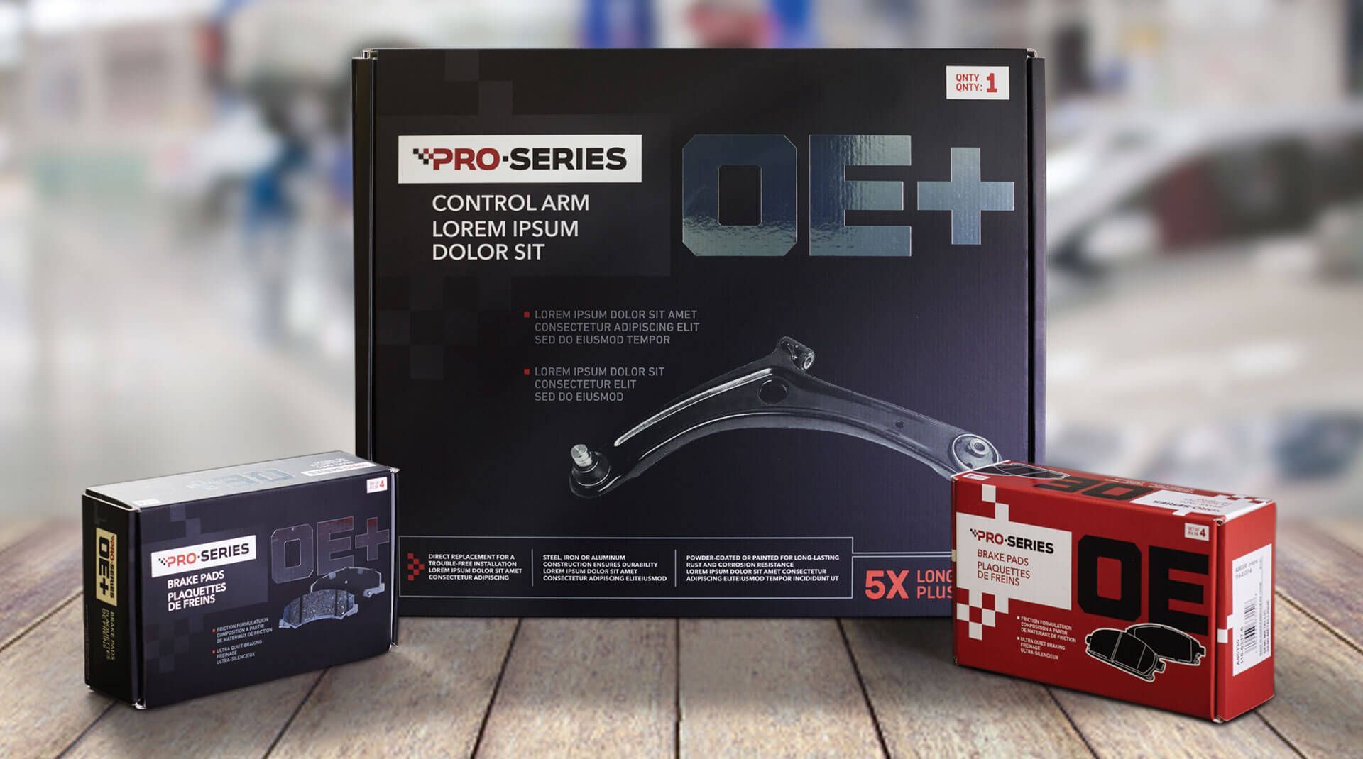
Canadian Tire engaged Jump to develop the new branding and packaging for the Pro-Series OE and OE+ products. There was a desire to evolve the look from the Part Source days to ensure that customers would recognize the name. The new logo that was developed took the checkered flag element from the original packaging and developed a cleaner, more abstract interpretation of this that became part of the word mark. This graphic was then extended to the packaging where the pattern became part of the logo lock-up. A large ‘OE’ and ‘OE+’ dominates the packaging as the industry-recognized acronym for “Original Equipment” – it refers to the ‘factory fitted part’.
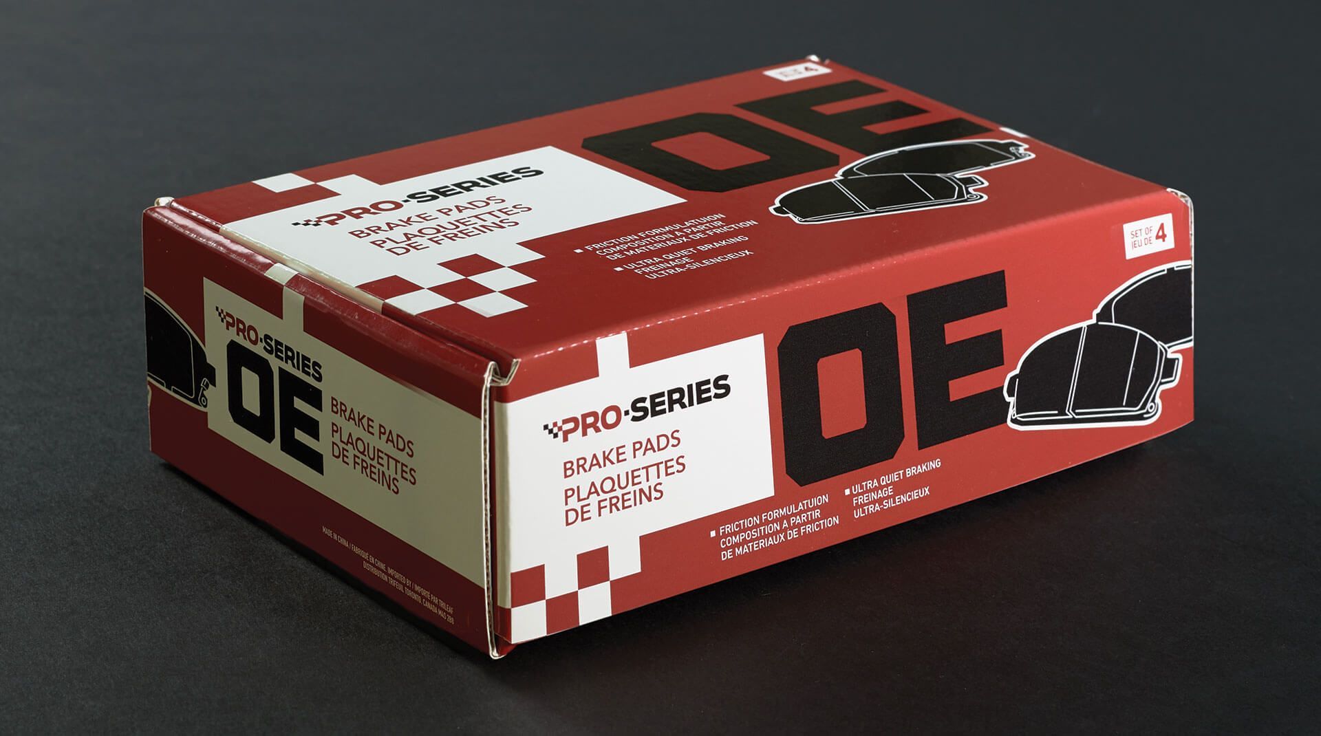
To distinguish between the two lines, the OE packaging uses a predominately red background, whereas the more premium OE+ line features black packaging. The more basic OE line was given an illustrative depiction of the products with the OE+ featuring photographs. To further elevate the OE+ line, a matte finish was utilized along with a metallic silver finish on the OE+ graphic.
The new-look brand was launched in stores in 2019 and continues to be applied to their growing assortment of car part products.