
Big impact, mini stick
For the 2025 Signature Series Mini Stick packaging project, Jump set out to capture Sherwood’s position as a true disruptor within the hockey category and to redefine what mini stick packaging can look and feel like at retail.
Packaging, Retail Packaging, Retail
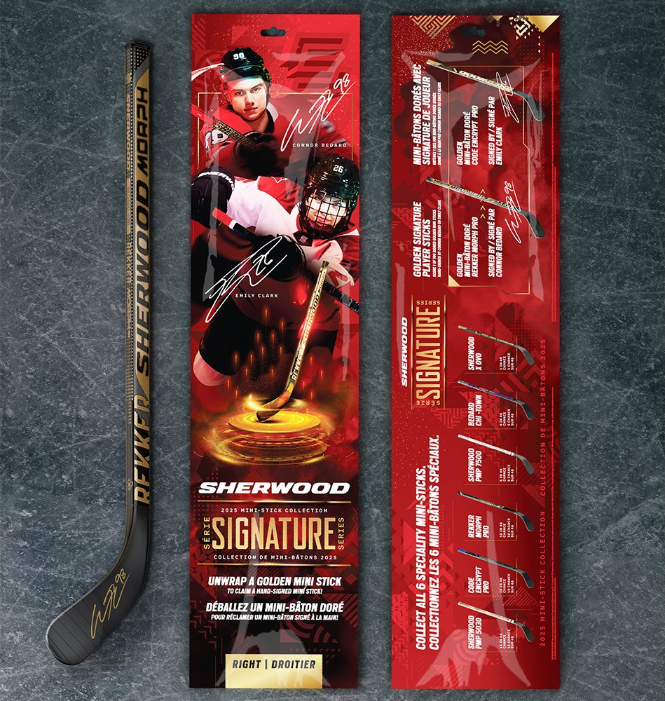
While much of the competitive landscape relies on basic product-focused visuals, Sherwood took a bold, athlete-first approach
—featuring dynamic NHL player imagery as the hero of the pack. The high-energy photography, player autograph treatments, and dramatic lighting effects shift the narrative from “toy stick” to “pro-level collectible,” tapping directly into fan culture and athlete aspiration. This entertainment-driven design language feels closer to a trading card release or limited-edition drop than traditional sporting goods packaging.
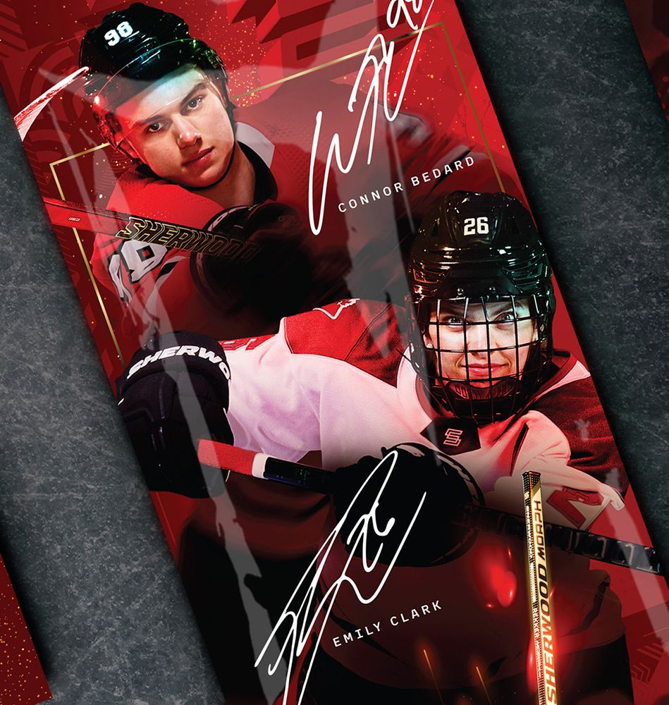
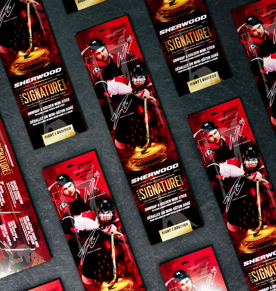
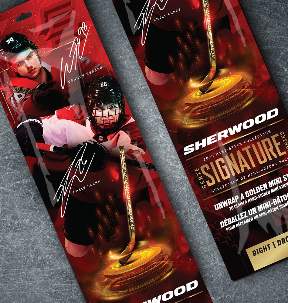
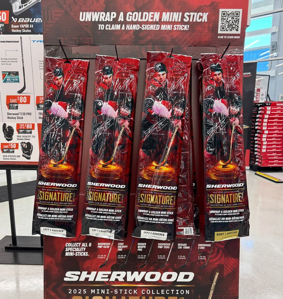
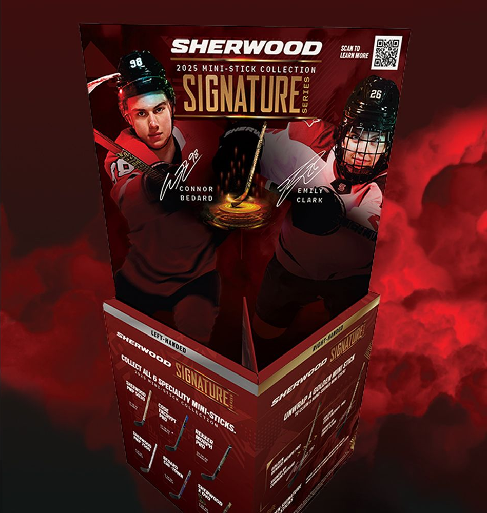
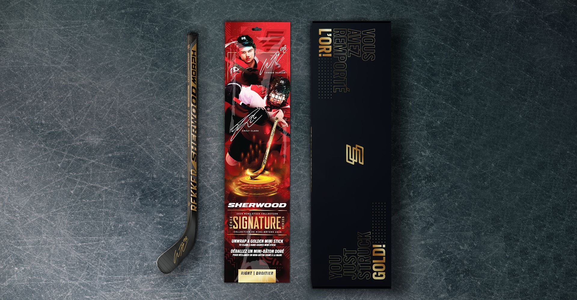
The program featured hockey stars Connor Bedard and Emily Clark as the faces of the collection. The consumer experience was heightened by the ‘Hunt for the Golden Stick’ contest, whereby they could win 1 of 100 golden signature mini sticks hand-signed by Bedard or Clark. The dominant red color system with gold-accented typography and oversized autograph treatments creates immediate impact while reinforcing the “Signature Series” positioning. Dynamic athlete photography and a glowing pedestal effect make the product the hero, giving it the feel of a trophy.
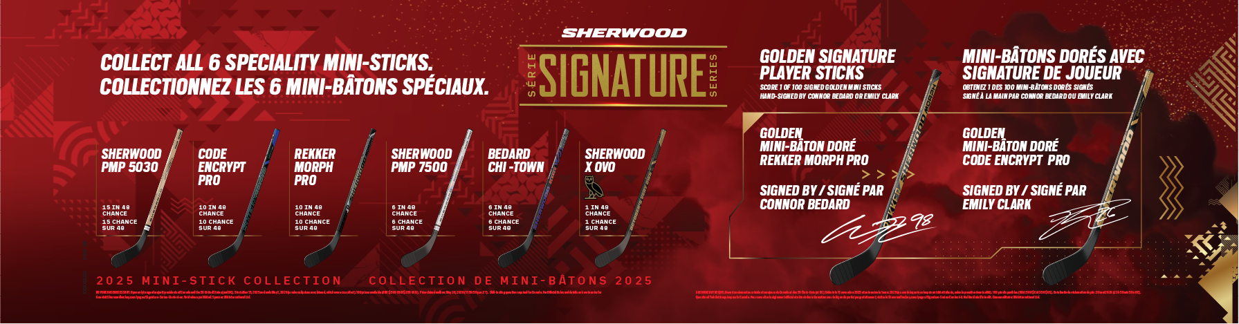
By integrating real NHL talent prominently on-pack, Jump differentiated the packaging visually and strategically, using player equity to build emotional connection, credibility, and perceived value. The back panel functions as a collector’s guide, showcasing all six specialty sticks and highlighting the hand-signed golden mini stick chase mechanic to gamify the purchase experience. Designed with bilingual integration and a vertical billboard-style format for strong retail visibility, the system establishes a scalable sub-brand platform that blends performance energy with premium memorabilia appeal.
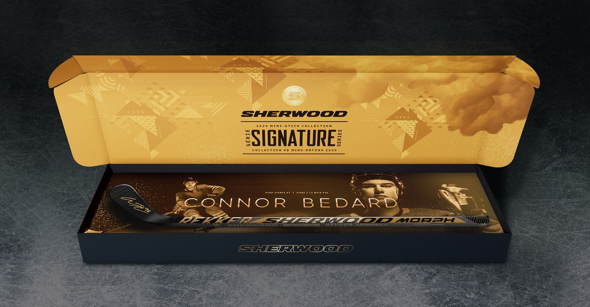
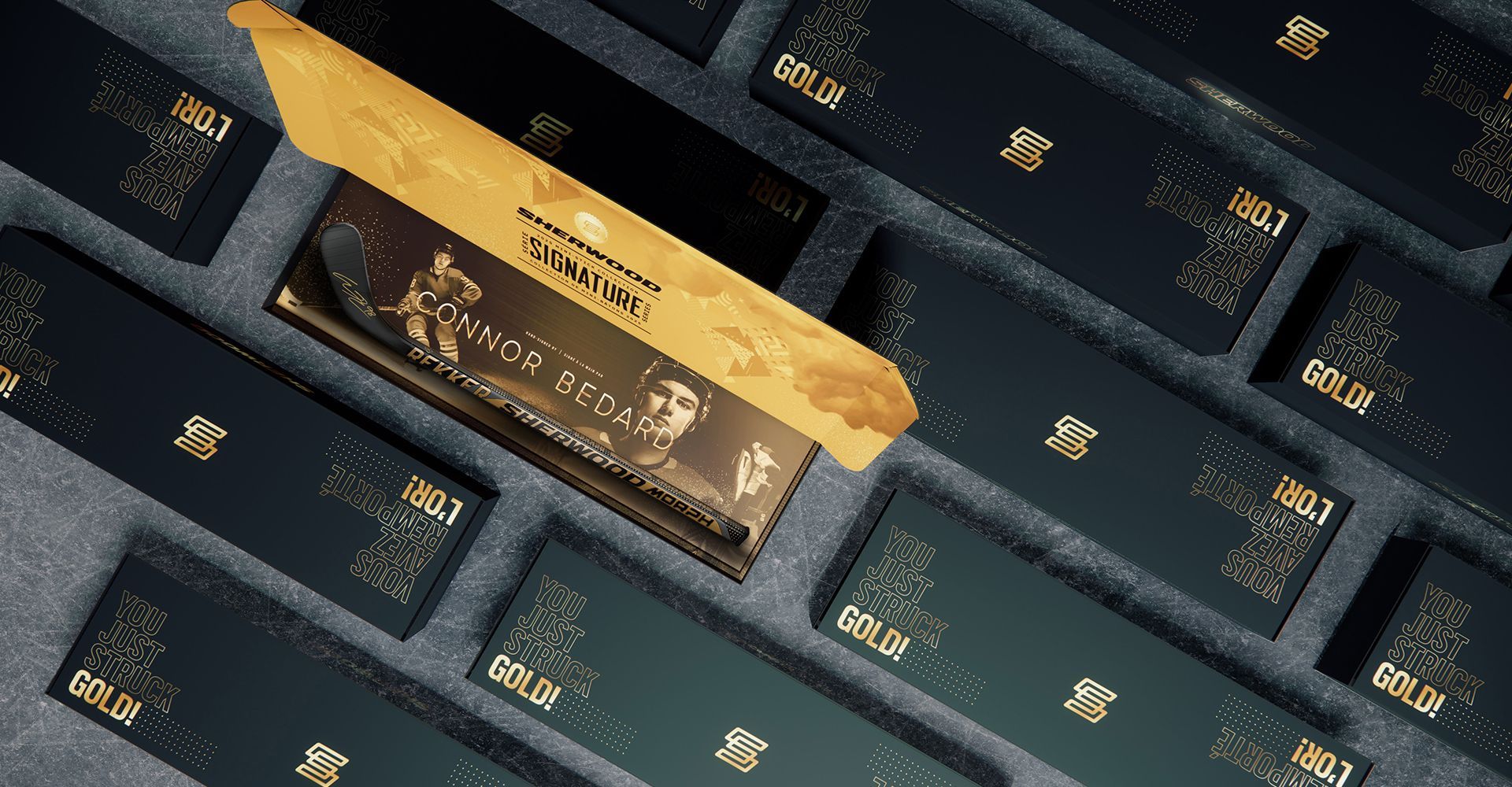
In addition to the retail packaging, Jump developed the in-store POP displays, as well as the golden stick prize packaging that winning customers would receive. This piece was designed to elevate the winning moment into a premium, keepsake-worthy experience that feels distinctly separate from the retail SKU. While the standard Signature Series pack uses bold red to drive shelf impact and energy, the prize box shifts entirely into a rich gold colourway—immediately signaling exclusivity and rarity. The exterior features a monochromatic black and gold palette layered with subtle geometric textures and tonal pattern work. The refined, metallic aesthetic positions the product closer to a luxury presentation box than sporting goods packaging.
The unboxing experience is intended to feel special. The inside lid prominently features the Sherwood Signature Series branding in gold on gold, reinforcing authenticity and prestige. The interior tray reveals the hand-signed mini stick against a dramatic black-and-gold backdrop, complete with large-scale athlete imagery and autograph treatment. The contrast between the matte black base and metallic gold detailing draws the eye directly to the signed stick, making it the hero of the experience.
This design transforms the product into a display piece rather than disposable packaging, acknowledging that winners are not just receiving a stick; they are receiving memorabilia. By differentiating the prize packaging so dramatically from the retail version, Sherwood amplifies the perceived value of the Golden Stick mechanic. The result is a cohesive system where the retail pack builds anticipation, and the gold prize box delivers on that promise with a premium, trophy-like reveal—further reinforcing Sherwood’s position as a disruptive, athlete-driven brand in the category.
2026 — PAC Awards, Best in Class