meet us in st. louis

St. Louis Bar and Grill wanted to breathe new life into their sports bar and make it appeal to more than just the regulars (we love you guys, but Mom and Dad want good wings too!). We sharpened the logo and dialled up the appeal of both the bar and the restaurant to make it more approachable to families and couples enjoying a night out. We created a whole new menu that changed the perception from a bar that serves food to a restaurant that serves drinks. In the menu, new food photography focused on appetite appeal and provided flexibility and versatility for franchisees. St. Louis now looks and feels as quality as the wings they’re famous for.

Identity, Packaging, Restaurant Packaging, Restaurant

A bunch of st. louis logos on a white background

retiring the athletic logo

The logo was complicated, featuring red and blue tones that really made St. Louis feel like a sports bar. We love a good sports bar like the next guy, but it has to be accessible by non-sports lovers as well. We eliminated the blue from the logo, and refined it by removing the athletic coloring and giving it a more proprietary word mark that instantly provided an edginess that feels more like the brand. The new logo has a much broader appeal and resonates with a larger audience – you could say it gets along with everybody.

A close up of a menu for a restaurant called elo bar and grill
A person is holding a menu that says eat em led handed

dialing up delicious

The St. Louis Menu was completely redesigned. Out with the heavily typographic design and in with gritty food pics that make you lick your lips…and your fingers. We got rid of the small, uninspiring photos and replaced them with oversized shots of table settings that get your gut rumbling.

A menu for a restaurant that says deals monday to sunday
a plate of food
a menu

Throw in the occasional offside messaging, and this is a man’s menu that your better half can’t help but dig into. Food is always accompanied by beer or cocktails – just like in real life. Food descriptions are more colourful (like some of the language at the bar), creating even more appetite appeal and giving the brand more voice.

A picture of a hamburger next to an advertisement for big mou
A bar with a red counter and blue lights behind it

a restaurant for the wing lover

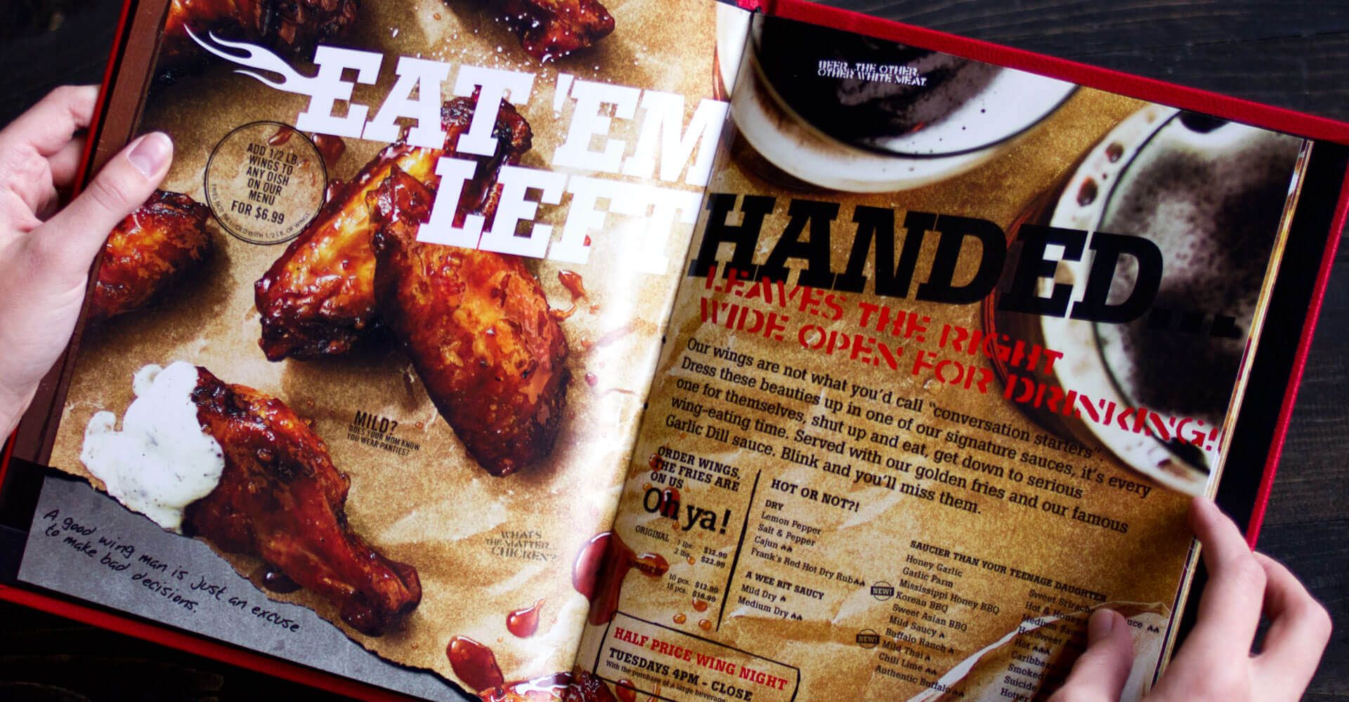
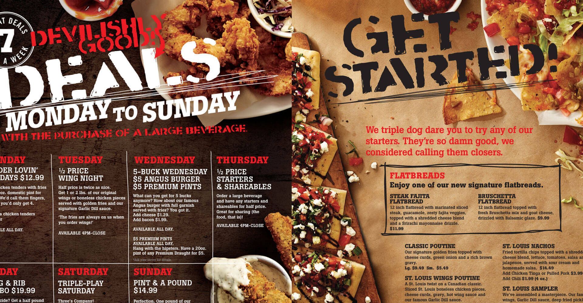
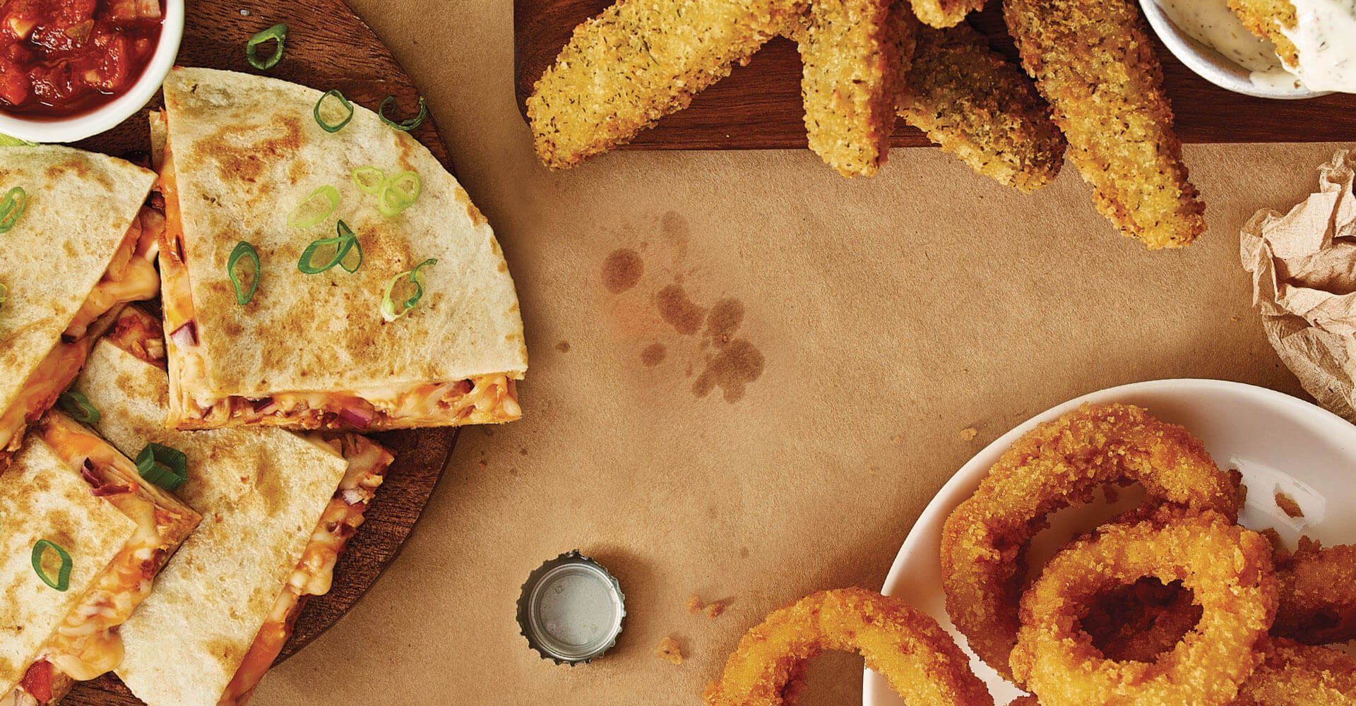
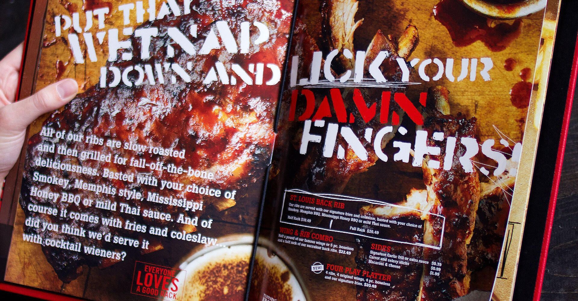
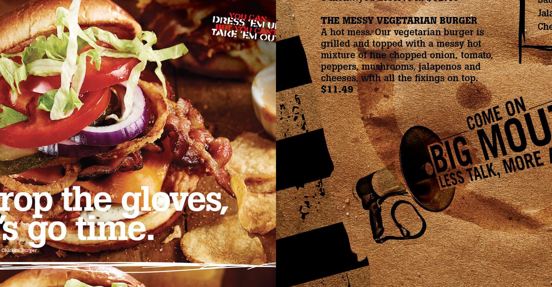
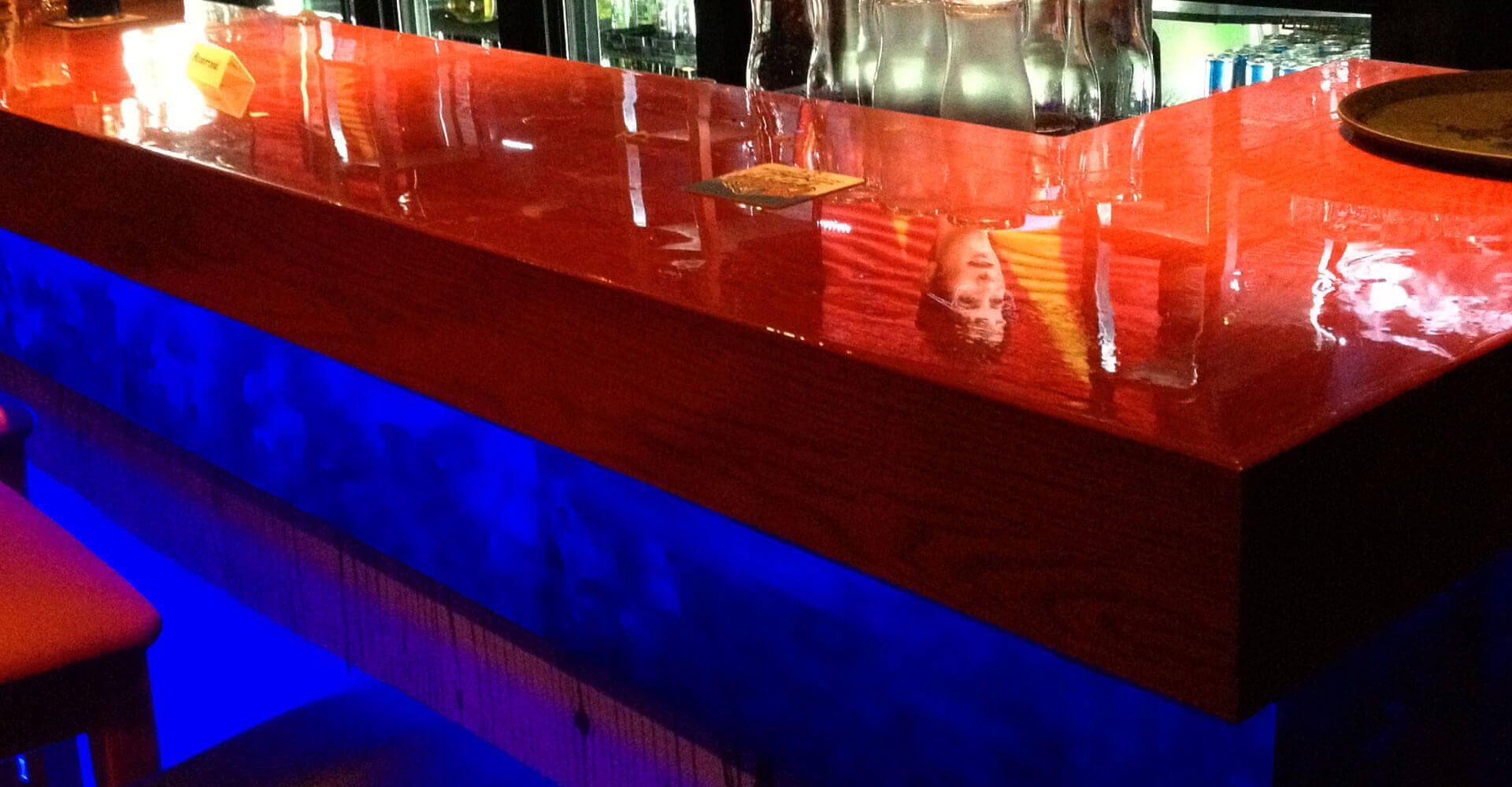
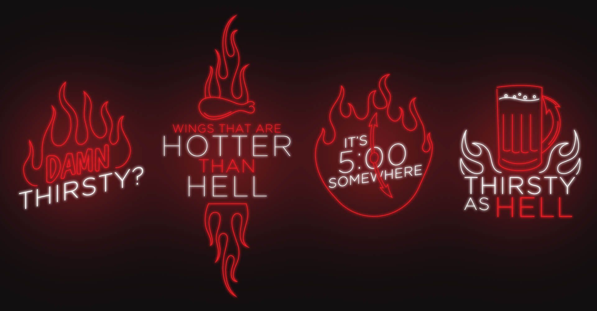
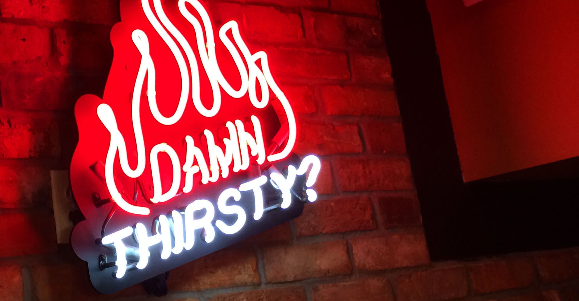
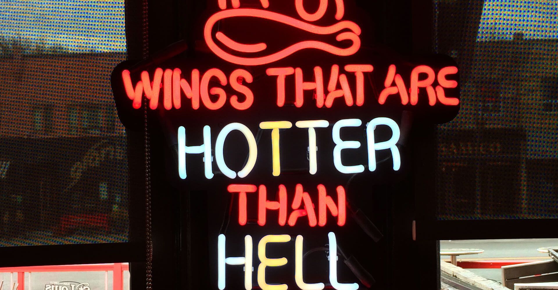
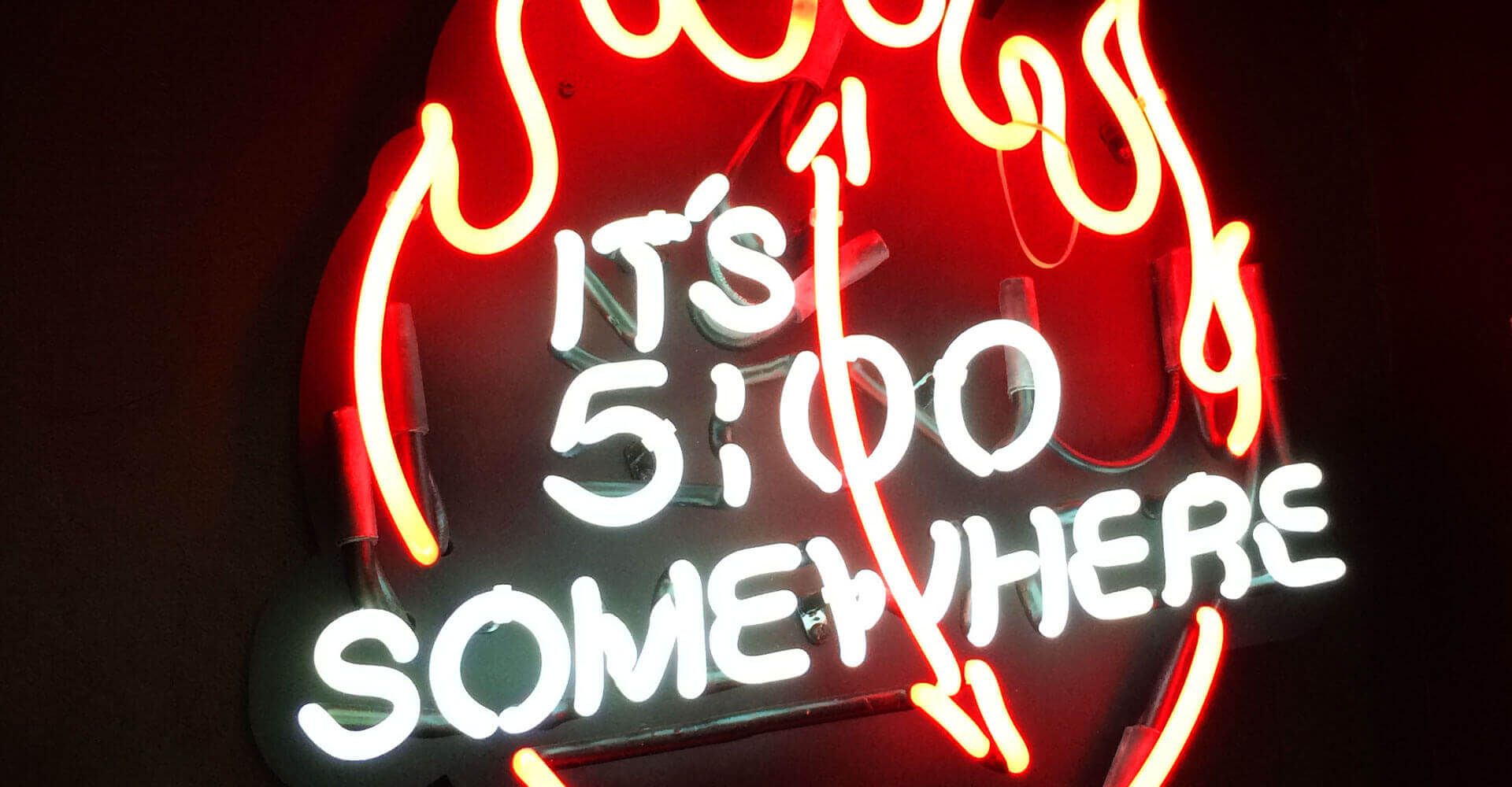
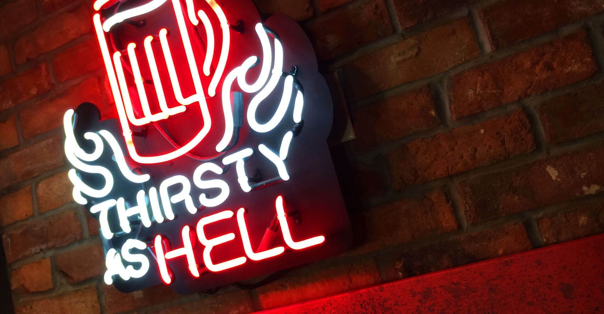
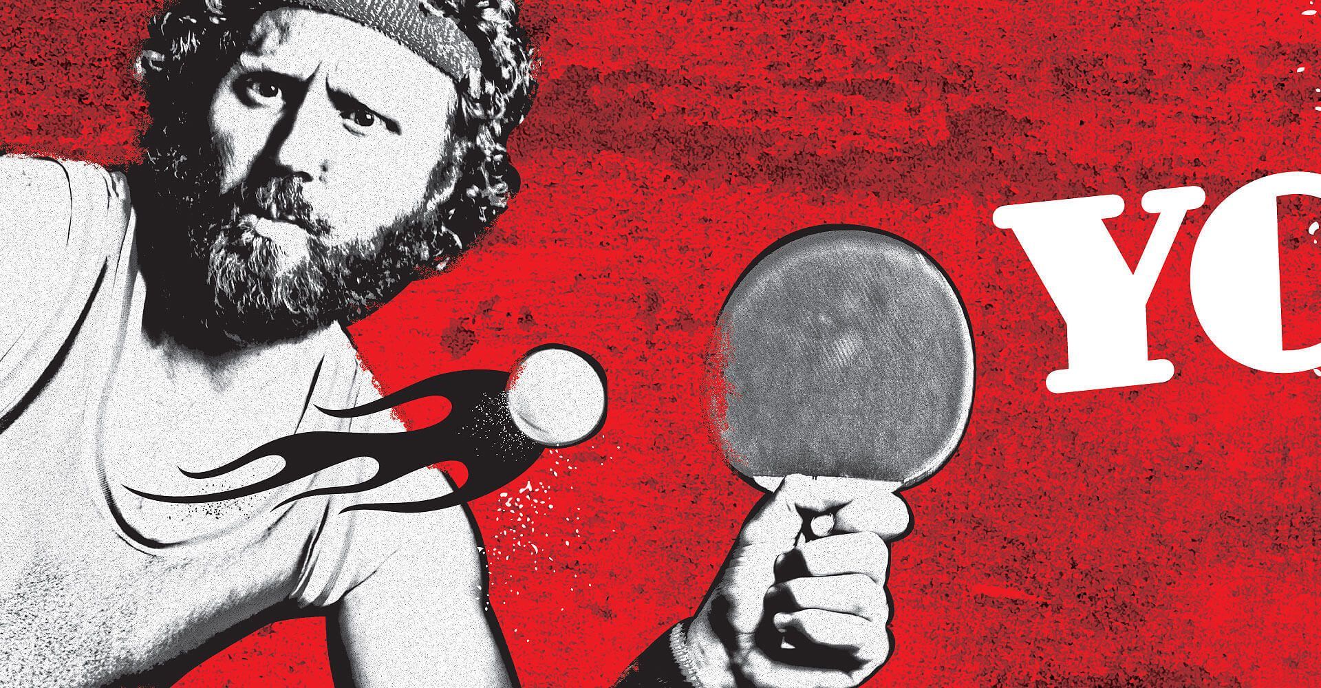
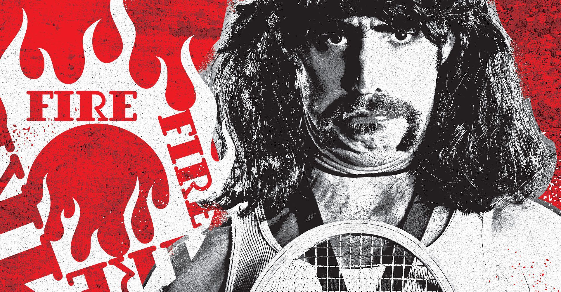
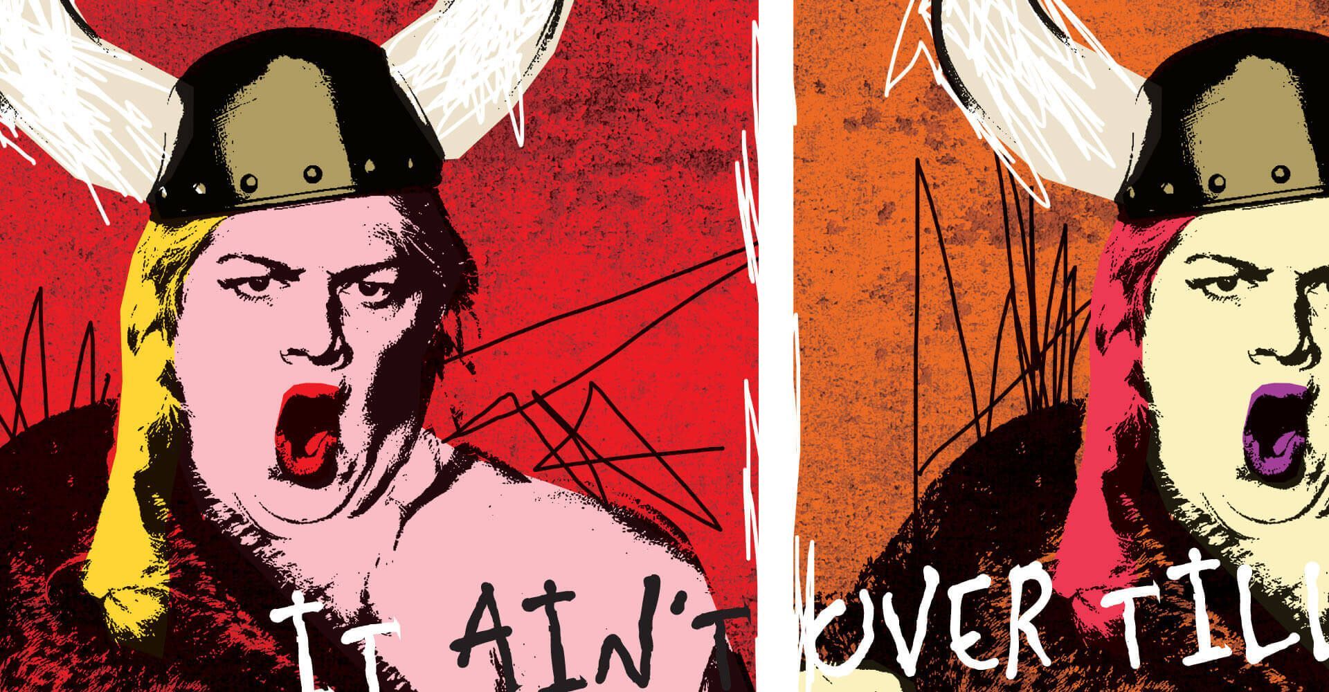
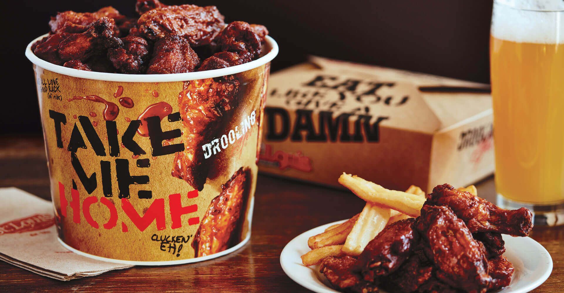
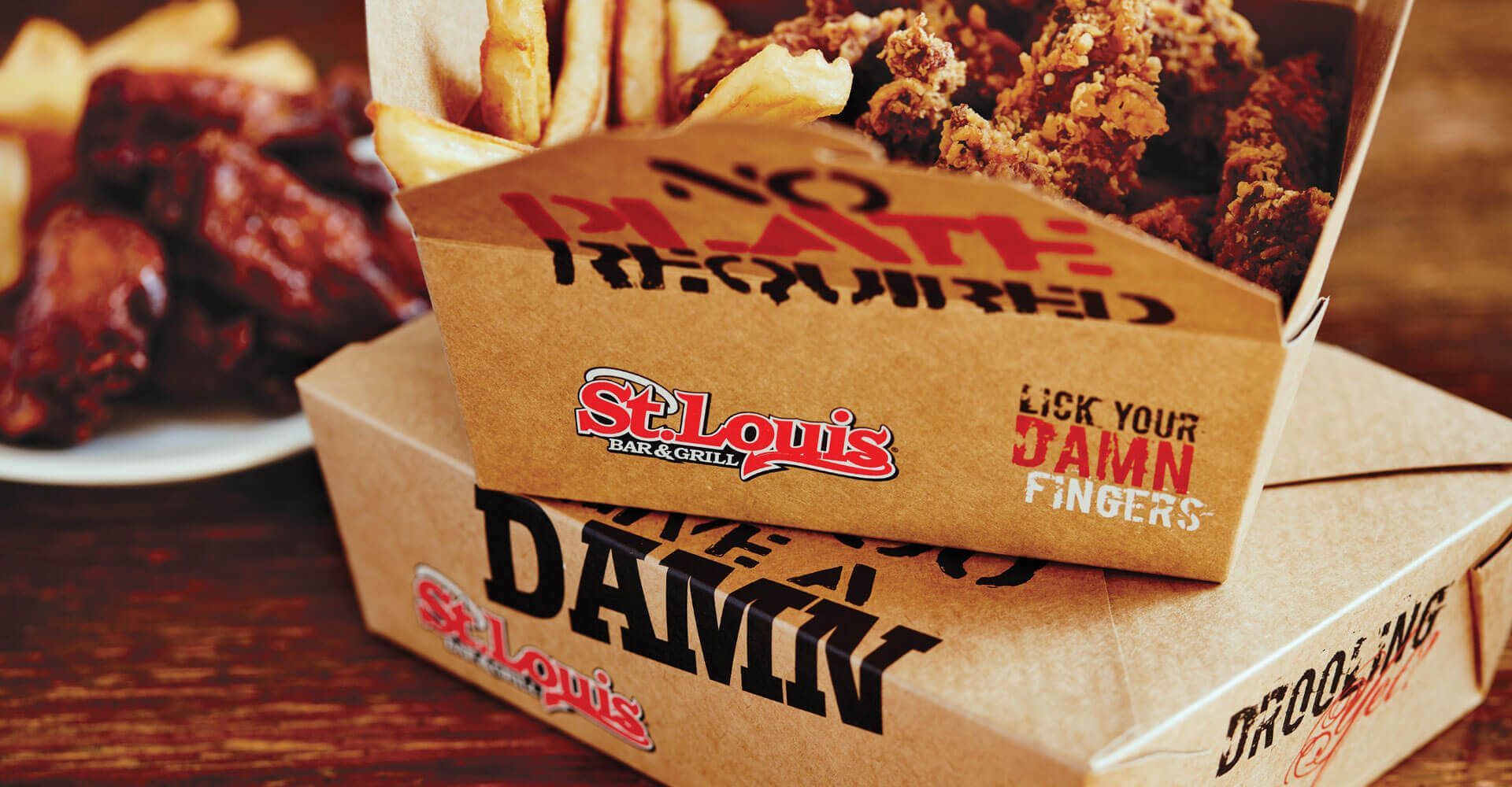
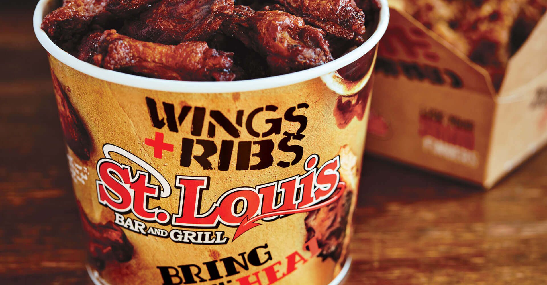
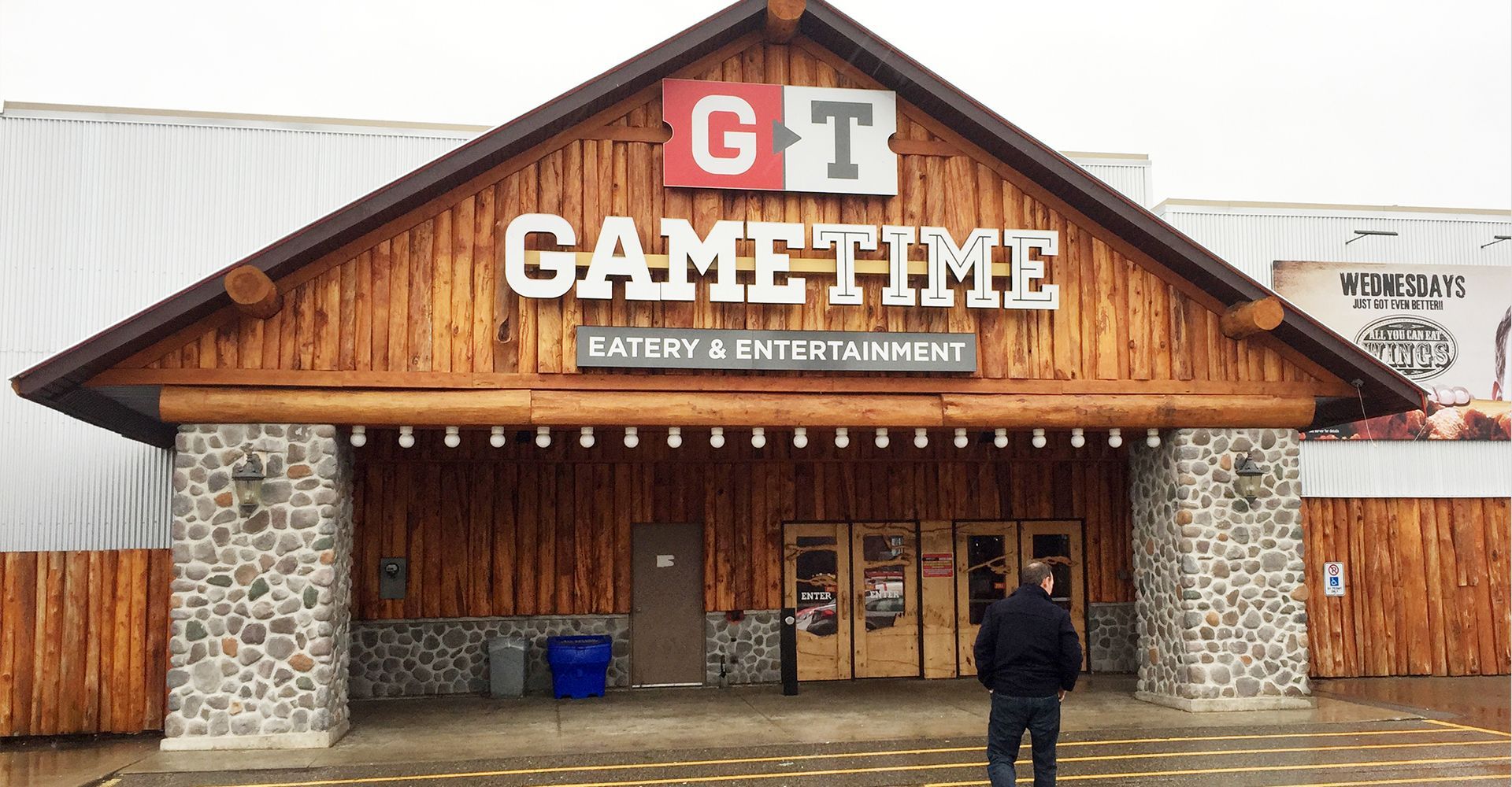
In the restaurant, we took a “less bar and more food” approach (hey, now!), recognizing that the existing design package appealed to men, but not so much to women and families. Guys need their space, but they’d also like to enjoy a good chicken wing with the fam, so we revitalized the bar to make it more approachable to a younger crowd and focused the restaurant on being a place for families and friends to grab a bite and a drink. We developed a design package, including signage, artwork, and decor, that existing franchisees can sink their teeth into, and gives St. Louis something easier to sell to potential future franchise owners.

a neon sign t
a neon sign
a neon sign that says wings that are hotter than hell
A neon sign that says it 's 5:00 somewhere
a neon sign t
A man with a beard is playing ping pong on a red background
A man with long hair and a beard is holding a tennis racquet.
A drawing of a viking with horns and the words it ain 't over till
The trouble with referees is that they just don t care which side wins
A black and white poster with a devil and a toilet on it
A bucket of chicken wings and a plate of french fries on a table.

tantalizing take-out

We wanted St. Louis customers to bring home more than just food – we wanted them to take the brand with them. The new take out packaging ratchets up the appetite appeal with food photography in the same way the new menus do, but they also carry messaging that brings the spirit of St. Louis to whatever occasion calls for it.

fries and chicken in a take out box
A bucket of wings and ribs from st. louis

if you like those, you might like...