White ocean waves crashing through deep teal water

Slide Title

Slide description
Button

Slide Title

Slide description
Button

Slide Title

Slide description
Button

built for the call of the wild

When we first looked at Yukon Gear, what stood out wasn’t what they were trying to add to the category, but what they were intentionally leaving out.

Identity, Packaging, Retail Packaging, Retail

White ocean waves crashing through deep teal water

Slide Title

Slide description
Button

Slide Title

Slide description
Button

Slide Title

Slide description
Button

They had a clear point of view from the start. This wasn’t about overbuilt features or technical storytelling. It was about giving people the gear they actually need to get outside. Simple, reliable, and accessible.


The disconnect was in how that thinking showed up on shelf. The hunting and outdoor equipment category is crowded and often overwhelming, filled with dense information and competing claims. Yukon Gear had a much more straightforward philosophy rooted in functionality over complexity, but their packaging wasn’t communicating that with the same clarity. Our role was to bring that mindset forward and make it visible.

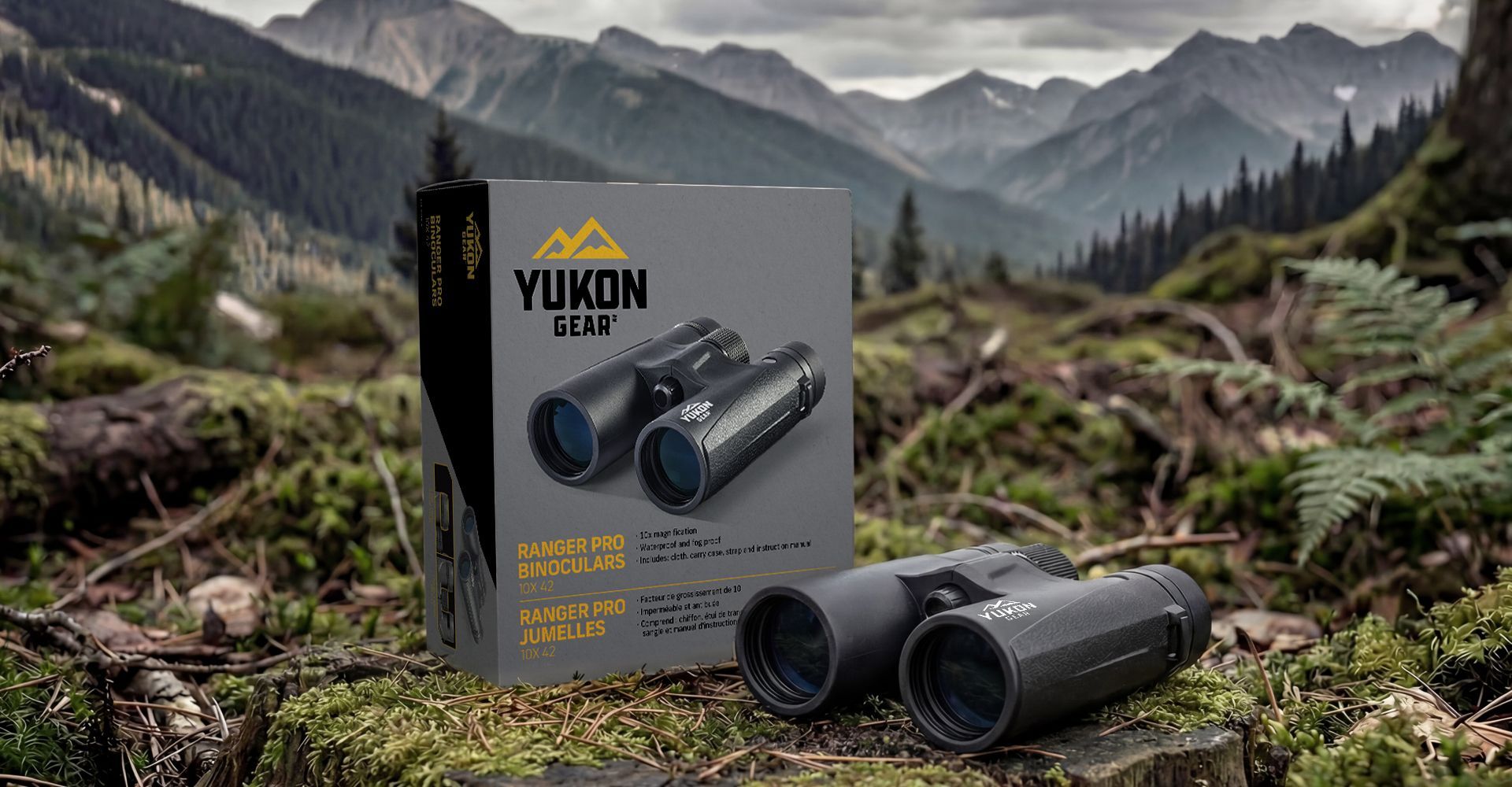
Yukon binoculars displayed beside their box on a forested mountain trail with misty peaks in the background
White ocean waves crashing through deep teal water

Slide Title

Slide description
Button

Slide Title

Slide description
Button

Slide Title

Slide description
Button

We approached the system by stripping things back. Every decision came down to usefulness.

If an element didn’t help someone understand the product quickly, it didn’t belong. That shift created a clear direction. Instead of layering on features and messages, we focused on hierarchy, legibility, and intent.

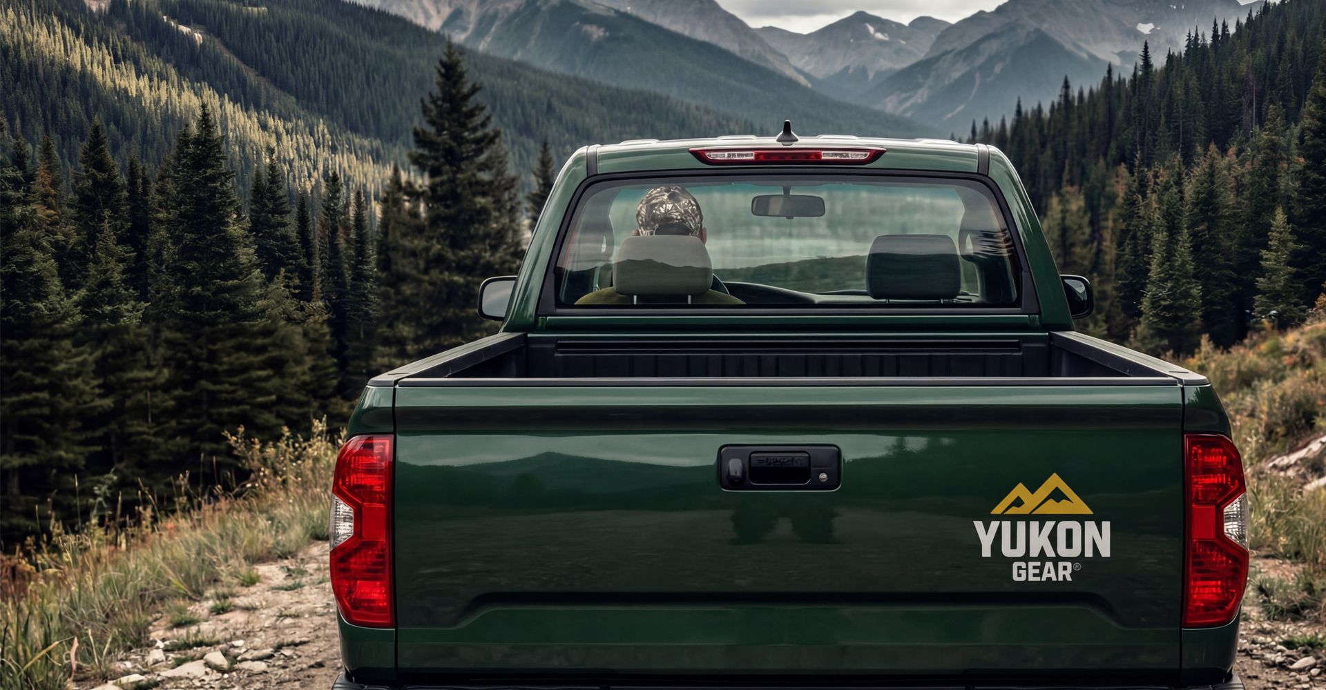
Green GMC Yukon pickup on a mountain road, with forested peaks in the background
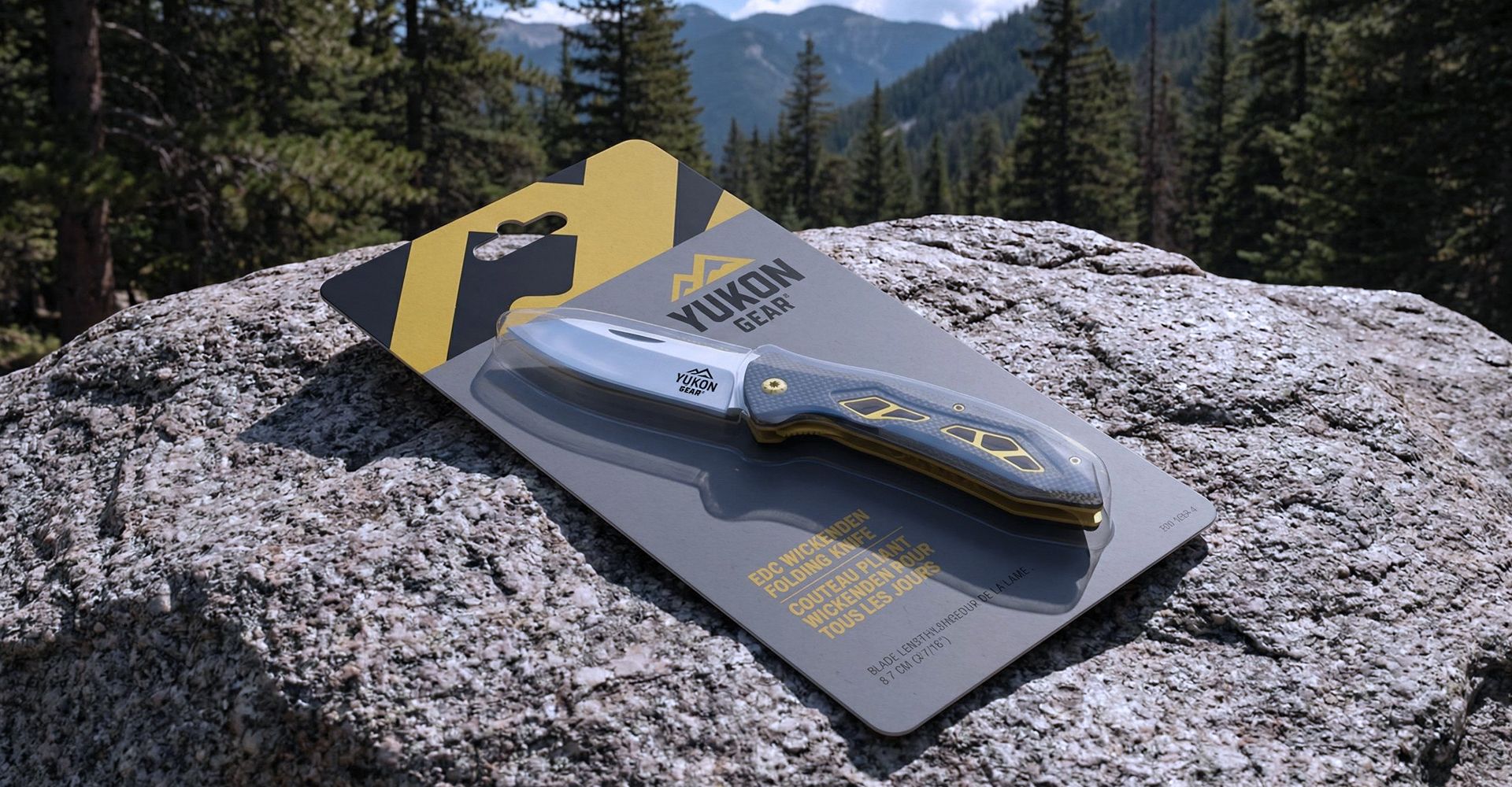
Blue folding knife on a display card atop a rock in a mountain forest setting.
White ocean waves crashing through deep teal water

Slide Title

Slide description
Button

Slide Title

Slide description
Button

Slide Title

Slide description
Button

We built a packaging system that prioritizes immediate understanding. The product is clear, the purpose is clear, and the key features are easy to find. Typography was chosen for its clarity and legibility. Colour was used for contrast and consistency. Photography was treated with depth and shadow to give the product presence without relying on heavy graphics. Each panel was structured to guide the eye naturally, creating a system that consistently works across all packaging formats.

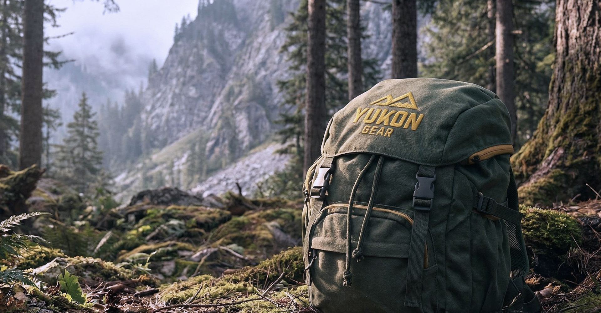
Green backpack on a forest trail with misty mountains and tall pine trees in the background
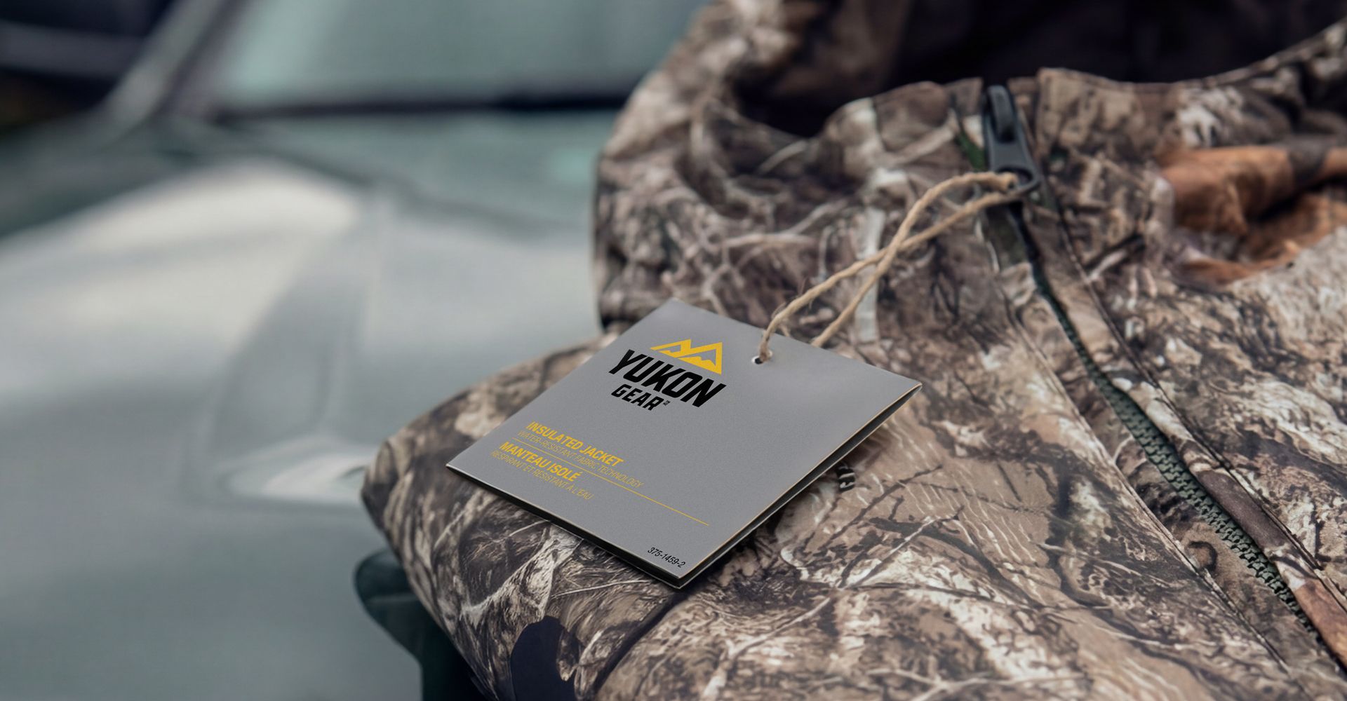
Camouflage jacket with a small rectangular tag resting on a car hood
White ocean waves crashing through deep teal water

Slide Title

Slide description
Button

Slide Title

Slide description
Button

Slide Title

Slide description
Button

The new brand and packaging design conveys a dependable and practical feel. It works for someone with years of hunting experience and for someone just getting started. That balance was important because the brand is built for both. Our objective wasn’t to amplify it with more noise, but to support it with clarity. The final packaging system does exactly that. It projects confidence, communicates what matters, and lets the product be the hero.

Yukon Gear logo with yellow mountains above black text on a gray background
Yukon Gear logo with yellow mountain peaks and bold black text on a gray background

if you like those, you might like...