eggs. reimagined.
Every great brand starts by asking a simple question. What if the most familiar item on the breakfast menu could become the one people crave most?
Identity, Packaging, Restaurant Packaging, Restaurant
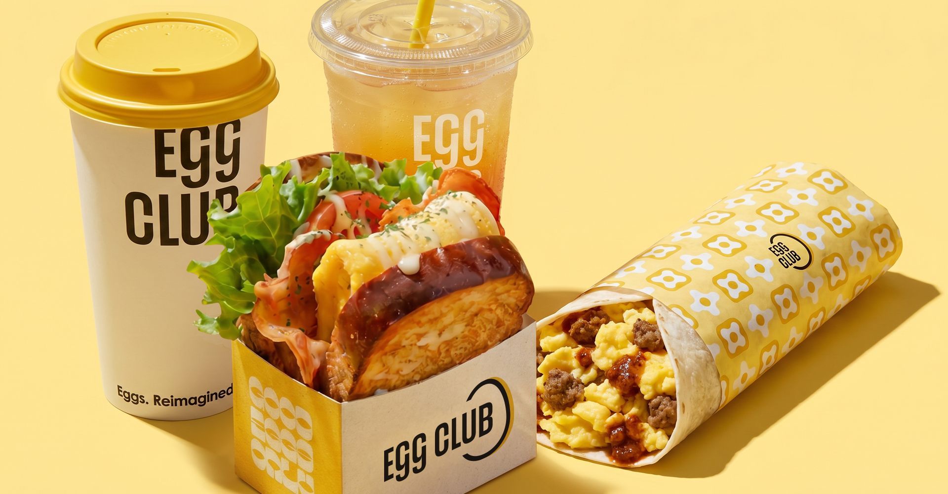
Inspired by Japan's iconic tamago sando, Egg Club takes soft folded eggs and Japanese milk bread and turns them into something rich, simple and indulgent in every bite. The opportunity wasn't simply to create another breakfast restaurant. It was to build a brand that could redefine what fast casual breakfast looks and feels like.
Working alongside the founders from the earliest stages, we developed a complete brand experience that extends beyond the logo. Every decision was guided by a simple philosophy. Keep the product at the centre and make every touchpoint support it.

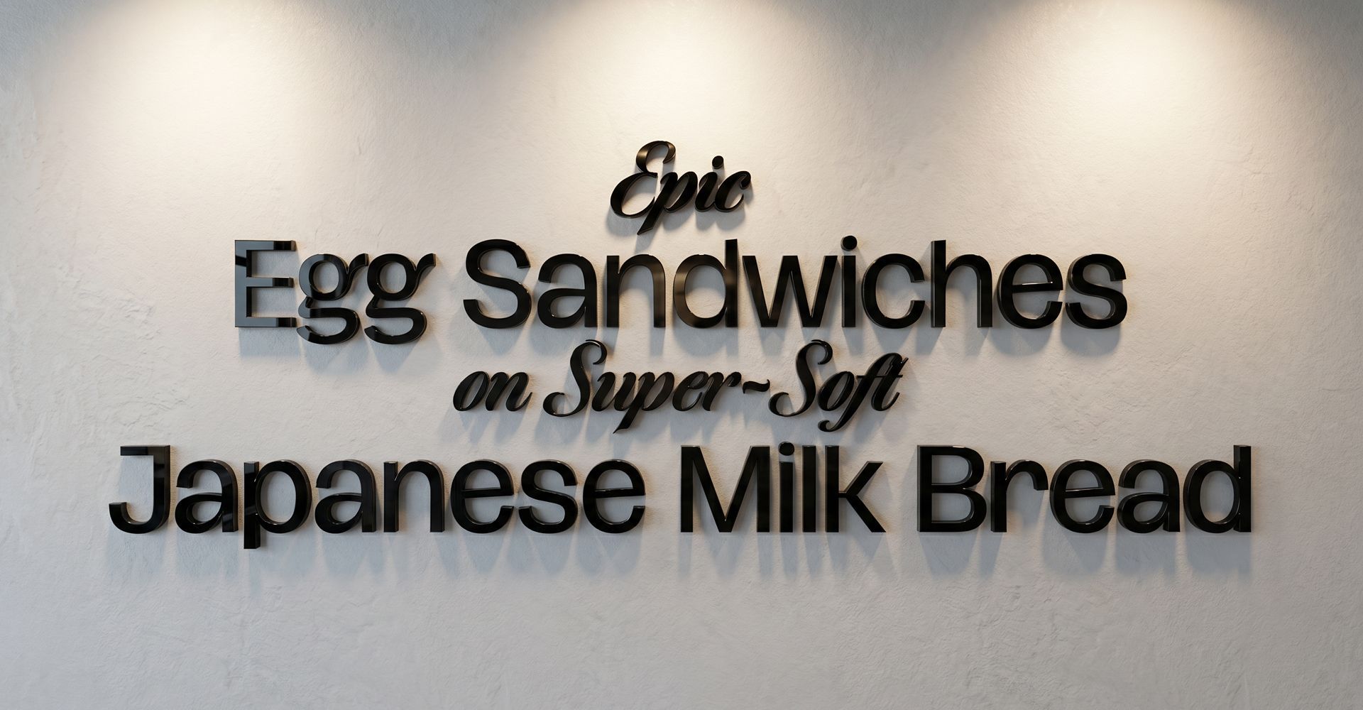
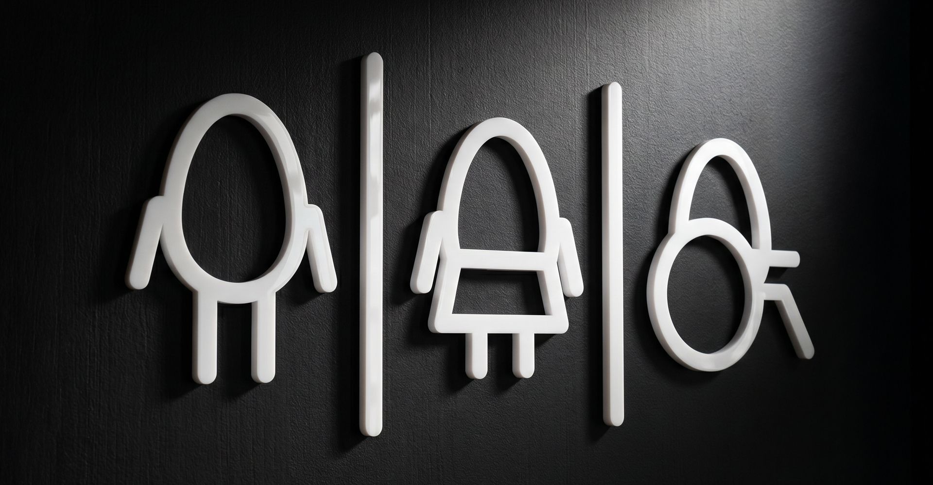
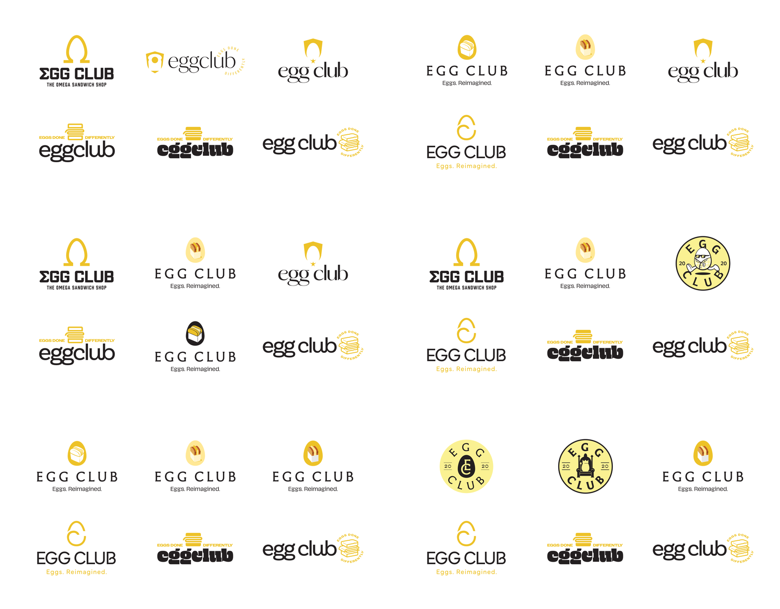
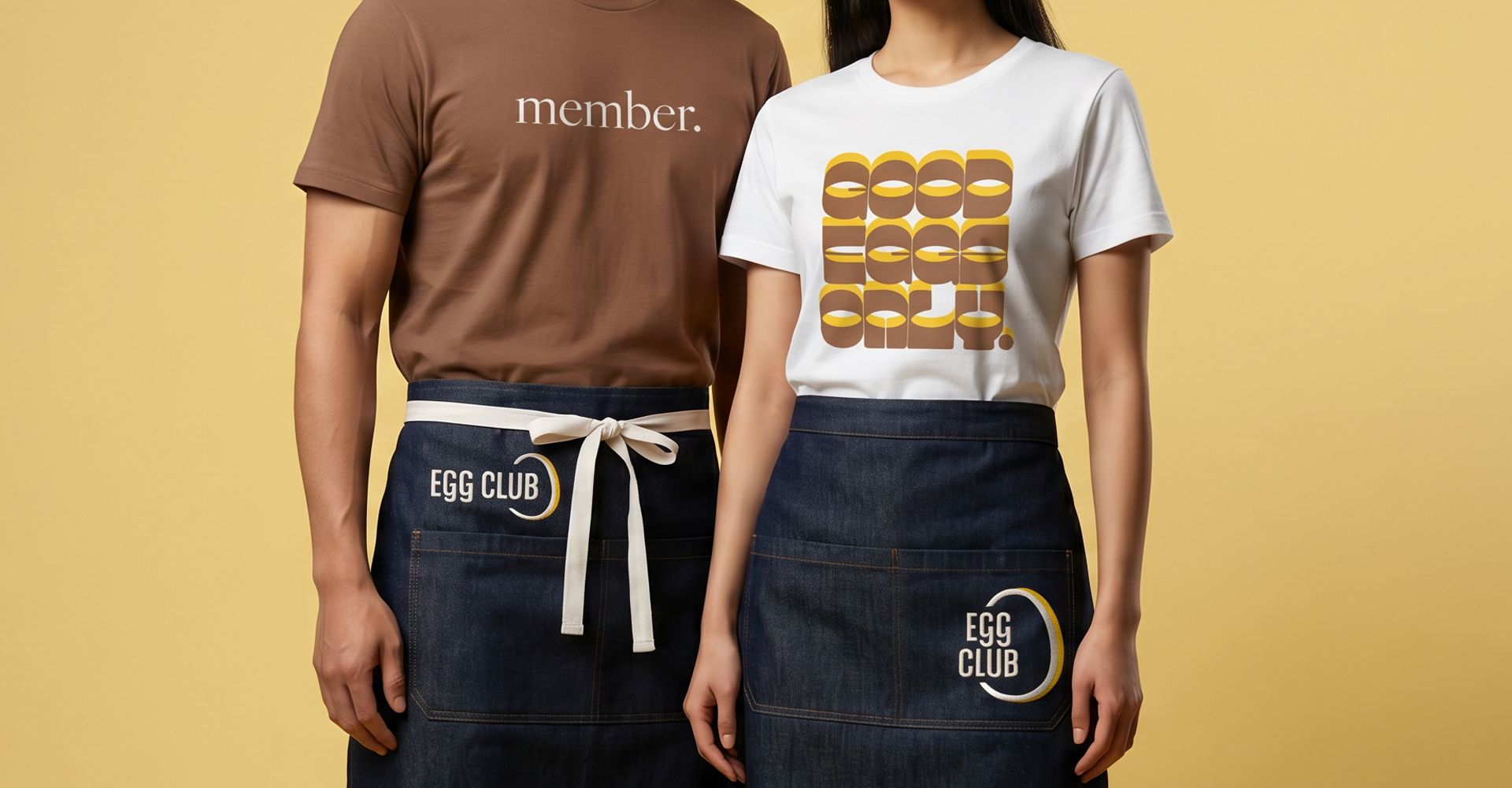
The identity is built on bold simplicity. A vibrant yellow palette, clean typography and straightforward graphic elements create a clear visual system while allowing the food to remain the focus. Egg iconography, custom illustrations and messaging are used across menus, uniforms, packaging and signage.


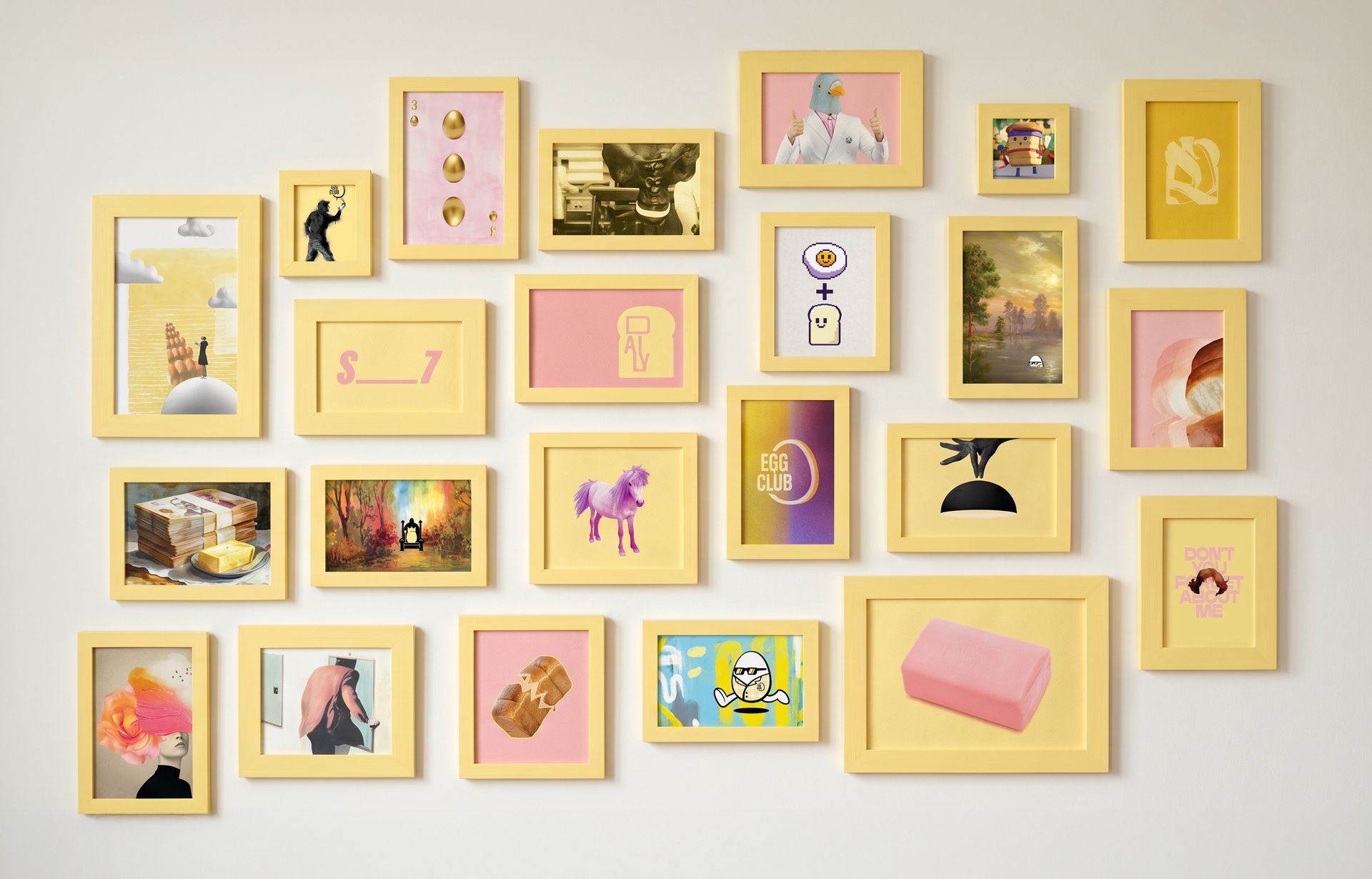
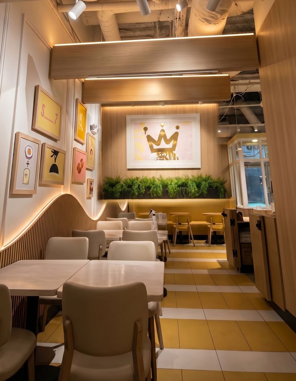
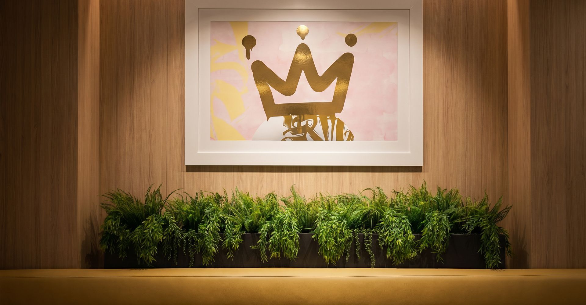
Inside the restaurant, the brand continues through environmental graphics, custom murals and a series of framed artworks that play on the idea of the "Club" in Egg Club. References to The Breakfast Club, Fight Club and Pink Pony Club appear throughout the space, adding a layer of visual storytelling and giving guests something to discover beyond the food.


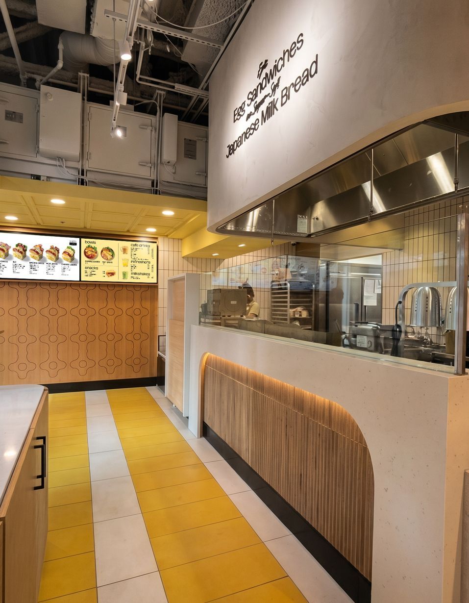
Warm natural materials, bold yellow architectural elements and clean white surfaces create a bright backdrop for the product. A single feature wall in wood carries a custom routed pattern, combining an abstract egg motif with negative space that forms shapes referencing Japanese milk bread.